A.1 Organizing and Summarizing a Set of Scores
This section describes some basic elements of descriptive statistics: the construction of frequency distributions, the measurement of central tendency, and the measurement of variability.
Ranking the Scores and Depicting a Frequency Distribution
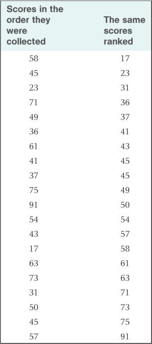
Suppose you gave a group of people a psychological test of introversion-extroversion, structured such that a low score indicates introversion (a tendency to withdraw from the social environment) and a high score indicates extroversion (a tendency to be socially outgoing). Suppose further that the possible range of scores is from 0 to 99, that you gave the test to 20 people, and that you obtained the scores shown in the left-hand column of Table A.1. As presented in that column, the scores are hard to describe in a meaningful way; they are just a list of numbers. As a first step toward making some sense of them, you might rearrange the scores in rank order, from lowest to highest, as shown in the right-hand column of the table. Notice how the ranking facilitates your ability to describe the set of numbers. You can now see that the scores range from a low of 17 to a high of 91 and that the two middle scores are 49 and 50.
Twenty scores unranked and ranked
A2
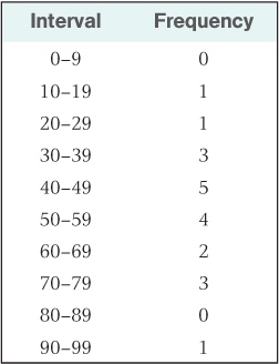
A second useful step in summarizing the data is to divide the entire range of possible scores into equal intervals and determine how many scores fall in each interval. Table A.2 presents the results of this process, using intervals of 10. A table of this sort, showing the number of scores that occurred in each interval of possible scores, is called a frequency distribution. Frequency distributions can also be represented graphically, as shown in Figure A.1. Here, each bar along the horizontal axis represents a different interval, and the height of the bar represents the frequency (number of scores) that occurred in that interval.
Frequency distribution formed from scores in Table A.1
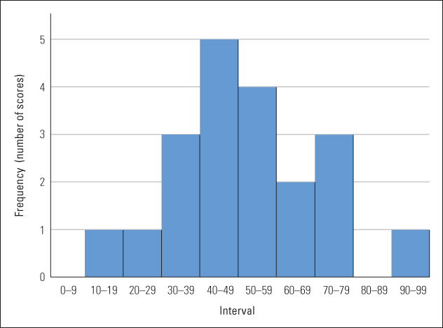
As you examine Figure A.1, notice that the scores are not evenly distributed across the various intervals. Rather, most of them fall in the middle intervals (centering around 50), and they taper off toward the extremes. This pattern would have been hard to see in the original, unorganized set of numbers.
Shapes of Frequency Distributions
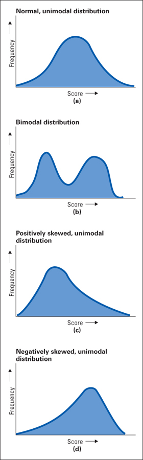
The frequency distribution in Figure A.1 roughly approximates a shape that is referred to as a normal distribution or normal curve. A perfect normal distribution (which can be expressed by a mathematical equation) is illustrated in Figure A.2a. Notice that the maximum frequency lies in the center of the range of scores and that the frequency tapers off—first gradually, then more rapidly, and then gradually again—symmetrically on the two sides, forming a bell-shaped curve. Many measures in nature are distributed in accordance with a normal distribution. Height (for people of a given age and sex) is one example. A variety of different factors (different genes and nutritional factors) go into determining a person’s height. In most cases, these different factors—some promoting tallness and some shortness—average themselves out so that most people are roughly average in height (accounting for the peak frequency in the middle of the distribution). A small proportion of people, however, will have just the right combination of factors to be much taller or much shorter than average (accounting for the tails at the high and low ends of the distribution). In general, when a measure is determined by several independent factors, the frequency distribution for that measure at least approximates the normal curve. The results of most psychological tests also form a normal distribution if the test is given to a sufficiently large group of people.
A3
But not all measures are distributed in accordance with the normal curve. Consider, for example, the set of scores that would be obtained on a test of English vocabulary if some of the people tested were native speakers of English and others were not. You would expect in this case to find two separate groupings of scores. The native speakers would score high and the others would score low, with relatively few scores in between. A distribution of this sort, illustrated in Figure A.2b, is referred to as a bimodal distribution. The mode is the most frequently occurring score or range of scores in a frequency distribution; thus, a bimodal distribution is one that has two separate areas of peak frequencies. The normal curve is a unimodal distribution because it has only one peak in frequency.
Some distributions are unimodal, like the normal distribution, but are not symmetrical. Consider, for example, the shape of a frequency distribution of annual incomes for any randomly selected group of people. Most of the incomes might center around, let’s say, $20,000. Some would be higher and some lower, but the spread of higher incomes would be much greater than that of lower incomes. No income can be less than $0, but no limit exists to the high ones. Thus, the frequency distribution might look like that shown in Figure A.2c. A distribution of this sort, in which the spread of scores above the mode is greater than that below, is referred to as a positively skewed distribution. The long tail of the distribution extends in the direction of high scores.
As an opposite example, consider the distribution of scores on a relatively easy examination. If the highest possible score is 100 points and most people score around 85, the highest score can only be 15 points above the mode, but the lowest score can be as much as 85 points below it. A typical distribution obtained from such a test is shown in Figure A.2d. A distribution of this sort, in which the long tail extends toward low scores, is called a negatively skewed distribution.
Measures of Central Tendency
Perhaps the most useful way to summarize a set of scores is to identify a number that represents the center of the distribution. Two different centers can be determined—the median and the mean (both described in Chapter 2). The median is the middle score in a set of ranked scores. Thus, in a ranked set of nine scores, the fifth score in the ranking (counting in either direction) is the median. If the data set consists of an even number of scores, determining the median is slightly more complicated because two middle scores exist rather than one. In this case, the median is simply the midpoint between the two middle scores. If you look back at the list of 20 ranked scores in Table A.1, you will see that the two middle scores are 49 and 50; the median in this case is 49.5. The mean (also called the arithmetic average) is found simply by adding up all of the scores and dividing by the total number of scores. Thus, to calculate the mean of the 20 introversion-extroversion scores in Table A.1, simply add them (the sum is 1,020) and divide by 20, obtaining 51 as the mean.
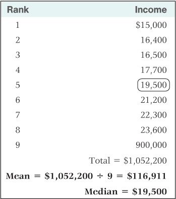
Notice that the mean and median of the set of introversion-extroversion scores are quite close to one another. In a perfect normal distribution, these two measures of central tendency are identical. For a skewed distribution, on the other hand, they can be quite different. Consider, for example, the set of incomes shown in Table A.3. The median is $19,500, and all but one of the other incomes are rather close to the median. But the set contains one income of $900,000, which is wildly different from the others. The size of this income does not affect the median. Whether the highest income were $19,501 (just above the median) or a trillion dollars, it still counts as just one income in the ranking that determines the median. But this income has a dramatic effect on the mean. As shown in the table, the mean of these incomes is $116,911. Because the mean is most affected by extreme scores, it will usually be higher than the median in a positively skewed distribution and lower than the median in a negatively skewed distribution. In a positively skewed distribution the most extreme scores are high scores (which raise the mean above the median), and in a negatively skewed distribution they are low scores (which lower the mean below the median).
Sample incomes, illustrating how the mean can differ greatly from the median
A4
Which is more useful, the mean or the median? The answer depends on one’s purpose, but in general the mean is preferred when scores are at least roughly normally distributed, and the median is preferred when scores are highly skewed. In Table A.3 the median is certainly a better representation of the set of incomes than is the mean because it is typical of almost all of the incomes listed. In contrast, the mean is typical of none of the incomes; it is much lower than the highest income and much higher than all the rest. This, of course, is an extreme example, but it illustrates the sort of biasing effect that skewed data can have on a mean. Still, for certain purposes, the mean might be the preferred measure even if the data are highly skewed. For example, if you wanted to determine the revenue that could be gained by a 5 percent local income tax, the mean income (or the total income) would be more useful than the median.
Measures of Variability
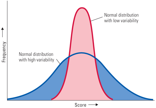
The mean or median tells us about the central value of a set of numbers, but not about how widely they are spread out around the center. Look at the two frequency distributions depicted in Figure A.3. They are both normal and have the same mean, but they differ greatly in their degree of spread or variability. In one case the scores are clustered near the mean (low variability), and in the other they are spread farther apart (high variability). How might we measure the variability of scores in a distribution?
One possibility would be to use the range—that is, simply the difference between the highest and lowest scores in the distribution—as a measure of variability. For the scores listed in Table A.1, the range is 91 − 17 = 74 points. A problem with the range, however, is that it depends on just two scores, the highest and lowest. A better measure of variability would take into account the extent to which all of the scores in the distribution differ from each other.
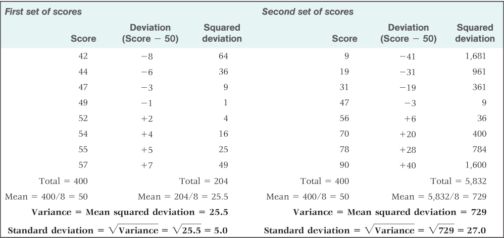
One measure of variability that takes all of the scores into account is the variance. The variance is calculated by the following four steps: (1) Determine the mean of the set of scores. (2) Determine the difference between each score and the mean; this difference is called the deviation. (3) Square each deviation (multiply it by itself). (4) Calculate the mean of the squared deviations (by adding them up and dividing by the total number of scores). The result—the mean of the squared deviations—is the variance. This method is illustrated for two different sets of scores in Table A.4. Notice that the two sets each have the same mean (50), but most of the scores in the first set are much closer to the mean than are those in the second set. The result is that the variance of the first set (25.5) is much smaller than that of the second set (729).
Calculation of the variance and standard deviation for two sets of scores that have identical means
A5
Because the variance is based on the squares of the deviations, the units of variance are not the same as those of the original measure. If the original measure is points on a test, then the variance is in units of squared points on the test (whatever on earth that might mean). To bring the units to their original form, all we need to do is take the square root of the variance. The square root of the variance is the standard deviation (SD), which is the measure of variability that is most commonly used. Thus, for the first set of scores in Table A.4, the standard deviation =  = 5.0; for the second set, the standard deviation =
  = 27.0.