2.3 2.2 Scatterplots
When you complete this section, you will be able to:
• Make a scatterplot to examine a relationship between two variables.
• Describe the overall pattern in a scatterplot and any striking deviations from that pattern.
• Use a scatterplot to describe the form, direction, and strength of a relationship.
• Use a scatterplot to identify outliers.
• Identify a linear pattern in a scatterplot.
• Explain the effect of a change of units on a scatterplot.
• Use a log transformation to change a curved relationship into a linear relationship.
• Use different plotting symbols to include information about a categorical variable in a scatterplot.
EXAMPLE 2.8
Laundry detergents. Consumers Union provides ratings on a large variety of consumer products. They use sophisticated testing methods as well as surveys of their members to create these ratings. The ratings are published in their magazine, Consumer Reports.4
One recent study rated 53 laundry detergents on a scale from 1 to 100. The scale summarizes washing performance under a variety of conditions. Price per load is given in cents.5 We will examine the relationship between rating and price per load for these laundry detergents. We expect that the higher-priced detergents will tend to have higher ratings.
USE YOUR KNOWLEDGE
Question 2.10
2.10 Examine the spreadsheet. Examine the spreadsheet of the laundry detergent data.
(a) How many cases are in the data set?
(b) Describe the labels, variables, and values.
(c) Which columns represent quantitative variables? Which columns give categorical variables.
(d) Is there an explanatory variable? A response variable? Explain your answer.
Question 2.11
2.11 Use the data set. Using the data set from the previous exercise, create graphical and numerical summaries for the rating and for the price per load.
2.11 Rating looks Normally distributed. Price also looks somewhat Normal but has a high outlier.
The most common way to display the relationship between two quantitative variables is a scatterplot.
SCATTERPLOT
A scatterplot shows the relationship between two quantitative variables measured on the same cases. The values of one variable appear on the horizontal axis, and the values of the other variable appear on the vertical axis. Each case in the data appears as the point in the plot determined by the values of both variables for that case.
EXAMPLE 2.9
Laundry detergents. A higher price for a product should be associated with a better product. Therefore, let’s treat price per load as the explanatory variable and rating as the response variable in our examination of the relationship between these two variables. We begin with a graphical display.
Figure 2.1 gives a scatterplot that displays the relationship between the response variable, rating, and the explanatory variable, price per load. The most striking feature that we see in the plot is a case that appears to be very different from the others. One of the laundry detergents has a rating that is about average (51), but the price per load (56 cents) is almost double that of the other products.
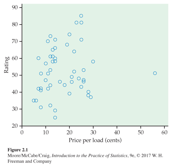
Cases that fall well outside the general pattern of the relationship are called outliers. We provide a more detailed description of these in Section 2.5. For now, we remove this case and focus on the relationship of the remaining data.
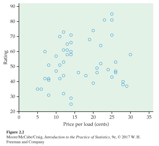
Figure 2.2 gives the scatterplot with the outlier removed. The relationship is weak. Paying a high price for your laundry detergent will not guarantee that you have selected a highly rated product.
Always plot the explanatory variable, if there is one, on the horizontal axis (the x axis) of a scatterplot. We usually call the explanatory variable x and the response variable y. If there is no explanatory-response distinction, either variable can go on the horizontal axis. Time plots such as the one in Figure 1.12 (page 22) are special scatterplots where the explanatory variable x is a measure of time.
USE YOUR KNOWLEDGE
Question 2.12
2.12 Make a scatterplot. Let’s consider the laundry data with the outlier removed.
(a) Make a scatterplot similar to Figure 2.2.
(b) Two of the laundry detergents cost 14 cents per load with a rating of 60. Mark the location of these items on your plot.
(c) Cases with identical values for both variables are generally indistinguishable in a scatterplot. To what extent do you think that this could give a distorted picture of the relationship between two variables for a data set that has a large number of duplicate values? Explain your answer.
(d) An option called jitterjitter is available with some statistical software that will add a little noise to each point so that points with identical values will appear to be different. If you have software that includes this option, apply it to your plot and summarize the effect of the jittering.
Question 2.13
2.13 Change the units. Refer to the laundry data with the outlier.
(a) Create a spreadsheet with the price per load expressed in dollars.
(b) Make a scatterplot for the data in your spreadsheet.
(c) Describe how this scatterplot differs from Figure 2.2.
2.13 (c) There is no difference in the plot except for the scale on the x axis.
Interpreting scatterplots
To look more closely at a scatterplot such as Figure 2.2, apply the strategies of exploratory analysis learned in Chapter 1.
EXAMINING A SCATTERPLOT
In any graph of data, look for the overall pattern and for striking deviations from that pattern.
You can describe the overall pattern of a scatterplot by the form, direction, and strength of the relationship.
The relationship in Figure 2.2 is difficult to see. Looking at it carefully suggests that its form is approximately linearlinear. In other words, it may be appropriate to summarize the relationshiprelationship with a straight line. To explore this possibility, we can use software to put a straight line through the data. We will see more details about how this is done in Section 2.4.
EXAMPLE 2.10
Scatterplot with a straight line. Figure 2.3 plots the laundry detergent data with a straight line. The line helps us to see and to evaluate the linear form of the relationship. In Section 2.4 (page 107), we will learn how to determine this line.
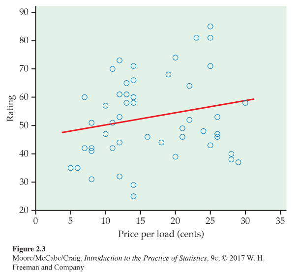
There is a large amount of scatter about the line. We see that there are eight laundry detergents with a price of 14 cents per load. For these products, the variation in ratings is substantial, from 25 to 71. We do not see any additional outliers in this plot.
Although it is very weak, the relationship in Figure 2.3 has a direction, laundry detergents that cost more have somewhat higher ratings. This is a positive association between the two variables.
POSITIVE ASSOCIATION, NEGATIVE ASSOCIATION
Two variables are positively associated when above-average values of one tend to accompany above-average values of the other and below-average values also tend to occur together.
Two variables are negatively associated when above-average values of one tend to accompany below-average values of the other, and vice versa.
The strength of a relationship in a scatterplot is determined by how closely the points follow a clear form. The overall relationship in Figure 2.3 is weak. Here is an example of a stronger linear relationship.
EXAMPLE 2.11
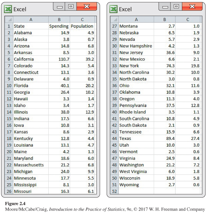
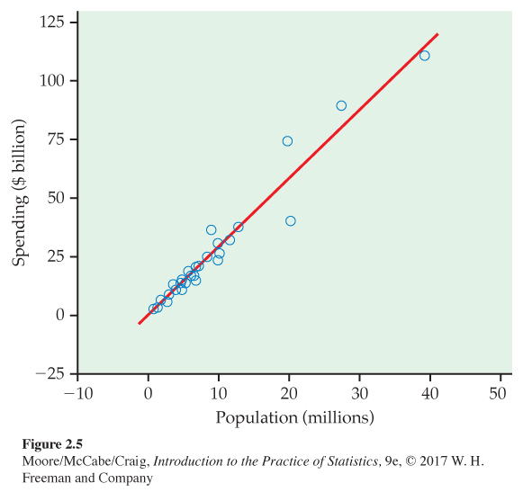
Education spending and population: Benchmarking. We expect that states with larger populations would spend more on education than states with smaller populations.6 What is the nature of this relationship? Can we use this relationship to evaluate whether some states are spending more than we expect or less than we expect? This type of exercise is called benchmarkingbenchmarking. The basic idea is to compare processes or procedures of an organization with those of similar organizations.
Figure 2.4 is a spreadsheet giving the education spending and the populations of the 50 U.S. states for 2015. Figure 2.5 is a scatterplot of the education spending versus the population with a straight line. The scatterplot shows a strong positive relationship between these two variables.
USE YOUR KNOWLEDGE
Question 2.14
2.14 Make a scatterplot. In our Mocha Frappuccino® example, the 12-ounce drink costs $3.95, the 16-ounce drink costs $4.45, and the 24-ounce drink costs $4.95. Explain which variable should be used as the explanatory variable, and make a scatterplot and include the fitted straight line if your software includes this option. Describe the scatterplot and the association between these two variables.
Of course, not all relationships are linear. Here is an example where a relationship is described by a curve.
EXAMPLE 2.12
Calcium retention. Our bodies need calcium to build strong bones. How much calcium do we need? Does the amount that we need depend on our age? Questions like these are studied by nutrition researchers. One series of studies used the amount of calcium retained by the body as a response variable and the amount of calcium consumed as an explanatory variable.7
Figure 2.6 is a scatterplot of calcium retention in milligrams per day (mg/d) versus calcium intake (mg/d) for 56 children aged 11 to 15 years. A smooth curve generated by software helps us see the relationship between the two variables.
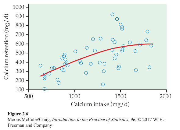
There is clearly a relationship here. As calcium intake increases, the body retains more calcium. However, the relationship is not linear. The curve is approximately linear for low values of intake, but then the line curves more and becomes almost level.
There are many kinds of curved relationships like that in Figure 2.6. For some of these, we can apply a transformationtransformation to the data that will make the relationship approximately linear. To do this, we replace the original values with the transformed values and then use the transformed values for our analysis.
Transforming data is common in statistical practice. There are systematic principles that describe how transformations behave and guide the search for transformations that will, for example, make a distribution more Normal or a curved relationship more linear.
The log transformation
The most important transformation that we will use is the log transformationlog transformation. This transformation can be used for variables that have positive values only. Occasionally, we use it when there are zeros, but in this case we first replace the zero values by some small value, often one-half of the smallest positive value in the data set.
You have probably encountered logarithms in one of your high school mathematics courses as a way to do certain kinds of arithmetic. Logarithms are a powerful tool when used in statistical analyses. We will use natural logarithms. Statistical software and statistical calculators generally provide easy ways to perform this transformation.
Let’s try a log transformation on our calcium retention data. Here are the details.
EXAMPLE 2.13
Calcium retention with logarithms. Figure 2.7 is a scatterplot of the log of calcium retention versus calcium intake. The plot includes a fitted straight line to help us see the relationship. We see that the transformation has worked. Our relationship is now approximately linear.
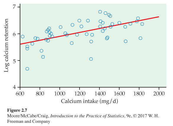
Our analysis of the calcium retention data in Examples 2.12 and 2.13 reminds us of an important issue when describing relationships. In Example 2.12, we noted that the relationship appeared to become approximately flat. Biological processes are consistent with this observation. There is probably a point where additional intake does not result in any additional retention. With our transformed relationship in Figure 2.7, however, there is no leveling off as we saw in Figure 2.6, even though we appear to have a good fit to the data. The relationship and fit apply to the range of data that are analyzed. We cannot assume that the relationship extends beyond the range of the data.
![]()
For the calcium data, we used a log transformation to describe the curved relationship in Figure 2.6 as the linear relationship in Figure 2.7. Here is another application of a log transformation.
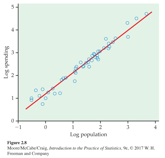
EXAMPLE 2.14
Education spending and population with logarithms. Let’s examine the relationship between spending and population using logs for both variables. Figure 2.8 gives the plot with the fitted line.
USE YOUR KNOWLEDGE
Question 2.15
2.15 Compare the plots. Compare the plot in Figure 2.8 with the one in Figure 2.5 (page 90). Which one do you prefer? Give reasons for your answer.
2.15 Answers may vary. Most will likely prefer the plot with the log transformation because it spreads out the data points and makes the plot easily to read and interpret.
![]()
Use of transformations and the interpretation of scatterplots are an art that requires judgment and knowledge about the variables that we are studying. Always ask yourself if the relationship that you see makes sense. If it does not, then additional analyses are needed to understand the data.
Adding categorical variables to scatterplots
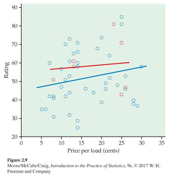
In Figure 2.3 (page 88), we looked at the relationship between the rating and the price per load for 52 laundry detergents. A more detailed look at the data shows that there are two different types of laundry detergent included in this data set, liquid and powder. Let’s examine where these two types of laundry detergents are in our plot.
CATEGORICAL VARIABLES IN SCATTERPLOTS
To add a categorical variable to a scatterplot, use a different plot color or symbol for each category.
EXAMPLE 2.15
Rating versus price and type of laundry detergent. In our scatterplot, we use the color blue for liquids and the color red for powders. The scatterplot is given in Figure 2.9. Separate lines are given for each type of laundry detergent. Most of the laundry detergents are liquids. There are three powders with somewhat low prices and four powders with relatively high prices. The prices of the powders are similar to the prices of the liquids.
In this example, we used a categorical variable, type, to distinguish the two types of laundry detergents in our plot. Suppose that the additional variable that we want to investigate is quantitative. In this situation, we sometimes can combine the values into ranges of the quantitative variable—such as high, medium, and low—to create a categorical variable.
![]()
Careful judgment is needed in using this graphical method. Don’t be discouraged if your first attempt is not very successful. In performing a good data analysis, you will often produce several plots before you find the one that you believe to be the most effective in describing the data.8
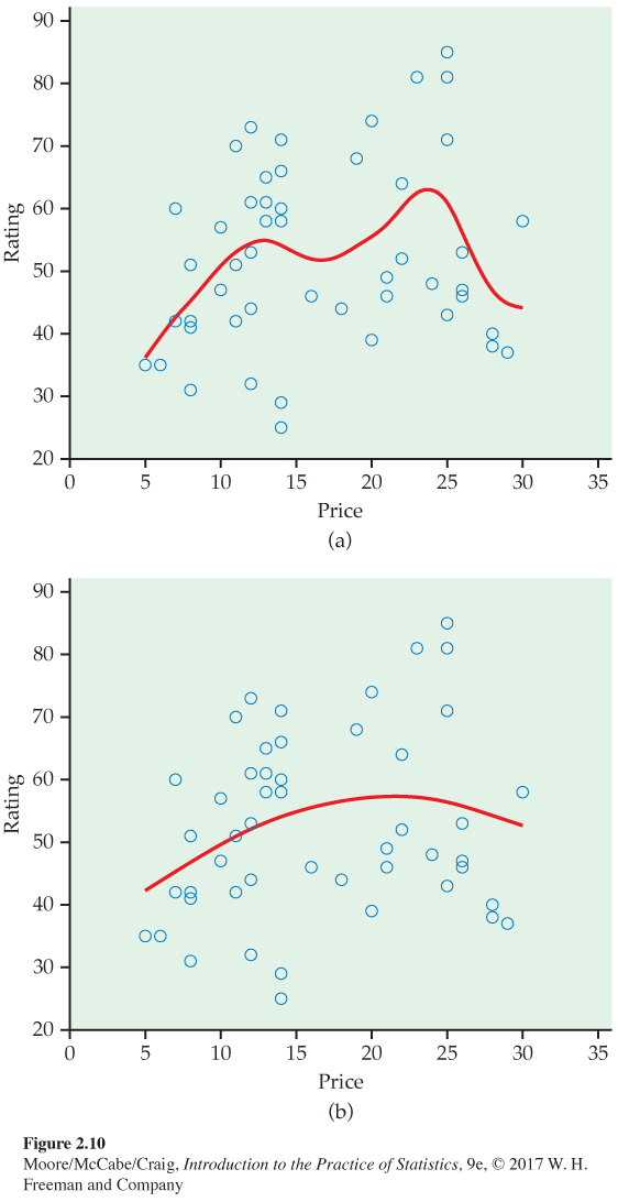
Scatterplot smoothers
In Figure 2.6 (page 90), we added a curve to our scatterplot to better understand the relationship between calcium retention and calcium intake. This curve helped us to see that the amount of calcium retained tends to level off as the intake increases. The method that we used to construct the curve is called smoothingsmoothing.
Today, most statistical software includes options to perform the calculations needed for smoothing. The technical details vary, but the basic idea is that there is a smoothing parameter that controls the degree to which the relationship is smoothed. Here is another example.
EXAMPLE 2.16
Laundry rating versus price with a smooth fit. Figure 2.2 (page 87) gives the scatterplot for rating versus price for the remaining 52 laundry detergents that we studied in Example 2.9. In Figure 2.3 (page 88), we added a straight line to the plot to help us see the relationship. Figure 2.10 shows the laundry detergent with two different smooth curves. The first (a) used a relatively small value of the smoothing parameter. The second (b) used a larger value, making the curve smoother. Overall, the relationship is very weak and there is no clear pattern in the plot.
Scatterplot smoothers can help you to learn about relationships between two quantitative variables. They can confirm that there is a linear relationship, or they can suggest other features that are not evident in a casual look at the scatterplot. Here is an example of the latter scenario.
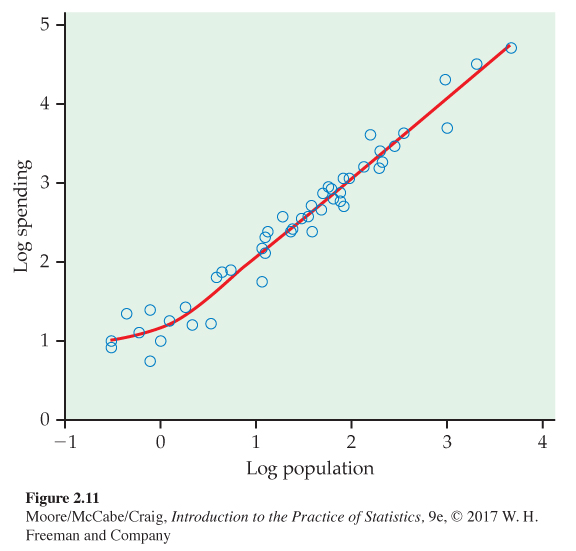
EXAMPLE 2.17
A smooth fit for education spending and population with logs. Figure 2.11 gives the scatterplot of log education spending versus log population with a smooth curve. The curve suggests that the relationship is approximately linear except for states with relatively small populations. For these, the spending is relatively flat.
Categorical explanatory variables
Scatterplots display the association between two quantitative variables. To display a relationship between a categorical variable and a quantitative variable, make a side-by-side comparison of the distributions of the response for each category. Back-to-back stemplots (page 12) and side-by-side boxplots (page 37) are useful tools for this purpose.
We will study methods for describing the association between two categorical variables in Section 2.6 (page 136).