7.3 The Industry Supply Curve
The industry supply curve shows the relationship between the price of a good and the total output of the industry as a whole.
Why will an increase in the demand for Christmas trees lead to a large price increase at first but a much smaller increase in the long run? The answer lies in the behavior of the industry supply curve—
As you might guess from the previous section, the industry supply curve must be analyzed in somewhat different ways for the short run and the long run. Let’s start with the short run.
The Short-Run Industry Supply Curve
Recall that in the short run the number of producers in an industry is fixed—
The short-
Each of these 100 farms will have an individual short-
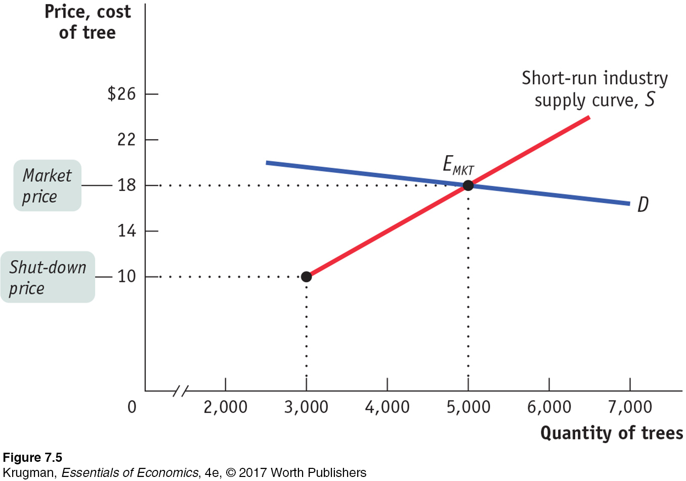
There is a short-
The demand curve D in Figure 7-5 crosses the short-
The Long-Run Industry Supply Curve
Suppose that in addition to the 100 farms currently in the Christmas tree business, there are many other potential producers. Suppose also that each of these potential producers would have the same cost curves as existing producers like Noelle if it entered the industry.
When will additional producers enter the industry? Whenever existing producers are making a profit—
What will happen as additional producers enter the industry? Clearly, the quantity supplied at any given price will increase. The short-
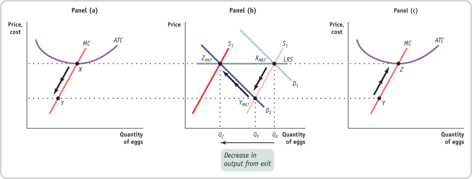
Figure 7-6 illustrates the effects of this chain of events on an existing firm and on the market; panel (a) shows how the market responds to entry, and panel (b) shows how an individual existing firm responds to entry. (Note that these two graphs have been rescaled in comparison to Figures 7-4 and 7-5 to better illustrate how profit changes in response to price.) In panel (a), S1 is the initial short-
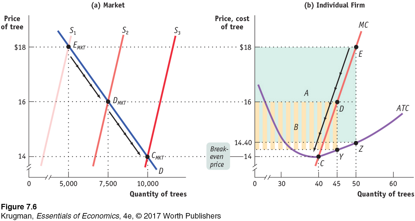
These profits will induce new producers to enter the industry, shifting the short-
From panel (b) you can see the effect of the entry of 67 new producers on an existing firm: the fall in price causes it to reduce its output, and its profit falls to the area represented by the striped rectangle labeled B.
Although diminished, the profit of existing firms at DMKT means that entry will continue and the number of firms will continue to rise. If the number of producers rises to 250, the short-
A market is in long-
Like EMKT and DMKT, CMKT is a short-
To explore further the significance of the difference between short-
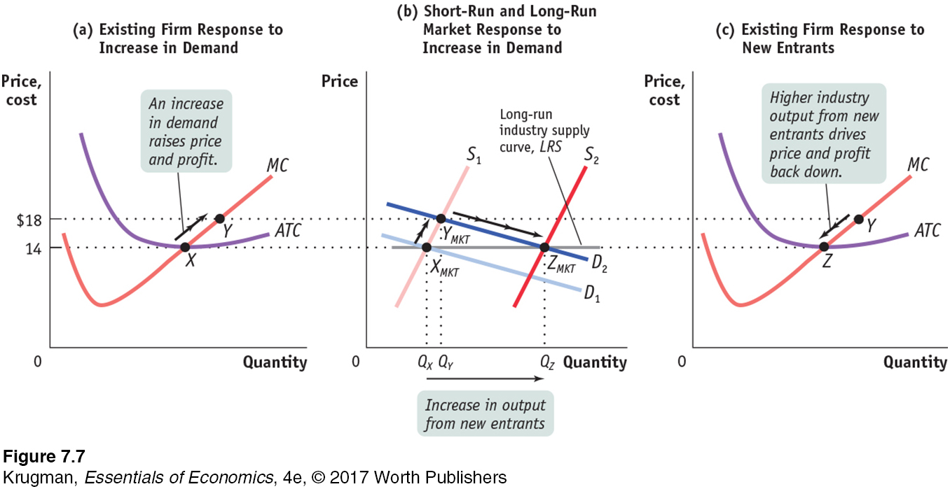
In panel (b) of Figure 7-7, D1 is the initial demand curve and S1 is the initial short-
Now suppose that the demand curve shifts out for some reason to D2. As shown in panel (b), in the short run, industry output moves along the short-
But we know that YMKT is not a long-
Over time entry will cause the short-
The effect of entry on an existing firm is illustrated in panel (c), in the movement from Y to Z along the firm’s individual supply curve. The firm reduces its output in response to the fall in the market price, ultimately arriving back at its original output quantity, corresponding to the minimum of its average total cost curve. In fact, every firm that is now in the industry—
The long-
The line LRS that passes through XMKT and ZMKT in panel (b) is the long-
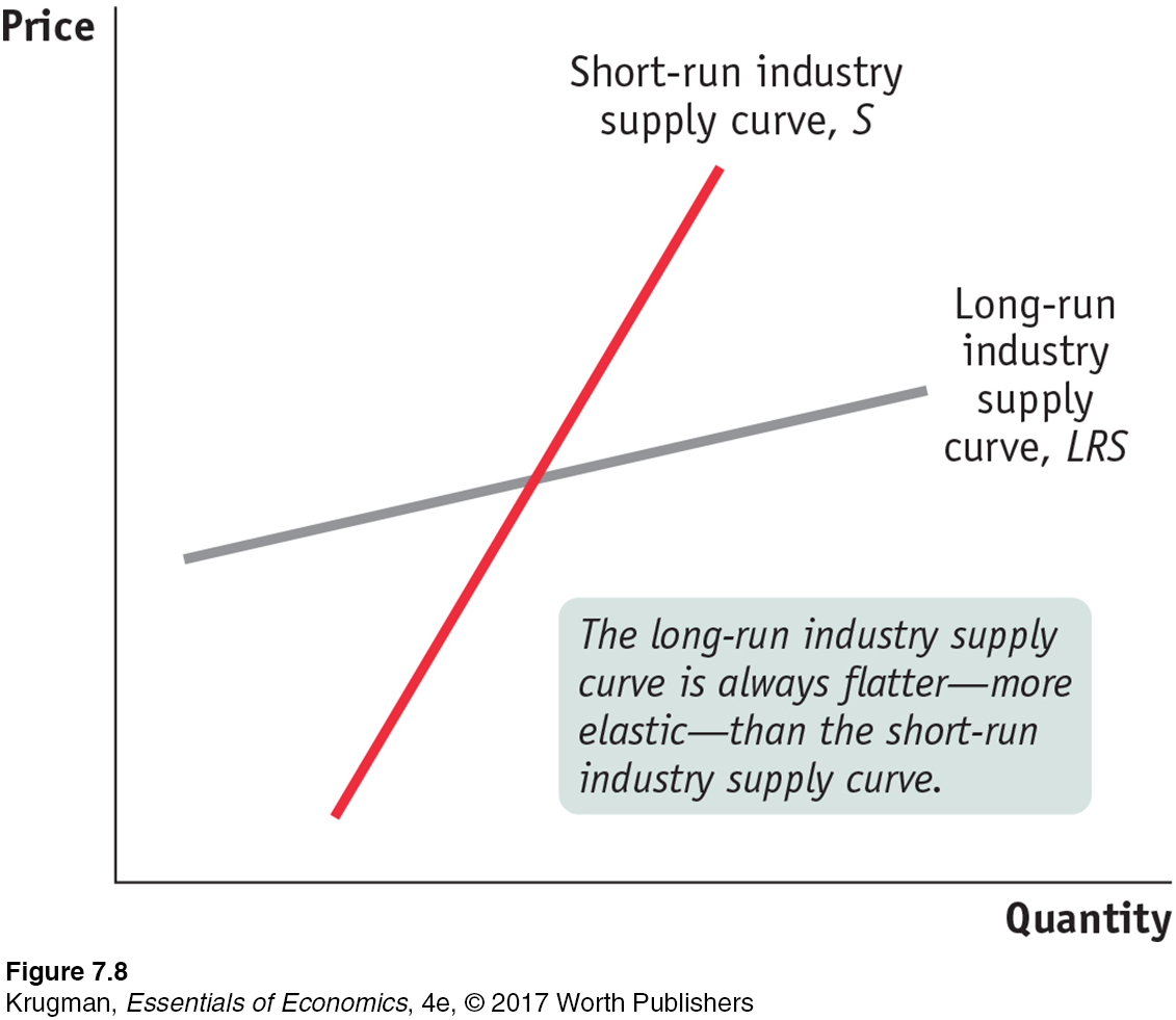
In this particular case, the long-
In other industries, however, even the long-
It is possible for the long-
In some cases, the advantages of large scale for an entire industry accrue to all firms in that industry. For example, the costs of new technologies such as solar panels tend to fall as the industry grows because that growth leads to improved knowledge, a larger pool of workers with the right skills, and so on.
Regardless of whether the long-
The distinction between the short-
The Cost of Production and Efficiency in Long-Run Equilibrium
Our analysis leads us to three conclusions about the cost of production and efficiency in the long-
In a perfectly competitive industry in equilibrium, the value of marginal cost is the same for all firms. That’s because all firms produce the quantity of output at which marginal cost equals the market price, and as price-
takers they all face the same market price. In a perfectly competitive industry with free entry and exit, each firm will have zero economic profit in long-
run equilibrium. Each firm produces the quantity of output that minimizes its average total cost— corresponding to point Z in panel (c) of Figure 7-7. So the total cost of production of the industry’s output is minimized in a perfectly competitive industry. The exception is an industry with increasing costs across the industry. Given a sufficiently high market price, early entrants make positive economic profits, but the last entrants do not as the market price falls. Costs are minimized for later entrants, as the industry reaches long-
run equilibrium, but not necessarily for the early ones. The long-
run market equilibrium of a perfectly competitive industry is efficient: no mutually beneficial transactions go unexploited. To understand this, recall a fundamental requirement for efficiency: all consumers who have a willingness to pay greater than or equal to sellers’ costs actually get the good. We also learned that when a market is efficient (except under certain, well- defined conditions), the market price matches all consumers with a willingness to pay greater than or equal to the market price to all sellers who have a cost of producing the good less than or equal to the market price.
So in the long-
PITFALLS
ECONOMIC PROFIT, AGAIN
Some readers may wonder why a firm would want to enter an industry if the market price is only slightly greater than the break-
The answer is that here, as always, when we calculate cost, we mean opportunity cost—
ECONOMICS in Action
From Global Wine Glut to Shortage
![]() | interactive activity
| interactive activity
If you were a wine producer still in business in 2012, you were probably breathing a big sigh of relief. Why? Because that is when the global wine market went from glut to shortage. This was a big change from the years 2004 to 2010, when the wine industry battled with an oversupply of product and plunging prices, driven first by a series of large global harvests and then by declining demand due to the global recession of 2008. After years of losses, many wine producers finally decided to exit the industry.
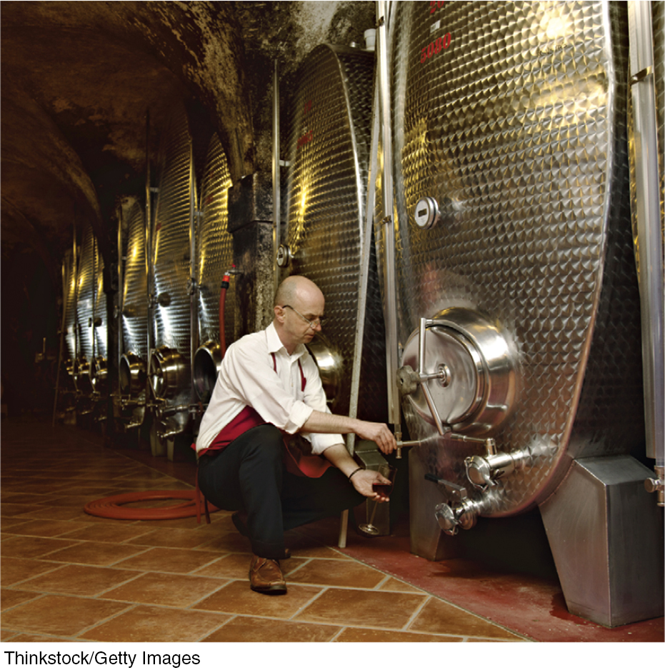
By 2012, wine production capacity was down significantly in Europe, South America, Africa, and Australia, and inventories were at their lowest point in over a decade. Moreover, 2012 was a year of bad weather for wine producers. And that same year, American wine consumption started growing again, while China’s wine consumption was surging, quadrupling over the previous five years. So combine a significant drop in capacity, a weather-
But as industry analysts noted, many vintners are cheering. The lack of production in other parts of the world and surging demand in China have opened opportunities for expansion. As the CEO of Washington State’s Chateau Ste. Michelle winery, Ted Bessler, commented, “Right now, we have about 50,000 acres in the state. I can foresee that we could have as much as 150,000 or more.”
Hold onto your wine glasses—
Quick Review
The industry supply curve corresponds to the supply curve of earlier chapters. In the short run, the time period over which the number of producers is fixed, the short-
run market equilibrium is given by the intersection of the short-run industry supply curve and the demand curve. In the long run, the time period over which producers can enter or exit the industry, the long-run market equilibrium is given by the intersection of the long-run industry supply curve and the demand curve. In the long-run market equilibrium, no producer has an incentive to enter or exit the industry. The long-
run industry supply curve is often horizontal, although it may slope upward when a necessary input is in limited supply. It is always more elastic than the short- run industry supply curve. In the long-
run market equilibrium of a perfectly competitive industry, each firm produces at the same marginal cost, which is equal to the market price, and the total cost of production of the industry’s output is minimized. It is also efficient.
Check Your Understanding 7-3
Question 7.4
1. Which of the following events will induce firms to enter an industry? Which will induce firms to exit? When will entry or exit cease? Explain your answer.
A technological advance lowers the fixed cost of production of every firm in the industry.
A fall in the fixed cost of production generates a fall in the average total cost of production and, in the short run, an increase in each firm’s profit at the current output level. So in the long run new firms will enter the industry. The increase in supply drives down price and profits. Once profits are driven back to zero, entry will cease.
The wages paid to workers in the industry go up for an extended period of time.
An increase in wages generates an increase in the average variable and the average total cost of production at every output level. In the short run, firms incur losses at the current output level, and so in the long run some firms will exit the industry. (If the average variable cost rises sufficiently, some firms may even shut down in the short run.) As firms exit, supply decreases, price rises, and losses are reduced. Exit will cease once losses return to zero.
A permanent change in consumer tastes increases demand for the good.
Price will rise as a result of the increased demand, leading to a short-
run increase in profits at the current output level. In the long run, firms will enter the industry, generating an increase in supply, a fall in price, and a fall in profits. Once profits are driven back to zero, entry will cease. The price of a key input rises due to a long-
term shortage of that input. The shortage of a key input causes that input’s price to increase, resulting in an increase in average variable and average total costs for producers. Firms incur losses in the short run, and some firms will exit the industry in the long run. The fall in supply generates an increase in price and decreased losses. Exit will cease when losses have returned to zero.
Question 7.5
2. Assume that the egg industry is perfectly competitive and is in long-
In the following diagram, point XMKT in panel (b), the intersection of S1 and D1, represents the long-
Solutions appear at back of book.