8.3 How a Monopolist Maximizes Profit
As we’ve suggested, once Cecil Rhodes consolidated the competing diamond producers of South Africa into a single company, the industry’s behavior changed: the quantity supplied fell and the market price rose. In this section, we will learn how a monopolist increases its profit by reducing output. And we will see the crucial role that market demand plays in leading a monopolist to behave differently from a perfectly competitive industry. (Remember that profit here is economic profit, not accounting profit.)
The Monopolist’s Demand Curve and Marginal Revenue
In Chapter 7 we derived the firm’s optimal output rule: a profit-
Although the optimal output rule holds for all firms, we will see shortly that its application leads to different profit-
In addition to the optimal output rule, we also learned that even though the market demand curve always slopes downward, each of the firms that make up a perfectly competitive industry faces a perfectly elastic demand curve that is horizontal at the market price, like DC in panel (a) of Figure 8-4. Any attempt by an individual firm in a perfectly competitive industry to charge more than the going market price will cause it to lose all its sales. It can, however, sell as much as it likes at the market price.
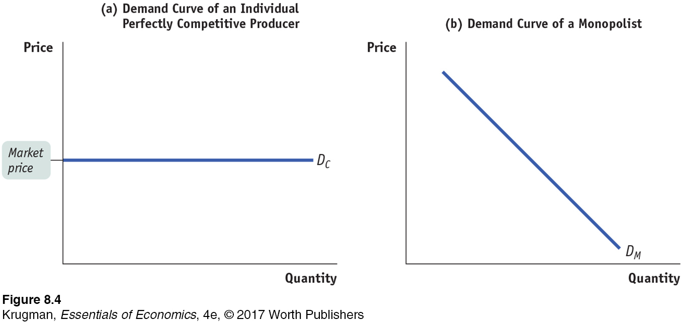
As we saw in Chapter 7, the marginal revenue of a perfectly competitive producer is simply the market price. As a result, the price-
A monopolist, in contrast, is the sole supplier of its good. So its demand curve is simply the market demand curve, which slopes downward, like DM in panel (b) of Figure 8-4. This downward slope creates a “wedge” between the price of the good and the marginal revenue of the good—
Table 8-1 shows this wedge between price and marginal revenue for a monopolist, by calculating the monopolist’s total revenue and marginal revenue schedules from its demand schedule.
| Price of diamond P |
Quantity of diamonds Q |
Total revenue TR = P × Q |
Marginal revenue MR = ΔTR/ΔQ |
| $1,000 | 0 | $0 | |
| $950 | |||
| 950 | 1 | 950 | |
| 850 | |||
| 900 | 2 | 1,800 | |
| 750 | |||
| 850 | 3 | 2,550 | |
| 650 | |||
| 800 | 4 | 3,200 | |
| 550 | |||
| 750 | 5 | 3,750 | |
| 450 | |||
| 700 | 6 | 4,200 | |
| 350 | |||
| 650 | 7 | 4,550 | |
| 250 | |||
| 600 | 8 | 4,800 | |
| 150 | |||
| 550 | 9 | 4,950 | |
| 50 | |||
| 500 | 10 | 5,000 | |
| −50 | |||
| 450 | 11 | 4,950 | |
| −150 | |||
| 400 | 12 | 4,800 | |
| −250 | |||
| 350 | 13 | 4,550 | |
| −350 | |||
| 300 | 14 | 4,200 | |
| −450 | |||
| 250 | 15 | 3,750 | |
| −550 | |||
| 200 | 16 | 3,200 | |
| −650 | |||
| 150 | 17 | 2,550 | |
| −750 | |||
| 100 | 18 | 1,800 | |
| −850 | |||
| 50 | 19 | 950 | |
| −950 | |||
| 0 | 20 | 0 |
The first two columns of Table 8-1 show a hypothetical demand schedule for De Beers diamonds. For the sake of simplicity, we assume that all diamonds are exactly alike. And to make the arithmetic easy, we suppose that the number of diamonds sold is far smaller than is actually the case. For instance, at a price of $500 per diamond, we assume that only 10 diamonds are sold. The demand curve implied by this schedule is shown in panel (a) of Figure 8-5.
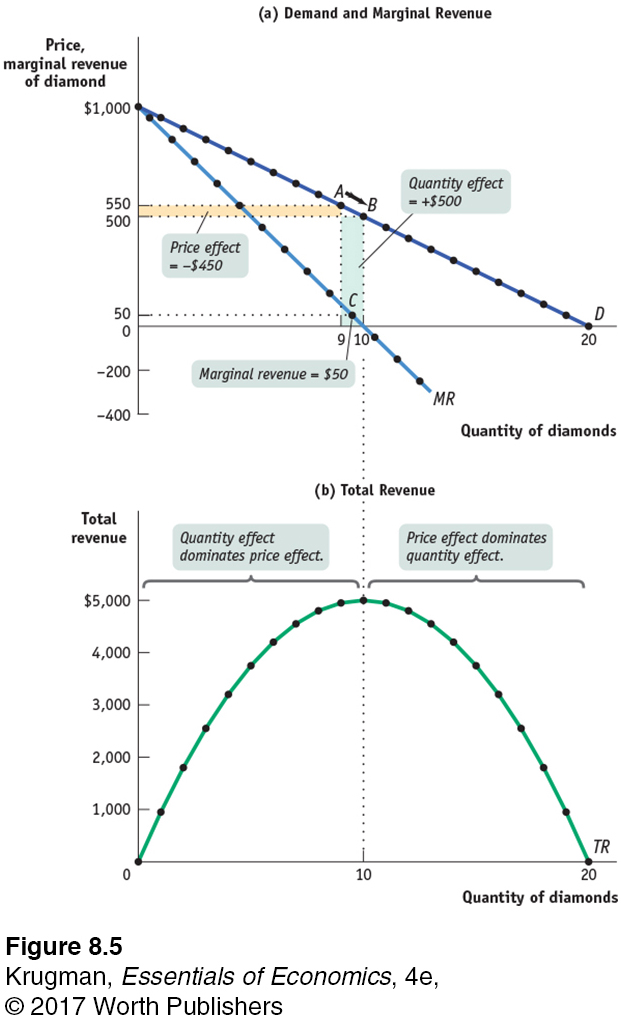
The third column of Table 8-1 shows De Beers’s total revenue from selling each quantity of diamonds—
Clearly, after the 1st diamond, the marginal revenue a monopolist receives from selling one more unit is less than the price at which that unit is sold. For example, if De Beers sells 10 diamonds, the price at which the 10th diamond is sold is $500. But the marginal revenue—
Why is the marginal revenue from that 10th diamond less than the price? It is less than the price because an increase in production by a monopolist has two opposing effects on revenue:
A quantity effect. One more unit is sold, increasing total revenue by the price at which the unit is sold.
A price effect. In order to sell the last unit, the monopolist must cut the market price on all units sold. This decreases total revenue.
The quantity effect and the price effect when the monopolist goes from selling 9 diamonds to 10 diamonds are illustrated by the two shaded areas in panel (a) of Figure 8-5. Increasing diamond sales from 9 to 10 means moving down the demand curve from A to B, reducing the price per diamond from $550 to $500. The green-
Point C lies on the monopolist’s marginal revenue curve, labeled MR in panel (a) of Figure 8-5 and taken from the last column of Table 8-1. The crucial point about the monopolist’s marginal revenue curve is that it is always below the demand curve. That’s because of the price effect: a monopolist’s marginal revenue from selling an additional unit is always less than the price the monopolist receives for the previous unit. It is the price effect that creates the wedge between the monopolist’s marginal revenue curve and the demand curve: in order to sell an additional diamond, De Beers must cut the market price on all units sold.
In fact, this wedge exists for any firm that possesses market power, such as an oligopolist as well as a monopolist. Having market power means that the firm faces a downward-
Take a moment to compare the monopolist’s marginal revenue curve with the marginal revenue curve for a perfectly competitive firm, one without market power. For such a firm there is no price effect from an increase in output: its marginal revenue curve is simply its horizontal demand curve. So for a perfectly competitive firm, market price and marginal revenue are always equal.
To emphasize how the quantity and price effects offset each other for a firm with market power, De Beers’s total revenue curve is shown in panel (b) of Figure 8-5. Notice that it is hill-
Correspondingly, the marginal revenue curve lies below zero at output levels above 10 diamonds. For example, an increase in diamond production from 11 to 12 yields only $400 for the 12th diamond, simultaneously reducing the revenue from diamonds 1 through 11 by $550. As a result, the marginal revenue of the 12th diamond is −$150.
The Monopolist’s Profit-Maximizing Output and Price
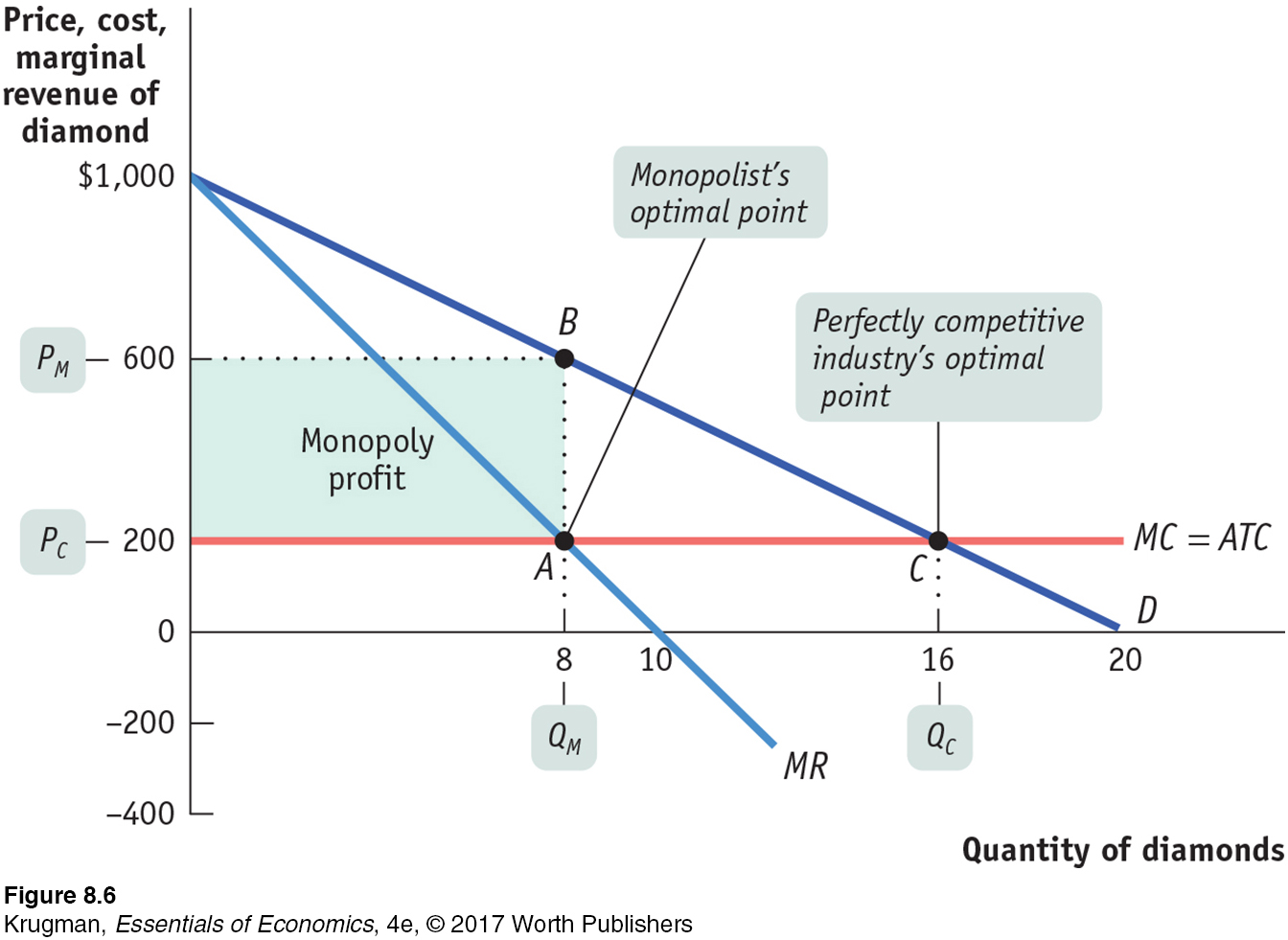
To complete the story of how a monopolist maximizes profit, we now bring in the monopolist’s marginal cost. Let’s assume that there is no fixed cost of production; we’ll also assume that the marginal cost of producing an additional diamond is constant at $200, no matter how many diamonds De Beers produces. Then marginal cost will always equal average total cost, and the marginal cost curve (and the average total cost curve) is a horizontal line at $200, as shown in Figure 8-6.
PITFALLS
FINDING THE MONOPOLY PRICE
In order to find the profit-
However, it’s important not to fall into a common error: imagining that point A also shows the price at which the monopolist sells its output. It doesn’t: it shows the marginal revenue received by the monopolist, which we know is less than the price.
To find the monopoly price, you have to go up vertically from A to the demand curve. There you find the price at which consumers demand the profit-
To maximize profit, the monopolist compares marginal cost with marginal revenue. If marginal revenue exceeds marginal cost, De Beers increases profit by producing more; if marginal revenue is less than marginal cost, De Beers increases profit by producing less. So the monopolist maximizes its profit by using the optimal output rule:
(8-
The monopolist’s optimal point is shown in Figure 8-6. At A, the marginal cost curve, MC, crosses the marginal revenue curve, MR. The corresponding output level, 8 diamonds, is the monopolist’s profit-
Monopoly versus Perfect Competition
When Cecil Rhodes consolidated many independent diamond producers into De Beers, he converted a perfectly competitive industry into a monopoly. We can now use our analysis to see the effects of such a consolidation.
Let’s look again at Figure 8-6 and ask how this same market would work if, instead of being a monopoly, the industry were perfectly competitive. We will continue to assume that there is no fixed cost and that marginal cost is constant, so average total cost and marginal cost are equal.
PITFALLS
IS THERE A MONOPOLY SUPPLY CURVE?
Given how a monopolist applies its optimal output rule, you might be tempted to ask what this implies for the supply curve of a monopolist. But this is a meaningless question: monopolists don’t have supply curves.
Remember that a supply curve shows the quantity that producers are willing to supply for any given market price. A monopolist, however, does not take the price as given; it chooses a profit-
If the diamond industry consists of many perfectly competitive firms, each of those producers takes the market price as given. That is, each producer acts as if its marginal revenue is equal to the market price. So each firm within the industry uses the price-
(8-
In Figure 8-6, this would correspond to producing at C, where the price per diamond, PC, is $200, equal to the marginal cost of production. So the profit-
But does the perfectly competitive industry earn any profits at C? No: the price of $200 is equal to the average total cost per diamond. So there are no economic profits for this industry when it produces at the perfectly competitive output level.
We’ve already seen that once the industry is consolidated into a monopoly, the result is very different. The monopolist’s calculation of marginal revenue takes the price effect into account, so that marginal revenue is less than the price. That is,
(8-
As we’ve already seen, the monopolist produces less than the competitive industry—
So, just as we suggested earlier, we see that compared with a competitive industry, a monopolist does the following:
Produces a smaller quantity: QM < QC
Charges a higher price: PM > PC
Earns a profit
Monopoly: The General Picture
Figure 8-6 involved specific numbers and assumed that marginal cost was constant, that there was no fixed cost, and, therefore, that the average total cost curve was a horizontal line. Figure 8-7 shows a more general picture of monopoly in action: D is the market demand curve; MR, the marginal revenue curve; MC, the marginal cost curve; and ATC, the average total cost curve. Here we return to the usual assumption that the marginal cost curve has a “swoosh” shape and the average total cost curve is U-
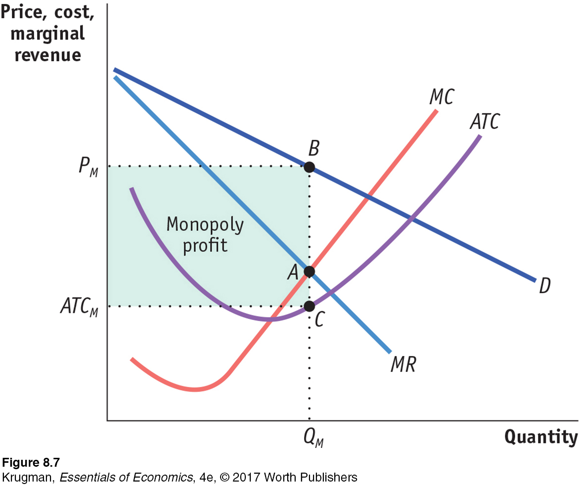
Applying the optimal output rule, we see that the profit-
Recalling how we calculated profit in Equation 7-
(8-
= (PM × QM) − (ATCM × QM)
= (PM − ATCM) × QM
Profit is equal to the area of the shaded rectangle in Figure 8-7, with a height of PM − ATCM and a width of QM.
In Chapter 7 we learned that a perfectly competitive industry can have profits in the short run but not in the long run. In the short run, price can exceed average total cost, allowing a perfectly competitive firm to make a profit. But we also know that this cannot persist.
In the long run, any profit in a perfectly competitive industry will be competed away as new firms enter the market. In contrast, barriers to entry allow a monopolist to make profits in both the short run and the long run.
ECONOMICS in Action
Shocked by the High Price of Electricity
![]() | interactive activity
| interactive activity
Historically, electric utilities were recognized as natural monopolies. A utility serviced a defined geographical area, owning the plants that generated electricity as well as the transmission lines that delivered it to retail customers. The rates charged customers were regulated by the government, set at a level to cover the utility’s cost of operation plus a modest return on capital to its shareholders.
Beginning in the late 1990s, however, there was a move toward deregulation, based on the belief that competition would result in lower retail electricity prices. Competition was introduced at two junctures in the channel from power generation to retail customers: (1) distributors would compete to sell electricity to retail customers, and (2) power generators would compete to supply power to the distributors.
That was the theory, at least. By 2014, only 16 states had instituted some form of electricity deregulation, while 7 had started but then suspended deregulation, leaving 27 states to continue with a regulated monopoly electricity provider. Why did so few states actually follow through on electricity deregulation?

One major obstacle to lowering electricity prices through deregulation is the lack of choice in power generators, the bulk of which still entail large up-
In fact, deregulation can make consumers worse off when there is only one power generator. That’s because deregulation allows the power generator to engage in market manipulation—
Another problem is that without prices set by regulators, producers aren’t guaranteed a profitable rate of return on new power plants. As a result, in states with deregulation, capacity has failed to keep up with growing demand. For example, Texas, a deregulated state, has experienced massive blackouts due to insufficient capacity, and in New Jersey and Maryland, regulators have intervened to compel producers to build more power plants.
Lastly, consumers in deregulated states have been subject to big spikes in their electricity bills, often paying much more than consumers in regulated states. So, angry customers and exasperated regulators have prompted many states to shift into reverse, with Illinois, Montana, and Virginia moving to regulate their industries. California and Montana have gone so far as to mandate that their electricity distributors reacquire power plants that were sold off during deregulation. In addition, regulators have been on the prowl, fining utilities in Texas, New York, and Illinois for market manipulation.
Quick Review
The crucial difference between a firm with market power, such as a monopolist, and a firm in a perfectly competitive industry is that perfectly competitive firms are price-
takers that face horizontal demand curves, but a firm with market power faces a downward- sloping demand curve. Due to the price effect of an increase in output, the marginal revenue curve of a firm with market power always lies below its demand curve. So a profit-
maximizing monopolist chooses the output level at which marginal cost is equal to marginal revenue— not to price. As a result, the monopolist produces less and sells its output at a higher price than a perfectly competitive industry would. It earns profits in the short run and the long run.
Check Your Understanding 8-2
Question 8.4
1. Use the accompanying total revenue schedule of Emerald, Inc., a monopoly producer of 10-
| Quantity of emeralds demanded |
Total revenue |
| 1 | $100 |
| 2 | 186 |
| 3 | 252 |
| 4 | 280 |
| 5 | 250 |
The demand schedule
The price at each output level is found by dividing the total revenue by the number of emeralds produced; for example, the price when 3 emeralds are produced is $252/3 = $84. The price at the various output levels is then used to construct the demand schedule in the accompanying table.
The marginal revenue schedule
The marginal revenue schedule is found by calculating the change in total revenue as output increases by one unit. For example, the marginal revenue generated by increasing output from 2 to 3 emeralds is ($252 − $186) = $66.
The quantity effect component of marginal revenue per output level
The quantity effect component of marginal revenue is the additional revenue generated by selling one more unit of the good at the market price. For example, as shown in the accompanying table, at 3 emeralds, the market price is $84; so when going from 2 to 3 emeralds, the quantity effect is equal to $84.
The price effect component of marginal revenue per output level
The price effect component of marginal revenue is the decline in total revenue caused by the fall in price when one more unit is sold. For example, as shown in the table, when only 2 emeralds are sold, each emerald sells at a price of $93. However, when Emerald, Inc. sells an additional emerald, the price must fall by $9 to $84. So the price effect component in going from 2 to 3 emeralds is (−$9) × 2 = −$18. That’s because 2 emeralds can only be sold at a price of $84 when 3 emeralds in total are sold, although they could have been sold at a price of $93 when only 2 in total were sold.
Quantity of
emeralds
demandedPrice
of
emeraldMarginal
revenueQuantity
effect
componentPrice effect
component1 $100 $86 $93 −$7 2 93 66 84 −18 3 84 28 70 −42 4 70 −30 50 −80 5 50 What additional information is needed to determine Emerald, Inc.’s profit-
maximizing output? In order to determine Emerald, Inc.’s profit-
maximizing output level, you must know its marginal cost at each output level. Its profit- maximizing output level is the one at which marginal revenue is equal to marginal cost.
Question 8.5
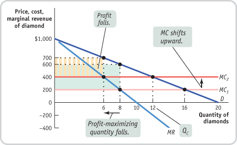
2. Use Figure 8-6 to show what happens to the following when the marginal cost of diamond production rises from $200 to $400.
Marginal cost curve
Profit-
maximizing price and quantity Profit of the monopolist
Perfectly competitive industry profits
As the accompanying diagram shows, the marginal cost curve shifts upward to $400. The profit-
Solutions appear at back of book.