Blane C. Holden’s Portfolio
| Home |
| Résumé |
| Poster |
| Web Style Guide |
| Newsletter Style Guide |
| Online Help |
| Instructional Brochure |
PORTFOLIO SAMPLE 1:
Promotional Poster
Purpose
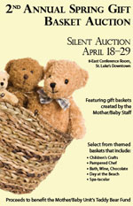
This poster was part of an assignment for English 405, Print Document Design, to design a promotional poster using graphic and typographic elements to convey a clear message. I chose to assist the St. Luke's Regional Medical Center's Mother-Baby Care Unit with its spring gift basket silent auction. Formerly, posters had been handmade and did not always present a clear message about the event, its purpose, or how to participate.
- Adobe CS5, InDesign
- Adobe CS5, Photoshop
Target Audience
The primary audience for this poster is the staff of the St. Luke's Mother/Baby unit. The staff is composed mainly of female nurses, aides, and clerks working with mothers and newborn babies. Secondary audiences included doctors, patients, and families that also visit the newborn baby facility, in addition to all other staff and visitors coming to St. Luke's.
The theme for the event is a silent auction of themed gift baskets. The proceeds will be used to support the Teddy Bear Fund. Attention to audience needs was the main consideration in the poster's design—announcing the event, place, and dates. I also had to follow acceptable hospital standards.
Design Considerations
Keeping in mind poster placement, the purpose and location of the event, and other unifying themes was paramount in creating a functional and attractive design. Taking clues from the event, the purpose, and the sponsor, I selected items that would serve each. My first consideration was typography. I wanted to "announce" the event in a grand manner, but also wanted to stay away from stenciled lettering styles used in the past.
I selected Perpetua Titling MT, in bold and light typefaces, for the main headings because it has very distinct thick-thin transitions, looks good in small caps, and served the need for understated elegance. I then chose Bell Gothic for the body text because its uniform line-weights complement the contrasting thick-thin transitions of the Perpetua Titling MT headings. The text blocks were kept short and the font size made large (24-30pt) to aid readability.
The key graphics had to call attention to the poster, unify purpose and theme, and work well color schemes complimentary to springtime. I also wanted graphics that could be associated with mothers and newborn babies. In keeping with the hospital's rules, they could be garish or overly bright. After searching many stock photo suppliers, I located the basket and teddy bears on iStockphoto and immediately knew I had what I needed. Finally, I chose a selection of cool, spring background colors: pink, blue, green, and yellow, to complete the cohesive effects of my graphical and typographic choices.
Production Considerations
A final consideration was printing this product in a variety of colors and sizes. I also wanted to use a commercial photocopy center for cost and accessibility. I made certain that the final product looked pleasing on a standard inkjet printer attached a PC and could be printed in sizes ranging from standard printer paper up to 22x34 posters.
Conclusion
The combination of the graphic, text, and colors fell together so well with the theme that the poster was designed for that I really didn't have any trouble with the overall design. This allowed more time for fine-tuning location and spacing of text and graphics. The customer, St. Luke's, Mother-Baby Care Unit staff, was very pleased with the final product.
