Blane C. Holden’s Portfolio
| Home |
| Résumé |
| Poster |
| Web Style Guide |
| Newsletter Style Guide |
| Online Help |
| Instructional Brochure |
PORTFOLIO SAMPLE 2:
Web Style Guide

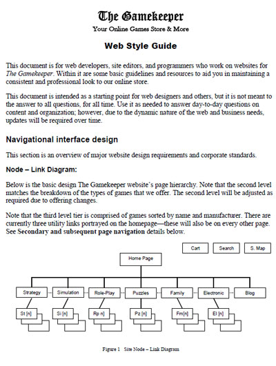
Click to view document.
Purpose
The web style guide was created as part of an assignment in English 415, On-screen Document Design. This sample illustrates my understanding of correct website design principles. For this project I created a fictitious online game store, The Gamekeeper. A style guide is a key element to the success of any complicated document and this is especially true in the case of a dynamic communications device like a website. I created this web style guide to lay the framework for a consistent presentation of the organization's philosophy, goals, and products to its customers.
Target Audience
The primary audiences are the web layout designers and content creators supporting the Gamekeeper's web presence. My web style guide's goal is to ensure consistency and clarity for a complex website while relieving contributors of the burdens associated with decisions about such matters as page layout, font choices, linking, and legal notices. By establishing these standards, I will allow contributors to the Gamekeeper's website more time to create and maintain content.
A secondary audience for this style guide is management. Managers now have a yardstick to measure performance as well as methods to disseminate and control changes to corporate identity as it evolves.
Design Considerations
The Gamekeeper's style guide establishes a starting point and clear specifications for web developers and content writers to use in creating our website. This sample style guide also demonstrates effective web design and a professional framework the Gamekeeper's web presence. My style guide is a starting point and reference, but allows for updates that reflect changes in technology and corporate identity.
- Navigational interface design – including homepage and secondary page navigation, menus, windows, and shopping cart features.
- Linking – categories and grouping, link design, and naming conventions.
- Screen content – line and screen lengths, paragraphing, and modularity.
- Screen layout and design – color, fonts, frames, logos and graphics, etc.
- Search features – indexing, search engine optimization, and site maps.
- Usage – abbreviations, acronyms, and numeric formats.
Conclusion
A style guide can be an extremely complex document because of the scope of its purpose. However, as seen in my attached sample, using clear diagrams, examples, and headings, it is possible to create a useful and essential time and labor saving device for designers, content developers, and managers to reference regularly.