13.2 The Pearson Correlation Coefficient
The Pearson correlation coefficient is a statistic that quantifies a linear relation between two scale variables.
The most widely used correlation coefficient is the Pearson correlation coefficient, a statistic that quantifies a linear relation between two scale variables. In other words, a single number is used to describe the direction and strength of the relation between two variables when their overall pattern indicates a straight-
Calculating the Pearson Correlation Coefficient
The correlation coefficient can be used as a descriptive statistic that describes the direction and strength of an association between two variables. However, it can also be used as an inferential statistic that relies on a hypothesis test to determine whether the correlation coefficient is significantly different from 0 (no correlation). In this section, we construct a scatterplot from the data and learn how to calculate the correlation coefficient. Then we walk through the steps of hypothesis testing.
EXAMPLE 13.3
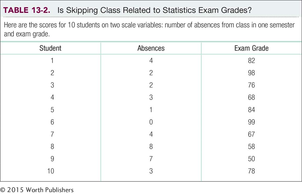
Every couple of semesters, we have a student who avows that she does not have to attend statistics classes regularly to do well because she can learn it all from the book. What do you think? Table 13-2 displays the data for 10 students in one of our statistics classes. The second column shows the number of absences over the semester (out of 29 classes total) for each student, and the third column shows each student’s final exam grade.
MASTERING THE CONCEPT
13-
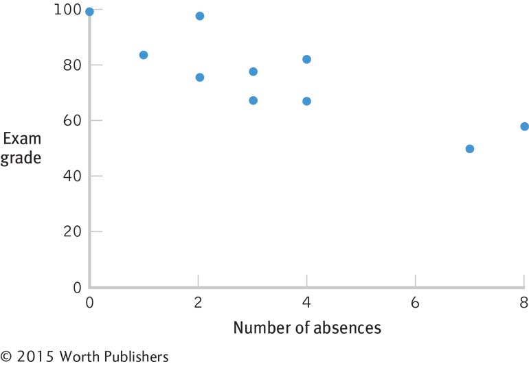
Let’s begin with a visual exploration of the scatterplot in Figure 13-6. The data, overall, have a pattern through which we could imagine drawing a straight line, so it makes sense to use the Pearson correlation coefficient. Look more closely at the scatterplot. Are the dots clustered closely around the imaginary line? If they are, then the correlation is probably close to 1.00 or −1.00; if they are not, then the correlation is probably closer to 0.00.
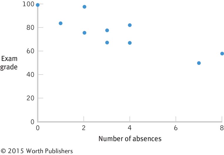
Always Start with a Scatterplot
Let your eyes do the work! Look at the scatterplot before calculating a correlation coefficient. Do the dots appear to form a straight line? Do they flow up and to the right (positive) or down and to the right (negative)? The dots in this scatterplot cluster tightly around an imaginary straight line that goes down and to the right so the correlation will probably be fairly close to −1.00.
A positive correlation results when a high score (above the mean) on one variable tends to indicate a high score (also above the mean) on the other variable. A negative correlation results when a high score (above the mean) on one variable tends to indicate a low score (below the mean) on the other variable. We can determine whether an individual falls above or below the mean by calculating deviations from the mean for each score. If participants tend to have two positive deviations (both scores above the mean) or two negative deviations (both scores below the mean), then the two variables are likely to be positively correlated. If participants tend to have one positive deviation (above the mean) and one negative deviation (below the mean), then the two variables are likely to be negatively correlated. That’s a big part of how the formula for the correlation coefficient does its work.
Think about why calculating deviations from the mean makes sense. With a positive correlation, high scores are above the mean and so would have positive deviations. The product of a pair of high scores would be positive. Low scores are below the mean and would have negative deviations. The product of a pair of low scores would also be positive. When we calculate a correlation coefficient, part of the process involves adding up the products of the deviations. If most of these are positive, we get a positive correlation coefficient.
Let’s consider a negative correlation. High scores, which are above the mean, would have positive deviations. Low scores, which are below the mean, would have negative deviations. The product of one positive deviation and one negative deviation would be negative. If most of the products of the deviations are negative, we would get a negative correlation coefficient.
The process we just described is the calculation of the numerator of the correlation coefficient. Table 13-3 shows us the calculations. The first column has the number of absences for each student. The second column shows the deviations from the mean, 3.40. The third column has the exam grade for each student. The fourth column shows the deviations from the mean for that variable, 76.00. The fifth column shows the products of the deviations. Below the fifth column, we see the sum of the products of the deviations, −304.0.
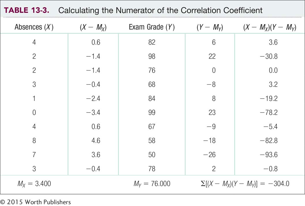
As we see in Table 13-3, the pairs of scores tend to fall on either side of the mean—
You might have noticed that this number, −304.0, is not between −1.00 and 1.00. The problem is that this number is influenced by two factors—
It makes sense that we would have to correct for variability. In Chapter 6, we learned that z scores provide an important function in statistics by allowing us to standardize. You may remember that the formula for the z score that we first learned was 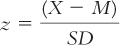 . In the calculations in the numerator for correlation, we already subtracted the mean from the scores when we created deviations, but we didn’t divide by the standard deviation. If we correct for variability in the denominator, that takes care of one of the two factors for which we have to correct.
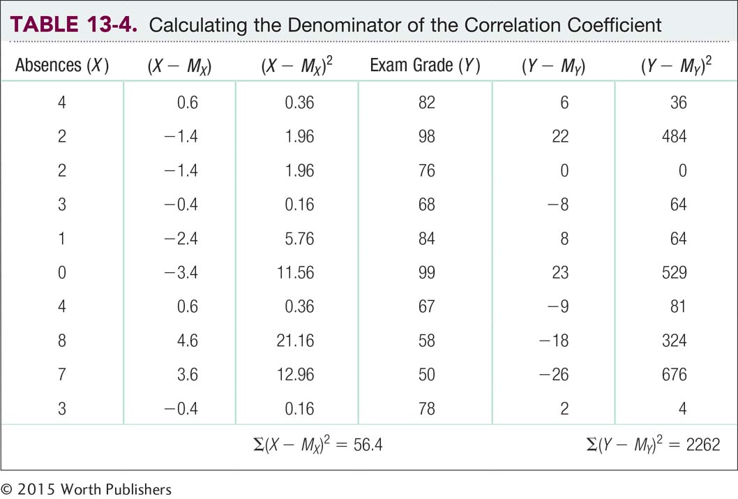
But we also have to correct for sample size. You may remember that when we calculate standard deviation, the last two steps are (1) dividing the sum of squared deviations by the sample size, N, to remove the influence of the sample size and to calculate variance; and (2) taking the square root of the variance to get the standard deviation. So to factor in sample size along with standard deviation (which we just mentioned allows us to factor in variability), we can go backward in the calculations. If we multiply variance by sample size, we get the sum of squared deviations, or sum of squares. Because of this, the denominator of the correlation coefficient is based on the sums of squares for both variables. To make the denominator match the numerator, we multiply the two sums of squares together, and then we take their square root, as we would with standard deviation. Table 13-4 shows the calculations for the sum of squares for the two variables, absences and exam grades.
MASTERING THE FORMULA
13-
We divide the sum of the products of the deviations for each variable by the square root of the products of the sums of squares for each variable. This calculation has a built-
We now have all of the ingredients necessary to calculate the correlation coefficient. Here’s the formula:
The numerator is the sum of the products of the deviations for each variable (see Table 13-3).
STEP 1: For each score, calculate the deviation from its mean.
STEP 2: For each participant, multiply the deviations for his or her two scores.
STEP 3: Sum the products of the deviations.
The denominator is the square root of the product of the two sums of squares. The sums of squares calculations are in Table 13-4.
STEP 1: Calculate a sum of squares for each variable.
STEP 2: Multiply the two sums of squares.
STEP 3: Take the square root of the product of the sums of squares.
Let’s apply the formula for the correlation coefficient to the data:

So the Pearson correlation coefficient, r, is −0.85. This is a very strong negative correlation. If we examine the scatterplot in Figure 13-6 carefully, we notice that there aren’t any glaring individual exceptions to this rule. The data tell a consistent story. So what should our students learn from this result? Go to class!
Hypothesis Testing with the Pearson Correlation Coefficient
We said earlier that correlation could be used in two ways: (1) as a descriptive statistic to simply describe a relation between two variables and (2) as an inferential statistic.
EXAMPLE 13.4
Here we outline the six steps for hypothesis testing with a correlation coefficient. Usually when we conduct hypothesis testing with correlation, we want to test whether a correlation is statistically significantly different from no correlation—
MASTERING THE CONCEPT
13-
STEP 1: Identify the populations, distribution, and assumptions.
Population 1: Students like those whom we studied in Example 13.3. Population 2: Students for whom there is no correlation between number of absences and exam grade.
The comparison distribution is a distribution of correlations taken from the population, but with the characteristics of our study, such as a sample size of 10. In this case, it is a distribution of all possible correlations between the numbers of absences and exam grades when 10 students are considered.
The first two assumptions are like those for other parametric tests. (1) The data must be randomly selected, or external validity will be limited. In this case, we do not know how the data were selected, so we should generalize with caution. (2) The underlying population distributions for the two variables must be approximately normal. In our study, it’s difficult to tell if the distribution is normal because we have so few data points.
The third assumption is specific to correlation: Each variable should vary equally, no matter the magnitude of the other variable. That is, number of absences should show the same amount of variability at each level of exam grade; conversely, exam grade should show the same amount of variability at each number of absences. You can get a sense of this by looking at the scatterplot in Figure 13-7. In our study, it’s hard to determine whether the amount of variability is the same for each variable across all levels of the other variable because we have so few data points. But it seems as if there’s variability of between 10 and 20 points on exam grade at each number of absences. The center of that variability decreases as we increase in number of absences, but the range stays roughly the same. It also seems that there’s variability of between two and three absences at each exam grade. Again, the center of that variability decreases as exam grade increases, but the range stays roughly the same.
Using a Scatterplot to Examine the Assumptions
We can use a scatterplot to see whether one variable varies equally at each level of the other variable. With only 10 data points, we can’t be certain. But this scatterplot suggests a variability of between 10 and 20 points on exam grade at each number of absences and a variability of between two and three absences at each exam grade.
STEP 2: State the null and research hypotheses.
Null hypothesis: There is no correlation between number of absences and exam grade—
STEP 3: Determine the characteristics of the comparison distribution.
The comparison distribution is an r distribution with degrees of freedom calculated by subtracting 2 from the sample size, which for Pearson correlation is the number of participants rather than the number of scores:
dfr = N − 2
MASTERING THE FORMULA
13-
dfr = N − 2.
In our study, degrees of freedom are calculated as follows:
dfr = N − 2 = 10 − 2 = 8
So the comparison distribution is an r distribution with 8 degrees of freedom.
STEP 4: Determine the critical values, or cutoffs.
Now we can look up the critical values in the r table in Appendix B. Like the z table and the t table, the r table includes only positive values. For a two-
STEP 5: Calculate the test statistic.
We already calculated the test statistic, r, in the preceding section. It is −0.85.
STEP 6: Make a decision.
The test statistic, r = −0.85, is larger in magnitude than the critical value of −0.632. We can reject the null hypothesis and conclude that number of absences and exam grade seem to be negatively correlated.
CHECK YOUR LEARNING
| Reviewing the Concepts |
|
|||||||||||||||||||
| Clarifying the Concepts | 13- |
Define the Pearson correlation coefficient. | ||||||||||||||||||
| 13- |
The denominator of the correlation equation corrects for which two issues present in the calculation of the numerator? | |||||||||||||||||||
| Calculating the Statistics | 13- |
Create a scatterplot for the following data:
|
||||||||||||||||||
| 13- |
Calculate the correlation coefficient for the data provided in Check Your Learning 13- |
|||||||||||||||||||
| Applying the Concepts | 13- |
According to social learning theory, children exposed to aggressive behavior, including family violence, are more likely to engage in aggressive behavior than are children who do not witness such violence. Let’s assume the data you worked with in Check Your Learning 13- |
Solutions to these Check Your Learning questions can be found in Appendix D.