1.2 Displaying Distributions with Graphs
 This page includes Video Technology Manuals
 This page includes Statistical Videos
exploratory data analysis
Statistical tools and ideas help us examine data to describe their main features. This examination is called exploratory data analysis. Like an explorer crossing unknown lands, we want first to simply describe what we see. Here are two basic strategies that help us organize our exploration of a set of data:
- Begin by examining each variable by itself. Then move on to study the relationships among the variables.
- Begin with a graph or graphs. Then add numerical summaries of specific aspects of the data.
We follow these principles in organizing our learning. The rest of this chapter presents methods for describing a single variable. We study relationships among two or more variables in Chapter 2. Within each chapter, we begin with graphical displays, then add numerical summaries for a more complete description.
Categorical variables: Bar graphs and pie charts
distribution of a categorical variable
The values of a categorical variable are labels for the categories, such as “Yes” and “No.” The distribution of a categorical variable lists the categories and gives either the count or the percent of cases that fall in each category.
EXAMPLE 1.6 How Do You Do Online Research?

A study of 552 first-year college students asked about their preferences for online resources. One question asked them to pick their favorite.3 Here are the results:
online
| Resource | Count (n) |
|---|---|
| Google or Google Scholar | 406 |
| Library database or website | 75 |
| Wikipedia or online encyclopedia | 52 |
| Other | 19 |
| Total | 552 |
Resource is the categorical variable in this example, and the values are the names of the online resources.
Note that the last value of the variable resource is “Other,“ which includes all other online resources that were given as selection options. For data sets that have a large number of values for a categorical variable, we often create a category such as this that includes categories that have relatively small counts or percents. Careful judgment is needed when doing this. You don’t want to cover up some important piece of information contained in the data by combining data in this way.
EXAMPLE 1.7 Favorites as Percents
online
When we look at the online resources data set, we see that Google is the clear winner. We see that 406 reported Google or Google Scholar as their favorite. To interpret this number, we need to know that the total number of students polled was 552. When we say that Google is the winner, we can describe this win by saying that 73.6% (406 divided by 552, expressed as a percent) of the students reported Google as their favorite. Here is a table of the preference percents:
| Resource | Percent (%) |
|---|---|
| Google or Google Scholar | 73.6 |
| Library database or website | 13.6 |
| Wikipedia or online encyclopedia | 9.4 |
| Other | 3.4 |
| Total | 100.0 |
The use of graphical methods will allow us to see this information and other characteristics of the data easily. We now examine two types of graphs.
bar graph
EXAMPLE 1.8 Bar Graph for the online Resource Preference Data
Figure 1.2 displays the online resource preference data using a bar graph. The heights of the four bars show the percents of the students who reported each of the resources as their favorite.
online
The categories in a bar graph can be put in any order. In Figure 1.2, we ordered the resources based on their preference percents. For other data sets, an alphabetical ordering or some other arrangement might produce a more useful graphical display.
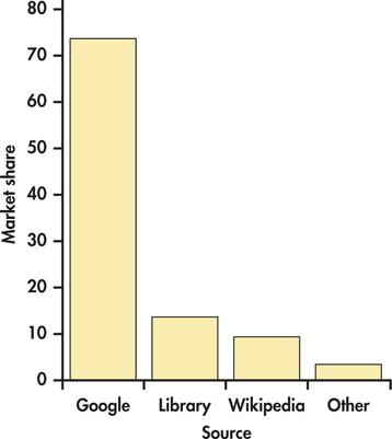
You should always consider the best way to order the values of the categorical variable in a bar graph. Choose an ordering that will be useful to you. If you have difficulty, ask a friend if your choice communicates what you expect.
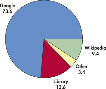
EXAMPLE 1.9 Pie Chart for the online Resource Preference Data
online
The pie chart in Figure 1.3 helps us see what part of the whole each group forms. Here it is very easy to see that Google is the favorite for about three-quarters of the students.
pie chart
Apply Your Knowledge
Question 1.15
1.15 Compare the bar graph with the pie chart.
Refer to the bar graph in Figure 1.2 and the pie chart in Figure 1.3 for the online resource preference data. Which graphical display does a better job of describing the data? Give reasons for your answer.
1.15
Answers may vary. The pie chart does a better job because it shows the dominance of Google as a source, filling almost three-quarters of the pie.
online
We use graphical displays to help us learn things from data. Here is another example.
EXAMPLE 1.10 Analyze the Costs of your Business
bcosts
Businesses spend money for many different types of things, and these are often organized into cost centers. Data for a company with 10 different cost centers is summarized in Figure 1.4. Cost center is a categorical variable with 10 possible values. These include salaries, maintenance, research, and seven other cost centers. Annual cost is a quantitative variable that gives the sum of the amounts spent in each cost center.4
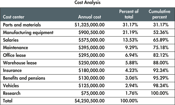
We have discussed two tools to make a graphical summary for these data—pie charts and bar charts. Let's consider possible uses of the data to help us to choose a useful graph. Which cost centers are generating large costs? Notice that the display of the data in Figure 1.4 is organized to help us answer this question. The cost centers are ordered by the annual cost, largest to smallest. The data display also gives the annual cost as a percent of the total. We see that parts and materials have an annual cost of $1,325,000, which is 31% of $4,250,500, the total cost.
The last column in the display gives the cumulative percent which is the sum of the percents for the cost center in the given row and all above it. We see that the three largest cost centers—parts and materials, manufacturing equipment, and salaries—account for 66% of the total annual costs.
Apply Your Knowledge
Question 1.16
1.16 Rounding in the cost analysis.
Refer to Figure 1.4 and the preceding discussion. In the discussion, we rounded the percents given in the figure. Do you think this is a good idea? Explain why or why not.
Question 1.17
1.17 Focus on the 80 percent.
Many analyses using data such as that given in Figure 1.4 focus on the items that make up the top 80% of the total cost. Which items are these for our cost analysis data? (Note that you will not be able to answer this question for exactly 80%, so either use the closest percent above or below.) Be sure to explain your choice, and give a reason for it.
1.17
The Cost Centers would include Parts and materials, Manufacturing equipment, Salaries, Maintenance, and Office lease. We need to include Office lease even though it gives more than 80% because otherwise we would only have the top 75% according to the data. So, to get the other 5%, we need to put Office lease in, giving us 82.12% total.
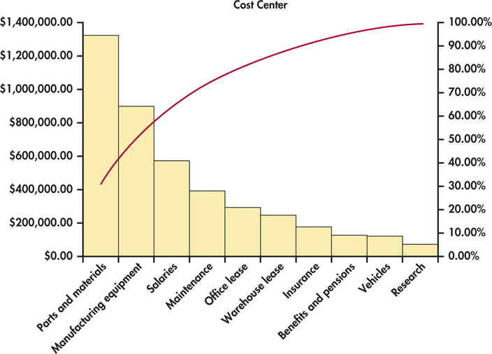
Pareto chart
A bar graph whose categories are ordered from most frequent to least frequent is called a Pareto chart.5 Pareto charts are frequently used in quality control settings. There, the purpose is often to identify common types of defects in a manufactured product. Deciding upon strategies for corrective action can then be based on what would be most effective. Chapter 12 gives more examples of settings where Pareto charts are used.
Let’s use a Pareto chart to look at our cost analysis data.
EXAMPLE 1.11 Pareto Chart for Cost Analysis
bcosts
Figure 1.5 displays the Pareto chart for the cost analysis data. Here it is easy to see that the parts and materials cost center has the highest annual cost. Research is the cost center with the lowest cost with less than 2% of the total. Notice the red curve that is superimposed on the graph. (It is actually a smoothed curve joined at the midpoints of the positions of the bars on the x axis.) This gives the cumulative percent of total cost as we move left to right in the figure.
Apply Your Knowledge
Question 1.18
1.18 Population of Canadian provinces and territories.
Here are populations of 13 Canadian provinces and territories based on the 2011 Census:6
| Province/territory | Population |
|---|---|
| Alberta | 3,645,257 |
| British Columbia | 4,400,057 |
| Manitoba | 1,208,268 |
| New Brunswick | 751,171 |
| Newfoundland and Labrador | 514,536 |
| Northwest Territories | 41,462 |
| Nova Scotia | 921,727 |
| Nunavut | 31,906 |
| Ontario | 12,851,821 |
| Prince Edward Island | 140,204 |
| Quebec | 7,903,001 |
| Saskatchewan | 1,033,381 |
| Yukon | 33,897 |
Display these data in a bar graph using the alphabetical order of provinces and territories in the table.
canadap
Question 1.19
1.19 Try a Pareto chart.
Refer to the previous exercise.
- Use a Pareto chart to display these data.
- Compare the bar graph from the previous exercise with your Pareto chart. Which do you prefer? Give a reason for your answer.
1.19
(b) Most people will prefer the Pareto because it emphasizes the largest categories.
canadap
Bar graphs, pie charts, and Pareto charts can help you see characteristics of a distribution quickly. We now examine quantitative variables, where graphs are essential tools.
Quantitative variables: Histograms
Quantitative variables often take many values. A graph of the distribution is clearer if nearby values are grouped together. The most common graph of the distribution of a single quantitative variable is a histogram.
histogram


tbill
Treasury bills, also known as T-bills, are bonds issued by the U.S. Department of the Treasury. You buy them at a discount from their face value, and they mature in a fixed period of time. For example, you might buy a $1000 T-bill for $980. When it matures, six months later, you would receive $1000—your original $980 investment plus $20 interest. This interest rate is $20 divided by $980, which is 2.04% for six months. Interest is usually reported as a rate per year, so for this example the interest rate would be 4.08%. Rates are determined by an auction that is held every four weeks. The data set TBILL contains the interest rates for T-bills for each auction from December 12, 1958, to May 30, 2014.7
Our data set contains 2895 cases. The two variables in the data set are the date of the auction and the interest rate. To learn something about T-bill interest rates, we begin with a histogram.
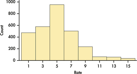
EXAMPLE 1.12 A Histogram of T-Bill Interest Rates
CASE 1.1 To make a histogram of the T-bill interest rates, we proceed as follows.
classes
tbill
Step 1. Divide the range of the interest rates into classes of equal width. The T-bill interest rates range from 0.85% to 15.76%, so we choose as our classes
0.00≤rate<2.002.00≤rate<4.00⋮14.00≤rate<16.00
Be sure to specify the classes precisely so that each case falls into exactly one class. An interest rate of 1.98% would fall into the first class, but 2.00% would fall into the second.
Step 2. Count the number of cases in each class. Here are the counts:
| Class | Count | Class | Count |
|---|---|---|---|
| 0.00≤rate<2.00 | 473 | 8.00≤rate<10.00 | 235 |
| 2.00≤rate<4.00 | 575 | 10.00≤rate<12.00 | 64 |
| 4.00≤rate<6.00 | 951 | 12.00≤rate<14.00 | 58 |
| 6.00≤rate<8.00 | 501 | 14.00≤rate<16.00 | 38 |
Step 3. Draw the histogram. Mark on the horizontal axis the scale for the variable whose distribution you are displaying. The variable is “interest rate” in this example. The scale runs from 0 to 16 to span the data. The vertical axis contains the scale of counts. Each bar represents a class. The base of the bar covers the class, and the bar height is the class count. Notice that the scale on the vertical axis runs from 0 to 1000 to accommodate the tallest bar, which has a height of 951. There is no horizontal space between the bars unless a class is empty, so that its bar has height zero. Figure 1.6 is our histogram.

Although histograms resemble bar graphs, their details and uses are distinct. A histogram shows the distribution of counts or percents among the values of a single variable. A bar graph compares the counts of different items. The horizontal axis of a bar graph need not have any measurement scale but simply identifies the items being compared. Draw bar graphs with blank space between the bars to separate the items being compared. Draw histograms with no space to indicate that all values of the variable are covered. Some spreadsheet programs, which are not primarily intended for statistics, will draw histograms as if they were bar graphs, with space between the bars. Often, you can tell the software to eliminate the space to produce a proper histogram.
Our eyes respond to the area of the bars in a histogram.8 Because the classes are all the same width, area is determined by height and all classes are fairly represented. There is no one right choice of the classes in a histogram. Too few classes will give a “skyscraper” graph, with all values in a few classes with tall bars. Too many will produce a “pancake” graph, with most classes having one or no observations. Neither choice will give a good picture of the shape of the distribution. Always use your judgment in choosing classes to display the shape. Statistics software will choose the classes for you, but there are usually options for changing them.

The histogram function in the One-Variable Statistical Calculator applet on the text website allows you to change the number of classes by dragging with the mouse so that it is easy to see how the choice of classes affects the histogram. The next example illustrates a situation where the wrong choice of classes will cause you to miss a very important characteristic of a data set.
EXAMPLE 1.13 Calls to a Customer Service Center
cc80
Many businesses operate call centers to serve customers who want to place an order or make an inquiry. Customers want their requests handled thoroughly. Businesses want to treat customers well, but they also want to avoid wasted time on the phone. They, therefore, monitor the length of calls and encourage their representatives to keep calls short.
We have data on the length of all 31,492 calls made to the customer service center of a small bank in a month. Table 1.1 displays the lengths of the first 80 calls.9
| 77 | 289 | 128 | 59 | 19 | 148 | 157 | 203 |
| 126 | 118 | 104 | 141 | 290 | 48 | 3 | 2 |
| 372 | 140 | 438 | 56 | 44 | 274 | 479 | 211 |
| 179 | 1 | 68 | 386 | 2631 | 90 | 30 | 57 |
| 89 | 116 | 225 | 700 | 40 | 73 | 75 | 51 |
| 148 | 9 | 115 | 19 | 76 | 138 | 178 | 76 |
| 67 | 102 | 35 | 80 | 143 | 951 | 106 | 55 |
| 4 | 54 | 137 | 367 | 277 | 201 | 52 | 9 |
| 700 | 182 | 73 | 199 | 325 | 75 | 103 | 64 |
| 121 | 11 | 9 | 88 | 1148 | 2 | 465 | 25 |
Take a look at the data in Table 1.1. In this data set, the cases are calls made to the bank’s call center. The variable recorded is the length of each call. The units of measurement are seconds. We see that the call lengths vary a great deal. The longest call lasted 2631 seconds, almost 44 minutes. More striking is that 8 of these 80 calls lasted less than 10 seconds. What’s going on?
We started our study of the customer service center data by examining a few cases, the ones displayed in Table 1.1. It would be very difficult to examine all 31,492 cases in this way. We need a better method. Let’s try a histogram.
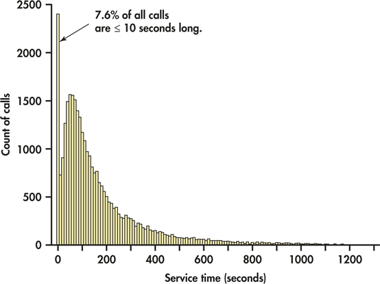
EXAMPLE 1.14 Histogram for Customer Service Center Call Lengths
cc
Figure 1.7 is a histogram of the lengths of all 31,492 calls. We did not plot the few lengths greater than 1200 seconds (20 minutes). As expected, the graph shows that most calls last between about 1 and 5 minutes, with some lasting much longer when customers have complicated problems. More striking is the fact that 7.6% of all calls are no more than 10 seconds long. It turns out that the bank penalized representatives whose average call length was too long—so some representatives just hung up on customers in order to bring their average length down. Neither the customers nor the bank were happy about this. The bank changed its policy, and later data showed that calls under 10 seconds had almost disappeared.
The choice of the classes is an important part of making a histogram. Let’s look at the customer service center call lengths again.
EXAMPLE 1.15 Another Histogram for Customer Service Center Call Lengths
cc
Figure 1.8 is a histogram of the lengths of all 31,492 calls with class boundaries of 0, 100, 200 seconds and so on. Statistical software made this choice as a default option. Notice that the spike representing the very brief calls that appears in Figure 1.7 is covered up in the 0 to 100 seconds class in Figure 1.8.
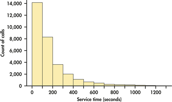
If we let software choose the classes, we would miss one of the most important features of the data, the calls of very short duration. We were alerted to this unexpected characteristic of the data by our examination of the 80 cases displayed in Table 1.1. Beware of letting statistical software do your thinking for you. Example 1.15 illustrates the danger of doing this. To do an effective analysis of data, we often need to look at data in more than one way. For histograms, looking at several choices of classes will lead us to a good choice.
Apply Your Knowledge
Question 1.20
1.20 Exam grades in an accounting course.
The following table summarizes the exam scores of students in an accounting course. Use the summary to sketch a histogram that shows the distribution of scores.
| Class | Count |
|---|---|
| 60≤score<70 | 9 |
| 70≤score<80 | 32 |
| 80≤score<90 | 55 |
| 90≤score<100 | 33 |
Question 1.21
1.21 Suppose some students scored 100.
No students earned a perfect score of 100 on the exam described in the previous exercise. Note that the last class included only scores that were greater than or equal to 90 and less than 100. Explain how you would change the class definitions for a similar exam on which some students earned a perfect score.
1.21
One solution is to have the highest range include 100, so 90 < score = 100, 80 < score = 90, etc.
Quantitative variables: Stemplots
Histograms are not the only graphical display of distributions of quantitative variables. For small data sets, a stemplot is quicker to make and presents more detailed information. It is sometimes referred to as a back-of-the-envelope technique. Popularized by the statistician John Tukey, it was designed to give a quick and informative look at the distribution of a quantitative variable. A stemplot was originally designed to be made by hand, although many statistical software packages include this capability.
Stemplot
To make a stemplot:
- Separate each observation into a stem, consisting of all but the final (rightmost) digit, and a leaf, the final digit. Stems may have as many digits as needed, but each leaf contains only a single digit.
- Write the stems in a vertical column with the smallest at the top, and draw a vertical line at the right of this column.
- Write each leaf in the row to the right of its stem, in increasing order out from the stem.
EXAMPLE 1.16 A Stemplot of T-Bill Interest Rates
tbill50
CASE 1.1 The histogram that we produced in Example 1.12 to examine the T-bill interest rates used all 2895 cases in the data set. To illustrate the idea of a stemplot, we take a simple random sample of size 50 from this data set. We learn more about how to take such samples in Chapter 3. Here are the data:
| 7.1 | 5.9 | 3.5 | 5.1 | 6.0 | 5.2 | 1.9 | 7.0 | 2.9 | 9.2 |
| 5.2 | 7.2 | 9.4 | 5.1 | 0.1 | 6.1 | 8.6 | 3.0 | 0.1 | 2.0 |
| 4.0 | 6.3 | 13.3 | 9.3 | 13.9 | 0.1 | 4.4 | 0.3 | 4.6 | 5.1 |
| 4.9 | 7.3 | 6.3 | 5.2 | 1.0 | 7.1 | 2.5 | 7.3 | 11.2 | 9.6 |
| 5.1 | 0.1 | 0.3 | 5.3 | 4.2 | 0.3 | 4.8 | 2.9 | 1.4 | 8.4 |
The original data set gave the interest rates with two digits after the decimal point. To make the job of preparing our stemplot easier, we first rounded the values to one place following the decimal.
Figure 1.9 illustrates the key steps in constructing the stemplot for these data. How does the stemplot for this sample of size 50 compare with the histogram based on all 2894 interest rates that we examined in Figure 1.6 (page 13)?
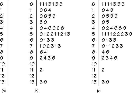
You can choose the classes in a histogram. The classes (the stems) of a stem-plot are given to you. When the observed values have many digits, it is often best to round the numbers to just a few digits before making a stemplot, as we did in Example 1.16.
rounding
splitting stems
You can also split stems to double the number of stems when all the leaves would otherwise fall on just a few stems. Each stem then appears twice. Leaves 0 to 4 go on the upper stem, and leaves 5 to 9 go on the lower stem. Rounding and splitting stems are matters for judgment, like choosing the classes in a histogram. Stemplots work well for small sets of data. When there are more than 100 observations, a histogram is almost always a better choice.
back-to-back stemplot
Stemplots can also be used to compare two distributions. This type of plot is called a back-to-back stemplot. We put the leaves for one group to the right of the stem and the leaves for the other group on the left. Here is an example.
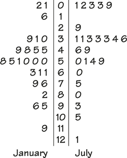
EXAMPLE 1.17 A Back-to-Back Stemplot of T-Bill Interest Rates in January and July
tbilljj
CASE 1.1 For this back-to-back stemplot, we took a sample of 25 January T-bill interest rates and another sample of 25 July T-bill interest rates. We round the rates to one digit after the decimal. The plot is shown in Figure 1.10. The stem with the largest number of entries is 5 for January and 3 for July. The rates for January appear to be somewhat larger than those for July. In the next section we learn how to calculate numerical summaries that will help us to make the comparison.
Special considerations apply for very large data sets. It is often useful to take a sample and examine it in detail as a first step. This is what we did in Example 1.16. Sampling can be done in many different ways. A company with a very large number of customer records, for example, might look at those from a particular region or country for an initial analysis.
Interpreting histograms and stemplots
Making a statistical graph is not an end in itself. The purpose of the graph is to help us understand the data. After you make a graph, always ask, “What do I see?” Once you have displayed a distribution, you can see its important features.
Examining a Distribution
In any graph of data, look for the overall pattern and for striking deviations from that pattern.
You can describe the overall pattern of a histogram by its shape, center, and spread.
An important kind of deviation is an outlier, an individual value that falls outside the overall pattern.
We learn how to describe center and spread numerically in Section 1.3. For now, we can describe the center of a distribution by its midpoint, the value with roughly half the observations taking smaller values and half taking larger values. We can describe the spread of a distribution by giving the smallest and largest values.
EXAMPLE 1.18 The Distribution of T-Bill Interest Rates
tbill
CASE 1.1 Let’s look again at the histogram in Figure 1.6 (page 13) and the TBILL data file. The distribution has a single peak at around 5%. The distribution is somewhat right-skewed—that is, the right tail extends farther from the peak than does the left tail.
There are some relatively large interest rates. The largest is 15.76%. What do we think about this value? Is it so extreme relative to the other values that we would call it an outlier? To qualify for this status, an observation should stand apart from the other observations either alone or with very few other cases. A careful examination of the data indicates that this 15.76% does not qualify for outlier status. There are interest rates of 15.72%, 15.68%, and 15.58%. In fact, there are 15 auctions with interest rates of 15% or higher.
When you describe a distribution, concentrate on the main features. Look for major peaks, not for minor ups and downs in the bars of the histogram. Look for clear outliers, not just for the smallest and largest observations. Look for rough symmetry or clear skewness.
Symmetric and Skewed Distributions
A distribution is symmetric if the right and left sides of the histogram are approximately mirror images of each other.
A distribution is skewed to the right if the right side of the histogram (containing the half of the observations with larger values) extends much farther out than the left side. It is skewed to the left if the left side of the histogram extends much farther out than the right side. We also use the term “skewed toward large values” for distributions that are skewed to the right. This is the most common type of skewness seen in real data.
EXAMPLE 1.19 IQ Scores of Fifth-Grade Students
iq
Figure 1.11 displays a histogram of the IQ scores of 60 fifth-grade students. There is a single peak around 110, and the distribution is approximately sym-IQ metric. The tails decrease smoothly as we move away from the peak. Measures such as this are usually constructed so that they have distributions like the one shown in Figure 1.11.
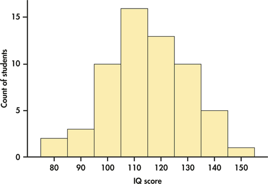
The overall shape of a distribution is important information about a variable. Some types of data regularly produce distributions that are symmetric or skewed. For example, data on the diameters of ball bearings produced by a manufacturing process tend to be symmetric. Data on incomes (whether of individuals, companies, or nations) are usually strongly skewed to the right. There are many moderate incomes, some large incomes, and a few very large incomes. Do remember that many distributions have shapes that are neither symmetric nor skewed. Some data show other patterns. Scores on an exam, for example, may have a cluster near the top of the scale if many students did well. Or they may show two distinct peaks if a tough problem divided the class into those who did and didn—t solve it. Use your eyes and describe what you see.
Apply Your Knowledge
Question 1.22
1.22 Make a stemplot.
Make a stemplot for a distribution that has a single peak and is approximately symmetric with one high and two low outliers.
Question 1.23
1.23 Make another stemplot.
Make a stemplot of a distribution that is skewed toward large values.
Time plots
Many variables are measured at intervals over time. We might, for example, measure the cost of raw materials for a manufacturing process each month or the price of a stock at the end of each day. In these examples, our main interest is change over time. To display change over time, make a time plot.
Time Plot
A time plot of a variable plots each observation against the time at which it was measured. Always put time on the horizontal scale of your plot and the variable you are measuring on the vertical scale. Connecting the data points by lines helps emphasize any change over time.
More details about how to analyze data that vary over time are given in Chapter 13. For now, we examine how a time plot can reveal some additional important information about T-bill interest rates.
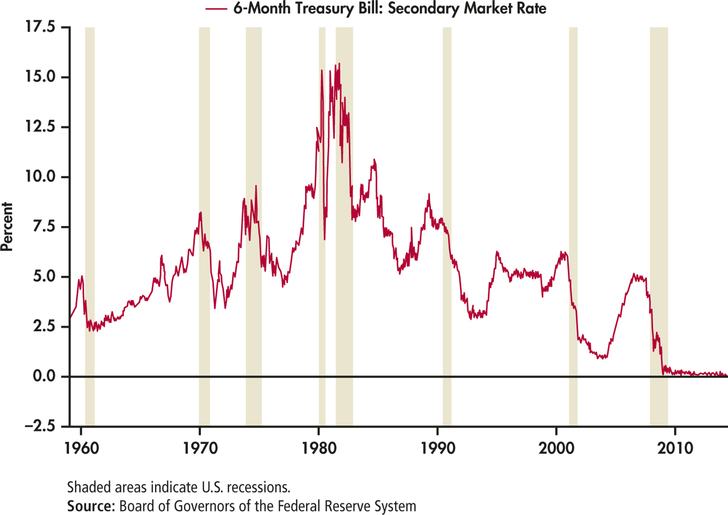
EXAMPLE 1.20 A Time Plot for T-Bill Interest Rates
CASE 1.1 The website of the Federal Reserve Bank of St. Louis provided a very interesting graph of T-bill interest rates.10 It is shown in Figure 1.12. A time plot shows us the relationship between two variables, in this case interest rate and the auctions that occurred at four-week intervals. Notice how the Federal Reserve Bank included information about a third variable in this plot. The third variable is a categorical variable that indicates whether or not the United States was in a recession. It is indicated by the shaded areas in the plot.
Apply Your Knowledge
Question 1.24
CASE 1.11.24 What does the time plot show?
Carefully examine the time plot in Figure 1.12.
- How do the T-bill interest rates vary over time?
- What can you say about the relationship between the rates and the recession periods?
In Example 1.12 (page 12) we examined the distribution of T-bill interest rates for the period December 12, 1958, to May 30, 2014. The histogram in Figure 1.6 showed us the shape of the distribution. By looking at the time plot in Figure 1.12, we now see that there is more to this data set than is revealed by the histogram. This scenario illustrates the types of steps used in an effective statistical analysis of data. We are rarely able to completely plan our analysis in advance, set up the appropriate steps to be taken, and then click on the appropriate buttons in a software package to obtain useful results. An effective analysis requires that we proceed in an organized way, use a variety of analytical tools as we proceed, and exercise careful judgment at each step in the process.