1.3 Describing Distributions with Numbers
 This page includes Video Technology Manuals
 This page includes Statistical Videos
In the previous section, we used the shape, center, and spread as ways to describe the overall pattern of any distribution for a quantitative variable. In this section, we will learn specific ways to use numbers to measure the center and spread of a distribution. The numbers, like the graphs of Section 1.1, are aids to understanding the data, not “the answer” in themselves.

CASE 1.2 Time to Start a Business
An entrepreneur faces many bureaucratic and legal hurdles when starting a new business. The World Bank collects information about starting businesses throughout the world. It has determined the time, in days, to complete all of the procedures required to start a business.17 Data for 189 countries are included in the data set, TTS. For this section, we examine data, rounded to integers, for a sample of 24 of these countries. Here are the data:
| 16 | 4 | 5 | 6 | 5 | 7 | 12 | 19 | 10 | 2 | 25 | 19 |
| 38 | 5 | 24 | 8 | 6 | 5 | 53 | 32 | 13 | 49 | 11 | 17 |
EXAMPLE 1.21 The Distribution of Business Start Times
tts24
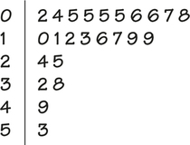
CASE 1.2 The stemplot in Figure 1.13 shows us the shape, center, and spread of the business start times. The stems are tens of days, and the leaves are days. The distribution is skewed to the right with a very long tail of high values. All but six of the times are less than 20 days. The center appears to be about 10 days, and the values range from 2 days to 53 days. There do not appear to be any outliers.
Measuring center: The mean
A description of a distribution almost always includes a measure of its center. The most common measure of center is the ordinary arithmetic average, or mean.
The Mean ˉx
To find the mean of a set of observations, add their values and divide by the number of observations. If the n observations are x1,x2,…,xn their mean is
ˉx=x1+x2+⋯+xnn
or, in more compact notation,
ˉx=1n∑xi
The ∑ (capital Greek sigma) in the formula for the mean is short for “add them all up.” The subscripts on the observations xi are just a way of keeping the n observations distinct. They do not necessarily indicate order or any other special facts about the data. The bar over the x indicates the mean of all the x-values. Pronounce the mean ˉx as “x-bar.” This notation is very common. When writers who are discussing data use ˉx or ˉy, they are talking about a mean.
EXAMPLE 1.22 Mean Time to Start a Business
tts24
CASE 1.2 The mean time to start a business is
ˉx=x1+x2+⋯+xnn=16+4+⋯+1724=39124=16.292
The mean time to start a business for the 24 countries in our data set is 16.3 days. Note that we have rounded the answer. Our goal in using the mean to describe the center of a distribution is not to demonstrate that we can compute with great accuracy. The additional digits do not provide any additional useful information. In fact, they distract our attention from the important digits that are meaningful. Do you think it would be better to report the mean as 16 days?
In practice, you can key the data into your calculator and hit the Mean key. You don't have to actually add and divide. But you should know that this is what the calculator is doing.
Apply Your Knowledge
Question 1.33
CASE 1.21.33 Include the outlier.
For Case 1.2, a random sample of 24 countries was selected from a data set that included 189 countries. The South American country of Suriname, where the start time is 208 days, was not included in the random sample. Consider the effect of adding Suriname to the original set. Show that the mean for the new sample of 25 countries has increased to 24 days. (This is a rounded number. You should report the mean with two digits after the decimal to show that you have performed this calculation.)
1.33
ˉX=23.96.
TTS25
Question 1.34
1.34 Find the mean of the accounting exam scores.
Here are the scores on the first exam in an accounting course for 10 students:
| 70 | 83 | 94 | 85 | 75 | 98 | 93 | 55 | 80 | 90 |
Find the mean first-exam score for these students.
acct
Question 1.35
1.35 Calls to a customer service center.
The service times for 80 calls to a customer service center are given in Table 1.1 (page 14). Use these data to compute the mean service time.
1.35
ˉX=196.575.
cc80
Exercise 1.33 illustrates an important fact about the mean as a measure of center: it is sensitive to the influence of one or more extreme observations. These may be outliers, but a skewed distribution that has no outliers will also pull the mean toward its long tail. Because the mean cannot resist the influence of extreme observations, we say that it is not a resistant measure of center.
resistant measure
Measuring center: The median
In Section 1.1, we used the midpoint of a distribution as an informal measure of center. The median is the formal version of the midpoint, with a specific rule for calculation.
The Median M
The median M is the midpoint of a distribution, the number such that half the observations are smaller and the other half are larger. To find the median of a distribution:
- Arrange all observations in order of size, from smallest to largest.
- If the number of observations n is odd, the median M is the center observation in the ordered list. Find the location of the median by counting (n+1)/2 observations up from the bottom of the list.
- If the number of observations n is even, the median M is the mean of the two center observations in the ordered list. The location of the median is again (n+1)/2 from the bottom of the list.
Note that the formula (n+1)/2 does not give the median, just the location of the median in the ordered list. Medians require little arithmetic, so they are easy to find by hand for small sets of data. Arranging even a moderate number of observations in order is very tedious, however, so that finding the median by hand for larger sets of data is unpleasant. Even simple calculators have an ˉx button, but you will need software or a graphing calculator to automate finding the median.
EXAMPLE 1.23 Median Time to Start a Business
tts24
CASE 1.2 To find the median time to start a business for our 24 countries, we first arrange the data in order from smallest to largest:
| 2 | 4 | 5 | 5 | 5 | 5 | 6 | 6 | 7 | 8 | 10 | 11 |
| 12 | 13 | 16 | 17 | 19 | 19 | 24 | 25 | 32 | 38 | 49 | 53 |
The count of observations n=24 is even. The median, then, is the average of the two center observations in the ordered list. To find the location of the center observations, we first compute
location of M=n+12=252=12.5
Therefore, the center observations are the 12th and 13th observations in the ordered list. The median is
M=11+122=11.5
Note that you can use the stemplot directly to compute the median. In the stemplot the cases are already ordered, and you simply need to count from the top or the bottom to the desired location.
Apply Your Knowledge
Question 1.36
1.36 Find the median of the accounting exam scores.
Here are the scores on the first exam in an accounting course for 10 students:
| 70 | 83 | 94 | 85 | 75 | 98 | 93 | 55 | 80 | 90 |
Find the median first-exam score for these students.
acct
Question 1.37
1.37 Calls to a customer service center.
The service times for 80 calls to a customer service center are given in Table 1.1 (page 14). Use these data to compute the median service time.
1.37
M=103.5
cc80
Question 1.38
CASE 1.21.38 Include the outlier.
Include Suriname, where the start time is 208 days, in the data set, and show that the median is 12 days. Note that with this TTS25 case included, the sample size is now 25 and the median is the 13th observation in the ordered list. Write out the ordered list and circle the outlier. Describe the effect of the outlier on the median for this set of data.
tts24
Comparing the mean and the median
Exercises 1.33 (page 24) and 1.38 (page 26) illustrate an important difference between the mean and the median. Suriname pulls the mean time to start a business up from 16 days to 24 days. The increase in the median is very small, from 11.5 days to 12 days.
The median is more resistant than the mean. If the largest starting time in the data set was 1200 days, the median for all 25 countries would still be 12 days. The largest observation just counts as one observation above the center, no matter how far above the center it lies. The mean uses the actual value of each observation and so will chase a single large observation upward.
The best way to compare the response of the mean and median to extreme observations is to use an interactive applet that allows you to place points on a line and then drag them with your computer’s mouse. Exercises 1.60 to 1.62 (page 37) use the Mean and Median applet on the website for this book to compare mean and median.
The mean and median of a symmetric distribution are close together. If the distribution is exactly symmetric, the mean and median are exactly the same. In a skewed distribution, the mean is farther out in the long tail than is the median.
Consider the prices of existing single-family homes in the United States.18 The mean price in 2013 was $245,700, while the median was $197,400. This distribution is strongly skewed to the right. There are many moderately priced houses and a few very expensive mansions. The few expensive houses pull the mean up but do not affect the median.
Reports about house prices, incomes, and other strongly skewed distributions usually give the median (page midpoint”) rather than the mean (page arithmetic average”). However, if you are a tax assessor interested in the total value of houses in your area, use the mean. The total is the mean times the number of houses, but it has no connection with the median. The mean and median measure center in different ways, and both are useful.
Apply Your Knowledge
Question 1.39
1.39 Gross domestic product.
gdpa
The success of companies expanding to developing regions of the world depends in part on the prosperity of the countries in those regions. Here are World Bank data on the growth of gross domestic product (percent per year) for 2013 for 13 countries in Asia:19
| Country | Growth |
|---|---|
| Bangladesh | 6.1 |
| China | 7.8 |
| Hong Kong | 1.4 |
| India | 6.5 |
| Indonesia | 6.2 |
| Japan | 2.0 |
| Korea (South) | 2.0 |
| Malaysia | 5.6 |
| Pakistan | 3.7 |
| Philippines | 6.6 |
| Singapore | 1.3 |
| Thailand | 6.4 |
| Vietnam | 5.0 |
- Make a stemplot of the data.
- There appear to be two distinct groups of countries in this distribution. Describe them.
- Find the mean growth rate. Do you think that the mean gives a good description of these data? Explain your answer.
- Find the median growth rate. Do you think that the median gives a good description of these data? Explain your answer.
- Give numerical summaries for the two distinct groups. Do you think that this is a better way to describe this distribution? Explain your answer.
1.39
(b) One group has 5.0 or more growth; the other group has 3.7 or less growth. (c) The mean growth rate is 4.66. Because the distribution is left-skewed, the mean is not a good measure of center. (d) The median growth rate is 5.6. Because the distribution is left-skewed, the median is a good measure of center. (e) The mean for group 1, 2.08, is much lower than the mean for group 2, 6.275. The split summaries are much better representations of the groups because there is no longer a large gap in the datasets. The gross domestic product of these countries is much better explained by the two distinct groups.
Measuring spread: The quartiles
A measure of center alone can be misleading. Two nations with the same median household income are very different if one has extremes of wealth and poverty and the other has little variation among households. A drug with the correct mean concentration of active ingredient is dangerous if some batches are much too high and others much too low. We are interested in the spread or variability of incomes and drug potencies as well as their centers. The simplest useful numerical description of a distribution consists of both a measure of center and a measure of spread.
One way to measure spread is to give the smallest and largest observations. For example, the times to start a business in our data set that included Suriname ranged from 2 to 208 days. Without Suriname, the range is 2 to 53 days. These largest and smallest observations show the full spread of the data and are highly influenced by outliers.
We can improve our description of spread by also giving several percentiles. The pth percentile of a distribution is the value such that p percent of the observations fall at or below it. The median is just the 50th percentile, so the use of percentiles to report spread is particularly appropriate when the median is the measure of center.
pth percentile
The most commonly used percentiles other than the median are the quartiles. The first quartile is the 25th percentile, and the third quartile is the 75th percentile. That is, the first and third quartiles show the spread of the middle half of the data. (The second quartile is the median itself.) To calculate a percentile, arrange the observations in increasing order, and count up the required percent from the bottom of the list. Our definition of percentiles is a bit inexact because there is not always a value with exactly p percent of the data at or below it. We are content to take the nearest observation for most percentiles, but the quartiles are important enough to require an exact recipe. The rule for calculating the quartiles uses the rule for the median.
The Quartiles Q1 and Q3
To calculate the quartiles:
- Arrange the observations in increasing order, and locate the median M in the ordered list of observations.
- The first quartile Q1 is the median of the observations whose position in the ordered list is to the left of the location of the overall median.
- The third quartile Q3 is the median of the observations whose position in the ordered list is to the right of the location of the overall median.
Here is an example that shows how the rules for the quartiles work for both odd and even numbers of observations.
EXAMPLE 1.24 Finding the Quartiles
tts24
CASE 1.2 Here is the ordered list of the times to start a business in our sample of 24 countries:
| 2 | 4 | 5 | 5 | 5 | 5 | 6 | 6 | 7 | 8 | 10 | 11 |
| 12 | 13 | 16 | 17 | 19 | 19 | 24 | 25 | 32 | 38 | 49 | 53 |
The count of observations n=24 is even, so the median is at position (24+1)/2=12.5, that is, between the 12th and the 13th observation in the ordered list. There are 12 cases above this position and 12 below it. The first quartile is the median of the first 12 observations, and the third quartile is the median of the last 12 observations. Check that Q1=5.5 and Q3=21.5.
Notice that the quartiles are resistant. For example, Q3 would have the same value if the highest start time was 530 days rather than 53 days.
There are slight differences in the methods used by software to compute percentiles. However, the results will generally be quite similar, except in cases where the sample sizes are very small.

Be careful when several observations take the same numerical value. Write down all the observations, and apply the rules just as if they all had distinct values.
The five-number summary and boxplots
The smallest and largest observations tell us little about the distribution as a whole, but they give information about the tails of the distribution that is missing if we know only Q1, M and Q3. To get a quick summary of both center and spread, combine all five numbers. The result is the five-number summary and a graph based on it.
The Five-number Summary and Boxplots
The five-number summary of a distribution consists of the smallest observation, the first quartile, the median, the third quartile, and the largest observation, written in order from smallest to largest. In symbols, the five-number summary is
Minimum
A boxplot is a graph of the five-number summary.
- A central box spans the quartiles.
- A line in the box marks the median.
- Lines extend from the box out to the smallest and largest observations.
Boxplots are most useful for side-by-side comparison of several distributions.
You can draw boxplots either horizontally or vertically. Be sure to include a numerical scale in the graph. When you look at a boxplot, first locate the median, which marks the center of the distribution. Then look at the spread. The quartiles show the spread of the middle half of the data, and the extremes (the smallest and largest observations) show the spread of the entire data set. We now have the tools for a preliminary examination of the customer service center call lengths.
EXAMPLE 1.25 Service Center Call Lengths
cc80
Table 1.1 (page 14) displays the customer service center call lengths for a random sample of 80 calls that we discussed in Example 1.13 (page 13). The five-number summary for these data is 1.0, 54.4, 103.5, 200, 2631. The distribution is highly skewed. The mean is 197 seconds, a value that is very close to the third quartile. The boxplot is displayed in Figure 1.14. The skewness of the distribution is the major feature that we see in this plot. Note that the mean is marked with a “+” and appears very close to the upper edge of the box.
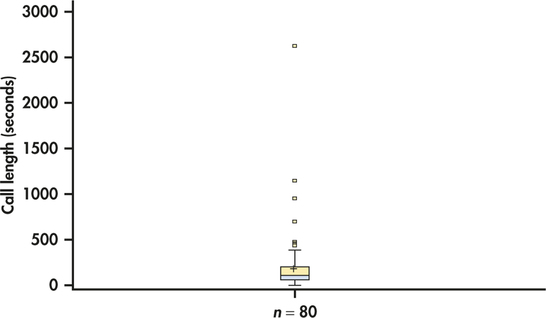
Because of the skewness in this distribution, we selected a software option to plot extreme points individually in Figure 1.14. This is one of several different ways to improve the appearance of boxplots for particular data sets. These variations are called modified boxplots.
modified boxplots
Boxplots can show the symmetry or skewness of a distribution. In a symmetric distribution, the first and third quartiles are equally distant from the median. This is not what we see in Figure 1.14. Here, the distribution is skewed to the right. The third quartile is farther above the median than the first quartile is below it. The extremes behave the same way. Boxplots do not always give a clear indication of the nature of a skewed set of data. For example, the quartiles may indicate right-skewness, while the whiskers indicate left-skewness.
Boxplots are particularly useful for comparing several distributions. Here is an example.
EXAMPLE 1.26 Compare the T-bill rates in January and July
tbilljj
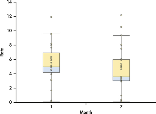
In Example 1.17 (page 17) we used a back-to-back stemplot to compare the T-bill rates for the months of January and July. Figure 1.15 gives side-by-side boxplots for the two months generated with JMP. Notice that this software plots the individual observations as dots in addition to the modified boxplots as default options.
Apply Your Knowledge
Question 1.40
1.40 Stemplots or boxplots for comparing T-bill rates.
The T-bill rates for January and July are graphically compared using a back-to-back stemplot in Figure 1.10 (page 17)and using side-by-side boxplots in Figure 1.15. Which graphical display do you prefer for these data? Give reasons for your answer.
Question 1.41
CASE 1.21.41 Time to start a business.
Refer to the data on times to start a business in 24 countries described in Case 1.2 on page 23. Use a boxplot to display the distribution. Discuss the features of the data that you see in the boxplot, and compare it with the stemplot in Figure 1.13 (page 23). Which do you prefer? Give reasons for your answer.
1.41
The time is right-skewed, with a long right tail. The mean is much higher than the median because of the skew.
tts24
Question 1.42
1.42 Accounting exam scores.
Here are the scores on the first exam in an accounting course for 10 students:
| 70 | 83 | 94 | 85 | 75 | 98 | 93 | 55 | 80 | 90 |
Display the distribution with a boxplot. Discuss whether or not a stemplot would provide a better way to look at this distribution.
acct
Measuring spread: the standard deviation
The five-number summary is not the most common numerical description of a distribution. That distinction belongs to the combination of the mean to measure center and the standard deviation to measure spread. The standard deviation measures spread by looking at how far the observations are from their mean.
The Standard Deviation
The variance of a set of observations is essentially the average of the squares of the deviations of the observations from their mean. In symbols, the variance of observations is
or, more compactly,
The standard deviation is the square root of the variance :
Notice that the “average” in the variance divides the sum by 1 less than the number of observations, that is, rather than . The reason is that the deviations always sum to exactly 0, so that knowing of them determines the last one. Only of the squared deviations can vary freely, and we average by dividing the total by . The number is called the degrees of freedom of the variance or standard deviation. Many calculators offer a choice between dividing by and dividing by , so be sure to use .
degrees of freedom
In practice, use software or your calculator to obtain the standard deviation from keyed-in data. Doing an example step-by-step will help you understand how the variance and standard deviation work, however.
EXAMPLE 1.27 Standard Deviation for Time to Start a Business
tts24
In Example 1.22 (page 24), we found that the mean time to start a business for the 24 countries in our data set was 16.3 days. Here, we keep an extra two digits to make sure that our intermediate calculations are accurate. When we are done, we will round the standard deviation in the same way that we rounded the mean, giving one digit after the decimal. We organize the arithmetic in a table.
| Observations |
Deviations |
Squared deviations |
|---|---|---|
| 16 | ||
| 4 | ||
| ... | ...= ... | ...= ... |
| 17 | ||
The variance is the sum of the squared deviations divided by 1 less than the number of observations:
The standard deviation is the square root of the variance:
More important than the details of hand calculation are the properties that determine the usefulness of the standard deviation:
- measures spread about the mean and should be used only when the mean is chosen as the measure of center.
- only when there is no spread. This happens only when all observations have the same value. Otherwise, is greater than zero. As the observations become more spread out about their mean, gets larger.
- has the same units of measurement as the original observations. For example, if you measure wages in dollars per hour, is also in dollars per hour.
- Like the mean , is not resistant. Strong skewness or a few outliers can greatly increase .
Apply Your Knowledge
Question 1.43
CASE 1.21.43 Time to start a business.
TTS24
TTS25
Verify the statement in the last bullet above using the data on the time to start a business. First, use the 24 cases from Case 1.2 (page 23) to calculate a standard deviation. Next, include the country Suriname, where the time to start a business is 208 days. Show that the inclusion of this single outlier increases the standard deviation from 14 to 41.
1.43
Without Suriname: . With Suriname: .
You may rightly feel that the importance of the standard deviation is not yet clear. We will see in the next section that the standard deviation is the natural measure of spread for an important class of symmetric distributions, the Normal distributions. The usefulness of many statistical procedures is tied to distributions with particular shapes. This is certainly true of the standard deviation.
Choosing measures of center and spread
How do we choose between the five-number summary and and to describe the center and spread of a distribution? Because the two sides of a strongly skewed distribution have different spreads, no single number such as describes the spread well. The five-number summary, with its two quartiles and two extremes, does a better job.
Choosing a Summary
The five-number summary is usually better than the mean and standard deviation for describing a skewed distribution or a distribution with extreme outliers. Use and only for reasonably symmetric distributions that are free of outliers.
Apply Your Knowledge
Question 1.44
1.44 Accounting exam scores.
Following are the scores on the first exam in an accounting course for 10 students. We found the mean of these scores in Exercise 1.34 (page 25) and the median in Exercise 1.36 (page 26).
| 70 | 83 | 94 | 85 | 75 | 98 | 93 | 55 | 80 | 90 |
- Make a stemplot of these data.
- Compute the standard deviation.
- Are the mean and the standard deviation effective in describing the distribution of these scores? Explain your answer.
acct
Question 1.45
1.45 Calls to a customer service center.
We displayed the distribution of the lengths of 80 calls to a customer service center in Figure 1.14 (page 29).
- Compute the mean and the standard deviation for these 80 calls (the data are given in Table 1.1, page 14).
- Find the five-number summary.
- Which summary does a better job of describing the distribution of these calls? Give reasons for your answer.
1.45
(a) . (b) . (c) The five-number summary is a better summary because the distribution is heavily skewed and has potential outliers.
cc80
Beyond The Basics: Risk And Return
A central principle in the study of investments is that taking bigger risks is rewarded by higher returns, at least on the average over long periods of time. It is usual in finance to measure risk by the standard deviation of returns on the grounds that investments whose returns show a large spread from year to year are less predictable and, therefore, more risky than those whose returns have a small spread. Compare, for example, the approximate mean and standard deviation of the annual percent returns on American common stocks and U.S. Treasury bills over a 50-year period starting in 1950:
| Investment | Mean return | Standard deviation |
|---|---|---|
| Common stocks | 14.0% | 16.9% |
| Treasury bills | 5.2% | 2.9% |
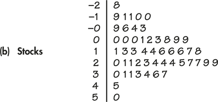
Stocks are risky. They went up 14% per year on the average during this period, but they dropped almost 28% in the worst year. The large standard deviation reflects the fact that stocks have produced both large gains and large losses. When you buy a Treasury bill, on the other hand, you are lending money to the government for one year. You know that the government will pay you back with interest. That is much less risky than buying stocks, so (on the average) you get a smaller return.
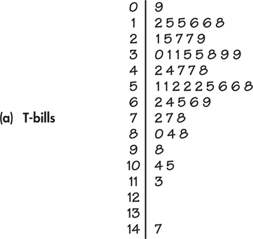
Are and good summaries for distributions of investment returns? Figures 1.16(a) and 1.16(b) display stemplots of the annual returns for both investments. You see that returns on Treasury bills have a right-skewed distribution. Convention in the financial world calls for and because some parts of investment theory use them. For describing this right-skewed distribution, however, the five-number summary would be more informative.
Remember that a graph gives the best overall picture of a distribution. Numerical measures of center and spread report specific facts about a distribution, but they do not describe its entire shape. Numerical summaries do not disclose the presence of multiple peaks or gaps, for example. Always plot your data.
