Population growth rate is influenced by the proportions of individuals in different age, size, and life history classes
In our discussion of population models so far, we have assumed that all individuals in the population have an identical intrinsic growth rate—that is, they have the same birth rates and death rates. While this assumption is helpful to generate simple models of population growth, we know that survival and fecundity commonly vary with an individual’s age, size, or life history stage. In terms of age, individuals cannot reproduce until they have achieved reproductive maturity. Individual mass often plays a large role in determining the individual’s fecundity, with larger individuals having higher fecundity (see Chapter 8). We can also consider different life history stages. For example, tadpoles experience low survival and no fecundity, whereas later in life, as frogs, they experience high survival and high fecundity. Many perennial plants alternate between years in which they are reproductive and years in which they are nonreproductive. In this section, we will examine how changes in survival and fecundity among different classes in a population affect population growth. In doing so, we will focus on age classes while recognizing that the same principles apply to size classes and life history classes.
Age Structure
Age structure In a population, the proportion of individuals that occurs in different age classes.
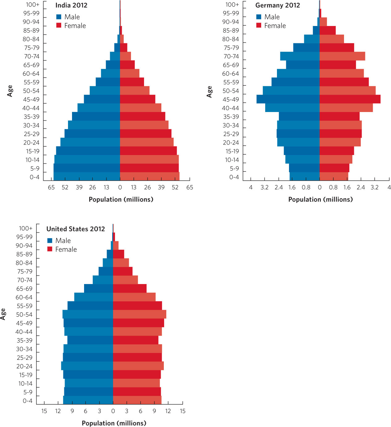
The age structure of a population is the proportion of individuals that occurs in different age classes. A population’s age structure can tell us a great deal about its past and its potential for future growth. Consider the different patterns of age structure among human populations in 2012 that are displayed in Figure 12.18. In these figures, known as age structure pyramids, we see that the nations of India, the United States, and Germany all have declining numbers of people after 50 years of age, due to senescence. But each has a very different pyramid shape below 50 years of age. Age structure pyramids with broad bases reflect growing populations, pyramids with straight sides reflect stable populations, and pyramids with narrow bases reflect declining populations.
284
In the case of India, for example, people in the younger age classes far outnumber those in the middle age classes. If the young age classes experience good nutrition and health care, they will survive well and the number of reproductive individuals 2 decades from now will be much greater than it is today, which will cause the population to grow.
We can contrast this with the age structure pyramid of the United States. The number of people in the younger age classes is very similar to those in the middle age classes. In this case, we would predict that 2 decades from now we would have a similar number of reproductive individuals, so the population should remain relatively stable.
The other extreme is represented by Germany. In Germany, the current reproductive age classes have experienced reduced reproduction such that the number of people in the younger age classes is less than the number in the middle age classes. If we project ahead 2 decades, we would predict that there will be fewer reproductive individuals in the future and, as a result, the population in Germany should decline.
285
Survivorship Curves
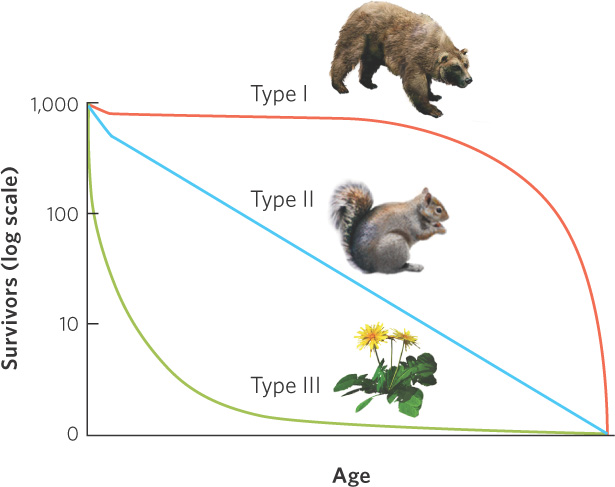
To understand the differences in survival among different age classes we can graph survival over time, as illustrated in Figure 12.19. Using this technique we find that species can be categorized according to type I, type II, or type III survivorship curves. A type I survivorship curve depicts a population that experiences very little mortality early in life and high mortality late in life. Examples include humans, elephants, and whales. A type II survivorship curve occurs when a population experiences relatively constant mortality throughout its life span. Organisms with type II curves include squirrels, corals, and some species of songbirds. A type III survivorship curve depicts a population with high mortality early in life and high survival later in life. This is a common pattern in many species of insects and in plants such as dandelions and oak trees that produce hundreds or thousands of seeds. In reality, most populations have survivorship curves that combine features of type I and type III curves, with high mortality early and late in life.
Life Tables
Because both birth and death rates can differ among age, size, and life history classes, we need a way to incorporate this information into our estimates of population growth rates. If we can find a way to do this, we can better predict how a population will change in abundance over time, which can be important for managing populations that humans consume, populations of species that we wish to conserve, and populations of pests that we wish to control. We can achieve this goal if we know the proportions of individuals in different classes and the birth and death rates of each age class. Collectively, such data can tell us whether a population is expected to increase, decrease, or remain unchanged.
Life tables Tables that contain class-specific survival and fecundity data.
To determine how age, size, or life history classes affect the growth of a population, ecologists use life tables. Life tables contain class-specific survival and fecundity data that help us understand and predict the growth of the population. Because it can be hard to ascertain paternity in many species, life tables are typically based on females and fecundity is defined as the number of female offspring per reproductive female. For some populations with highly skewed sex ratios or unusual mating systems (see Chapter 9), using only females can pose problems, but in most cases a female-based life table provides a useful model of population growth.
To understand how ecologists use life tables, let’s consider a hypothetical population composed of 100 individuals distributed into different age classes, as illustrated in Table 12.1. In this table, the age classes are denoted by x and the number of individuals in each age class is denoted by nx. The value of nx represents the number of individuals present immediately after the population has produced offspring. In the table, survival rate from one age class to the next age class is denoted as sx. (You can think of “s” for survival.) In our example, the column labeled as sx indicates that the new offspring have a 50 percent survival rate, 1-year-olds have an 80 percent survival rate, 2-year-olds have a 50 percent survival rate, and no 3-year-olds survive to become 4-year-olds. The fecundity of each age class is denoted by bx. (You can think of “b” for birth.) In the table, the column labeled as bx indicates that the new offspring cannot reproduce, but 1-year-olds can each produce one offspring, 2-year-olds can each produce three offspring, and 3-year-olds can each produce two offspring.
A HYPOTHETICAL POPULATION OF 100 INDIVIDUALS WITH AGE-SPECIFIC RATES OF SURVIVAL AND FECUNDITY
|
NUMBER OF SURVIVAL |
|||
| AGE | INDIVIDUALS | RATE | FECUNDITY |
| (x) | (nx) | (sx) | (bx) |
| 0 | 20 | 0.5 | 0 |
| 1 | 10 | 0.8 | 1 |
| 2 | 40 | 0.5 | 3 |
| 3 | 30 | 0.0 | 2 |
| 4 | 0 | — | — |
| Total | 100 | ||
286
The data in this life table allows us to calculate the expected size of the population after one year. Table 12.2 shows us the calculations for the population in Table 12.1. To calculate the number of individuals that survive to the next age class we multiply the number of individuals in an age class by the annual survival rate of that age class, as shown in the red-shaded region of the table. For example, if we start with 0-year-olds and their survival rate is 50 percent, then we can calculate the number of 1-year-olds that we will have in the following year:
Number surviving to next age class = (nx) × (sx)
Number surviving to next age class = 20 × 0.5
Number surviving to next age class = 10
THE NUMBER OF SURVIVORS AND NEW OFFSPRING AFTER 1 YEAR FOR THE HYPOTHETICAL POPULATION IN TABLE 12.1
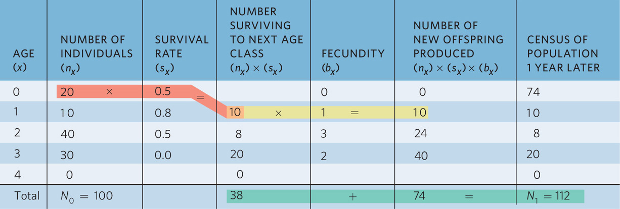
To determine the number of new offspring that will be produced next year, we multiply the number of individuals that survive to the next age class—as shown in the orange-shaded region—by the fecundity of that age class. For example, if 10 individuals will survive to be 1-year-olds and each 1-year-old can produce one offspring, then we can calculate the number of new offspring that this age class will produce, as shown in the yellow-shaded region of the table:
Number of new offspring produced = (nx) × (sx) × (bx)
Number of new offspring produced = 20 × 0.5 × 1
Number of new offspring produced = 10
If we do these calculations for every age class, we find that next year we will have a total of 74 new offspring. In addition, we will have 10 individuals that are now 1 year old, 24 individuals that are 2 years old, and 40 individuals that are now 3 years old. You can see a summary of this in Table 12.3.
POPULATION SIZE INITIALLY AND 1 YEAR LATER BASED ON THE HYPOTHETICAL POPULATION IN TABLE 12.1
| AGE (x) | NUMBER OF INDIVIDUALS (nx) | NUMBER OF INDIVIDUALS 1 YEAR LATER (nx + 1) |
| 0 | 20 | 74 |
| 1 | 10 | 10 |
| 2 | 40 | 8 |
| 3 | 30 | 20 |
| 4 | 0 | 0 |
| Total | N0 = 100 | N1 = 112 |
When we add up all of the age classes, we find that these survival and fecundity rates have caused the population to grow from a total size of 100 to a new total size of 112 individuals 1 year later. As a result, the geometric growth rate of the population is
We can continue these calculations to estimate the size of the population for many years into the future. In Table 12.4, for example, you can see the results of these same calculations for 8 years into the future. We can also continue to calculate the geometric rate of growth of the population for each year. If we examine these values of λ, we can see that they initially fluctuate widely between 1.05 and 1.69. As the years pass, however, the values of λ settle down to 1.49. Provided that survival and fecundity of each class stays constant over time, λ will stabilize at a single value and the proportion of individuals in each age class also will stabilize. When the structure of a population is not changing over time, we say it has a stable age distribution. If the survival and fecundity rates were to change, the value of λ and the proportion of individuals in each age class would be altered as well.
PROJECTING POPULATION GROWTH OVER 8 YEARS BASED ON THE HYPOTHETICAL POPULATION IN TABLE 12.1
| YEAR 0 | YEAR 1 | YEAR 2 | YEAR 3 | YEAR 4 | YEAR 5 | YEAR 6 | YEAR 7 | YEAR 8 | |
| n0 | 20 | 74 | 69 | 132 | 175 | 274 | 399 | 599 | 889 |
| n1 | 10 | 10 | 37 | 34 | 61 | 87 | 137 | 199 | 299 |
| n2 | 40 | 8 | 8 | 30 | 28 | 53 | 70 | 110 | 160 |
| n3 | 30 | 20 | 4 | 4 | 15 | 14 | 26 | 35 | 55 |
| N | 100 | 112 | 118 | 200 | 279 | 428 | 632 | 943 | 1403 |
| λ | 1.12 | 1.05 | 1.69 | 1.40 | 1.53 | 1.48 | 1.49 | 1.49 |
Stable age distribution When the age structure of a population does not change over time.
287
Calculating Survivorship
We have examined life tables using the survival rate (sx) from one age class to the next age class. Another useful measure of survival is the probability of surviving from birth to any later age class, which we call survivorship and denote as lx. (You can think of “l” for living.) Survivorship in the first age class is always set at 1 because all individuals in the population are initially alive. Survivorship at any given age class is the product of the prior year’s survivorship and the prior year’s survival rate. For example, survivorship to the second year is calculated as
l2 = l1s1
and survivorship to the third year is calculated as
l3 = l2s2
The calculated survivorships in our hypothetical population are shown in Table 12.5.
CALCULATING THE SURVIVORSHIP (lx) OF THE HYPOTHETICAL POPULATION IN TABLE 12.1
| AGE (x) | NUMBER OF INDIVIDUALS (nx) | SURVIVAL RATE (sx) | SURVIVORSHIP (lx) |
| 0 | 20 | 0.5 | 1.0 |
| 1 | 10 | 0.8 | 0.5 |
| 2 | 40 | 0.5 | 0.4 |
| 3 | 30 | 0.0 | 0.2 |
| 4 | 0 | — | 0.0 |
| Total | 100 | ||
Calculating the Net Reproductive Rate
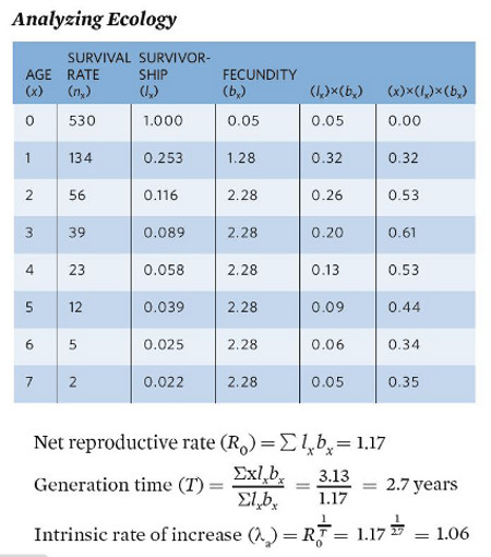
The net reproductive rate is the total number of female offspring that we expect an average female to produce over the course of her life. If this value is greater than 1, then each female more than replaces herself in the population and the population will grow. The net reproductive rate, denoted as R0, is calculated in two steps. First, we multiply the probability of living to each age class (lx) by the fecundity of the respective age classes (bx). Second, we sum these products, as shown in the following equation
Net reproductive rate The total number of female offspring that we expect an average female to produce over the course of her life.
R0 = ∑ lx bx
An example is shown in Table 12.6 for our hypothetical population. In this case, the net reproductive rate is 2.1, which means that each female is producing 2.1 daughters on average, so the population will grow.
CALCULATING THE NET REPRODUCTIVE RATE BASED ON THE HYPOTHETICAL POPULATION IN TABLE 12.1
| AGE (x) | SURVIVAL RATE (sx) | SURVIVORSHIP (lx) | FECUNDITY (bx) | (lx) × (bx) |
| 0 | 0.5 | 1.0 | 0 | |
| 1 | 0.8 | 0.5 | 1 | 0.5 |
| 2 | 0.5 | 0.4 | 3 | 1.2 |
| 3 | 0.0 | 0.2 | 2 | 0.4 |
| 4 | — | 0.0 | — | 0.0 |
| NET REPRODUCTIVE RATE (R0) = ∑ lx bx = 2.1 | ||||
288
Calculating the Generation Time
Generation time (T) The average time between the birth of an individual and the birth of its offspring.
We can also use life tables to calculate the generation time (T) of a population, which is the average time between the birth of an individual and the birth of its offspring. To calculate generation time, we must make three sets of calculations, as shown in Table 12.7. First, within each age class we multiply the age (x), survivorship (lx), and fecundity (bx). Second, we take the sum of these products. This provides us with the expected number of births for a female, weighted by the ages at which she produced the offspring.
CALCULATING THE GENERATION TIME, T, FROM THE HYPOTHETICAL POPULATION IN TABLE 12.1
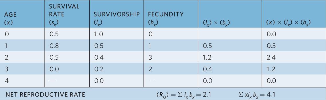
Using these calculations, we can now calculate generation time as
This tells us that in our hypothetical population, the average time between the birth of an individual and the birth of its offspring is about 2 years.
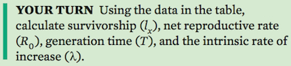
Calculating the Intrinsic Rate of Increase
We can make connections between life tables and our earlier population growth models by using life table data to estimate the population’s intrinsic rate of increase (λ or r). When an intrinsic rate of increase is estimated from a life table, we assume that the life table has a stable age distribution. However, stable age distributions rarely occur in nature because the environment varies from year to year in ways that can affect survival and fecundity. As a result, any approximation of λ or r is necessarily restricted to the set of environmental conditions that the population experiences. There are complicated equations to estimate λ and r. However, we can provide close approximations, denoted as λa and ra (where the letter “a” indicates an approximation), based on our estimates of net reproductive rate (R0) and generation time (T)

which given our earlier calculations simplifies to

Note that this value of 1.46 is close to our observed λ of about 1.49 after the population achieved a stable age distribution (see Table 12.3). If we wanted to calculate ra, we could do so using the following equation
You can see that a population’s intrinsic rate of increase depends on both the net reproductive rate (R0) and the generation time (T). A population grows when R0 exceeds 1, which is the replacement level of reproduction for a population. In contrast, a population declines when R0 < 1. The rate at which a population can change increases with shorter generation times.
Collecting Data for Life Tables
Cohort life table A life table that follows a group of individuals born at the same time from birth to the death of the last individual.
To determine the age structure of a population and predict future population growth, we need to collect data or organisms from different ages. This objective can be met by constructing either a cohort life table or a static life table. A cohort life table follows a group of individuals born at the same time from birth to the death of the last individual. In contrast, a static life table quantifies the survival and fecundity of all individuals in a population during a single time interval. As we will see, the two types of life tables are used in different situations and have different advantages and disadvantages.
Static life table A life table that quantifies the survival and fecundity of all individuals in a population during a single time interval.
289
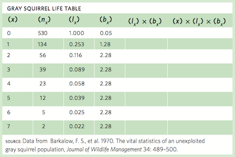
ANALYZING ECOLOGY
Calculating Life Table Values
Life table data are collected for many different species. For example, a group of researchers spent a decade following a population of gray squirrels (Sciurus carolinensis) in North Carolina to quantify the survival and fecundity of the squirrels. Below is a table of the age-specific survival and fecundity.
Cohort Life Tables
Cohort life tables are readily applied to populations of plants and sessile animals in which marked individuals can be continually tracked over the course of their entire life. The cohort life table does not work well for species that are highly mobile or for species with very long life spans, such as trees. One of the problems in using a cohort life table is that a change in the environment during one year can affect survival and fecundity of the cohort that year. This makes it difficult to disentangle the effects of age from the effects of changing environmental conditions. For example, imagine that you mark a population of plants that lives for several years. However, in the middle of this life span the population experiences a severe drought that causes sharp reductions in survival and fecundity. The following year is wet, which causes high survival and fecundity. When you construct the life table, you cannot determine whether the age-specific changes in survival and fecundity are due to a change in age or a change in the environment.
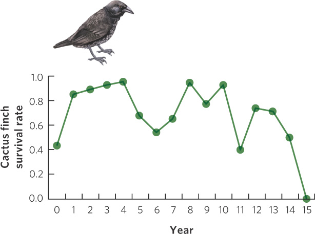
An excellent example of a cohort life table comes from Peter and Rosemary Grant, who have studied several species of ground finches in the Galápagos Islands off the coast of Ecuador. On the small island of Daphne Major, the Grants were able to capture all the birds on the island and mark them with uniquely colored plastic leg bands. Because this island is so isolated, few birds left from the island or arrived from elsewhere. Using 210 cactus finches (Geospiza scandens) that fledged in 1978, the researchers constructed a cohort life table for the population. In Figure 12.20 you can see the annual survival rates for these birds. As is the case for many species, survival rate was low in the population’s first year and then remained high for several subsequent years. However, survival was quite variable throughout the life of the birds. This variation in survival reflects variation in the environment due to climatic changes during El Niño years (see Chapter 5). Because El Niño years are wet years, the vegetation produces abundant food for the finches and this causes high survival. Following El Niño years are periods of several dry years. During this time, food becomes scarce for the finches and this causes low survival. These data emphasize a disadvantage of cohort life tables. As mentioned above, it is difficult to determine whether low survival at a particular age is due to the age of the individuals or due to the environmental conditions that occur during that year.
290
Static Life Tables
Using a static life table avoids many of the problems of the cohort life table. By considering the survival and fecundity of individuals of all ages during a single time interval, differences among the age classes are quantified under the same environmental conditions, so age is not confounded with time. In addition, static life tables allow us to look at the survival and fecundity of all individuals during a snapshot in time, which means we can examine both species that are highly mobile as well as species that have long life spans.
To construct a static life table, we must be able to age all individuals since we do not mark them at birth. A number of techniques are available to do this. For example, we can count annual growth rings in the trunks of trees, in the teeth of mammals, and in the ear bones of fish. The one major concern when using static life tables is that the age-specific data on survival and fecundity only apply to the environmental conditions that existed at the time the data were collected. Because the life table may not be representative of years in which the environmental conditions are quite different, it is helpful to construct static life tables for multiple years to assess how much environmental variation affects the predicted population growth.
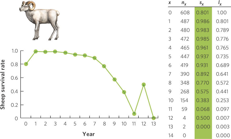
A classic study using a static life table was conducted by Olaus Murie, who examined the survival of Dall mountain sheep (Ovis dalli) at a site in Alaska during the 1930s. Murie knew that the horns of the sheep contained annual growth rings that could be used to age the sheep. He also knew that following a cohort of highly mobile sheep for 15 years in Alaska was not feasible, so he took a static approach by conducting a search of all sheep skeletons in the area. He found a total of 608 skeletons from sheep that had died in recent years and assigned an age to each individual based on its horns. Using these estimates, he determined how many of the original 608 sheep died in each age class. His results, depicted in Figure 12.21, show a low survival rate during the first year, followed by high survival for the next 7 years. After 7 years of age, the annual survival rate began to drop, with the exception of those at 12 years of age. However, only four animals made it to 12 years, which gives us a poor estimate of the typical survival rate for 12-year-old sheep. Because these data were taken from the skeletons of sheep that presumably died over a relatively short period, we do not see the large variation in survival rate that we saw in the cohort life table of the cactus finch.
291
Throughout this chapter we have examined how ecologists use their understanding of populations to develop mathematical models that mimic natural patterns of population growth. Although populations commonly grow rapidly when at low densities, they become limited as the populations grow larger. The simplest population models are helpful starting points, but they are not sufficient for most species that have survival and fecundity rates that vary with age, size, or life history stage. Using life tables helps to incorporate this complexity. As we will see below in “Ecology Today: Connecting the Concepts,” the analysis of life tables can be very helpful in setting priorities for management strategies to save species from extinction.
ECOLOGY TODAY CONNECTING THE CONCEPTS
SAVING THE SEA TURTLES

Under the cover of darkness, the swimmers come to shore. After spending a year out in the ocean, the female sea turtles crawl up the shore and dig a nest to lay their eggs. After about 2 months, these eggs will hatch and the hatchlings will scramble toward the ocean where they will face a gauntlet of predators. If they survive, they will need 2 or 3 decades to become reproductively mature. They may live for 80 years.
Not long ago, many more females came to shore. Of the six species of sea turtles, all have declined over the past several centuries. For example, scientists estimate that there were once 91 million green turtles (Chelonia mydas) in the Caribbean; today there are about 300,000, which is a decline of more than 99 percent. Sea turtles, which live in temperate and tropical waters, are declining worldwide. Historically, people hunted them for food and used turtle shells for decorations; more recently, land development has caused the loss of beach habitat for egg laying. Commercial fishing operations accidentally catch turtles. Across all six species, more than 300,000 were caught along the U.S. coast in the 1980s, and more than 70,000 of these died before being returned to water. About 98 percent of these accidental catches were from shrimp trawlers pulling large nets through the water.
292
For many years, ecologists struggled to find a solution that would reverse the decline of the sea turtles. They felt one important step might be to protect the remaining nesting areas and to incubate large numbers of eggs artificially. They released the hatchlings into the oceans to improve their probability of survival, but after spending a great deal of time and money on this effort, population modelers had an interesting insight. When they began constructing life tables for turtles—a real challenge, given that the turtles spend nearly all of their life at sea—they discovered that improving the survival of the hatchlings would have little positive impact on the growth of the population. Because so few hatchlings survive to adulthood naturally, adding even thousands more would have little impact on the turtle population. Rather, the life tables indicated that improving the survivorship of the adult turtles was the key to growing the population.
This insight completely changed the emphasis of sea turtle conservation. The focus shifted to the commercial fishing operations that were accidentally killing adult sea turtles. Pressure mounted for commercial shrimp fishermen to install turtle excluder devices on their trawling nets. These devices work like a sieve; small shrimp pass through the sieve and get captured in the net while sea turtles, which are too big to pass through the sieve, are shunted out of the net. The installation of these devices has been a tremendous success. In 2011, researchers reported that the number of turtles that had been accidentally netted had been reduced by 60 percent and the number of turtles that were killed had declined by 94 percent.
Scientists continue to work on obtaining age-specific survival rates on the six species of sea turtles, which is still a challenge since the animals can migrate thousands of miles and males do not return to nesting beaches. Indeed, the most recent population models indicate that improving the survival of the hatchlings does have a small positive effect on the population, although improving the survival of older animals continues to have a much greater effect. The story of the sea turtle makes it clear that being able to model population growth can be a critical step in bringing species back from the brink of extinction.
SOURCES: Finkbeiner, E. M., et al. 2011. Cumulative estimates of sea turtle bycatch and mortality in USA fisheries between 1990 and 2007. Biological Conservation 144: 2719–2727.
Marzaris, A. D., et al. 2006. An individual based model of a sea turtle population to analyze effects of age dependent mortality. Ecological Modelling 198: 174–182.