Appendix 3
Answers to “Analyzing Ecology” and “Graphing the Data”
A-11
Analyzing Ecology
Insect abundance on uncaged trees:
Mean = 3.0
Variance = 1.0
Analyzing Ecology
Standard deviation of the mean = 7.0
Standard error of the mean = 3.1
Graphing the Data
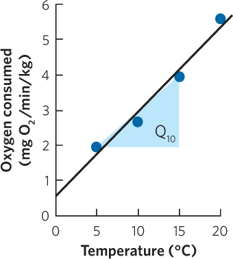
Based on the data, the Q10 between 5°C and 15°C is 2.0.
Analyzing Ecology
Each of the three soil treatments would be considered a categorical variable because they fall into distinct categories. In contrast, if we had considered three treatments such as 100 percent sand, 70 percent sand, and 40 percent sand, then we would have a continuous variable.
Graphing the Data
Analyzing Ecology
- a. It is a negative correlation.
- b. It is curvilinear.
Graphing the Data
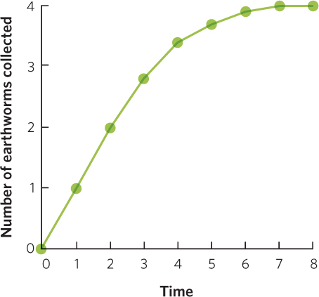
The data represent a correlation. The data also represent causation because increased time allows the birds to collect a greater number of earthworms.
Analyzing Ecology
Given the following equation:
Temperature = –1.2 × Latitude + 43
At a latitude of 10 degrees, the mean January temperature is
Temperature = –1.2 × 10 + 43 = 31°C
At a latitude of 20 degrees, the mean January temperature is
Temperature = –1.2 × 20 + 43 = 19°C
At a latitude of 30 degrees, the mean January temperature is
Temperature = –1.2 × 30 + 43 = 7°C
A-12
Graphing the Data
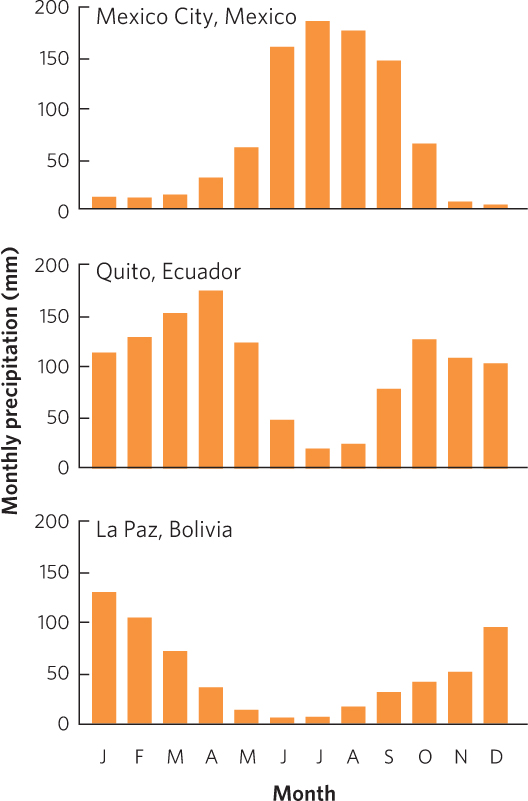
- a. Mexico City and La Paz have a single peak in precipitation whereas Quito has two peaks in precipitation.
- b. Peak precipitation occurs when the ITCZ passes overhead. Because of the different latitudes of the three cities, the ITCZ passes over Mexico City and La Paz once each year, but it passes over Quito twice each year.
Analyzing Ecology
Mean = 15.6
Median = 17
Mode = 17
The values differ because the mean measures the central tendency of the data by calculating the average value while the median ranks the data and uses the middle data point; the mode uses the commonly occurring value.
Graphing the Data
Analyzing Ecology
To determine the response to selection (R), we multiply the strength of selection on a trait (S) and the heritability of the trait (h2).
| S | h2 | R |
| 0.5 | 0.7 | 0.35 |
| 1 | 0.7 | 0.7 |
| 1.5 | 0.7 | 1.05 |
| 2 | 0.9 | 1.8 |
| 2 | 0.6 | 1.2 |
| 2 | 0.3 | 0.6 |
| 2 | 0 | 0 |
Based on the above results, the responses to selection (R) are greater whenever the strength of selection increases or the heritability of the trait increases.
Graphing the Data
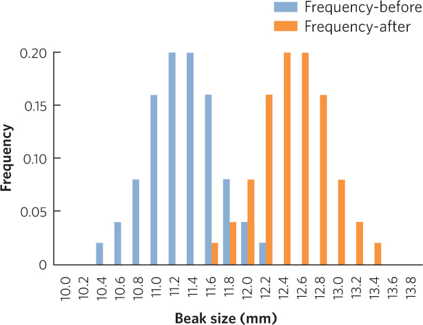
We can determine the mean beak size before or after selection by multiplying each beak depth by its frequency and then taking the sum of these products.
Mean beak size before selection = 11.3 mm
Mean beak size after selection = 12.5 mm
Because the mean beak depth has increased after selection, this set of data is an example of directional selection.
Analyzing Ecology
For Population A:
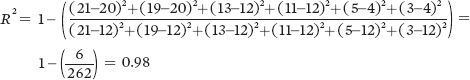
For Population B:

A-13
For Population C:
Because of the higher coefficient of determination, Population A provides the strongest confidence that there is a negative relationship between seed size and seed number.
Graphing the Data
Lizards that produce a larger number of eggs do so by producing smaller eggs.
Analyzing Ecology
If there are four males and five females:
Average male fitness = 10 gene copies ÷ 4 males
= 2.5 gene copies/male
Average female fitness = 10 gene copies ÷ 5 females
= 2.0 gene copies/female
If there are six males and five females:
Average male fitness = 10 gene copies ÷ 6 males
= 1.7 gene copies/male
Average female fitness = 10 gene copies ÷ 5 females
= 2.0 gene copies/female
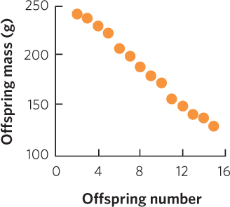
Over the long term, if either sex becomes rare, it will have higher fitness, which will subsequently cause it to become more common. Over the long term, this process will favor an equal sex ratio.
Graphing the Data
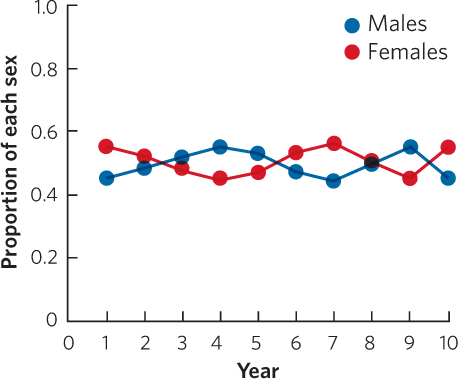
Whenever one of the sexes becomes rare, it subsequently becomes common. Over the long term, we tend toward an equal sex ratio.
Analyzing Ecology
If the fitness that primary helpers give to their parents declines to 1.0, their indirect fitness declines to 0.32 and their inclusive fitness declines to 0.73. Under this scenario, the secondary helper strategy would be the most favored by natural selection.
| YEAR 1 | YEAR 2 | |||||||
| MALE ROLE | B1 | r1 | INDIRECT FITNESS | B2 | r2 | Psm | DIRECT FITNESS | INCLUSIVE FITNESS |
| PRIMARY HELPER | 1.0 × 0.32 = 0.32 | 2.5 × 0.5 × 0.32 = 0.41 | 0.32 + 0.41 = 0.73 | |||||
| SECONDARY HELPER | 1.3 × 0.00 = 0.00 | 2.5 × 0.5 × 0.67 = 0.84 | 0.00 + 0.84 = 0.84 | |||||
| DELAYER | 0.0 × 0.00 = 0.00 | 2.5 × 0.5 × 0.23 = 0.29 | 0.00 + 0.29 = 0.29 | |||||
Graphing the Data
| SCHOOL SIZE | |||||
| TRIAL | 3 | 5 | 10 | 15 | 20 |
| 1 | 0.9 | 0.7 | 0.4 | 0.4 | 0.1 |
| 2 | 0.8 | 0.8 | 0.5 | 0.5 | 0.1 |
| 3 | 0.7 | 0.9 | 0.6 | 0.3 | 0.2 |
| 4 | 1.1 | 0.6 | 0.8 | 0.2 | 0.3 |
| 5 | 1.0 | 1.0 | 0.7 | 0.6 | 0.3 |
| MEAN | 0.90 | 0.80 | 0.60 | 0.40 | 0.20 |
| STANDARD DEVIATION | 0.16 | 0.16 | 0.16 | 0.16 | 0.10 |
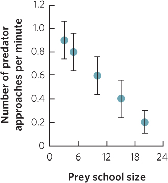
As the size of the prey school increases, there is a decline in the number of times a predator approaches.
Analyzing Ecology
Given the equation:
N = M × C ÷ R
N = 20 × 48 ÷ 24
N = 40
Because these 40 crayfish were found in a 300 m2 stretch of a stream, the density of the crayfish can be calculated as:
40 crayfish ÷ 300 m2 = 0.13 crayfish/m2
A-14
Graphing the Data
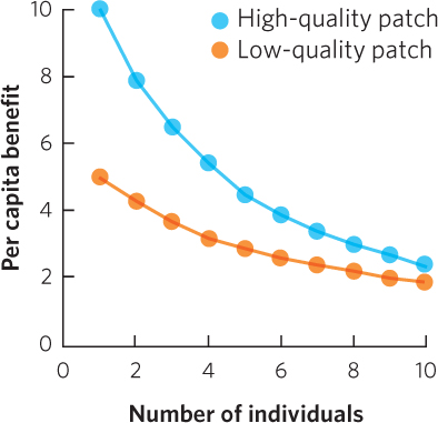
Once four individuals have arrived at the high-quality patch, the next individual to arrive would receive a larger per capita benefit by moving to the low-quality patch.
If there are 12 individuals, all individuals would gain the highest per capita benefit if 8 individuals remained in the high-quality patch and 4 individuals moved to the low-quality patch.
Analyzing Ecology
| AGE | SURVIVAL RATE | SURVIVORSHIP | FECUNDITY | ||
| (x) | (nx) | (lx) | (bx) | (lx)×(bx) | (x)×(lx)×(bx) |
| 0 | 530 | 1.000 | 0.05 | 0.05 | 0.00 |
| 1 | 134 | 0.253 | 1.28 | 0.32 | 0.32 |
| 2 | 56 | 0.116 | 2.28 | 0.26 | 0.53 |
| 3 | 39 | 0.089 | 2.28 | 0.20 | 0.61 |
| 4 | 23 | 0.058 | 2.28 | 0.13 | 0.53 |
| 5 | 12 | 0.039 | 2.28 | 0.09 | 0.44 |
| 6 | 5 | 0.025 | 2.28 | 0.06 | 0.34 |
| 7 | 2 | 0.022 | 2.28 | 0.05 | 0.35 |
Graphing the Data
Analyzing Ecology
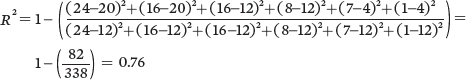
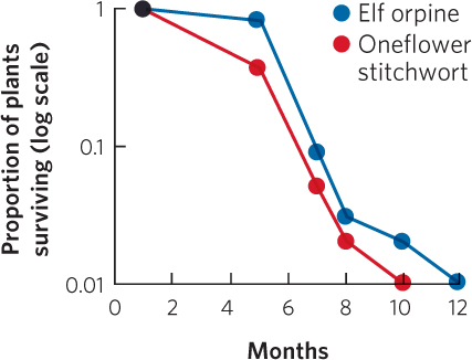
The population sizes from year 1 through 15 are as follows:
| YEAR | CHANGE IN POPULATION SIZE | TOTAL POPULATION SIZE |
| 1 | 10.0 | |
| 2 | 10.0 | 20.0 |
| 3 | 19.8 | 39.8 |
| 4 | 35.0 | 74.8 |
| 5 | 49.5 | 124.4 |
| 6 | 34.4 | 158.8 |
| 7 | –42.6 | 116.2 |
| 8 | –75.2 | 41.0 |
| 9 | –7.3 | 33.7 |
| 10 | 21.9 | 55.6 |
| 11 | 40.5 | 96.1 |
| 12 | 47.0 | 143.1 |
| 13 | 6.2 | 149.2 |
| 14 | –70.7 | 78.5 |
| 15 | –42.5 | 36.0 |
Given that the product rT = 1.1 × 1 = 1.1, we would expect the population will experience damped oscillations, which you can confirm from the graphed data.
Graphing the Data
| PROPORTION OF OCCUPIED PATCHES | PROBABILITY OF EXTINCTION | RATE OF EXTINCTION | PROBABILITY OF COLONIZATION | RATE OF COLONIZATION |
| p | e | e × p | c | (c × p) × 1 − p |
| 0.1 | 0.25 | 0.025 | 0.5 | 0.045 |
| 0.2 | 0.25 | 0.050 | 0.5 | 0.080 |
| 0.3 | 0.25 | 0.075 | 0.5 | 0.105 |
| 0.4 | 0.25 | 0.100 | 0.5 | 0.120 |
| 0.5 | 0.25 | 0.125 | 0.5 | 0.125 |
| 0.6 | 0.25 | 0.150 | 0.5 | 0.120 |
| 0.7 | 0.25 | 0.175 | 0.5 | 0.105 |
| 0.8 | 0.25 | 0.200 | 0.5 | 0.080 |
| 0.9 | 0.25 | 0.225 | 0.5 | 0.045 |
| 1 | 0.25 | 0.250 | 0.5 | 0 |
A-15
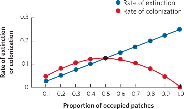
For these data, the rates of extinction and colonization come to equilibrium where the two lines meet when the proportion of occupied patches is 0.5. This can also be calculated using the equilibrium equation:
Analyzing Ecology
When we repeatedly sample the two distributions, we can conclude that they are significantly different if the two means do not overlap 95 percent of the time. This would happen when the two distributions are approximately two standard deviations apart from each other.
Graphing the Data
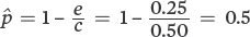
Because the number of caribou killed per wolf gradually slows as caribou density increases, the wolves most closely follow a type II functional response.
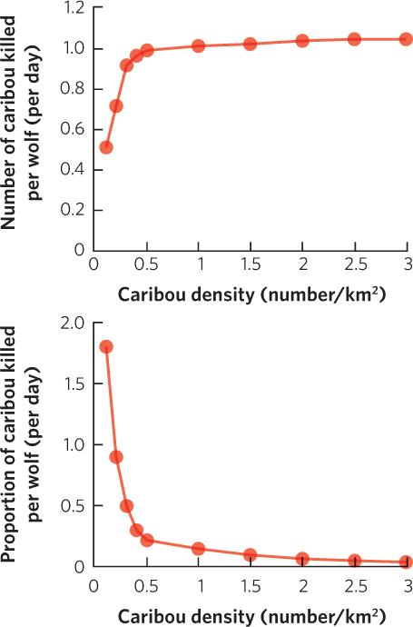
Analyzing Ecology
To calculate the t-value:
To calculate the degrees of freedom:
degrees of freedom = 8 + 8 − 2 = 14
Based on the statistical table for a t-test (see the Statistical Tables appendix), the critical value of t for 14 degrees of freedom and an alpha value of 0.05 is 2.1. Since our t-value exceeds the critical value from the table, we conclude that the two means are significantly different.
Graphing the Data
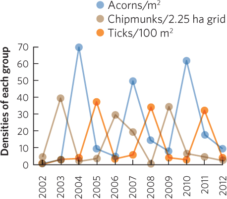
Based on the graph, one can see that the peak density of acorns is followed 1 year later by the peak density of chipmunks and 2 years later by the peak density of ticks.
Analyzing Ecology
Use the following equation for a Chi-square test:
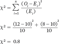
Degrees of freedom = (number of observed categories − 1) = (2 − 1) = 1
Using the Chi-square table in the Statistical Tables appendix, we can compare our calculated value (0.8) to the critical Chi-square value when we have 1 degree of freedom and an alpha value of 0.05. The critical Chi-square value is 3.841, which exceeds our Chi-square value. Thus, we conclude that our observed distribution of mice in the bare zone and in the grass is not significantly different from an equal distribution.
A-16
Graphing the Data
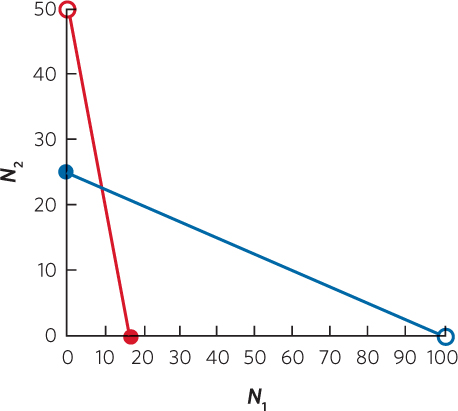
Based on this graph, the predicted outcome of this competition is that either of the two species can win, but it depends on the initial number of each species.
Analyzing Ecology
U = R1 − (n1 (n1 + 1) ÷ 2)
U = 40.5 − (8 (8 + 1) ÷ 2)
U = 40.5 − (72 ÷ 2)
U = 4.5
Using this value for R1, we can now calculate z:
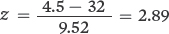
When we look up the critical value of z in the Statistical Tables appendix, we use the absolute value of z. As a result, both R1 and R2 provide us with values of z that have the same absolute value.
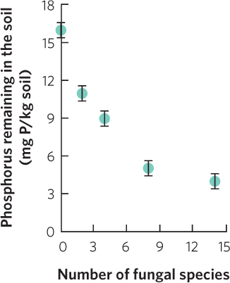
Graphing the Data
| NUMBER OF FUNGAL SPECIES | MEANPHOSPHORUS REMAINING INTHE SOI (mg p/kg soil) | STANDARD ERROR |
| 0 | 16.0 | 0.6 |
| 2 | 11.0 | 0.6 |
| 4 | 9.0 | 0.6 |
| 8 | 5.0 | 0.6 |
| 14 | 4.0 | 0.6 |
Analyzing Ecology
Simpson’s index
Community A:
Community B:
Community C:
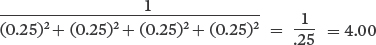
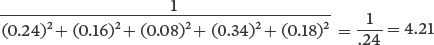
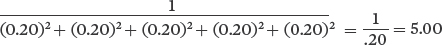
Shannon’s index
Community A:
−[(0.24) (ln 0.24)+(0.16) (ln 0.16)+(0.8)(ln 0.08)+(0.34) (ln 0.34)+(0.18) (ln 0.18)] = 1.51
Community B:
−[(0.20) (ln 0.20)+(0.20) (ln 0.20)+(0.20) (ln 0.20)+(0.20) (ln 0.20)+(0.20) (ln 0.20)] = 1.61
Community C:
−[(0.25) (ln 0.25)+(0.25) (ln 0.25)+(0.25)(ln 0.25)+(0.25) (ln 0.25)] = 1.39
For both indexes, greater evenness with the same richness provides a higher index value. When evenness is identical, the community with the higher richness has a higher index value.
Graphing the Data
A-17
Analyzing Ecology
Comparing Communities A and B:
Comparing Communities A and C:
Comparing Communities B and C:
Based on these calculations, Communities A and B are the most similar to each other.
Graphing the Data
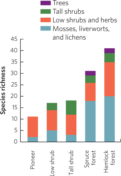
Over time, the composition of the seral stages changes, but total species richness continually increases.
Analyzing Ecology
Lake ecosystem
Consumption efficiency = 65%
Assimilation efficiency = 70%
Net production efficiency = 42%
Ecological efficiency = 19%
Stream ecosystem
Consumption efficiency = 65%
Assimilation efficiency = 38%
Net production efficiency = 40%
Ecological efficiency = 10%
The two aquatic ecosystems have higher ecological efficiencies than the terrestrial ecosystem primarily due to higher consumption efficiencies.
In this example, the lower ecological efficiency in the stream ecosystem compared to the lake ecosystem is caused by a lower assimilation efficiency in the stream ecosystem.
Graphing the Data
| TERRESTRIAL ECOSYSTEMS | NPP (g/m2/yr) | AREA (106km2) | TOTAL PR0DUCTION (1012kg/yr) |
| Tropical rainforest | 2,000 | 17.0 | 34.00 |
| Tropical seasonal forest | 1,500 | 7.5 | 11.25 |
| Temperate rainforest | 1,300 | 5.0 | 0.01 |
| Temperate seasonal forest | 1,200 | 7.0 | 8.40 |
| Boreal forest | 800 | 12.0 | 9.60 |
| Savanna | 700 | 15.0 | 10.50 |
| Cultivated land | 650 | 14.0 | 9.10 |
| Woodland/shrubland | 600 | 8.0 | 4.80 |
| Temperate grassland | 500 | 9.0 | 4.50 |
| Tundra | 140 | 8.0 | 1.12 |
| Desert shrub | 70 | 18.0 | 1.26 |
| AQUATIC ECOSYSTEMS | |||
| Swamp and marsh | 2,500 | 2.0 | 5.00 |
| Coral reef | 2,000 | 0.6 | 1.20 |
| Salt marsh | 1,800 | 1.4 | 2.52 |
| Upwelling zones | 500 | 0.4 | 0.20 |
| Lake and stream | 500 | 2.5 | 1.25 |
| Continental shelf | 360 | 26.6 | 9.58 |
| Open ocean | 125 | 332.0 | 41.50 |
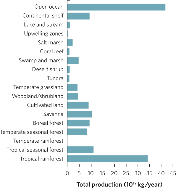
Some areas, such as the open ocean, do not have a high productivity per unit area, but the total area is so large that it contributes a relatively large amount to total production. In contrast, some highly productive ecosystems, such as swamps and marshes, do not cover a large area so they contribute a relatively small amount of total production.
A-18
Analyzing Ecology
We can calculate these answers using the following equation: mt = mo e–kt
For k = 0.05
After 10 days: mt = mo e–kt = 100 e–(0.05)(10) = 61 grams
After 50 days: mt = mo e–kt = 100 e–(0.05)(50) = 8.2 grams
After 100 days: mt = mo e–kt = 100 e–(0.05)(100) = 0.7 grams
For k = 0.10
After 10 days: mt = mo e–kt = 100 e–(0.10)(10) = 37 grams
After 50 days: mt = mo e–kt = 100 e–(0.10)(50) = 0.7 grams
After 100 days: mt = mo e–kt = 100 e–(0.10)(100) = 0.0 grams
Graphing the Data
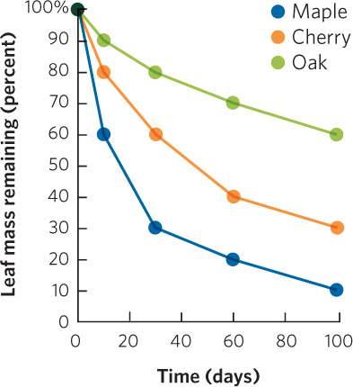
Based on this graph, maple leaves have the highest value of k.
Analyzing Ecology
For this problem, we will use the following equation:
For Community B:
For Community C:
The greater the number of species represented by a single individual, the greater the estimated number of species in the community.
Graphing the Data
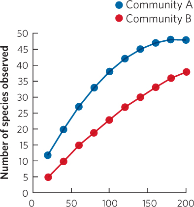
Community A has been sampled sufficiently enough to provide a good estimate of species richness, as evidenced by the fact that the species accumulation curve reaches a plateau. In contrast, the curve for Community B suggests that more sampling needs to be conducted before a plateau is achieved.
Analyzing Ecology
We can make use of the equation that calculates half-lives:
t1/2 = t ln(2) ÷ ln(N0 ÷ Nt)
t1/2 = (1) ln(2) ÷ ln(50 ppb ÷ 10 ppb)
t1/2 = 0.69 ÷ 1.61
t1/2 = 0.43 days
Graphing the Data
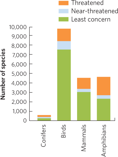
When we look at the absolute numbers in each category, we are able not only to have a sense of the proportion of species that fall within each category, but also to know the absolute number in each category. For example the percentage of threatened mammals is about twice that of birds, but the total number of threatened birds and mammals is about the same. In addition, the percentage of threatened mammals and conifers is similar, but the actual number of threatened mammals is more than six times higher.