Understanding the Process of Creating Graphics
Creating graphics involves planning, producing, revising, and citing.
PLANNING GRAPHICS
Whether you focus first on the text or the graphics, consider the following four issues as you plan your graphics.
Audience. Will readers understand the kinds of graphics you want to use? Will they know the standard icons in your field? Are they motivated to read your document, or do you need to enliven the text—
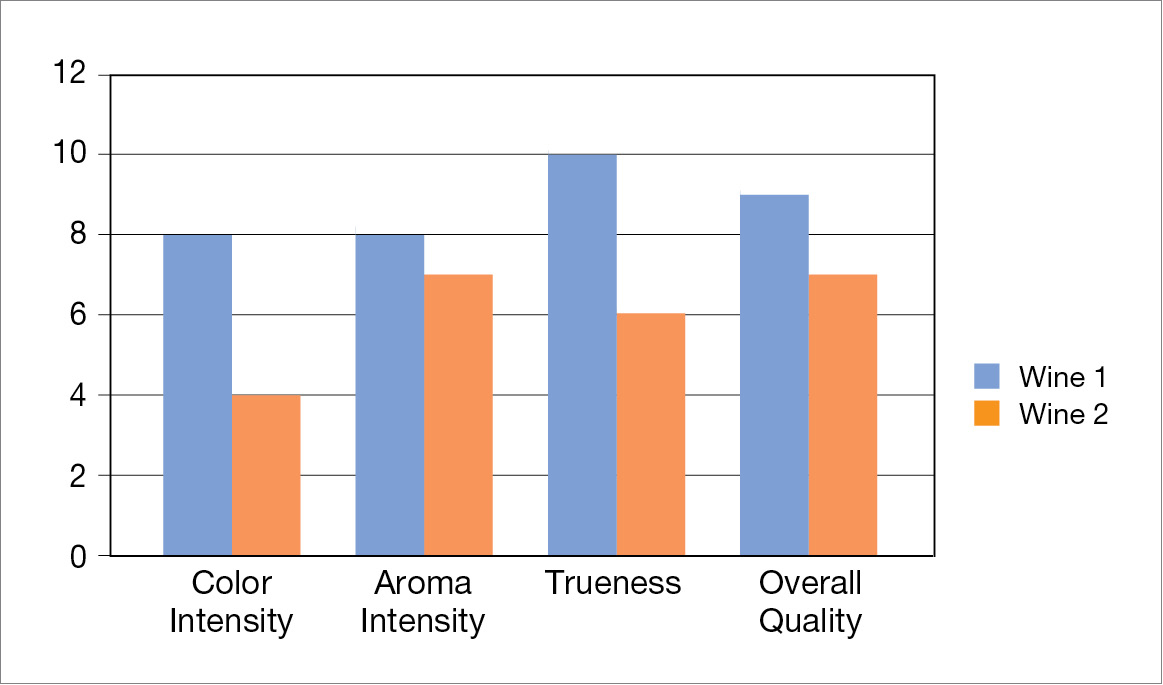
for example, by adding color for emphasis— to hold their attention? General audiences know how to read common types of graphics, such as those that appear frequently in newspapers or on popular websites. A general audience, for example, could use this bar graph to compare two bottles of wine: 
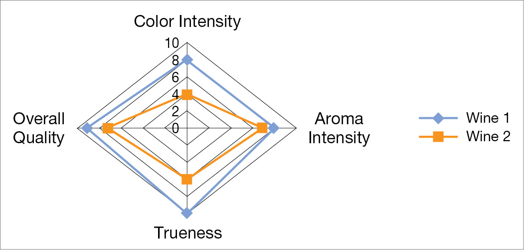
However, they would probably have trouble with the following radar graph:
 Page 202
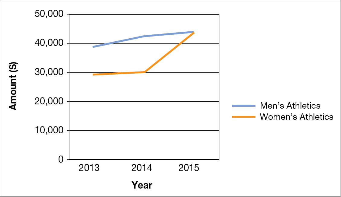
Purpose. What point are you trying to make with the graphic? Imagine what you want your readers to know and do with the information. For example, if you want readers to know the exact dollar amounts spent on athletics by a college, use a table:
Year Men’s Athletics ($) Women’s Athletics ($) 2013 38,990 29,305 2014 42,400 30,080 2015 44,567 44,213 If you want readers to know how spending on athletics is changing over time, use a line graph:

The kind of information you want to communicate. Your subject will help you decide what type of graphic to include. For example, in writing about languages spoken by your state’s citizens, you might use a table for the statistical data, a map for the patterns of language use, and a graph for statistical trends over time.
Physical conditions. The physical conditions in which readers will use the document—
amount of lighting, amount of surface space available, the size of the screen on which the information will be displayed, and so forth— will influence the type of graphic as well as its size and shape, the thickness of lines, the size of type, and the color.
As you plan how you are going to create the graphics, consider four important factors:
Time. Because making a complicated graphic can take a lot of time, you need to establish a schedule.
Money. Creating a high-
quality graphic can be expensive. How big is the project budget? How can you use that money effectively? Equipment. Determine what tools and software you will require, such as spreadsheets for tables and graphs or graphics software for diagrams.
Expertise. How much do you know about creating graphics? Do you have access to the expertise of others?
ETHICS NOTE
CREATING HONEST GRAPHICS
Follow these six suggestions to ensure that you represent data honestly in your graphics.
If you did not create the graphic or generate the data, cite your source. If you want to publish a graphic that you did not create, obtain permission. For more on citing graphics, see “Citing Sources of Graphics,” below.
Include all relevant data. For example, if you have a data point that you cannot explain, do not change the scale to eliminate it.
Begin the axes in your graphs at zero—
or mark them clearly— so that you represent quantities honestly. Do not use a table to hide a data point that would be obvious in a graph.
Show items as they really are. Do not manipulate a photograph of a computer monitor to make the screen look bigger than it is, for example.
Do not use color or shading to misrepresent an item’s importance. A light-
shaded bar in a bar graph, for example, appears larger and nearer than a dark- shaded bar of the same size.
Common problem areas are pointed out in the discussions of various kinds of graphics throughout this chapter.
PRODUCING GRAPHICS
Usually, you won’t have all the resources you would like. You will have to choose one of the following four approaches:
Use existing graphics. For a student paper that will not be published, some instructors allow the use of photocopies or scans of existing graphics; other instructors do not. For a document that will be published, whether written by a student or a professional, using an existing graphic is permissible if the graphic is in the public domain (that is, not under copyright), if it is the property of the writer’s organization, or if the organization has obtained permission to use it. Be particularly careful about graphics you find on the web. Many people mistakenly think that anything on the web can be used without permission. The same copyright laws that apply to printed material apply to web-
based material, whether words or graphics. For more on citing graphics, see “Citing Sources of Graphics,” below. Page 204Aside from the issue of copyright, think carefully before you use existing graphics. The style of the graphic might not match that of the others you want to use; the graphic might lack some features you want or include some you don’t. If you use an existing graphic, assign it your own number and title.
Modify existing graphics. You can redraw an existing graphic or use a scanner to digitize the graphic and then modify it electronically with graphics software.
Create graphics on a computer. You can create many kinds of graphics using your spreadsheet software and the drawing tools on your word processor. Consult the Selected Bibliography for a list of books about computers and technical communication.
Have someone else create the graphics. Professional-
level graphics software can cost hundreds of dollars and require hundreds of hours of practice. Some companies have technical- publications departments with graphics experts, but others subcontract this work. Many print shops and service bureaus have graphics experts on staff or can direct you to them.
Integrating Graphics and Text

It is not enough to add graphics to your text; you have to integrate the two.
Place the graphic in an appropriate location. If readers need the graphic in order to understand the discussion, put it directly after the relevant point in the discussion or as soon after it as possible. If the graphic merely supports or elaborates a point, include it as an appendix.
Introduce the graphic in the text. Whenever possible, refer to a graphic before it appears (ideally, on the same page). Refer to the graphic by number (such as “see Figure 7”). Do not refer to “the figure above” or “the figure below,” because the graphic might move during the production process. If the graphic is in an appendix, cross-
reference it: For complete details of the operating characteristics, see Appendix B. Explain the graphic in the text. State what you want readers to learn from it. Sometimes a simple paraphrase of the title is enough: “Figure 2 compares the costs of the three major types of coal gasification plants.” At other times, however, you might need to explain why the graphic is important or how to interpret it. If the graphic is intended to make a point, be explicit:
As Figure 2 shows, a high-
sulfur bituminous coal gasification plant is more expensive than either a low- sulfur bituminous or an anthracite plant, but more than half of its cost is for cleanup equipment. If these expenses could be eliminated, high- sulfur bituminous would be the least expensive of the three types of plants. In addition to text explanations, graphics are often accompanied by captions, ranging from a sentence to several paragraphs.
For more about white space, screens, boxes, and rules, see “Designing Print Documents” in Ch. 7. For more about lists of illustrations, see “Writing Recommendation Reports” in Ch. 13.
Make the graphic clearly visible. Distinguish the graphic from the surrounding text by adding white space around it, placing rules (lines) above and below it, putting a screen behind it, or enclosing it in a box.
Make the graphic accessible. If the document is more than a few pages long and contains more than four or five graphics, consider including a list of illustrations so that readers can find them easily.
REVISING GRAPHICS
As with any other aspect of technical communication, build in enough time and budget enough money to revise the graphics you want to use. Create a checklist and evaluate each graphic for effectiveness. The Writer’s Checklist at the end of this chapter is a good starting point. Show your graphics to people whose backgrounds are similar to those of your intended readers and ask them for suggestions. Revise the graphics and solicit more reactions.
CITING SOURCES OF GRAPHICS
For more about copyright, see “Your Ethical and Legal Obligations” in Ch. 2.
If you wish to publish a graphic that is protected by copyright (even if you have revised it), you need to obtain written permission from the copyright holder. Related to the issue of permission is the issue of citation. Of course, you do not have to cite the source of a graphic if you created it yourself, if it is not protected by copyright, or if your organization owns the copyright.
In all other cases, however, you should include a source citation, even if your document is a course assignment and will not be published. Citing the sources of graphics, even those you have revised substantially, shows your instructor that you understand professional conventions and your ethical responsibilities.
If you are following a style manual, check to see whether it presents a format for citing sources of graphics. In addition to citing a graphic’s source in the reference list, most style manuals call for a source statement in the caption:
For more about style manuals, see Appendix, Part A.
PRINT SOURCE
Source: Verduijn, 2015, p. 14. Copyright 2015 by Tedopres International B.V. Reprinted with permission.
ONLINE SOURCE
Source: Johnson Space Center Digital Image Collection. Copyright 2015 by NASA. Reprinted with permission.
If your graphic is based on an existing graphic, the source statement should state that the graphic is “based on” or “adapted from” your source:
Source: Adapted from Jonklaas et al., 2011, p. 771. Copyright 2008 by American Medical Association. Reprinted with permission.