Section 2.3 Exercises
CLARIFYING THE CONCEPTS
Question 2.279
1. Explain the difference between a frequency distribution and a cumulative frequency distribution. (p. 87)
2.3.1
A frequency distribution gives the frequency counts for each class (grouped or ungrouped). A cumulative frequency distribution gives the number of values that are less than or equal to the upper limit of a given class for grouped data or it gives the number of values that are less than or equal to a given number for ungrouped data.
Question 2.280
2. Explain the difference between a cumulative frequency distribution and a cumulative relative frequency distribution. (p. 87)
Question 2.281
3. What is the graphical equivalent of a cumulative frequency distribution? (p. 88)
2.3.3
Ogive.
Question 2.282
4. Explain how to construct an ogive. (p. 88)
Question 2.283
5. What do we call data that are analyzed with respect to time? (p. 89)
2.3.5
Time series data.
Question 2.284
6. Explain how to construct a time series plot. (p. 89)
PRACTICING THE TECHNIQUES
 CHECK IT OUT!
| To do | Check out | Topic |
|---|---|---|
| Exercises 9–12 | Example 22 | Cumulative frequency and cumulative relative frequency distributions |
| Exercises 13–16 | Example 23 | Ogives |
| Exercises 17–18 |
Examples 24 and 25 |
Time series plots |
The U.S. Census Bureau reported in 2014 that the relative frequency of the age of the head of the household is as shown in Table 38 (for those with heads of households younger than age 65). Use Table 38 to construct the following graphical summaries of the variable age.
| Age | Frequency (millions) |
Relative frequency |
|---|---|---|
| 15to<35 | 22.7 | 0.24 |
| 35to<45 | 22.2 | 0.24 |
| 45to<55 | 25.8 | 0.27 |
| 55to<65 | 23.2 | 0.25 |
Question 2.285
7. Cumulative frequency distribution
2.3.7
| Age | Frequency (millions) | Relative frequency | Cumulative frequency (millions) | Cumulative relative frequency |
|---|---|---|---|---|
| 15≤x<35 | 22.7 | 0.24 | 22.7 | 0.24 |
| 35≤x<45 | 22.2 | 0.24 | 22.7+22.2=44.9 | 0.24+0.24=0.48 |
| 45≤x<55 | 25.8 | 0.27 | 22.7+22.2+25.8=70.7 | 0.24+0.24+0.27=0.75 |
| 55≤x<65 | 23.2 | 0.25 | 22.7+22.2+25.8+23.2=93.9 | 0.24+0.24+0.27+0.25=1.00 |
Question 2.286
8. Cumulative relative frequency distribution
For Exercises 9–12, do the following:
- Construct a cumulative frequency distribution for the indicated data.
- Build a cumulative relative frequency distribution for the indicated data.
Question 2.287
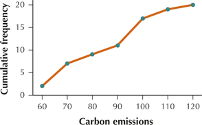
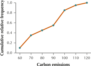
9. Carbon emissions data from Table 20 on page 63.
2.3.9
(a) and (b)
| Carbon emissions | Frequency | Relative frequency | Cumulative frequency | Cumulative relative frequency |
|---|---|---|---|---|
| 50≤x<60 | 2 | 2/20=0.10 | 2 | 0.10 |
| 60≤x<70 | 5 | 5/20=0.25 | 2+5=7 | 0.10+0.25=0.35 |
| 70≤x<70 | 2 | 2/20=0.10 | 2+5+2=9 | 0.10+0.25+0.10=0.45 |
| 80≤x<90 | 2 | 2/20=0.10 | 2+5+2+2=11 | 0.10+0.25+0.10+0.10=0.55 |
| 90≤x<100 | 6 | 6/20=0.30 | 2+5+2+2+6=17 | 0.10+0.25+0.10+0.10+0.30=0.85 |
| 100≤x<110 | 2 | 2/20=0.10 | 2+5+2+2+6+2=19 | 0.10+0.25+0.10+0.10+0.30+0.10=0.95 |
| 110≤x<120 | 1 | 1/20=0.25 | 2+5+2+2+6+2+1=20 | 0.10+0.25+0.10+0.10+0.30+0.10+0.05=1.00 |
| Total | 20 | 20/20 = 1.00 |
Question 2.288
10. Unemployment data from Table 22 on page 65.
Question 2.289
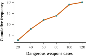
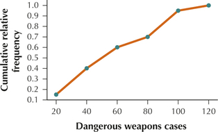
11. Dangerous weapons data from Table 23 on page 68.
2.3.11
(a) and (b)
| Dangerous weapons cases | Frequency | Relative frequency | Cumulative frequency | Cumulative relative frequency |
|---|---|---|---|---|
| 0≤x<20 | 3 | 3/20=0.15 | 3 | 0.15 |
| 20≤x<40 | 5 | 5/20=0.25 | 8 | 0.40 |
| 40≤x<60 | 4 | 4/20=0.20 | 12 | 0.60 |
| 60≤x<80 | 2 | 2/20=0.10 | 14 | 0.70 |
| 80≤x<100 | 5 | 5/20=0.25 | 19 | 0.95 |
| 100≤x<120 | 1 | 1/20=0.05 | 20 | 1.00 |
| Total | 20 | 1.00 |
Question 2.290
12. Brooklyn frauds 2013 data from Table 31 on page 82.
For Exercises 13–16, do the following:
- Construct a frequency ogive for the indicated data.
- Build a relative frequency ogive for the indicated data.
Question 2.292
14. Unemployment data from Table 22 on page 65.
Question 2.294
16. Brooklyn frauds 2013 data from Table 31 on page 82.
Question 2.295
harassment
17.  The following time series data represent the number of aggravated harassment cases handled by New York City Police Precinct 1 from 2000 to 2013.
- Construct the time series graph of the data.
- Describe any patterns you see.
| Year | 2000 | 2001 | 2002 | 2003 | 2004 | 2005 | 2006 |
|---|---|---|---|---|---|---|---|
| Cases | 547 | 568 | 476 | 475 | 450 | 445 | 379 |
| Year | 2007 | 2008 | 2009 | 2010 | 2011 | 2012 | 2013 |
| Cases | 424 | 404 | 425 | 429 | 343 | 400 | 400 |
2.3.17
(a)
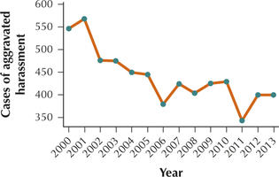
(b) Generally decreasing
Question 2.296
petitlarceny5
18.
The following time series data represent the number of petit larceny cases handled by New York City Police Precinct 5 from 2000 to 2013.
- Construct the time series graph of the data.
- Describe any patterns you see.
| Year | 2000 | 2001 | 2002 | 2003 | 2004 | 2005 | 2006 |
|---|---|---|---|---|---|---|---|
| Cases | 909 | 846 | 834 | 793 | 798 | 871 | 808 |
| Year | 2007 | 2008 | 2009 | 2010 | 2011 | 2012 | 2013 |
| Cases | 859 | 1020 | 1014 | 1263 | 1197 | 1240 | 1288 |
APPLYING THE CONCEPTS
Question 2.297
19. Unemployment Rate. The frequency ogive below represents the unemployment rate (in percentages) for 367 cities nationwide.9
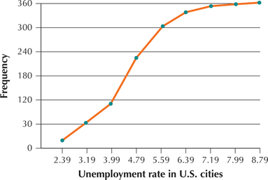
- What is the class width?
- What is the upper class limit of the leftmost class?
- What is the class midpoint of the leftmost class?
2.3.19
(a) 0.8 (b) 2.39 (c) 1.99
Question 2.298
20. Refer to the frequency ogive of unemployment rates.
- About how many cities have unemployment rates 3.99 and below?
- About how many cities have unemployment rates 5.59 and below?
- About how many cities have unemployment rates 5.6 and above?
Question 2.299
maunaloa2
21. Atmospheric Carbon Dioxide. Table 39 contains the amount of carbon dioxide in parts per million (ppm) found in the atmosphere above Mauna Loa, Hawaii, measured monthly from October 2012 to September 2013.
- Construct a time series plot of these data.
- Describe the pattern you see.
| Month | Carbon dioxide (ppm) |
Month | Carbon dioxide (ppm) |
|---|---|---|---|
| Oct. | 391.01 | Apr. | 398.35 |
| Nov. | 392.81 | May | 399.76 |
| Dec. | 394.28 | June | 398.58 |
| Jan. | 395.54 | July | 397.20 |
| Feb. | 396.80 | Aug. | 395.15 |
| Mar. | 397.31 | Sept. | 393.51 |
2.3.21
(a)
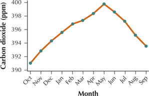
(b) The level of carbon dioxide increases from October to May and decreases from May to September.
Question 2.300
22. Medicare. Table 40 contains a time series of the number of enrollees (in millions) in Medicare from 1987 to 2012.
| Year | Enrollees | Year | Enrollees | Year | Enrollees |
|---|---|---|---|---|---|
| 1987 | 30 | 1996 | 35 | 2005 | 40 |
| 1988 | 31 | 1997 | 36 | 2006 | 40 |
| 1989 | 31 | 1998 | 36 | 2007 | 41 |
| 1990 | 32 | 1999 | 37 | 2008 | 43 |
| 1991 | 33 | 2000 | 38 | 2009 | 43 |
| 1992 | 33 | 2001 | 38 | 2010 | 45 |
| 1993 | 33 | 2002 | 39 | 2011 | 47 |
| 1994 | 34 | 2003 | 40 | 2012 | 49 |
| 1995 | 35 | 2004 | 40 |
Question 2.301
23. Refer to your time series plot from the preceding exercise. The increase in the number of enrollees is fairly constant and then becomes steeper. In what year does this change occur?
2.3.23
2009
Agricultural Exports. For Exercises 24–26, refer to Table 41. The table gives the value of agricultural exports (in billions of dollars) from the top 20 U.S. states in 2009.
| State | Exports | State | Exports |
|---|---|---|---|
| California | 12.5 | Arkansas | 2.6 |
| Iowa | 6.5 | North Dakota | 5.2 |
| Texas | 4.7 | Ohio | 2.7 |
| Illinois | 5.5 | Florida | 2.1 |
| Nebraska | 4.8 | Wisconsin | 2.2 |
| Kansas | 4.7 | Missouri | 2.7 |
| Minnesota | 4.3 | Georgia | 1.8 |
| Washington | 3.0 | Pennsylvania | 1.7 |
| North Carolina | 2.9 | Michigan | 1.6 |
| Indiana | 3.1 | South Dakota | 2.3 |
Question 2.302
agriexports
24. Construct a cumulative frequency distribution of agricultural exports. Start at $0 and use class widths of $2 billion.
- How many states have exports of less than $4 billion?
- How many states have exports of less than $6 billion?
- How many states have exports of at least $6 billion?
Question 2.303
agriexports
25. Construct a cumulative relative frequency distribution of agricultural exports. Start at $0 and use class widths of $2 billion.
- What proportion of states has exports of less than $4 billion?
- What proportion of states has exports of less than $6 billion?
- What proportion of states has exports of at least $6 billion?
2.3.25
| Agricultural exports (in billions of dollars) | Frequency | Relative frequency | Cumulative relative frequency |
|---|---|---|---|
| $0−$1.9 | 3 | 0.15 | 0.15 |
| $2.0−$3.9 | 9 | 0.45 | 0.60 |
| $4.0−$5.9 | 6 | 0.30 | 0.90 |
| $6.0−$7.9 | 1 | 0.05 | 0.95 |
| $8.0−$9.9 | 0 | 0 | 0.95 |
| $10.0−$11.9 | 0 | 0 | 0.95 |
| $12.0−$13.9 | 1 | 0.05 | 1.00 |
| Total | 20 | 1.00 |
(a) 0.60 (b) 0.90 (c) 0.10
Question 2.304
agriexports
26. Use your cumulative relative frequency distribution to construct a relative frequency ogive of agricultural exports.
Question 2.305
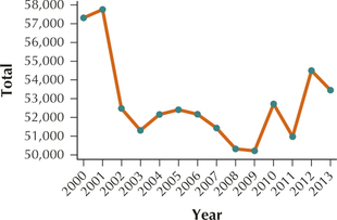
percapitaincome
27. Per Capita Income. The following data represent the per capita income in the United States from 1967 to 2012, in thousands of constant (2012) dollars.
| Year | Per capita income $1000s |
Year | Per capita income $1000s |
Year | Per capita income $1000s |
|---|---|---|---|---|---|
| 1967 | 15 | 1983 | 21 | 1998 | 28 |
| 1968 | 16 | 1984 | 22 | 1999 | 29 |
| 1969 | 17 | 1985 | 22 | 2000 | 30 |
| 1970 | 17 | 1986 | 23 | 2001 | 30 |
| 1971 | 17 | 1987 | 24 | 2002 | 29 |
| 1972 | 18 | 1988 | 24 | 2003 | 29 |
| 1973 | 19 | 1989 | 25 | 2004 | 29 |
| 1974 | 19 | 1990 | 25 | 2005 | 29 |
| 1975 | 19 | 1991 | 24 | 2006 | 30 |
| 1976 | 19 | 1992 | 24 | 2007 | 30 |
| 1977 | 20 | 1993 | 25 | 2008 | 29 |
| 1978 | 21 | 1994 | 25 | 2009 | 28 |
| 1979 | 21 | 1995 | 26 | 2010 | 28 |
| 1980 | 21 | 1996 | 26 | 2011 | 28 |
| 1981 | 21 | 1997 | 27 | 2012 | 28 |
| 1982 | 21 |
- Construct a time series plot of the per capita income.
- A fairly constant increasing trend occurs. In what year does this trend appear to end?
2.3.27
(a)
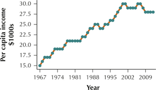
(b) 2008
Question 2.306
flrainfall
28. Rainfall in Fort Lauderdale. The following data represent the total monthly rainfall (in inches) in 2013 in Fort Lauderdale, Florida, as reported by the U.S. Historical Climatology Network.
| Jan. | 0.55 | July | 15.54 |
| Feb. | 2.39 | Aug. | 3.33 |
| Mar. | 0.15 | Sept. | 6.78 |
| Apr. | 3.99 | Oct. | 5.8 |
| May | 13.63 | Nov. | 11.61 |
| June | 13.63 | Dec. | 1.11 |
- Construct a time series plot of the data.
- Is it wetter in summer or winter in Fort Lauderdale?
Question 2.307
 29. In Exercise 28, what if we add 3 inches to each month's rainfall amount. Describe how this would affect the time series plot. What would change? What would stay the same?
2.3.29
The only change would be that the entire time series graph would shift up 3 units. The horizontal scale would stay the same and the shape of the graph would stay the same.
Question 2.308
12thsmokers
30. Cigarette use among 12th-Graders. Table 42 presents the percentages of 12th-graders who smoke cigarettes, for the years 1980–2009.
- Construct a time series plot of the data.
- Describe any trends that you see.
| Year | Percent | Year | Percent |
|---|---|---|---|
| 1980 | 30.5 | 1995 | 33.5 |
| 1981 | 29.4 | 1996 | 34.0 |
| 1982 | 30.0 | 1997 | 36.5 |
| 1983 | 30.3 | 1998 | 35.1 |
| 1984 | 29.3 | 1999 | 34.6 |
| 1985 | 30.1 | 2000 | 31.4 |
| 1986 | 29.6 | 2001 | 29.5 |
| 1987 | 29.4 | 2002 | 26.7 |
| 1988 | 28.7 | 2003 | 24.4 |
| 1989 | 28.6 | 2004 | 25.0 |
| 1990 | 29.4 | 2005 | 23.2 |
| 1991 | 28.3 | 2006 | 21.6 |
| 1992 | 27.8 | 2007 | 21.6 |
| 1993 | 29.9 | 2008 | 20.4 |
| 1994 | 31.2 | 2009 | 20.1 |
Question 2.309
miamideptcorrections
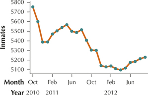
31. Miami arrests. The Miami-Dade Department of Corrections and Rehabilitation publishes its monthly average daily population of inmates in its Annual Report. Table 43 shows the average daily number of inmates from October 2010 through September 2012. Construct a time series graph of the data.
| Month | Inmates | Month | Inmates | Month | Inmates |
|---|---|---|---|---|---|
| Oct 2010 | 5753 | Jun 2011 | 5500 | Feb 2012 | 5138 |
| Nov 2010 | 5600 | Jul 2011 | 5486 | Mar 2012 | 5111 |
| Dec 2010 | 5387 | Aug 2011 | 5515 | Apr 2012 | 5097 |
| Jan 2011 | 5388 | Sep 2011 | 5406 | May 2012 | 5117 |
| Feb 2011 | 5471 | Oct 2011 | 5304 | Jun 2012 | 5175 |
| Mar 2011 | 5504 | Nov 2011 | 5201 | Jul 2012 | 5185 |
| Apr 2011 | 5538 | Dec 2011 | 5141 | Aug 2012 | 5214 |
| May 2011 | 5567 | Jan 2012 | 5129 | Sept 2012 | 5229 |
2.3.31
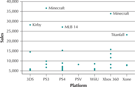
Individual Value Plot. Have you played Minecraft? On which platform did you play it? Figure 53 represents an individual value plot of video game sales for the week of May 17, 2014, separated by platform. An individual value plot is similar to a dotplot for different categories, which is rendered vertically. Each dot represents the sales for a particular video game. The top five sellers are labeled. Minecraft was the biggest seller that week, with the PS3 version slightly outselling the Xbox 360 version. Use this information for Exercises 32 and 33.
Question 2.310
32. Which platform is indicated by MLB 14?
Question 2.311
33. Are sales higher for the top-performing title for Xbox One (“Xone”) or 3DS?
2.3.33
3DS
WORKING WITH LARGE DATA SETS
Assault.
Open the Assault data set, which contains the number of third-degree assaults per precinct for the years 2000–2013. Use technology to do the following:
Question 2.312
34. Construct a time series plot of the number of third-degree assaults in Precinct 1 from 2000 to 2013. Describe any patterns you see.
Question 2.313
35. For each year, calculate the sum of the number of third-degree assaults, across all precincts.
2.3.35
Question 2.314
36. Build a time series plot of the total number of third-degree assaults, across all precincts. Describe any patterns you see.