3.3 How to Build a Graph
In this section, you will learn how to choose the most appropriate type of graph and then use a checklist to ensure that the graph conforms to APA style. We also discuss innovative graphs that highlight the exciting future of graphing. Innovations in graphing can help us to deliver a persuasive message, much like that conveyed by Florence Nightingale’s coxcomb graph.
Choosing the Appropriate Type of Graph
MASTERING THE CONCEPT
3-
When deciding what type of graph to use, first examine the variables. Decide which is the independent variable and which is the dependent variable. Also, identify which type of variable—
After assessing the types of variables that are in the study, use the following guidelines to select the appropriate graph:
If there is one scale variable (with frequencies), use a histogram or a frequency polygon (Chapter 2).
If there is one scale independent variable and one scale dependent variable, use a scatterplot or a line graph. (Figure 3-9 on page 55 provides an example of how to use more than one line on a time plot.)
If there is one nominal or ordinal independent variable and one scale dependent variable, use a bar graph. Consider using a Pareto chart if the independent variable has many levels.
If there are two or more nominal or ordinal independent variables and one scale dependent variable, use a bar graph.
How to Read a Graph
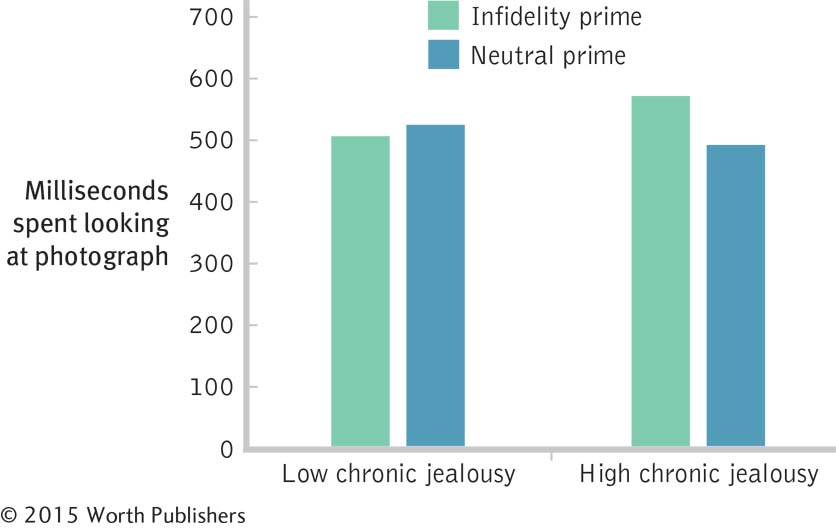
Let’s use the graph in Figure 3-16 to confirm your understanding of independent and dependent variables. This study of jealousy (Maner, Miller, Rouby, & Gailliot, 2009) includes two independent variables: level of jealousy (whether or not a participant is low or high in chronic jealousy) and how people were primed (whether they were primed to think about infidelity or about a neutral topic). People primed to think about infidelity visualized and wrote about a time when they had infidelity-
Here are the critical questions you need to ask in order to understand the graph of the findings of the jealousy study. A well-
What variable are the researchers trying to predict? That is, what is the dependent variable?
Is the dependent variable nominal, ordinal, or scale?
What are the units of measurement on the dependent variable? For example, if the dependent variable is IQ as measured by the Wechsler Adult Intelligence Scale, then the possible scores are the IQ scores themselves, ranging from 0 to 145.
What variables did the researchers use to predict this dependent variable? That is, what are the independent variables?
Are these two independent variables nominal, ordinal, or scale?
What are the levels for each of these independent variables?

Two Independent Variables
When graphing a data set that has two independent variables, show one independent variable on the x-axis (in this case, chronic jealousy—
Now check your answers:
The dependent variable is time, in milliseconds.
Milliseconds is a scale variable.
Milliseconds can range from 0 on up. In this case, no average exceeds 600 milliseconds.
The first independent variable is level of jealousy; the second independent variable is priming condition.
Level of jealousy is an ordinal variable, but it can be treated as a nominal variable in the graph; priming condition is a nominal variable.
The levels for jealousy condition are low chronic jealousy and high chronic jealousy. The levels for priming condition are infidelity and neutral.
Because there are two independent variables—
Guidelines for Creating a Graph
Here is a helpful checklist of questions to ask when you encounter a graph or when you’re creating a graph. Some we’ve mentioned previously, and all are wise to follow.
Does the graph have a clear, specific title?
Are both axes labeled with the names of the variables? Do all labels read left to right—
even the one on the y-axis? Are all terms on the graph the same terms that are used in the text that the graph is to accompany? Have all unnecessary abbreviations been eliminated?
Are the units of measurement (e.g., minutes, percentages) included in the labels?
Do the values on the axes either go down to 0 or have cut marks (double slashes) to indicate that they do not go down to 0?
Are colors used in a simple, clear way—
ideally, shades of gray instead of other colors? Has all chartjunk been eliminated?
Chartjunk is any unnecessary information or feature in a graph that detracts from a viewer’s ability to understand the data.
The last of these guidelines involves a new term, the graph-
MASTERING THE CONCEPT
3-
Moiré vibrations are any visual patterns that create a distracting impression of vibration and movement.
Grids are chartjunk that take the form of a background pattern, almost like graph paper, on which the data representations, such as bars, are superimposed.
A duck is a form of chartjunk in which a feature of the data has been dressed up to be something other than merely data.
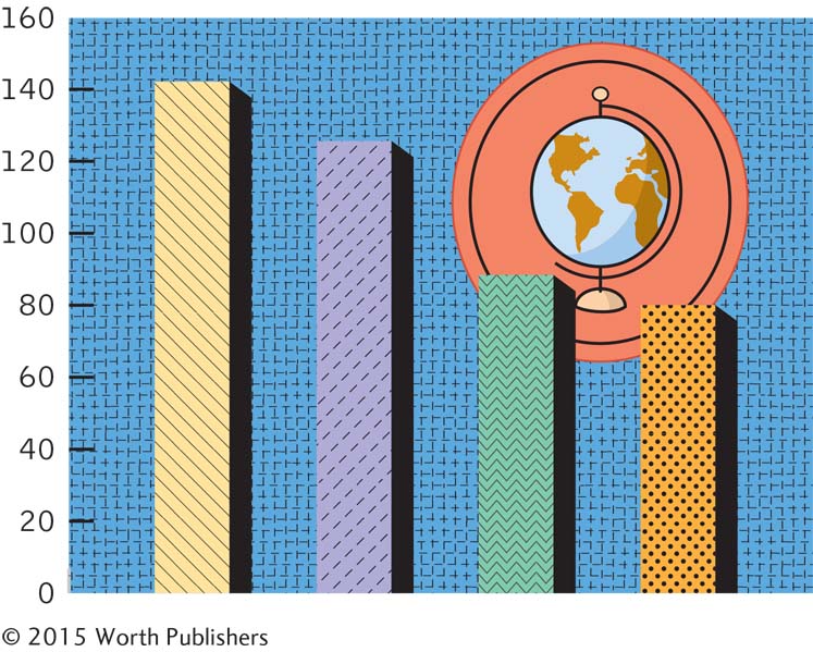
Moiré vibrations are any visual patterns that create a distracting impression of vibration and movement. Unfortunately, they are sometimes the default settings for bar graphs in statistical software. Tufte recommends using shades of gray instead of patterns.
A grid is a background pattern, almost like graph paper, on which the data representations, such as bars, are superimposed. Tufte recommends the use of grids only for hand-
drawn drafts of graphs. In final versions of graphs, use only very light grids, if necessary. Ducks are features of the data that have been dressed up to be something other than merely data. Think of ducks as data in costume. Named for the Big Duck, a store in Flanders, New York, that was built in the form of a very large duck, graphic ducks can be three-
dimensional effects, cutesy pictures, fancy fonts, or any other flawed design features. Avoid chartjunk!

Chartjunk Run Amok
Moiré vibrations, such as those seen in the patterns on these bars, might be fun to use, but they detract from the viewer’s ability to glean the story of the data. Moreover, the grid pattern behind the bars might appear scientific, but it serves only to distract. Ducks—

Computer defaults are the options that the software designer has preselected; these are the built-
in decisions that the software will implement if you do not instruct it otherwise.
There are several computer-
The Future of Graphs
Thanks to computer technology, we have entered a second golden age of scientific graphing. We mention only three categories here: interactive graphs, geographic information systems, and multivariable graphs.
Interactive Graphs One informative and haunting graph was published online in the New York Times on September 9, 2004, to commemorate the day on which the 1000th U.S. soldier died in Iraq (tinyurl.com/55nlu). Titled “A Look at 1000 Who Died,” this beautifully designed tribute is formed by photos of each of the dead servicemen and women. One can view these photographs organized by variables such as last name, where they were from, gender, cause of death, and how old they were when they died. Because the photos are the same size, the stacking of the photos also functions as a bar graph. By clicking on two or more months in a row, or on two or more ages in a row, one can visually compare numbers of deaths among levels of a category.
Yet this interactive graph is even more nuanced because it provides a glimpse into the life stories of these soldiers. By holding the cursor over a photo that catches your eye, you can learn, for example, that Spencer T. Karol, regular duty in the U.S. Army, from Woodruff, Arizona, died on October 6, 2003, at the age of 20, from hostility-
Geographic Information Systems (GIS) Many companies have published software that enables computer programmers to link Internet-
Sociologists, geographers, political scientists, consumer psychologists, and epidemiologists (who use statistics to track patterns of disease) have already become familiar with GIS in their respective fields. Organizational psychologists, social psychologists, and environmental psychologists can use GIS to organize workflow, assess group dynamics, and study the design of classrooms. Ironically, this advance in computerized mapping is pretty much what John Snow did without a computer in 1854 when he studied the Broad Street cholera outbreak.
Multivariable Graphs As graphing technologies become more advanced, there are increasingly elegant ways to depict multiple variables on a single graph. Using the bubble graph option under “Other Charts” on Microsoft Excel (and even better, downloading Excel templates from sites such as http:/
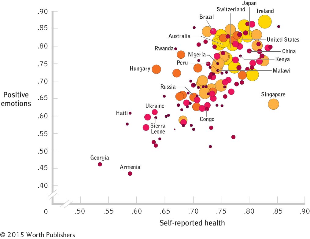
In an article titled “Is the Emotion-
Country. Each bubble is one country. For example, the large yellow bubble toward the upper right corner represents Ireland; the small red bubble toward the lower far left represents Georgia.
Self-
reported health. The x-axis indicates self- reported physical health for a country. Positive emotions. The y-axis indicates reported positive emotions for a country.
Gross domestic product (GDP). Both the size and the color of the bubbles represent a country’s GDP. Smaller and darker red bubbles indicate lower GDP; larger and yellower bubbles indicate higher GDP.

A Multivariable Graph
Increasingly sophisticated technology allows us to create increasingly sophisticated graphs. This bubble graph from a study by Sarah Pressman and her colleagues (2013) depicts four variables: country (each bubble), self-
The researchers could have chosen to add a fifth variable by using either size or color to represent GDP, rather than both. They might have used size, for example, to represent GDP, and color to represent the continent for each country.
From this graph, we can see a strong relation between physical health and positive emotions. GDP appears to be related to both measures; for countries with higher GDP (larger, yellower dots) and lower GDP (smaller, darker red dots), there is a link between emotions and health.
Some interactive versions of a bubble graph have, amazingly, added a sixth variable to the five that are possible on a printed page. For instance, www.gapminder.org/
CHECK YOUR LEARNING
| Reviewing the Concepts |
|
|
| Clarifying the Concepts | 3- |
What is chartjunk? |
| Calculating the Statistics | 3- |
Decisions about which kind of graph to use depend largely on how variables are measured. Imagine a researcher is interested in how “quality of sleep” is related to typing performance (measured by the number of errors made). For each of the measures of sleep below, decide which kind of graph to use.
|
| Applying the Concepts | 3- |
Imagine that the graph in Figure 3-17 represents data testing the hypothesis that exposure to the sun can impair IQ. Further imagine that the researcher has recruited groups of people and randomly assigned them to different levels of exposure to the sun: 0, 1, 6, and 12 hours per day (enhanced, in all cases, by artificial sunlight when natural light is not available). The mean IQ scores are 142, 125, 88, and 80, respectively. Redesign this chartjunk graph, either by hand or by using software, paying careful attention to the dos and don’ts outlined in this section. |
Solutions to these Check Your Learning questions can be found in Appendix D.