Chapter 3
Visual Displays of Data
How to Lie with Visual Statistics
- “The Most Misleading Graph Ever Published”
- Techniques for Misleading with Graphs
Common Types of Graphs
- Scatterplots
- Line Graphs
- Bar Graphs
- Pictorial Graphs
- Pie Charts
How to Build a Graph
- Choosing the Appropriate Type of Graph
- How to Read a Graph
- Guidelines for Creating a Graph
- The Future of Graphs
Next Steps: Multivariable Graphs
BEFORE YOU GO ON
- You should understand the different types of variables—nominal, ordinal, and scale (Chapter 1).
- You should understand the difference between independent variables and dependent variables (Chapter 1).
- You should know how to construct a histogram (Chapter 2).
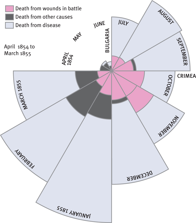
The legendary nineteenth-century nurse Florence Nightingale was also known as the “passionate statistician” (Diamond & Stone, 1981). The lens of time has softened the image of this sarcastic, sharp-elbowed infighter (Gill, 2005) who created trouble simply by counting things. She counted supplies in a closet and discovered corruption; she counted physicians’ diagnoses and discovered incompetence. She created the visual display in Figure 3-1 after counting the causes of death of British soldiers in the Crimea. The British army was killing through poor hygiene more of its own soldiers than were dying due to wounds of war—and an outraged public demanded change. That is one powerful graph!
This chapter shows you how to create graphs, called figures in APA-speak, that tell data stories. We recommend Displaying Your Findings by Adelheid Nicol and Penny Pexman (2010) for a more detailed look, but a checklist at the end of this chapter will answer most of your questions about how to create graphs.