9.1 Inference for Two-Way Tables
 This page includes Video Technology Manuals
Use of categorical data by businesses extends beyond just inference for proportions.
- Are flexible companies more competitive?
- Does Nivea have a feminine personality while Audi has a masculine personality?
- Does the color of the shirt worn by a server in a restaurant influence whether or not a customer will leave a tip?
In this chapter, we focus on how to compare two or more populations when the response variable has two or more categories, how to test whether two categorical variables are independent, and whether a sample from one population follows a hypothesized distribution.
First, however, we need to summarize the data in a different way. When we studied inference for two populations in Section 8.2, we recorded the number of observations in each group (n) and the count of those that are “successes” (Χ).
EXAMPLE 9.1 Social Media in the Supply Chain
Case 8.3 (page 438) examined the use of audio/visual sharing through social media for large and small companies.1 Here is the data summary. The table gives the number n of companies for each company size. The count Χ is the number of companies that used audio/visual sharing through social media in their supply chain.
| Size | n | Χ |
|---|---|---|
| 1 (small companies) | 178 | 150 |
| 2 (large companies) | 52 | 27 |
To compare small companies with the large companies, we calculated sample proportions from these counts.
Two-way tables
In this chapter, we start with a different summary of the same data. Rather than recording just the counts of small companies and large companies that use social media, we record counts for both outcomes (users and nonusers) in a two-way table.
two-way table
EXAMPLE 9.2 Social Media in the Supply Chain
Here is the two-way table classifying companies by size and whether or not they use social media:
| Company size | |||
|---|---|---|---|
| Use social media | Small | Large | Total |
| Yes | 150 | 27 | 177 |
| No | 28 | 25 | 53 |
| Total | 178 | 52 | 230 |
Check that this table simply rearranges the information in Example 9.1.
Because we are interested in how company size influences social media use, we view company size as an explanatory variable and social media use as a response variable. This is why we put company size in the columns (like the x axis in a scat-terplot) and social media use in the rows (like the y axis in a scatterplot).


Be sure that you understand how this table is obtained from the table in Example 9.1. Most errors in the use of categorical data methods come from a misunderstanding of how these tables are constructed.
We call this particular two-way table a 2×2 table because there are two rows (Yes and No for social media use) and two columns (Small companies and Large companies). The advantage of two-way tables is that they can present data for variables having more than two categories by simply increasing the number of rows or columns. Suppose, for example, that we recorded company size as “Small,” “Medium,” or “Large.” The explanatory variable would then have three levels, so our table would be 2×3, with two rows and three columns.
In this section, we advance from describing data to inference in the setting of two-way tables. Our data are counts of observations, classified according to two categorical variables. The question of interest is whether there is a relation between the row variable and the column variable. For example, is there a relation between company size and social media use? In Example 8.9 (pages 442–443) we found that there was a statistically significant difference in the proportions of social media users for small companies and large companies: 84.3% for small companies versus 51.9% for large companies. We now think about these data from a slightly different point of view: is there a relationship between company size and social media use?
We introduce inference for two-way tables with data that form a 2×3 table. The methodology applies to tables in general.


A study designed to address this question examined characteristics of 61 companies. Each company was asked to describe its own level of competitiveness and level of flexibility.2
flxcom
Options for competitiveness were “High,” “Medium,” and “Low.” No companies chose the third option, so this categorical variable has two levels. They were given four options for flexibility, but again one option, “No flexibility,” was not chosen. Here are the characterizations of the other three options:
- Adaptive flexibility, responds to issues eventually.
- Parallel flexibility, identifies issues and responds to them.
- Preemptive flexibility, anticipates issues and responds before they develop into a problem.
We can think of this categorical variable measuring the degree of flexibility with adaptive being the least flexible, followed by parallel, and then preemptive.
To start our analysis of the relationship between competitiveness and flexibility we organize the data in a two-way table. The following example gives the details.
EXAMPLE 9.3 The Two-Way Table
flxcom
Two categorical variables were measured for each company. Each company was classified according to competitiveness—“High” or “Medium”—and according to flexibility—“Adaptive,” “Parallel,” or “Preemptive.” The study author described a theory where more flexibility could lead to more competitiveness. Therefore, we treat flexibility as the explanatory variable here and make it the column variable. Here is the 2×3 table with the marginal totals:
| Number of companies | ||||
| Flexibility | ||||
|---|---|---|---|---|
| Competitiveness | Adaptive | Parallel | Preemptive | Total |
| Medium | 12 | 21 | 3 | 36 |
| High | 2 | 15 | 8 | 25 |
| Total | 14 | 36 | 11 | 61 |
The entries in the two-way table in Example 9.3 are the observed, or sample, counts of the numbers of companies in each category. For example, there were 12 adaptive companies that were medium competitive and two adaptive companies that were highly competitive. The table includes the marginal totals, calculated by summing over the rows or columns. The grand total, 61, is the sum of the row totals and is also the sum of the column totals. It is the total number of companies in the study.
The rows and columns of a two-way table represent values of two categorical variables. These are called “Flexibility” and “Competitiveness” in Example 9.3. Each combination of values for these two variables defines a cell. A two-way table with r rows and c columns contains r×c cells. The 2×3 table in Example 9.3 has six cells.
cell
In this study, we have data on two variables for a single sample of 61 companies. The same table might also have arisen from two separate samples, one from medium competitive companies and the other from highly competitive companies. Fortunately, the same inference applies in both cases. When we studied relationships between quantitative variables in Chapter 2, we noted that not all relationships involve an explanatory variable and a response variable. The same is true for categorical variables that we study here. Two-way tables can be used to display the relationship between any two categorical variables.
Apply Your Knowledge
Question 9.1
9.1 Gender and commercial preference.
In Exercise 8.52 (page 439) we analyzed data from a study where women and men were asked to express a preference for one of two commercials, A or B. For the women, 44 out of 100 women preferred Commercial A. For the men, 79 out of 140 preferred Commercial A.
- For these data, do you want to consider one of these categorical variables as an explanatory variable and the other as a response variable? Give a reason for your answer.
- Display these data using an r×c table. What are the values of r and c? Which variable is the column variable and which is the row variable? Give a reason for your choice.
- How many cells will that table have?
- Add the marginal totals to your table.
9.1
(a) Gender is the explanatory and Commercial preference is the response because we are interested in how gender influences commercial preference.
(b) r×c=2×2. Gender is the column variable because it is the explanatory variable; commercial preference is the row variable because it is the response variable.
(c) 4 cells.
Question 9.2
9.2 A reduction in force.
A human resources manager wants to assess the impact of a planned reduction in force (RIF) on employees over the age of 40. (Various laws state that discrimination against this group is illegal.) The company has 850 employees over 40 and 675 who are 40 years of age or less. The current plan for the RIF will terminate 120 employees: 90 who are over 40, and 30 who are 40 or less. Display these data in a two-way table. (Be careful. Remember that each employee should be counted in exactly one cell.)
Describing relations in two-way tables
Analysis of two-way tables in practice uses statistical software to carry out the considerable arithmetic required. We use output from some typical software packages for the data of Case 9.1 to describe inference for two-way tables.
To describe relations between categorical variables, we compute and compare percents. Section 2.5 (page 104) discusses methods for describing relationships in two-way tables. You should review that material now if you have not already studied it.
The count in each cell can be viewed as a percent of the grand total, of the row total, or of the column total. In the first case, we are describing the joint distribution of the two variables; in the other two cases, we are examining the conditional distributions. We learned many of the ideas related to conditional distributions when we studied conditional probability in Section 4.3. When analyzing data, you should use the context of the problem to decide which percents are most appropriate. Software usually prints out all three, but not all are of interest in a specific problem.
joint distribution conditional distribution
EXAMPLE 9.4 Software Output
flxcom
Figure 9.1 shows the output from JMP, Minitab, and SPSS, for the data of Case 9.1. We named the variables Competitiveness and Flexibility. The two-way table appears in the outputs in expanded form. Each cell contains five entries. They appear in different orders or with different labels, but all three outputs contain the same information. The count is the first entry in all three outputs. The row and column totals appear in the margins, just as in Example 9.3. The cell count as a percent of the row total is variously labeled as “Row %,” “% of Row,” or “% within Competitiveness.” The row % for the cell with the count for High Competitiveness and Preemptive Flexibility is 8/25, or 32%. Similarly, the cell count as a percent of the column total is also given.
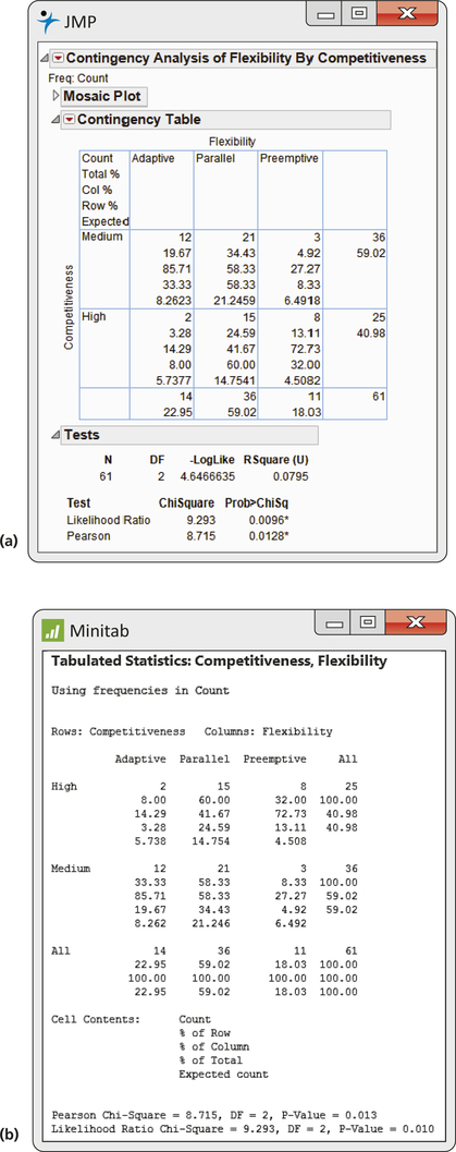
Another entry is the cell count divided by the total number of observations (the joint distribution). This is sometimes not very useful and tends to clutter up the output. We discuss the last entry, “Expected count,” and other parts of the output in Examples 9.5 and 9.6.
In Case 9.1, we are interested in comparing competitiveness for the three levels of flexibility. We examine the column percents to make this comparison. Here they are, rounded from the output for clarity:
| Column percents for flexibility | |||
| Flexibility | |||
|---|---|---|---|
| Competitiveness | Adaptive | Parallel | Preemptive |
| Medium | 86% | 58% | 27% |
| High | 14% | 42% | 73% |
| Total | 100% | 100% | 100% |
The “Total” row reminds us that the sum of the column percents is 100% for each level of flexibility.
Apply Your Knowledge
Question 9.3
9.3 Read the output.
Look at Figure 9.1. What percent of companies are highly competitive? What percent of highly competitive companies are classified as parallel for flexibility?
9.3
40.98%. 60%.
Question 9.4
9.4 Read the output.
Look at Figure 9.1. What type of flexibility characterizes the largest percent of companies? What is this percent?
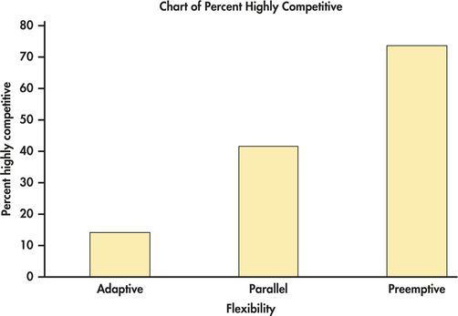
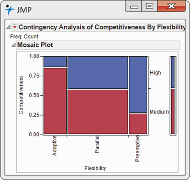
EXAMPLE 9.5 Graphical Displays
flxcom
CASE 9.1 Figure 9.2 is a bar chart from Minitab that displays the percent of highly competitive companies for each level of flexibility. It shows a clear pattern: as we move from adaptive flexibility to parallel flexibility, to preemptive flexibility, the proportion of highly competitive companies increases from 14% to 42%, to 73%. The mosaic plot from JMP in Figure 9.3 displays the distribution of competitiveness for the three levels of flexibility as well as the marginal distributions. Which graphical display do you prefer for this example?
Apply Your Knowledge
Question 9.5
9.5 Gender and commercial preference.
Refer to Exercise 9.1 (page 458) where you created a 2×2 table of counts for the commercial preferences of women and men. Make a graphical display of the data. Give reasons for the choices of what information to include in your plot.
Question 9.6
9.6 A reduction in force.
Refer to Exercise 9.2 (page 458) where you summarized data regarding a reduction in force. Make a graphical display of the data. Give reasons for the choices of what information to include in your plot.
The hypothesis: No association
The difference among the percents of highly competitive companies among the two types of flexibility is quite large. A statistical test tells us whether or not these differences can be plausibly attributed to chance. Specifically, if there is no association between competitiveness and flexibility, how likely is it that a sample would show differences as large or larger than those displayed in Figures 9.2 and 9.3?
The null hypothesis H0 of interest in a two-way table is this: there is no association between the row variable and the column variable. For Case 9.1 (page 457), this null hypothesis says that competitiveness and flexibility are not related. The alternative hypothesis Ha is that there is an association between these two variables. The alternative Ha does not specify any particular direction for the association. For r×c tables in general, the alternative includes many different possibilities. Because it includes all the many kinds of association that are possible, we cannot describe Ha as either one-sided or two-sided.
In our example, the hypothesis H0 that there is no association between competitiveness and flexibility is equivalent to the statement that the distributions of the competitiveness variable are the same for companies in the three categories of flexibility. For r×c tables like that in Example 9.3, there are c distributions for the row variable, one for each population. The null hypothesis then says that the c distributions of the row variable are identical. The alternative hypothesis is that the distributions are not all the same.
Expected cell counts
To test the null hypothesis in r×c tables, we compare the observed cell counts with expected cell counts calculated under the assumption that the null hypothesis is true. Our test statistic is a numerical measure of the distance between the observed and expected cell counts.
expected cell counts
EXAMPLE 9.6 Expected Counts from Software
flxcom
CASE 9.1 The expected counts for Case 9.1 appear in the computer outputs shown in Figure 9.1. For example, the expected count for the parallel flexibility and highly competitive cell is 14.75.
How is this expected count obtained? Look at the percents in the right margin of the table in Figure 9.1. We see that 40.98% of all companies are highly competitive. If the null hypothesis of no relation between competitiveness and flexibility is true, we expect this overall percent to apply to all levels of flexibility. For our example, we expect 40.98% of the companies that use parallel flexibility to be highly competitive. There are 36 companies that use parallel flexibility, so the expected count is 40.98% of 36, or 14.75. The other expected counts are calculated in the same way.
The reasoning of Example 9.6 leads to a simple formula for calculating expected cell counts. To compute the expected count for highly successful companies that use parallel flexibility, we multiplied the proportion of highly competitive companies (25/61) by the number of companies that use parallel flexibility (36). From Figure 9.1, we see that the numbers 25 and 36 are the row and column totals for the cell of interest and that 61 is n, the total number of observations for the table. The expected cell count is, therefore, the product of the row and column totals divided by the table total.
Expected Cell Counts
The expected count in any cell of a two-way table when the null hypothesis of no association is true is
expected count=row total×column totaln
Apply Your Knowledge
Question 9.7
9.7 Expected counts.
We want to calculate the expected count of companies that use adaptive flexibility and are highly competitive. From Figure 9.1 (pages 459–460), how many companies use adaptive flexibility? What proportion of all companies are highly competitive? Explain in words why, if there is no association between flexibility and competitiveness, the expected count we want is the product of these two numbers. Verify that the formula gives the same answer.
9.7
14. 40.98%. 22.95% of companies use adaptive flexibility, and of that 22.95%, 40.98% of them should be highly competitive assuming no association between flexibility and competitiveness. From the formula, (25)(14)/(61)=5.74.
Question 9.8
9.8 An alternative view.
Refer to Figure 9.1. Verify that you can obtain the expected count for the highly competitive by adaptive flexibility cell by multiplying the number of highly competitive companies by the percent of companies that use adaptive flexibility. Explain your calculations in words.
The chi-square test
To test the H0 that there is no association between the row and column classifications, we use a statistic that compares the entire set of observed counts with the set of expected counts. First, take the difference between each observed count and its corresponding expected count, and then square these values so that they are all 0 or positive. A large difference means less if it comes from a cell that we think will have a large count, so divide each squared difference by the expected count, a kind of standardization. Finally, sum over all cells. The result is called the chi-square statistic Χ2. The chi-square statistic was invented by the English statistician Karl Pearson (1857-1936) in 1900, for purposes slightly different from ours. It is the oldest inference procedure still used in its original form. With the work of Pearson and his contemporaries at the beginning of the twentieth century, statistics first emerged as a separate discipline.
Chi-Square Statistic
The chi-square statistic is a measure of how much the observed cell counts in a two-way table diverge from the expected cell counts. The recipe for the statistic is
Χ2=∑(observed count-expected count)2expected count
where “observed” represents an observed sample count, “expected” represents the expected count for the same cell, and the sum is over all r×c cells in the table.
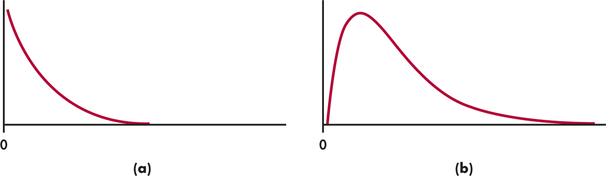
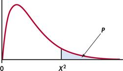
If the expected counts and the observed counts are very different, a large value of Χ2 will result. Therefore, large values of Χ2 provide evidence against the null hypothesis. To obtain a P-value for the test, we need the sampling distribution of Χ2 under the assumption that H0 (no association between the row and column variables) is true. We once again use an approximation, related to the Normal approximations that we employed in Chapter 8. The result is a new distribution, the chi-square distribution, which we denote by χ2 (χ is the lowercase form of the Greek letter chi).
chi-square distribution
Like the t distributions, the χ2 distributions form a family described by a single parameter, the degrees of freedom. We use χ2(df) to indicate a particular member of this family. Figure 9.4 displays the density curves of the χ2(2) and χ2(4) distributions. As the figure suggests, χ2 distributions take only positive values and are skewed to the right. Table F in the back of the book gives upper critical values for the χ2 distributions.
Chi-Square Test for Two-Way Tables
The null hypothesis H0 is that there is no association between the row and column variables in a two-way table. The alternative is that these variables are related.
If H0 is true, the chi-square statistic Χ2 has approximately a χ2 distribution with (r−1)(c−1) degrees of freedom.
The P-value for the chi-square test is
P(χ2≥Χ2)
where χ2 is a random variable having the χ2(df) distribution with df=(r−1)(c−1). If the P-value is sufficiently small, we reject the null hypothesis of no association. In this case, we say that the data provide evidence for us to conclude that there is an association.
The chi-square test always uses the upper tail of the χ2 distribution because any deviation from the null hypothesis makes the statistic larger. The approximation of the distribution of Χ2 by χ2 becomes more accurate as the cell counts increase. Moreover, it is more accurate for tables larger than 2×2.
For tables larger than 2×2, we use this approximation whenever the average of the expected counts is 5 or more and the smallest expected count is 1 or more. For 2×2 tables, we require that all four expected cell counts be 5 or more.3 When the data are not suitable for the chi-square approximation to be useful, other exact methods are available. These are provided in the output of many statistical software programs.
EXAMPLE 9.7 Are Flexible Companies More Competitive?
flxcom
CASE 9.1 The results of the chi-square significance test that we described appear in the lower portion of the computer outputs in Figure 9.1 (pages 459–460) for the flexibility and competitiveness example. They are labeled “Pearson” or “Pearson Chi-Square.” The outputs also give an alternative significance test called the likelihood ratio test. The results here are very similar.
Because all the expected cell counts are moderately large, the χ2 distribution provides accurate P-values. We see that Χ2=8.715 and df=2. Examine the outputs and find the P-value in each output. The rounded value is P=0.01. As a check, we verify that the degrees of freedom are correct for a 2×3 table:
df=(r−1)(c−1)=(2−1)(3−1)=2
The chi-square test confirms that the data contain clear evidence against the null hypothesis that there is no relationship between competitiveness and flexibility. Under H0, the chance of obtaining a value of Χ2 greater than or equal to the calculated value of 8.715 is small—less than one time in 100.
The test does not tell us what kind of relationship is present. You should always accompany a chi-square test with percents and figures such as those in the Figures 9.1, 9.2, and 9.3 and by a description of the nature of the relationship.
The observational study of Case 9.1 cannot tell us whether being flexible is a cause of being highly competitive. The association may be explained by confounding with other variables that have not been measured. A randomized comparative experiment that assigns companies to the three types of competitiveness would settle the issue of causation. As is often the case, however, an experiment isn't practical.
Apply Your Knowledge
Question 9.9
9.9 Degrees of freedom.
A chi-square significance test is performed to examine the association between two categorical variables in a 5×3 table. What are the degrees of freedom associated with the test statistic?
9.9
df=8.
Question 9.10
9.10 The P-value.
A test for association gives Χ2=15.07 with df=8. How would you report the P-value for this problem? Use Table F in the back of the book. Illustrate your solution with a sketch.
The chi-square test and the z test
We began this chapter by converting a “compare two proportions” setting (Example 9.1, pages 455–456) into a 2×2 table. We now have two ways to test the hypothesis of equality of two population proportions: the chi-square test and the two-sample z test from Section 8.2 (page 423). In fact, these tests always give exactly the same result because the chi-square statistic is equal to the square of the z statistic and χ2(1) critical values are equal to the squares of the corresponding N(0,1) critical values. Exercise 9.11 asks you to verify this for Example 9.1. The advantage of the z test is that we can test either one-sided or two-sided alternatives and add confidence intervals to the significance test. The chi-square test always tests the two-sided alternative for a 2×2 table. The advantage of the chi-square test is that it is much more general: we can compare more than two population proportions or, more generally yet, ask about relations in two-way tables of any size.
Apply Your Knowledge
Question 9.11
9.11 Social media in the supply chain.
Sample proportions from Example 9.1 and the two-way table in Example 9.2 (page 456) report the same information in different ways. We saw in Example 8.9 (pages 442–443) that the z statistic for the hypothesis of equal population proportions is z=4.87 with P<0.0004.
- Find the chi-square statistic Χ2 for this two-way table and verify that it is equal (up to roundoff error) to z2.
- Verify that the 0.001 critical value for chi-square with df=1 (Table F) is the square of the 0.0005 critical value for the standard Normal distribution (Table D). The 0.0005 critical value corresponds to a P-value of 0.001 for the two-sided z test.
- Explain carefully why the two hypotheses
H0:p1=p2(z test)H0:no relation between company size and social media use(Χ2 test)
say the same thing about the population.
9.11
(a) χ2=23.74≈z2=23.72.
(b) (z*)2=3.2912=1083=Χ2*.
(c) The z test null hypothesis indicates that the proportions are equal or that small and large companies use social media equally; in other words, the size of the company doesn’t matter in determining social media use—i.e., there is no relation between company size and social media use, the null hypothesis for the Χ2 test.
Models for two-way tables
The chi-square test for the presence of a relationship between the two directions in a two-way table is valid for data produced from several different study designs. The precise statement of the null hypothesis “no relationship” in terms of population parameters is different for different designs. We now describe two of these settings in detail. An essential requirement is that each experimental unit or subject is counted only once in the data table.
Comparing several populations: The first model
Case 2.2 (wine sales in three environments) is an example of separate and independent random samples from each of c populations. The c columns of the two-way table represent the populations. There is a single categorical response variable, wine type. The r rows of the table correspond to the values of the response variable.
We know that the z test for comparing the two proportions of successes and the chi-square test for the 2×2 table are equivalent. The r×c table allows us to compare more than two populations or more than two categories of response, or both. In this setting, the null hypothesis “no relationship between column variable and row variable” becomes
H0:The distribution of the response variable is the same in allc populations.
Because the response variable is categorical, its distribution just consists of the probabilities of its r values. The null hypothesis says that these probabilities (or population proportions) are the same in all c populations.
EXAMPLE 9.8 Music and Wine Sales
CASE 2.2 In the market research study of Case 2.2 (page 104), we compare three populations:

- Population 1: bottles of wine sold when no music is playing
- Population 2: bottles of wine sold when French music is playing
- Population 3: bottles of wine sold when Italian music is playing
We have three samples, of sizes 84, 75, and 84, a separate sample from each population. The null hypothesis for the chi-square test is
H0: The proportions of each wine type sold are the same in all three populations.
The parameters of the model are the proportions of the three types of wine that would be sold in each of the three environments. There are three proportions (for French wine, Italian wine, and other wine) for each environment.
More generally, if we take an independent simple random sample (SRS) from each of c populations and classify each outcome into one of r categories, we have an r×c table of population proportions. There are c different sets of proportions to be compared. There are c groups of subjects, and a single categorical variable with r possible values is measured for each individual.
Model for Comparing Several Populations Using Two-Way Tables
Select independent SRSs from each of c populations, of sizes n1,n2,…,nc. Classify each individual in a sample according to a categorical response variable with r possible values. There are c different probability distributions, one for each population.
The null hypothesis is that the distributions of the response variable are the same in all c populations. The alternative hypothesis says that these c distributions are not all the same.
Testing independence: The second model
A second model for which our analysis of r×c tables is valid is illustrated by the competitiveness and flexibility study of Case 9.1 (page 457). There, a single sample from a single population was classified according to two categorical variables.
EXAMPLE 9.9 Competitiveness and Flexibility
CASE 9.1 The single population studied is
- Population: Austrian food and beverage companies
The researchers had a sample of 61 companies. They measured two categorical variables for each company:
- Column variable: Flexibility (Adaptive, Parallel, or Preemptive)
- Row variable: Competitive (Medium or High)
The null hypothesis for the chi-square test is
H0: The row variable and the column variable are independent.
The parameters of the model are the probabilities for each of the six possible combinations of values of the row and column variables. If the null hypothesis is true, the multiplication rule for independent events says that these can be found as the products of outcome probabilities for each variable alone.
More generally, take an SRS from a single population and record the values of two categorical variables, one with r possible values and the other with c possible values. The data are summarized by recording the number of individuals for each possible combination of outcomes for the two random variables. This gives an r×c table of counts. Each of these r×c possible outcomes has its own probability. The probabilities give the joint distribution of the two categorical variables.
Each of the two categorical random variables has a distribution. These are the marginal distributions because they are the sums of the population proportions in the rows and columns.
The null hypothesis “no relationship” now states that the row and column variables are independent. The multiplication rule for independent events tells us that the joint probabilities are the products of the marginal probabilities.
EXAMPLE 9.10 The Joint Distribution and the Two Marginal Distributions
flxcom
The joint probability distribution gives a probability for each of the six cells in our 3×2 table of “Flexibility” and “Competitive.” The marginal distribution for “Flexi-bilty” gives probabilities for adaptive, parallel, and preemptive, the three possible categories of flexibility. The marginal distribution for “Competitive” gives probabilities for medium and high, the two possible types of competitiveness.
Independence between “Flexibility” and “Competitive” implies that the joint distribution can be obtained by multiplying the appropriate terms from the two marginal distributions. For example, the probability that a company is adaptive (flexibility) and medium (competitive) is equal to the probability that it is adaptive (flexibility) times the probability it is medium (competitive). The hypothesis that “Flexibility” and “Competitive” are independent says that the multiplication rule applies to all outcomes.
Model for Examining Independence in Two-Way Tables
Select an SRS of size n from a population. Measure two categorical variables for each individual.
The null hypothesis is that the row and column variables are independent. The alternative hypothesis is that the row and column variables are dependent.
BEYOND THE BASICS: Meta-Analysis
Policymakers wanting to make decisions based on research are sometimes faced with the problem of summarizing the results of many studies. These studies may show effects of different magnitudes, some highly significant and some not significant. What overall conclusion can we draw? Meta-analysis is a collection of statistical techniques designed to combine information from different but similar studies. Each individual study must be examined with care to ensure that its design and data quality are adequate. The basic idea is to compute a measure of the effect of interest for each study. These are then combined, usually by taking some sort of weighted average, to produce a summary measure for all of the studies. Of course, a confidence interval for the summary is included in the results. Here is an example.
meta-analysis
EXAMPLE 9.11 Vitamin A Saves Lives of Young Children
Vitamin A is often given to young children in developing countries to prevent night blindness. It was observed that children receiving vitamin A appear to have reduced death rates. To investigate the possible relationship between vitamin A supplementation and death, a large field trial with more than 25,000 children was undertaken in Aceh Province of Indonesia. About half of the children were given large doses of vitamin A, and the other half were controls. The researchers reported a 34% reduction in mortality (deaths) for the treated children who were one to six years old compared with the controls. Several additional studies were then undertaken. Most of the results confirmed the association: treatment of young children in developing countries with vitamin A reduces the death rate, but the size of the effect varied quite a bit.
How can we use the results of these studies to guide policy decisions? To address this question, a meta-analysis was performed on data from eight studies.4 Although the designs varied, each study provided a two-way table of counts. Here is the table for the study conducted in Aceh Province. A total of n=25,200 children were enrolled in the study. Approximately half received vitamin A supplements. One year after the start of the study, the number of children who had died was determined.
| Vitamin A | Control | |
|---|---|---|
| Dead | 101 | 130 |
| Alive | 12,890 | 12,079 |
| Total | 12,991 | 12,209 |
relative risk
The summary measure chosen was the relative risk: the ratio formed by dividing the proportion of children who died in the vitamin A group by the proportion of children who died in the control group. For Aceh, the proportion who died in the vitamin A group was
10112,991=0.00777
or 7.7 per thousand. For the control group, the proportion who died was
13012,209=0.01065
or 10.6 per thousand. The relative risk is, therefore,
0.007770⋅01065=0.73
Relative risk less than 1 means that the vitamin A group has the lower mortality rate.
The relative risks for the eight studies were
| 0.73 | 0.50 | 0.94 | 0.71 | 0.70 | 1.04 | 0.74 | 0.80 |
A meta-analysis combined these eight results to produce a relative risk estimate of 0.77 with a 95% confidence interval of (0.68, 0.88). That is, vitamin A supplementation reduced the mortality rate to 77% of its value in an untreated group. The confidence interval does not include 1, so we can reject the null hypothesis of no effect (a relative risk of 1). The researchers examined many variations of this meta-analysis, such as using different weights and leaving out one study at a time. These variations had little effect on the final estimate.
After these findings were published, large-scale programs to distribute high-potency vitamin A supplements were started. These programs have saved hundreds of thousands of lives since the meta-analysis was conducted and the arguments and uncertainties were resolved.