Choosing the Appropriate Kind of Graphic
Printed Page 306-334
Choosing the Appropriate Kind of Graphic
As Figure 12.7 shows, even a few simple facts can yield a number of different points. Your responsibility when creating a graphic is to determine what point you want to make and how best to make it. Don’t rely on your software to do your thinking; it can’t.
Graphics used in technical documents are classified as tables or figures. Tables are lists of data, usually numbers, arranged in columns. Figures are everything else: graphs, charts, diagrams, photographs, and the like. Typically, tables and figures are numbered separately: the first table in a document is Table 1; the first figure is Figure 1. In documents of more than one chapter (like this book), the graphics are usually numbered within each chapter. That is, Figure 3.2 is the second figure in Chapter 3.
The discussion that follows is based on the classification system in William Horton’s “Pictures Please—Presenting Information Visually,” in Techniques for Technical Communicators (Horton, 1992). Table 12.1 below presents an overview of the following discussion.
The kinds of graphics used most often to display numerical values are tables, bar graphs, infographics, line graphs, and pie charts.
Tables Tables convey large amounts of numerical data easily, and they are often the only way to present several variables for a number of items. For example, if you wanted to show how many people are employed in six industries in 10 states, a table would probably be most effective. Although tables lack the visual appeal of other kinds of graphics, they can handle much more information.
In addition to having a number (“Table 1”), tables are identified by an informative title that includes the items being compared and the basis (or bases) of comparison:
Table 3. Mallard Population in Rangeley, 2009–2011
Table 4.7. The Growth of the Robotics Industry in Japan and the United States, 2010
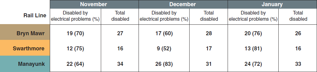
Each of these four graphs emphasizes a different point derived from the data in the table. Graph (a) focuses on the total number of railcars disabled each month, classified by cause; graph (b) focuses on the three rail lines during one month; and so forth. For information on bar graphs, see pages 312–17. For information on line graphs, see pages 319–22.
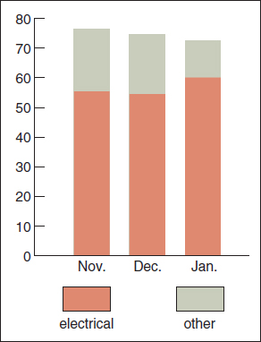
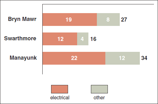
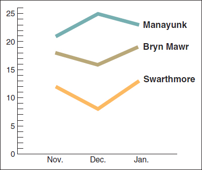
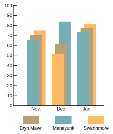
Figure 12.7 Different Graphics Emphasizing Different Points
| TABLE 12.1 Choosing the Appropriate Kind of Graphic | |||
| PURPOSE | TYPE OF GRAPHIC | WHAT THE GRAPHIC DOES BEST | |
| Illustrating numerical information | Table |
|
Shows large amounts of numerical data, especially when there are several variables for a number of items |
| Bar graph |

|
Shows the relative values of two or more items. | |
| Infographic |
Source: Whitehouse.gov, 2014: https://www.whitehouse.gov/share/current-minimum-wage-isn-t-enough-workers-get-out-poverty.
|
Enlivens statistical information for the general reader. | |
| Line graph |

|
Shows how the quantity of an item changes over time. A line graph can present much more data than a bar graph can. | |
| Pie chart |

|
Shows the relative sizes of the parts of a whole. Pie charts are instantly familiar to most readers. | |
| Illustrating logical relationships | Diagram |
|
Represents relationships among items or properties of items. |
| Organization chart |
|
Shows the lines of authority and responsibility in an organization or hierarchical relationships among items. | |
| Illustrating process descriptions and instructions | Checklist |
|
Lists or shows what equipment or materials to gather or describes an action. |
| Table |
|
Shows numbers of items or indicates the state (on/off) of an item. | |
| Flowchart |
|
Shows the stages of a procedure or a process. | |
| Logic tree |
|
Shows which of two or more paths to follow. | |
| Illustrating visual and spatial characteristics | Photograph |
|
Shows precisely the external surface of objects. |
| Screen shot |
|
Shows what appears on a computer screen. | |
| Line drawing |

|
Shows simplified representations of objects. | |
| Map |

|
Shows geographic areas. | |
Based on W. Horton, “The Almost Universal Language: Graphics for International Documentation” from TECHNICAL COMMUNICATION 40 (1993): 682–693.
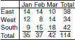
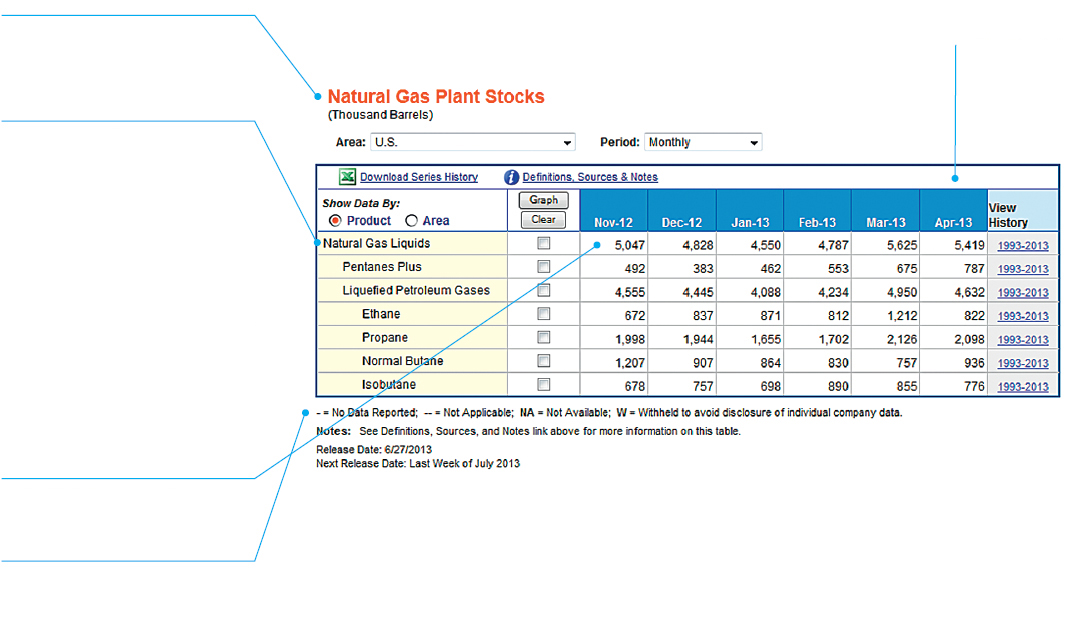
Figure 12.8 illustrates the standard parts of a table.
Tables are usually titled at the top because readers scan them from top to bottom.
Some tables include a stub head. The stub—the left-hand column— lists the items for which data are displayed. Note that indentation in the stub helps show relationships. The heading “Natural Gas Liquids” is left-aligned. This row functions as a Totals row. Indented beneath this heading are the two categories that make up the totals: pentanes plus and liquefied petroleum gases. Beneath the heading are rows for the four kinds of liquefied petroleum gases.
Note that tables often contain one or more source statements and footnotes.
Note that tables often contain one or more source statements and footnotes.
Note that the numbers are right aligned.
Creating Effective Tables

Follow these nine suggestions to make sure your tables are clear and professional.
- Indicate the units of measure. If all the data are expressed in the same unit, indicate that unit in the title:
Farm Size in the Midwestern States (in Hectares)
If the data in different columns are expressed in different units, indicate the units in the column heads:
Population (in Millions) Per Capita Income (in Thousands of U.S. Dollars) If all the data cells in a column use the same unit, indicate that unit in the column head, not in each data cell:
Speed (in Knots)
15
18
14
You can express data in both real numbers and percentages. A column head and the first data cell under it might read as follows:
Number of Students (Percentage)
53 (83)
- In the stub—the left-hand column—list the items being compared. Arrange the items in a logical order: big to small, more important to less important, alphabetical, chronological, geographical, and so forth. If the items fall into several categories, include the names of the categories in the stub:
Snowbelt States . . . . . . . . .. .
Connecticut . . . . . . . . . . . .
New York . . . . . . . . . . . .. .
Vermont . . . . . . . . . . . . . . .
Sunbelt States . . . . . . . . . . . ..
Arizona . . . . . . . . . . . . . . ..
California . . . . . . . . . . . .. .
New Mexico . . . . . . . . . . . .
If you cannot group the items in the stub in logical categories, skip a line after every five rows to help the reader follow the rows across the table. Or use a screen (a colored background) for every other set of five rows. Also useful is linking the stub and the next column with a row of dots called dot leaders.
- In the columns, arrange the data clearly and logically. Use the decimal-tab feature to line up the decimal points:
3,147.4
365.7
46,803.5
In general, don’t vary the units used in a column unless the quantities are so dissimilar that your readers would have a difficult time understanding them if expressed in the same units.
3.4 hr
12.7 min
4.3 sec
This list would probably be easier for most readers to understand than one in which all quantities were expressed in the same unit.
- Do the math. If your readers will need to know the totals for the columns or the rows, provide them. If your readers will need to know percentage changes from one column to the next, present them:
Number of Students (Percentage Change from Previous Year)
2013 2014 2015 619 644 (+4.0) 614 (–4.7) - Use dot leaders if a column contains a “blank” spot—a place where there are no appropriate data:
3,147
. . .
46,803
But don’t substitute dot leaders for a quantity of zero.
- Don’t make the table wider than it needs to be. The reader should be able to scan across a row easily. As White (1984) points out, there is no reason to make a table as wide as the text column in the document. If a column head is long—more than five or six words—stack the words:
Computers Sold Without
a Memory-Card Reader
- Minimize the use of rules. Grimstead (1987) recommends using rules only when necessary: to separate the title and the heads, the heads and the body, and the body and the notes. When you use rules, make them thin rather than thick.
- Provide footnotes where necessary. All the information your readers need in order to understand the table should accompany it.
- If you did not generate the information yourself, indicate your source. See the discussion of citing sources of graphics in "Understanding the Process of Creating Graphics."
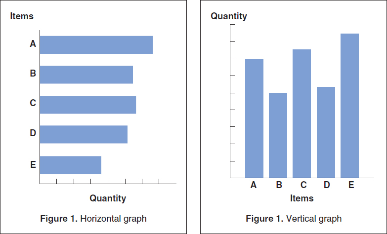
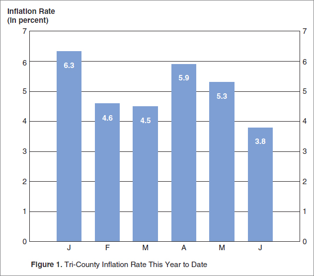
Bar Graphs Like tables, bar graphs can communicate numerical values, but they are better at showing the relative values of two or more items. Figure 12.9 shows typical horizontal and vertical bar graphs that you can make easily using your spreadsheet software. Figure 12.10 shows an effective bar graph that uses grid lines.
Horizontal bars are best for showing quantities such as speed and distance. Vertical bars are best for showing quantities such as height, size, and amount. However, these distinctions are not ironclad; as long as the axes are clearly labeled, readers should have no trouble understanding the graph.
Creating Effective Bar Graphs
- Make the proportions fair. Make your vertical axis about 25 percent shorter than your horizontal axis. An excessively long vertical axis exaggerates the differences in quantities; an excessively long horizontal axis minimizes the differences. Make all the bars the same width, and make the space between them about half as wide as a bar. Here are two poorly proportioned graphs:
 a. Excessively long vertical axis
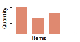 b. Excessively long horizontal axis
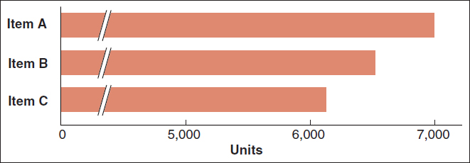
 - If possible, begin the quantity scale at zero. Doing so ensures that the bars accurately represent the quantities. Notice how misleading a graph can be if the scale doesn’t begin at zero.
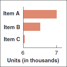 a. Misleading
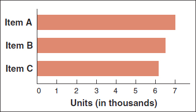 b. Accurately representative
If it is not practical to start the quantity scale at zero, break the quantity axis clearly at a common point on all the bars.
The five variations on the basic bar graph shown in Table 12.2 can help you accommodate different communication needs. You can make all these types using your spreadsheet software.
| TABLE 12.2 Variations on the Basic Bar Graph | |
|
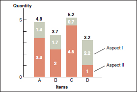
Grouped bar graph. The grouped bar graph lets you compare two or three aspects for each item. Grouped bar graphs would be useful, for example, for showing the numbers of full-time and part-time students at several universities. One bar could represent full-time students; the other, part-time students. To distinguish between the bars, use hatching (striping), shading, or color, and either label one set of bars or provide a key. |
|
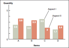
Subdivided bar graph. In the subdivided bar graph, Aspect I and Aspect II are stacked like wooden blocks placed on top of each. Although totals are easy to compare in a subdivided bar graph, individual quantities are not. |
|
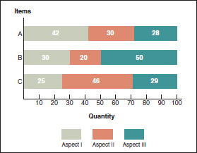
100-percent bar graph. The 100-percent bar graph, which shows the relative proportions of the aspects that make up several items, is useful in portraying, for example, the proportion of full-scholarship, partial-scholarship, and no-scholarship students at a number of colleges. |
|
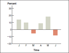
Deviation bar graph. The deviation bar graph shows how various quantities deviate from a norm. Deviation bar graphs are often used when the information contains both positive and negative values, such as profits and losses. Bars on the positive side of the norm line (above it) represent profits; bars on the negative side (below it), losses. |
|
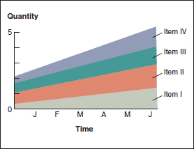
Stratum graph. The stratum graph, also called an area graph, shows the change in quantities of several items over time. Although stratum graphs are used frequently in business and scientific fields, general readers sometimes have trouble understanding how to read them. |
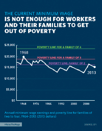
Infographics An infographic—short for information graphic—is a combination of words and graphics used to present factual data about a subject in a visually interesting way.
Creating Effective Infographics
Follow these seven suggestions for making effective infographics.
- Make a claim. A good infographic states—or at least implies—a claim and then presents evidence to support it. For instance, the claim might be that the number of people accessing the Internet in a language other than English is increasing at an accelerating rate, that the pace at which new drugs are coming onto the market is slowing, or that the cost of waging a campaign for a U.S. Senate seat has increased tenfold in the last twenty years. The claim you present will suggest the theme of your graphics: you might consider maps, flowcharts, or statistics.
- Use accurate data. Once you have settled on your claim, find facts to support it. Use reputable sources, and then check and re-check them. Be sure to cite your sources on the infographic itself.
- Follow the guidelines for the type of graphic you are creating. Although you want to express your creativity when you create graphics, abide by the guidelines for that type of graphic. For instance, if you use a bar graph to present data on the number of zebras born in captivity, your first obligation is to make the length of each bar reflect the quantity it represents; don’t manipulate the lengths of the bars to make the graph look like a zebra.
- Write concisely. If you need more than a paragraph to introduce a graphic, try revising the text to get the word count down or see if you can break the idea into several smaller ones.
- Don’t present too much information. It’s natural to want to include all the data you have found, but if the infographic is too tightly packed with text and graphics, readers will be intimidated. Use white space to let the graphics breathe.
- Don’t go on forever. Your readers will want to spend a minute—maybe two—on the infographic. They won’t want to spend 15 minutes.
- Test the infographic. As with any kind of technical document, the more you revise, evaluate, and test the infographic, the better it will be.
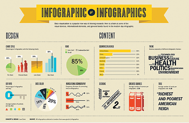
Designer Ivan Cash created this infographic by collecting data about infographics and then creating graphics to make the data interesting and visually appealing.
Infographics are built around basic types of graphical display: pie charts, line graphs, bar graphs, and diagrams. In an effective infographic, each visual display adheres to the conventions of the graphic on which it is based. For instance, in the “Countries Featured” bar graph, the length of each bar accurately reflects the quantity of the item it represents.
The art makes the data visually interesting, but the most important characteristic of an infographic is accuracy: the data must be accurate and presented fairly.
Figure 12.11, a portion of an infographic about infographics, shows many of the techniques used in this type of display.
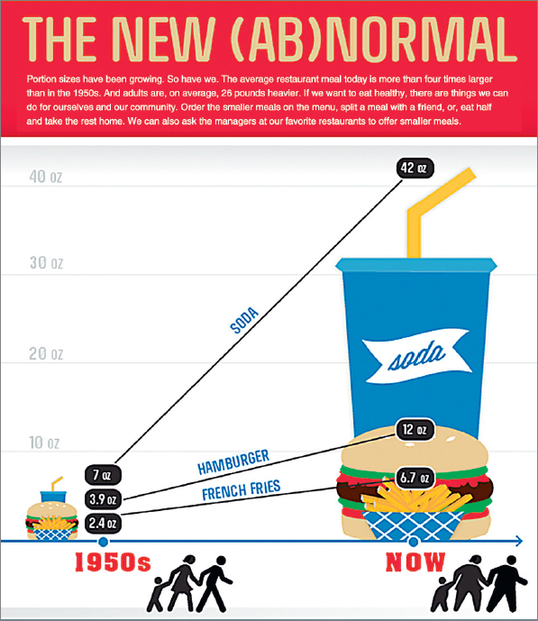
Infographics are also an effective way to communicate information through a visual/verbal argument. Figure 12.12 shows a portion of an infographic that makes a very clear argument about the rising size of food portions.
Many organizations use infographics to present arguments. Here, the Centers for Disease Control compares fast-food portion sizes from the 1950s and today to make the case that, as the text at the top states, “Portion sizes have been growing. So have we.” The text goes on to suggest steps people can take to reduce their portion sizes.
Several sites on the web, such as infogr.am, offer free templates for making infographics.
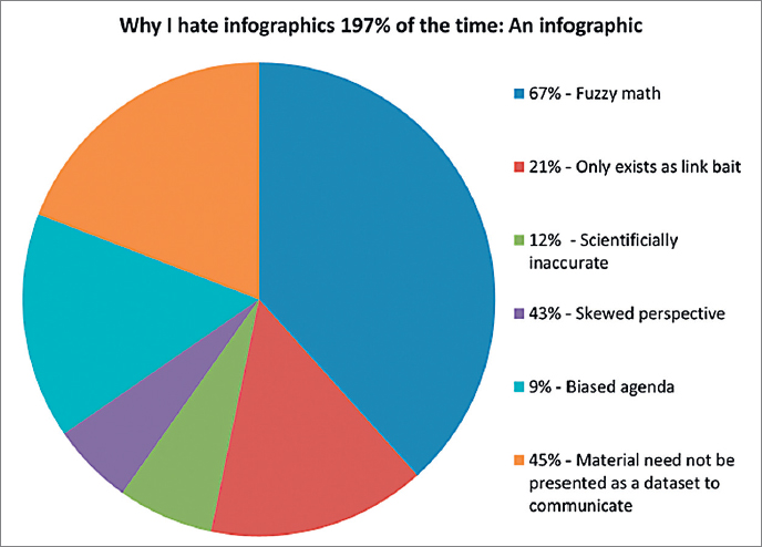
Infographics are very popular, but many of them are of low quality. Before you create an infographic to communicate technical information, be sure you are not skewing your data or oversimplifying to promote an agenda. Doing so is unethical. In Figure 12.13, digital strategist Hervé Peitrequin offers a clever commentary on infographics.
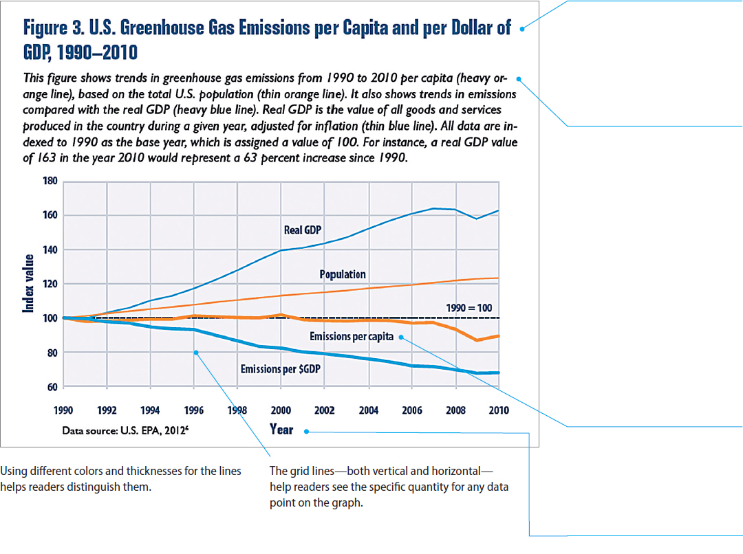
Line Graphs Line graphs are used almost exclusively to show changes in quantity over time, for example, the month-by-month production figures for a product. A line graph focuses readers’ attention on the change in quantity, whereas a bar graph emphasizes the quantities themselves.
You can plot three or four lines on a line graph. If the lines intersect, use different colors or patterns to distinguish them. If the lines intersect too often, however, the graph will be unclear; in this case, draw separate graphs. Figure 12.14 shows a line graph.
Note that the title is lengthy because it specifically names the main variables presented in the graph. Name all the important data in the title; it is better for a title to be lengthy than to be imprecise or unclear.
The designer has included a caption that explains how to read the graph. Because this graph is illustrating several items that are measured in different units and therefore cannot be plotted on the same scale (including population and greenhouse gases), the designer chose to have the y-axis express variations from a norm. In this case, the norm is represented by the quantity of each item in the year 1990. If this graph illustrated several items that were measured in the same units, such as the sales figures, in dollars, of several salespersons, the designer would start the y-axis at zero.
Because the four data lines are sufficiently far apart, the designer placed the appropriate data label next to each line. Alternatively, the designer could have used a separate color-coded legend.
Each axis is labeled clearly.
Creating Effective Line Graphs
Follow these three suggestions to create line graphs that are clear and easy to read.
- If possible, begin the quantity scale at zero. Doing so is the best way to portray the information honestly. If you cannot begin at zero, clearly indicate a break in the axis, if appropriate.
- Use reasonable proportions for the vertical and horizontal axes. As with bar graphs, make the vertical axis about 25 percent shorter than the horizontal axis.
- Use grid lines—horizontal, vertical, or both—rather than tick marks when your readers need to read the quantities precisely.
Pie Charts The pie chart is a simple but limited design used for showing the relative sizes of the parts of a whole. You can make pie charts with your spreadsheet software. Figure 12.15 shows typical examples.
You can set your software so that the slices use different saturations of the same color. This approach makes the slices easy to distinguish from each other—without any distractions or misrepresentations caused by a rainbow of colors.
You can set your software to emphasize one slice by separating it from the rest of the pie.
Creating Effective Pie Charts
Follow these eight suggestions to ensure that your pie charts are easy to understand and professional looking.
- Restrict the number of slices to no more than seven. As the slices get smaller, judging their relative sizes becomes more difficult.
- Begin with the largest slice at the top and work clockwise in order of decreasing size, unless you have a good reason to arrange the slices otherwise.
- If you have several very small quantities, put them together in one slice, to maintain clarity. Explain its contents in a footnote. This slice, sometimes called “other,” follows the other slices.
- Place a label (horizontally, not radially) inside the slice, if space permits. Include the percentage that each slice represents and, if appropriate, the raw number.
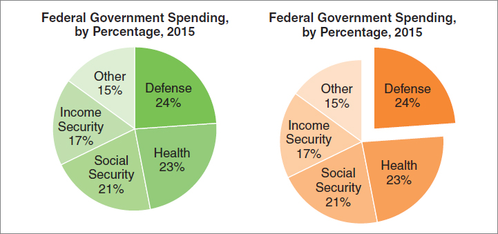
- To emphasize one slice, use a bright, contrasting color or separate the slice from the pie. Do this, for example, when you introduce a discussion of the item represented by that slice.
- Check to see that your software follows the appropriate guidelines for pie charts. Some spreadsheet programs add fancy visual effects that can impair comprehension. For instance, many programs portray the pie in three dimensions, as shown here.
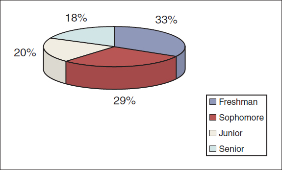 In this three-dimensional pie chart about the percentages of a college’s student body, by year, the sophomore slice looks bigger than the freshman slice, even though it isn’t, because it appears closer to the reader. To communicate clearly, make pie charts two-dimensional.
 - Don’t overdo fill patterns. Fill patterns are patterns, shades, or colors that distinguish one slice from another. In general, use simple, understated patterns or none at all.
- Check that your percentages add up to 100. If you are doing the calculations yourself, check your math.
Graphics can help you present logical relationships among items. For instance, in describing a piece of hardware, you might want to show its major components. The two kinds of graphics that best show logical relationships are diagrams and organization charts.
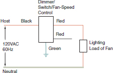
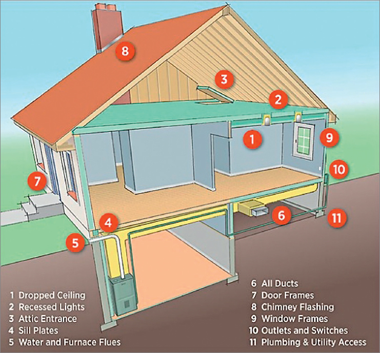
Diagrams A diagram is a visual metaphor that uses symbols to represent relationships among items or their properties. In technical communication, common kinds of diagrams are blueprints, wiring diagrams, and schematics. Figure 12.16 is a diagram.
The purpose of this diagram is to help people understand the different areas in their home that need to be insulated. In diagrams, items do not necesssarily look realistic. Here the designer is trying to represent logical relationships, not the physical appearances of items.
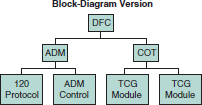
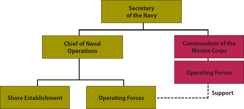
Organization Charts A popular form of diagram is the organization chart, in which simple geometric shapes, usually rectangles, suggest logical relationships, as shown in Figure 12.17. You can create organization charts with your word processor.
An organization chart is often used to show the hierarchy in an organization, with the most senior person in the organization in the box at the top.
Alternatively, an organization chart can show the functional divisions of a system, such as the human nervous system.
Graphics often accompany process descriptions and instructions (see Chapter 20). The following discussion looks at some of the graphics used in writing about actions: checklists, flowcharts, and logic trees. It also discusses techniques for showing motion in graphics.
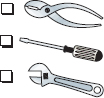
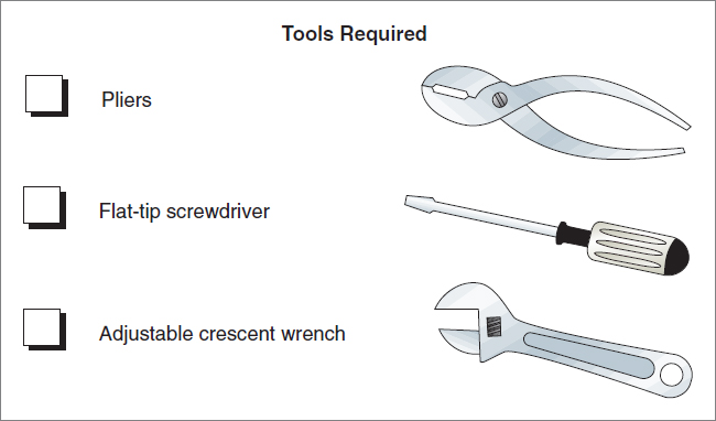
Checklists In explaining how to carry out a task, you often need to show the reader what equipment or materials to gather, or describe an action or a series of actions to take. A checklist is a list of items, each preceded by a check box. If readers might be unfamiliar with the items you are listing, include drawings of the items, as shown in Figure 12.18. You can use the list function in your word processor to create checklists.
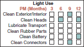
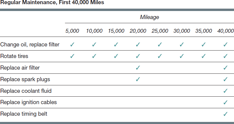
Often you need to indicate that readers are to carry out certain tasks at certain intervals. A table is a useful graphic for this kind of information, as shown in Figure 12.19.
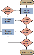
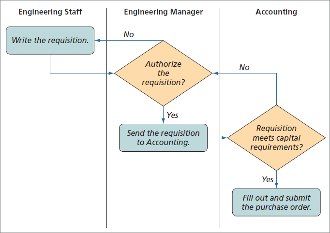
Flowcharts A flowchart, as the name suggests, shows the various stages of a process or a procedure. Flowcharts are useful, too, for summarizing instructions. On a basic flowchart, stages are represented by labeled geometric shapes. Flowcharts can portray open systems (those that have a start and a finish) or closed systems (those that end where they began). Figure 12.20 shows an open-system flowchart and a closed-system flowchart. Figure 12.21 shows a deployment flowchart, which you can make using the drawing tools in your word processor.
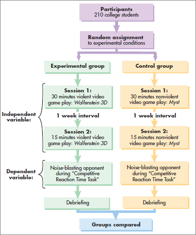
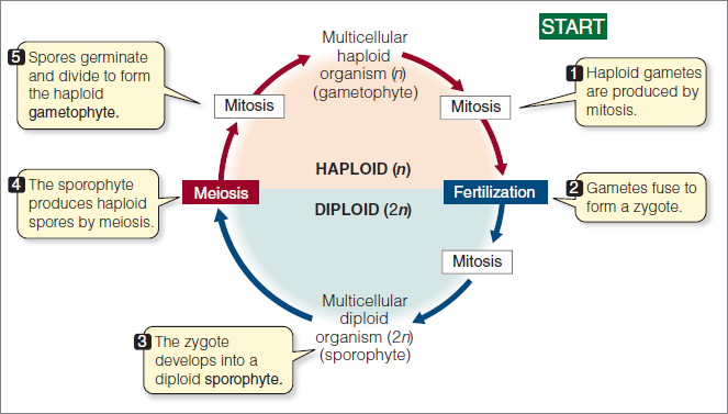
Figure 12.20 Flowcharts
A deployment flowchart shows who is responsible for carrying out which tasks. Here the engineering staff writes the requisition, then sends it to the Engineering Manager.
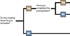
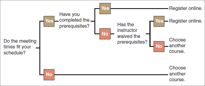
Logic Trees Logic trees use a branching metaphor. The logic tree shown in Figure 12.22 helps students think through the process of registering for a course.
Techniques for Showing Action or Motion In some types of process descriptions and instructions, you will want to show action or motion. For instance, in an instruction manual for helicopter technicians, you might want to illustrate the process of removing an oil dipstick or tightening a bolt, or you might want to show a warning light flashing. Although animation and video are frequently used to illustrate action or motion in online documents, such processes still need to be communicated in static graphics for print documents.
If the reader is to perform the action, show the action from the reader’s point of view, as in Figure 12.23.
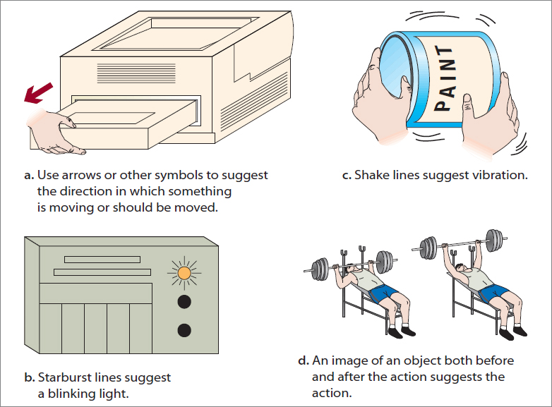
Figure 12.24 illustrates four additional techniques for showing action. These techniques are conventional but not universal. If you are addressing readers from another culture, consult a qualified person from that culture to make sure your symbols are clear and inoffensive.
To illustrate visual and spatial characteristics, use photographs, screen shots, line drawings, and maps.
 For a tutorial on photo editing, go to Ch. 12 > Additional Resources > Tutorials: macmillanhighered.com/launchpad/techcomm11e.
Photographs Photographs are unmatched for reproducing visual detail. Sometimes, however, a photograph can provide too much information. In a sales brochure for an automobile, a glossy photograph of the dashboard might be very effective. But in an owner’s manual, if you want to show how to use the trip odometer, use a diagram that focuses on that one item.
Sometimes a photograph can provide too little information. The item you want to highlight might be located inside the mechanism or obscured by another component.
Presenting Photographs Effectively
Follow these five suggestions to make sure your photographs are clear, honest, and easy to understand.
- Eliminate extraneous background clutter that can distract readers. Crop the photograph to delete unnecessary detail. Figure 12.25 shows examples of cropped and uncropped photographs.
- Do not electronically manipulate the photograph. There is nothing unethical about removing blemishes or cropping a digital photograph. However, manipulating a photograph—for example, enlarging the size of the monitor that comes with a computer system—is unethical.
- Help readers understand the perspective. Most objects in magazines and journals are photographed at an angle to show the object’s depth as well as its height and width.
- If appropriate, include some common object, such as a coin or a ruler, in the photograph to give readers a sense of scale.
- If appropriate, label components or important features.

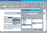
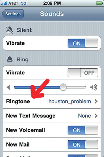
Screen Shots Screen shots—images of what appears on a computer monitor or some other screen—are often used in manuals to show users what the screen will look like as they perform tasks with the device. Readers who see that the screen shot accurately portrays what appears on their own devices are reassured and therefore better able to concentrate on the task they are trying to perform. Figure 12.26 is an example of how screen shots are used.
This screen shot, from a user guide on NASA’s website, shows users how to select a ringtone.
Line Drawings Line drawings are simplified visual representations of objects. Line drawings offer three possible advantages over photographs:
- Line drawings can focus readers’ attention on desired information better than a photograph can.
- Line drawings can highlight information that might be obscured by bad lighting or a bad angle in a photograph.
- Line drawings are sometimes easier for readers to understand than photographs are.
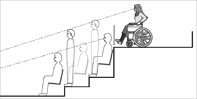
Figure 12.27 shows the effectiveness of line drawings.
This drawing, which accompanies a manual about the Americans with Disabilities Act, illustrates the idea that “wheelchair seating locations must provide lines of sight comparable to those provided to other spectators.” A photograph could not show this concept as clearly as this drawing does.
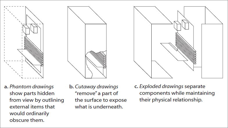
You have probably seen the three variations on the basic line drawing shown in Figure 12.28.
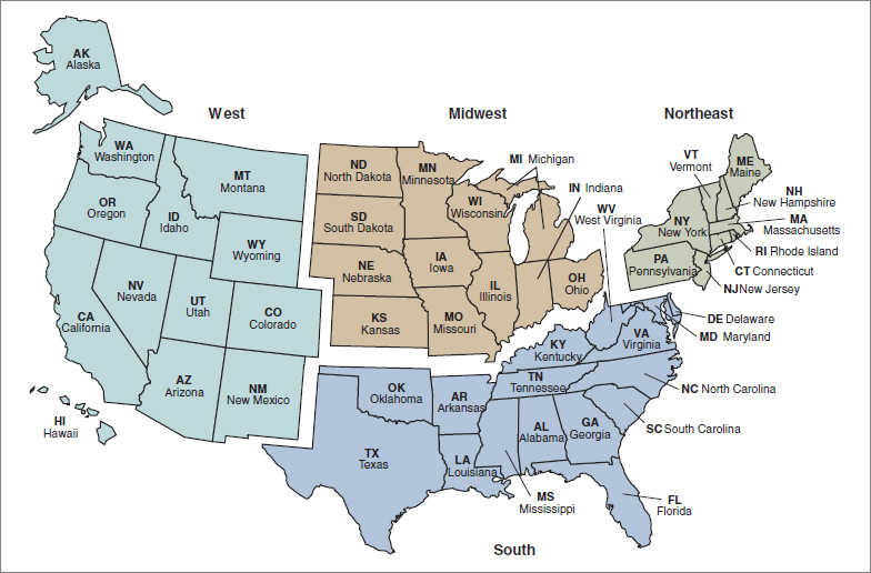
Maps Maps are readily available as clip art that can be modified with a graphics program. Figure 12.29 shows a map derived from clip art.
Include a scale and a legend if the map is one that is not thoroughly familiar to your readers. Also, use conventional colors, such as blue for water.