Section 2.2 Exercises
CLARIFYING THE CONCEPTS
Question 2.138
1. Which of the methods for displaying data introduced in this section (frequency and relative frequency distributions, histograms, frequency polygons, stem-and-leaf displays, and dotplots) can be used with both quantitative and qualitative data? Which can be used for quantitative data only? (p. 71)
2.2.1
Both: frequency distribution, relative frequency distribution; quantitative data only: histograms, frequency polygons, stem-and-leaf displays, dotplot.
Question 2.139
2. Describe at least one potential benefit of combining classes when constructing a frequency distribution. Describe at least one potential benefit from retaining a larger number of classes. (p. 62)
Question 2.140
3. In general, how many classes should be used when constructing a frequency distribution? (p. 63)
2.2.3
Between 5 and 20
Question 2.141
4. Describe at least one drawback of choosing class limits that overlap. (p. 64)
Question 2.142
5. Describe at least one way that a dotplot may be useful. (p. 70)
2.2.5
Answers will vary.
Question 2.143
6. In your own words, describe what is meant by “symmetry.” Provide an example of a shape that is symmetric and an example of a shape that is not symmetric. (p. 73)
Question 2.144
7. What are some examples of data sets that are often right-skewed? Left-skewed? (p. 73)
2.2.7
Answers will vary.
Question 2.145
8. True or false: When the objective is to retain complete knowledge of the data set, the best graphical summary to use is the histogram. (p. 75)
PRACTICING THE TECHNIQUES
 CHECK IT OUT!
| To do | Check out | Topic |
|---|---|---|
| Exercises 9–12 |
Example 9 | Frequency and relative frequency distributions |
| Exercises 13–16 |
Example 10 | Frequency distributions using classes |
| Exercises 17–40 |
Examples 11 and 12 |
Class limits, widths, boundaries, and frequency distributions for continuous data |
| Exercises 41–52 |
Example 13 | Constructing histograms |
| Exercises 53–56 |
Example 14 | Frequency polygons |
| Exercises 57–60 |
Example 15 | Stem-and-leaf displays |
| Exercises 61–64 |
Example 17 | Dotplots |
| Exercises 65–66 |
Example 18 | Comparison dotplots |
| Exercises 67–78 |
Example 19 | Acquiring information from graphs and tables |
| Exercises 79–82 |
Example 20 | Identifying the shape of the distribution |
Business Insider reported the list of actors in Table 24 who have received more than one Oscar nomination but have never won an Oscar. Use the data to construct the table or graph indicated in Exercises 9 and 10.
| Actor | Nominations | Actor | Nominations |
|---|---|---|---|
| Peter O'Toole | 8 | Tom Cruise | 3 |
| Richard Burton | 7 | Will Smith | 2 |
| Glenn Close |
6 | John Travolta |
2 |
| Leonardo DiCaprio |
5 | Edward Norton |
2 |
| Julianne Moore |
4 | Judy Garland |
2 |
| Sigourney Weaver |
3 | James Dean |
2 |
| Johnny Depp | 3 |
Question 2.146
nooscars
9. Frequency distribution
2.2.9
| Number of nominations | Frequency | Relative frequency |
|---|---|---|
| 2 | 5 | 5/13 = 0.3846 |
| 3 | 3 | 3/13 = 0.2308 |
| 4 | 1 | 1/13 = 0.0769 |
| 5 | 1 | 1/13 = 0.0769 |
| 6 | 1 | 1/13 = 0.0769 |
| 7 | 1 | 1/13 = 0.0769 |
| 8 | 1 | 1/13 = 0.0769 |
| Total | 13 | 13/13 = 1.0000 |
Question 2.147
nooscars
10. Relative frequency distribution
The data in Table 25 represent the top 18 players in baseball history for the number of career grand slams (home run with the bases loaded). Use the data to construct the table or graph indicated in Exercises 11 and 12.
| Player | Grand slams |
Player | Grand slams |
|---|---|---|---|
| Alex Rodriguez | 24 | Hank Aaron | 16 |
| Lou Gehrig | 23 | Dave Kingman | 16 |
| Manny Ramírez | 21 | Babe Ruth | 16 |
| Eddie Murray | 19 | Ken Griffey, Jr. | 15 |
| Willie McCovey | 18 | Richie Sexson | 15 |
| Robin Ventura | 18 | Jason Giambi | 14 |
| Carlos Lee | 17 | Gil Hodges | 14 |
| Jimmie Foxx | 17 | Mark McGwire | 14 |
| Ted Williams | 17 | Mike Piazza | 14 |
Question 2.148
grandslams
11. Frequency distribution
2.2.11
| Grand slams | Frequency | Relative frequency |
|---|---|---|
| 14 | 4 | 4/18 = 0.2222 |
| 15 | 2 | 2/18 = 0.1111 |
| 16 | 3 | 3/18 = 0.1667 |
| 17 | 3 | 3/18 = 0.1667 |
| 18 | 2 | 2/18 = 0.1111 |
| 19 | 1 | 1/18 = 0.0556 |
| 21 | 1 | 1/18 = 0.0556 |
| 23 | 1 | 1/18 = 0.0556 |
| 24 | 1 | 1/18 = 0.0556 |
| Total | 18 | 18/18 = 1.0000 |
Question 2.149
grandslams
12. Relative frequency distribution
For Exercises 13 and 14, use the Oscar nomination data from Table 24.
Question 2.150
nooscars
13. Define the following classes: 0-3, 4-6, and 7-9. Use these classes to construct a frequency distribution.
2.2.13
| Nominations | Frequency | Relative frequency |
|---|---|---|
| 0–3 | 8 | 8/13 = 0.6154 |
| 4–6 | 3 | 3/13 = 0.2308 |
| 7–9 | 2 | 2/13 = 0.1538 |
| Total | 13 | 13/13 = 1.0000 |
Question 2.151
nooscars
14. Using the classes in the previous exercise, construct a relative frequency distribution.
For Exercises 15 and 16, use the grand slams data from Table 25.
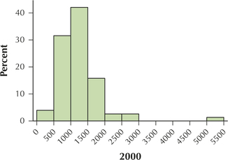
Question 2.152
grandslams
15. Define the following classes: 11–15, 16–20, and 21–25. Use these classes to construct a frequency distribution.
2.2.15
| Grand slams | Frequency | Relative frequency |
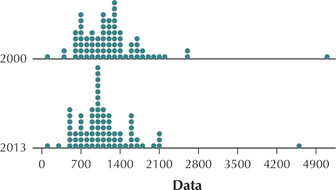
|---|---|---|
| 11–15 | 6 | 6/18 = 0.3333 |
| 16–20 | 9 | 9/18 = 0.5000 |
| 21–25 | 3 | 3/18 = 0.1667 |
| Total | 18 | 18/18 = 1.0000 |
Question 2.153
grandslams
16. Using the classes in the previous exercise, construct a relative frequency distribution.
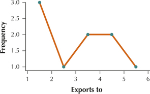
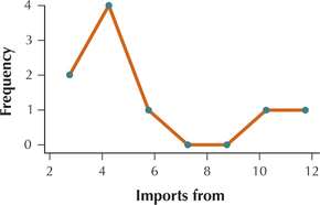
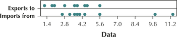
The United States currently maintains a negative trade balance with many countries around the world, meaning that we import more from those countries than we export to them. This tends to increase unemployment here in the United States. The data in Table 26 represent the exports, imports, and trade balance of the United States with a sample of 11 countries, for the month of June 2014.
| Country | Exports to | Imports from |
Trade balance |
|---|---|---|---|
| Brazil | 3.5 | 2.5 | 1 |
| France | 2.8 | 4 | −1.2 |
| Germany | 4.5 | 10 | −5.6 |
| India | 1.9 | 3.2 | −1.3 |
| Italy | 1.2 | 3.7 | −2.4 |
| Japan | 5.6 | 11.3 | −5.6 |
| South Korea | 3.8 | 5.6 | −1.8 |
| Saudi Arabia | 1.7 | 3.5 | −1.8 |
| United Kingdom | 4.4 | 4.4 | 0 |
Use the exports to data for Exercises 17–20. Use five classes with class widths equal to 1. Define the leftmost class as: 1 to < 2.
Question 2.154
tradebalance
17. Determine the class limits.
2.2.17
1 to < 2, 2 to < 3, 3 to < 4, 4 to < 5, 5 to < 6
Question 2.155
tradebalance
18. Determine the class boundaries.
Question 2.156
tradebalance
19. Construct a frequency distribution.
2.2.19
| Exports to | Frequency | Relative frequency |
|---|---|---|
| 1 to < 2 | 3 | 3/9 = 0.3333 |
| 2 to < 3 | 1 | 1/9 = 0.1111 |
| 3 to < 4 | 2 | 2/9 = 0.2222 |
| 4 to < 5 | 2 | 2/9 = 0.2222 |
| 5 to < 6 | 1 | 1/9 = 0.1111 |
| Total | 9 | 9/9 = 1.0000 |
Question 2.157
tradebalance
20. Build a relative frequency distribution.
For Exercises 21–24, use the imports from data from Table 26. Use five classes with class widths equal to 2. Let the leftmost class be: 2 to < 4.
Question 2.158
tradebalance
21. Determine the class limits.
2.2.21
2 to < 4, 4 to < 6, 6 to < 8, 8 to < 10, 10 to < 12
Question 2.159
tradebalance
22. Determine the class boundaries.
Question 2.160
tradebalance
23. Construct a frequency distribution.
2.2.23
| Imports from | Frequency | Relative frequency |
|---|---|---|
| 2 to < 4 | 4 | 4/9 = 0.4444 |
| 4 to < 6 | 3 | 3/9 = 0.3333 |
| 6 to < 8 | 0 | 0/9 = 0.0000 |
| 8 to < 10 | 0 | 0/9 = 0.0000 |
| 10 to < 12 | 2 | 2/9 = 0.2222 |
| Total | 9 | 9/9 = 1.0000 |
Question 2.161
tradebalance
24. Build a relative frequency distribution.
For Exercises 25–28, again use the imports from data from Table 26. But this time, use seven classes with class widths equal to 1.5. Let the leftmost class be: 2.0 to < 3.5.
Question 2.162
tradebalance
25. Determine the class limits.
2.2.25
2 to < 3.5, 3.5 to < 5, 5 to < 6.5, 6.5 to < 8, 8 to < 9.5, 9.5 to < 11, 11 to < 12.5
Question 2.163
tradebalance
26. Determine the class boundaries.
Question 2.164
tradebalance
27. Construct a frequency distribution.
2.2.27
| Imports from | Frequency | Relative frequency |
|---|---|---|
| 2 to < 3.5 | 2 | 2/9 = 0.2222 |
| 3.5 to < 5 | 4 | 4/9 = 0.4444 |
| 5 to < 6.5 | 1 | 1/9 = 0.1111 |
| 6.5 to < 8 | 0 | 0/9 = 0.0000 |
| 8 to < 9.5 | 0 | 0/9 = 0.0000 |
| 9.5 to < 11 | 1 | 1/9 = 0.1111 |
| 11 to < 12.5 | 1 | 1/9 = 0.1111 |
| Total | 9 | 9/9 = 1.0000 |
Question 2.165
tradebalance
28. Build a relative frequency distribution.
For Exercises 29–32, use the trade balance data from Table 26. Use eight classes with class widths equal to 1. Let the leftmost class be: −6 to < −5.
Question 2.166
tradebalance
29. Determine the class limits.
2.2.29
–6 to < –5, –5 to < –4, –4 to < –3, –3 to < –2, –2 to < –1, –1 to < 0, 0 to < 1, 1 to < 2
Question 2.167
tradebalance
30. Determine the class boundaries.
Question 2.168
tradebalance
31. Construct a frequency distribution.
2.2.31
| Trade balance | Frequency | Relative frequency |
|---|---|---|
| –6 to < –5 | 2 | 2/9 = 0.2222 |
| –5 to < –4 | 0 | 0/9 = 0.0000 |
| –4 to < –3 | 0 | 0/9 = 0.0000 |
| –3 to < –2 | 1 | 1/9 = 0.1111 |
| –2 to < –1 | 4 | 4/9 = 0.4444 |
| –1 to < 0 | 0 | 0/9 = 0.0000 |
| 0 to < 1 | 1 | 1/9 = 0.1111 |
| 1 to < 2 | 1 | 1/9 = 0.1111 |
| Total | 9 | 9/9 = 1.0000 |
Question 2.169
tradebalance
32. Build a relative frequency distribution.
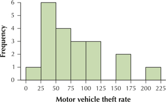
Table 27 contains the motor vehicle theft rate for the top 20 countries in the world for motor vehicle theft, for 2012. The theft rate equals the number of motor vehicles stolen in 2012 per 100,000 residents.
| Country | Motor vehicle theft rate |
Country | Motor vehicle theft rate |
|---|---|---|---|
| Italy | 208.0 | Trinidad | 61.7 |
| France | 174.1 | Jordan | 58.3 |
| USA | 167.8 | Hungary | 56.5 |
| Sweden | 117.2 | Lithuania | 45.7 |
| Belgium | 106.0 | Slovakia | 45.2 |
| Greece | 100.2 | Latvia | 37.8 |
| Norway | 94.1 | Switzerland | 30.9 |
| Netherlands | 75.2 | Serbia | 28.9 |
| Spain | 75.1 | Austria | 27.2 |
| Cyprus | 66.0 | Barbados | 24.0 |
Use the motor vehicle theft rate data for Exercises 33–36. Use nine classes with class widths equal to 25. Define the leftmost class as: 0 to < 25.
Question 2.170
theftrate20
33. Determine the class limits.
2.2.33
0 to < 25, 25 to < 50, 50 to < 75, 75 to < 100, 100 to < 125, 125 to < 150, 150 to < 175, 175 to < 200, 200 to < 225
Question 2.171
theftrate20
34. Determine the class boundaries.
Question 2.172
theftrate20
35. Construct a frequency distribution.
2.2.35
| Motor vehicle theft rate | Frequency | Relative frequency |
|---|---|---|
| 0 to < 25 | 1 | 1/20 = 0.05 |
| 25 to < 50 | 6 | 6/20 = 0.30 |
| 50 to < 75 | 4 | 4/20 = 0.20 |
| 75 to < 100 | 3 | 3/20 = 0.15 |
| 100 to < 125 | 3 | 3/20 = 0.15 |
| 125 to < 150 | 0 | 0/20 = 0.00 |
| 150 to < 175 | 2 | 2/20 = 0.10 |
| 175 to < 200 | 0 | 0/20 = 0.00 |
| 200 to < 225 | 1 | 1/20 = 0.05 |
| Total | 20 | 20/20 = 1.00 |
Question 2.173
theftrate20
36. Build a relative frequency distribution.
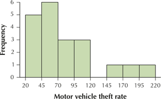
For Exercises 37–40, again use the motor vehicle theft rate data from Table 27. But this time, use eight classes with class widths equal to 25. Define the leftmost class as: 20 to < 45.
Question 2.174
37. Determine the class limits.
2.2.37
20 to < 45, 45 to < 70, 70 to < 95, 95 to < 120, 120 to < 145, 145 to < 170, 170 to < 195, 195 to < 220
Question 2.175
38. Determine the class boundaries.
Question 2.176
39. Construct a frequency distribution.
2.2.39
| Motor vehicle theft rate | Frequency | Relative frequency |
|---|---|---|
| 20 to < 45 | 5 | 5/20 = 0.25 |
| 45 to < 70 | 6 | 6/20 = 0.30 |
| 70 to < 95 | 3 | 3/20 = 0.15 |
| 95 to < 120 | 3 | 3/20 = 0.15 |
| 120 to < 145 | 0 | 0/20 = 0.00 |
| 145 to < 170 | 1 | 1/20 = 0.05 |
| 170 to < 195 | 1 | 1/20 = 0.05 |
| 195 to < 220 | 1 | 1/20 = 0.05 |
| Total | 20 | 20/20 = 1.00 |
Question 2.177
40. Build a relative frequency distribution.
For Exercises 41 and 42, use the exports to data from Table 26. Construct the indicated histogram using five classes with class widths equal to 1. Your work from Exercises 17–20 should be helpful.
Question 2.178
41. Frequency histogram
2.2.41
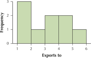
Question 2.179
42. Relative frequency histogram
For Exercises 43 and 44, use the imports from data from Table 26. Construct the indicated histogram, using five classes with class widths equal to 2. Your work from Exercises 21–24 should be helpful.
Question 2.180
43. Frequency histogram
2.2.43
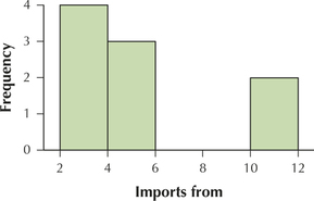
Question 2.181
44. Relative frequency histogram
For Exercises 45 and 46, again use the imports from data from Table 26. This time, construct the indicated histogram using seven classes with class widths equal to 1.5. Use your work from Exercises 25–28.
Question 2.182
45. Frequency histogram
2.2.45
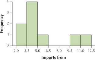
Question 2.183
46. Relative frequency histogram
For Exercises 47 and 48, use the trade balance data from Table 26. Construct the indicated histogram, this time using eight classes with class widths equal to 1. Use your work from Exercises 29–32.
Question 2.184
47. Frequency histogram
2.2.47
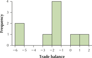
Question 2.185
48. Relative frequency histogram
For Exercises 49 and 50, use the motor vehicle theft rate data from Table 27. Construct the indicated histogram, using nine classes with class widths equal to 25. Use your work from Exercises 33–36.
Question 2.186
49. Frequency histogram
2.2.49
Question 2.187
50. Relative frequency histogram
For Exercises 51 and 52, again use the motor vehicle theft rate data from Table 27. But this time, construct the indicated histogram, using eight classes with class widths equal to 25. Use your work from Exercises 37–40.
Question 2.188
51. Frequency histogram
2.2.51
Question 2.189
52. Relative frequency histogram
For Exercises 53–56, construct a frequency polygon with the indicated data.
Question 2.190
53. The exports to data from Table 26. Calculate the midpoints using five classes with class width equal to 1.
2.2.53
Question 2.191
54. The imports from data from Table 26. Get the midpoints using five classes with class width equal to 2.
Question 2.192
55. The imports from data from Table 26. But this time compute the midpoints using seven classes with class width equal to 1.5.
2.2.55
Question 2.193
56. The motor vehicle theft rate data from Table 27. Calculate the midpoints using nine classes with class widths equal to 25.
For Exercises 57–60, construct a stem-and-leaf display of the indicated data.
Question 2.194
57. Exports to data from Table 26.
2.2.57
Question 2.195
58. Imports from data from Table 26.
Question 2.196
59. Trade balance data from Table 26.
2.2.59
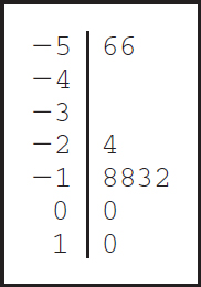
Question 2.197
60. Motor vehicle theft rate data from Table 27.
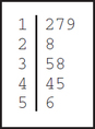
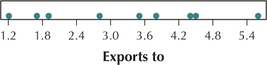
For Exercises 61–64, construct a dotplot of the indicated data.
Question 2.198
61. Exports to data from Table 26.
2.2.61
Question 2.199
62. Imports from data from Table 26.
Question 2.200
63. Trade balance data from Table 26.
2.2.63
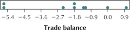
Question 2.201
64. Motor vehicle theft rate data from Table 27.
For Exercises 65 and 66, construct a comparison dotplot of the indicated data.
Question 2.202
65. Exports to data and imports from data from Table 26.
2.2.65
Question 2.203
66. Exports to data and trade balance data from Table 26.
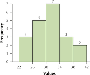
The cost of the last music download (in dollars) for 100 college students is summarized in Figure 43. Use this information for Exercises 67–70.
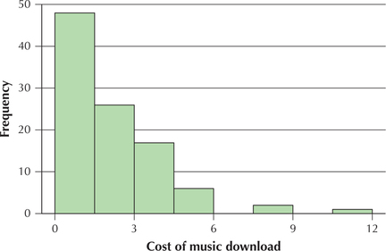
Question 2.204
67. What are the class midpoints?
2.2.67
0.75, 2.25, 3.75, 5.25, 6.75, 8.25, 9.75, 11.25
Question 2.205
68. About how many students paid less than $1.50 for their last music download? What is the relative frequency?
Question 2.206
69. About how many students paid $10.50 or more on their last music download?
2.2.69
2, 0.02
Question 2.207
70. Use your answers to the last two questions to estimate about how many students paid between $1.50 and $10.50 for their last music download.
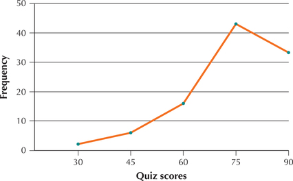
Figure 44 shows a histogram of a set of statistics quiz scores. Use this information for Exercises 71–74.
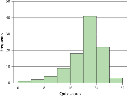
Question 2.208
71. What are the class midpoints?
2.2.71
2, 6, 10, 14, 18, 22, 26, 30
Question 2.209
72. Between which two scores did the most quiz scores occur?
Question 2.210
73. Can we tell what the highest grade on the quiz was? Why or why not? Would a stem-and-leaf display of this data be able to tell us what the highest grade was?
2.2.73
No. The histogram does not tell us the actual quiz scores. Yes.
Question 2.211
74. Estimate the relative frequency of quiz scores below 8.
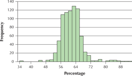
Figure 45 shows a histogram of a set of women's heights. Use this information for Exercises 75–78.
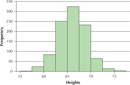
Question 2.212
75. Calculate the class midpoints.
2.2.75
56.25, 58.75, 61.25, 63.75, 66.25, 68.75, 71.25, 73.75, 76.25
Question 2.213
76. Between which two values did the most heights occur?
Question 2.214
77. If we added one inch to every woman's height, how would Figure 45 change?
2.2.77
The scale on the x-axis would shift up by 1 inch.
Question 2.215
78. If we added one inch to every woman's height, which aspects of Figure 45 would stay the same?
For Exercises 79–82, identify the shape of the distribution as either symmetric, right-skewed, or left-skewed.
Question 2.216
79. The data represented in Figure 43.
2.2.79
Right-skewed
Question 2.217
80. The distribution of the data in Figure 44.
Question 2.218
81. The data represented in Figure 45.
2.2.81
Symmetric
Question 2.219
82. The data from Table 19 on page 61.
APPLYING THE CONCEPTS
Question 2.220
fruitcups
83. Fruit Cup Sales for the Student-Run Café. Table 28 contains the number of fruit cups sold per day for the Student-Run café business.
| 1 | 1 | 1 | 1 | 2 | 2 |
| 0 | 2 | 2 | 4 | 2 | 2 |
| 0 | 1 | 2 | 1 | 1 | 1 |
| 3 | 2 | 2 | 4 | 0 | 0 |
| 2 | 3 | 3 | 0 | 4 | 4 |
| 2 | 0 | 1 | 2 | 1 | 3 |
| 2 | 1 | 3 | 2 | 2 | 1 |
| 0 | 2 | 0 | 3 | 2 |
- Construct a frequency distribution and a relative frequency distribution similar to Table 18.
- Use the following classes to construct a frequency distribution and a relative frequency distribution using classes, similar to Table 19. Use the following classes: 0–1, 2–3, 4–5.
- What is the relative frequency of days that three or more fruit cups were sold? Did you use your work from (a) or (b) to answer this? Explain how we could not have used the distributions in (b) to answer this.
2.2.83
(a)
| Fruit cups sold per day | Frequency | Relative frequency |
|---|---|---|
| 0 | 8 | 8/47 = 0.1702 |
| 1 | 12 | 12/47 = 0.2553 |
| 2 | 17 | 17/47 = 0.3617 |
| 3 | 6 | 6/47 = 0.1277 |
| 4 | 4 | 4/47 = 0.0851 |
| Total | 47 | 47/47 = 1.0000 |
(b)
| Fruit cups sold per day | Frequency | Relative frequency |
|---|---|---|
| 0–1 | 20 | 20/47 = 0.4255 |
| 2–3 | 23 | 23/47 = 0.4894 |
| 4–5 | 4 | 4/47 = 0.0851 |
| Total | 47 | 47/47 = 1.0000 |
(c) 0.2128, (a), Since 2 and 3 fruit cups sold per day are grouped together, we don't know how many of the days had 3 fruit cups sold that day.
Question 2.221
sandwich
84. Sandwich Sales for the Student-Run Café. Table 29 shows the number of sandwiches sold per day for the Student-Run café business.
| 5 | 6 | 8 | 4 | 3 | 7 |
| 6 | 0 | 3 | 2 | 3 | 4 |
| 9 | 1 | 3 | 8 | 7 | 8 |
| 2 | 3 | 8 | 6 | 4 | 4 |
| 6 | 7 | 6 | 5 | 2 | 3 |
| 8 | 4 | 4 | 6 | 7 | 3 |
| 5 | 2 | 4 | 8 | 4 | 6 |
| 1 | 2 | 6 | 4 | 4 |
- Construct a frequency distribution and a relative frequency distribution similar to Table 18.
- Use the following classes to construct a frequency distribution and a relative frequency distribution using classes, similar to Table 19. Use the following classes: 0–2, 3–5, 6–8, 9–11.
- Would you say that the distributions in (b) are symmetric? Explain.
- What is the proportion (relative frequency) of days that fewer than six sandwiches were sold?
Question 2.222
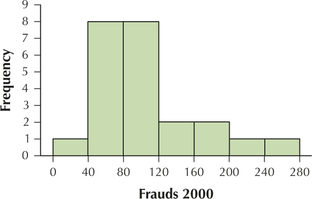
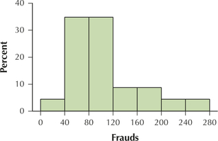
brooklynfrauds2000
85. Frauds in brooklyn in 2000. Table 30 provides the number of misdemeanor fraud cases in each of Brooklyn's 23 police precincts in 2000.
| Precinct | Frauds | Precinct | Frauds |
|---|---|---|---|
| 40 | 60 | 75 | 198 |
| 41 | 198 | 76 | 45 |
| 42 | 92 | 77 | 83 |
| 43 | 109 | 78 | 33 |
| 44 | 79 | 79 | 156 |
| 45 | 240 | 81 | 69 |
| 46 | 130 | 83 | 78 |
| 47 | 89 | 84 | 54 |
| 48 | 210 | 88 | 107 |
| 49 | 89 | 90 | 45 |
| 50 | 103 | 94 | 46 |
| 52 | 95 |
- Use 7 classes of width 40 each, starting at the leftmost class: 0 to < 40. Find the frequencies for each class.
- Find the relative frequencies for each class.
- Construct a frequency histogram of the number of fraud cases in Brooklyn in 2000.
- Construct a relative frequency histogram of the number of fraud cases in Brooklyn in 2000.
2.2.85
(a) and (b)
| Frauds | Frequency | Relative frequency |
|---|---|---|
| 0 to < 40 | 1 | 1/23 = 0.0435 |
| 40 to < 80 | 8 | 8/23 = 0.3478 |
| 80 to < 120 | 8 | 8/23 = 0.3478 |
| 120 to < 160 | 2 | 2/23 = 0.0870 |
| 160 to < 200 | 2 | 2/23 = 0.0870 |
| 200 to < 240 | 1 | 1/23 = 0.0435 |
| 240 to < 280 | 1 | 1/23 = 0.0435 |
| Total | 23 | 23/23 = 1.0000 |
(c)
(d)
 Frauds in Brooklyn in 2013.
Table 31 provides the number of misdemeanor fraud cases in each of Brooklyn's 23 police precincts in 2013. Use this data for Exercises 86–90.
| Precinct | Frauds | Precinct | Frauds |
|---|---|---|---|
| 60 | 33 | 75 | 133 |
| 61 | 53 | 76 | 19 |
| 62 | 76 | 77 | 41 |
| 63 | 52 | 78 | 15 |
| 66 | 23 | 79 | 63 |
| 67 | 57 | 81 | 36 |
| 68 | 44 | 83 | 68 |
| 69 | 16 | 84 | 41 |
| 70 | 42 | 88 | 48 |
| 71 | 73 | 90 | 51 |
| 72 | 27 | 94 | 21 |
| 73 | 90 |
Question 2.223
brooklynfrauds2013
86. Constructing and comparing histograms. Do the following:
- Use 7 classes of width 40 each, starting at the leftmost class: 0 to < 40. Find the class boundaries.
- Find the frequencies for each class.
- Find the relative frequencies for each class.
- Construct a frequency histogram of the number of fraud cases in Brooklyn in 2013.
- Construct a relative frequency histogram of the number of fraud cases in Brooklyn in 2013.
- Compare your frequency histograms from Exercises 85c and 86d. Describe any differences between the two graphs. Do you think this represents good news, bad news, or no news?
Question 2.224
brooklynfrauds2013
87. Getting information from histograms. Refer to your work from Exercise 86 to answer the following questions.
- Find the relative frequency of precincts where 80 or more frauds occurred.
- Compute the proportion (relative frequency) of precincts where 40 or more frauds occurred.
- Compute the relative frequency of precincts that had fewer than 40 frauds. Explain how you could have used your answer from (b) to calculate this.
2.2.87
(a) 0.0870 (b) 0.6522 (c) 0.3478, 1 – 0.6522 = 0.3478
Question 2.225
brooklynfrauds2013
88. Constructing Frequency Polygons. Use Table 31 to answer the following:
- Using the same class boundaries you calculated in Exercise 86, find the class midpoints.
- Construct a frequency polygon of the number of misdemeanor fraud cases in Brooklyn in 2013.
- Use (b) to construct a relative frequency polygon.
- Use the relative frequency polygon to find the relative frequency of precincts where more than 100 frauds occurred.
Question 2.226
brooklynfrauds2013
89. Stem-and-leaf Displays. Use Table 31 to answer the following:
- Construct a stem-and-leaf display of the number of frauds in Brooklyn in 2013.
- Build a split-stem stem-and-leaf display of the number of frauds.
- Using the stem-and-leaf display, find how many precincts had 52 or more frauds. Explain whether this could have been found using the histogram from Exercise 86.
2.2.89
(a)
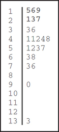
(b)
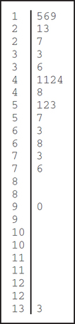
(c) 9. Could not have used histogram because the histogram does not contain the actual data.
Question 2.227
brooklynfrauds2013
90. Dotplots. Use Tables 30 and 31 for the following:
- Make a dotplot of the number of frauds in Brooklyn in 2013.
- Construct a comparison dotplot of the number of frauds in Brooklyn in 2000 and in 2013.
- Describe any differences between the two distributions in (b).
Question 2.228
coffees
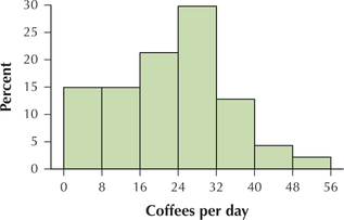
91. Coffee Sales for the Student-Run Café. In Table 32, we see the number of coffees sold per day for the Student-Run café business. Consider this to be continuous data.
| 41 | 30 | 21 | 25 | 21 | 4 |
| 33 | 27 | 28 | 35 | 8 | 13 |
| 34 | 30 | 23 | 33 | 8 | 4 |
| 27 | 27 | 31 | 35 | 4 | 16 |
| 20 | 26 | 29 | 16 | 4 | 14 |
| 23 | 24 | 48 | 24 | 3 | 10 |
| 32 | 18 | 25 | 20 | 5 | 11 |
| 31 | 22 | 31 | 11 | 6 |
- Use 7 classes of width 8 each, starting with the following leftmost class: 0 to < 8. Calculate the class boundaries.
- Find the frequencies for each class.
- Find the relative frequencies for each class.
- Construct a frequency histogram of coffees sold.
- Construct a relative frequency histogram of coffees sold.
2.2.91
(a), (b), (c)
| Coffee sold per day | Frequency | Relative frequency |
|---|---|---|
| 0 to < 8 | 7 | 7/47 = 0.1489 |
| 8 to < 16 | 7 | 7/47 = 0.1489 |
| 16 to < 24 | 10 | 10/47 = 0.2128 |
| 24 to < 32 | 15 | 15/47 = 0.3191 |
| 32 to < 40 | 6 | 6/47 = 0.1277 |
| 40 to < 48 | 1 | 1/47 = 0.0213 |
| 48 to < 56 | 1 | 1/47 = 0.0213 |
| Total | 47 | 47/47 = 1.0000 |
(d)
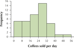
(e)
Question 2.229
sodas
92. Soda Sales for the Student-Run Café. In Table 33, we see the number of sodas sold per day for the Student-Run café business. Consider this to be continuous data.
| 20 | 12 | 24 | 25 | 43 | 45 |
| 13 | 19 | 31 | 36 | 24 | 50 |
| 23 | 33 | 15 | 33 | 48 | 26 |
| 13 | 20 | 26 | 37 | 35 | 26 |
| 13 | 29 | 39 | 22 | 33 | 55 |
| 33 | 14 | 24 | 36 | 24 | 42 |
| 15 | 17 | 35 | 54 | 30 | 45 |
| 27 | 31 | 11 | 34 | 50 |
- Use 10 classes of width 5 each, starting with the following leftmost class: 10 to < 15. Calculate the class boundaries.
- Find the frequencies for each class.
- Find the relative frequencies for each class.
- Construct a frequency histogram of sodas sold.
- Construct a relative frequency histogram of sodas sold.
Question 2.230
93. Coffee Sales. Refer to your work from Exercise 91 to answer the following questions.
- Find the relative frequency of days that more than 39 coffees were sold.
- Compute the proportion (relative frequency) of days that more than 31 coffees were sold.
- Compute the relative frequency of days that 31 or fewer coffees were sold. Explain how you could have used your answer from (b) to calculate this.
- Find the proportion of days that between 16 and 31 coffees (inclusive) were sold.
2.2.93
(a) 0.0426 (b) 0.1702 (c) 0.8298; 1 – 0.1702 = 0.9298 (d) 0.5319
Question 2.231
94. Soda Sales. Refer to your work from Exercise 92 to answer the following questions.
- Find the relative frequency of days that more than 34 sodas were sold.
- Find the relative frequency of days that fewer than 20 sodas were sold.
- Compute the proportion (relative frequency) of days that 20 or more sodas were sold. Explain how you could have used your answer from (b) to calculate this.
- Find the proportion of days that between 20 and 39 sodas (inclusive) were sold.
Question 2.232
95. Coffee Sales. Use Table 32 to answer the following:
- Use 7 classes of width 8 each, starting with the following leftmost class: 0 to < 8. Use the class boundaries you calculated in Exercise 91. Find the class midpoints.
- Construct a frequency polygon of the number of coffees sold.
- Use (b) to construct a relative frequency polygon of the number of coffees sold.
- Use the relative frequency polygon to find the relative frequency of days that fewer than 17 coffees were sold.
2.2.95
(a) 4, 12, 20, 28, 36, 44, 52
(b)
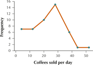
(c)
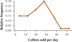
(d) 0.3404
Question 2.233
96. Soda Sales. Use Table 33 to answer the following:
- Use 10 classes of width 5 each, starting with the following leftmost class: 10 to < 15. Use the class boundaries you calculated in Exercise 92. Find the class midpoints.
- Construct a frequency polygon of the number of sodas sold.
- Use (b) to construct a relative frequency polygon of the number of sodas sold.
- Use the relative frequency polygon to find the relative frequency of days that more than 24 sodas were sold.
Question 2.234
97. Coffee Sales. Use Table 32 to answer the following:
- Construct a stem-and-leaf display of the number of coffees sold.
- Build a split-stem stem-and-leaf display of the number of coffees sold.
- Make a dotplot of the number of coffees sold.
- Using the stem-and-leaf display, find the number of days that 28 or more coffees were sold. Explain whether this could have been found using the histogram from Exercise 91.
2.2.97
(a)
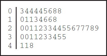
(b)
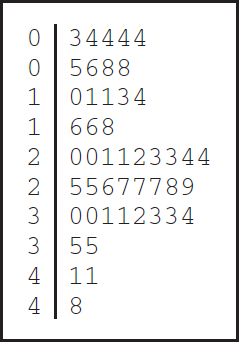
(c)
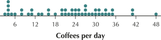
(d) 15. No, the stem-and-leaf display contains the actual data.
Question 2.235
98. Soda Sales. Use Table 33 to answer the following:
- Construct a stem-and-leaf display of the number of sodas sold.
- Build a split-stem stem-and-leaf display of the number of sodas sold.
- Make a dotplot of the number of sodas sold.
- Using the stem-and-leaf display, find the number of days that 32 or more sodas were sold. Explain whether this could have been found using the histogram from Exercise 92.
Question 2.236
99. Best-selling video games. Figure 46 contains a histogram of the top 30 best-selling video game sales for the week of May 17, 2014. Use Figure 46 to answer the following:
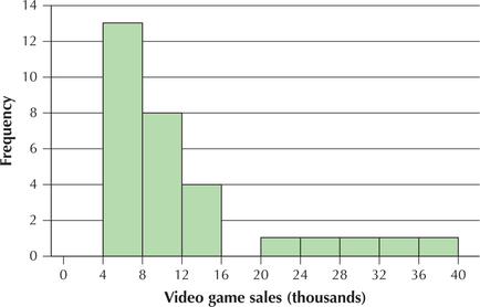
- Identify whether the distribution is symmetric, left-skewed, or right-skewed. Explain your answer.
- Use the histogram to construct a relative frequency histogram.
- Explain whether we could use the information in Figure 46 to construct a stem-and-leaf display of video game sales.
2.2.99
(a) Right-skewed, tail on right
(b)
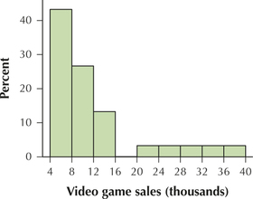
(c) No. Histogram does not contain actual data.
Question 2.237
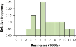
100. Small businesses. The U.S. Census Bureau tracks the number of small businesses per city. The accompanying frequency polygon represents the numbers of small businesses per city (in thousands) for 266 cities nationwide.
- What is the class width?
- What is the lower class limit of the leftmost class? (Hint: Don't forget about the units.)
- Which class has the highest frequency?
- Which class has the lowest frequency?
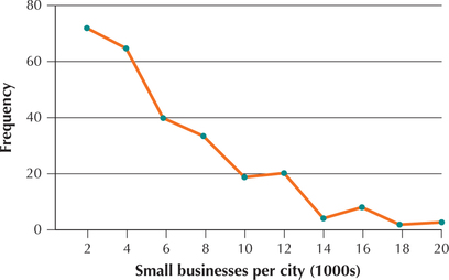
Question 2.238
101. Refer to the frequency polygon of small businesses per city.
- About how many cities have between 1000 and 3000 small businesses?
- About how many cities have more than 19,000 small businesses?
- About how many cities have between 9000 and 11,000 small businesses?
2.2.101
(a) Approximately 72 (b) Approximately 2 (c) Approximately 18
Question 2.239
countrycont
102. Countries and Continents. Suppose we are interested in analyzing the variable continent for the 10 countries in Table 34. Construct each of the following tabular or graphical summaries. If not appropriate, explain clearly why we can't use that method.
| Country | Continent |
|---|---|
| Iraq | Asia |
| United States | North America |
| Pakistan | Asia |
| Canada | North America |
| Madagascar | Africa |
| North Korea | Asia |
| Chile | South America |
| Bulgaria | Europe |
| Afghanistan | Asia |
| Iran | Asia |
- Frequency distribution
- Relative frequency distribution
- Frequency histogram
- Dotplot
- Stem-and-leaf display
Question 2.240
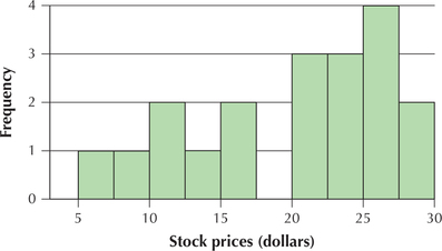
103. Stock Prices. Refer to the histogram of stock prices of 19 technology firms.
- How could we turn this into a relative frequency histogram? Would the classes or the rectangles be affected?
- Suppose we were given a relative frequency histogram instead. How could we turn it into a frequency histogram?
- What is the sample size?
2.2.103
(a) Divide the frequency values by the total frequency—classes not affected (b) change the scale along the relative frequency (vertical) axis by multiplying the relative frequency values by the total frequency—shape of distribution not affected (c) 19
Question 2.241
104. Refer to the histogram of stock prices.
- How many stocks were priced above $27.50?
- What is the relative frequency of stocks priced above $27.50?
- How many stocks had a price below $15?
- What is the relative frequency of stocks with a price below $15?
Question 2.242
105. Refer to the histogram of stock prices.
- How many stocks are priced between $17.50 and $20?
- What is the relative frequency of stocks priced below $5?
- Which class has the largest relative frequency? Calculate this relative frequency.
- What is the frequency of stocks priced between $10 and $14.99?
- How many stocks had a price of $40?
2.2.105
(a) 0 (b) 0 (c) $25 to $27.5 has the largest relative frequency, 4/19 = 0.2105. (d) 3 (e) 0
Question 2.243
106. Would you characterize the shape of the stock prices distribution as (a) tending to be symmetric, (b) tending to be right-skewed, or (c) tending to be left-skewed?
Question 2.244
107. Stem-and-Leaf Display. Refer to the accompanying stem-and-leaf display. Reconstruct the data set.
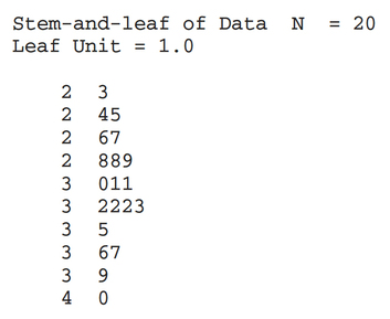
2.2.107
Data set: 23 24 25 26 27 28 28 29 30 31 31 32 32 32 33 35 36 37 39 40
Question 2.245
108.Refer to the stem-and-leaf display in Exercise 107. Construct a relative frequency distribution, using appropriate values for the class width and the lower class limit of the leftmost class.
Question 2.246
109. Refer to the stem-and-leaf display in Exercise 107. Construct a frequency histogram.
2.2.109
Histogram with five classes
Question 2.247
110. Refer to the stem-and-leaf display in Exercise 107. Construct a dotplot.
Question 2.248
111. Frequency Polygon. The following frequency polygon represents the quiz scores for a course in introductory statistics.
- What is the class width?
- What is the lower class limit of the class that has 45 as its midpoint?
- What is the upper class limit of the class that has 45 as its midpoint?
- Which class has the highest frequency?
- Which class has the lowest frequency?
2.2.111
(a) 15 (b) 37.5 (c) 52.5 (d) 67.5 to 82.5 (e) 22.5 to 37.5
Question 2.249
112. Refer to the frequency polygon of quiz scores.
- About how many students scored higher than 82.5?
- About how many students scored lower than 52.5?
- Can we say how many students scored in the 90s? Why or why not?
WORKING WITH LARGE DATA SETS
New York Townspeople. Use the following information for Exercises 113–116. For towns in New York State, the following histogram provides information on the percentage of the townspeople who are between 18 and 65 years old.
Question 2.250
newyork
113.Would you characterize the distribution as left-skewed, right-skewed, or fairly symmetrical?
2.2.113
Fairly symmetrical
Question 2.251
newyork
114. Provide an estimate of the “typical” percentage of townspeople who are between 18 and 65 years old. Is this typical value near the middle or near one of the “tails” of the distribution?
Question 2.252
newyork
115. Provide a rough estimate of the sample size.
2.2.115
n≈690.
Question 2.253
newyork
116. Would it be possible to construct a stem-and-leaf display using the information from the histogram? Explain.
Number of Businesses. Use the following data for Exercises 117–120. The data represent the number of business establishments in a sample of states.
| State | Businesses (1000s) |
State | Businesses (1000s) |
|---|---|---|---|
| Alabama | 3.8 | Michigan | 7.5 |
| Arizona | 7.9 | Minnesota | 6.1 |
| Colorado | 8.9 | Missouri | 5.9 |
| Connecticut | 3.1 | Ohio | 9.5 |
| Georgia | 10.3 | Oklahoma | 3.8 |
| Illinois | 11.9 | Oregon | 5.4 |
| Indiana | 5.6 | South Carolina | 4.6 |
| Iowa | 2.7 | Tennessee | 5.4 |
| Maryland | 5.7 | Virginia | 8.6 |
| Massachusetts | 6.3 | Washington | 9.3 |
Question 2.254
statebusinesses
117. Construct the following:
- A frequency distribution
- A relative frequency distribution
- A relative frequency histogram
2.2.117
(a) and (b)
| Businesses (1000s) | Frequency | Relative frequency |
|---|---|---|
| 2 to < 3 | 1 | 1/20 = 0.05 |
| 3 to < 4 | 3 | 3/20 = 0.15 |
| 4 to < 5 | 1 | 1/20 = 0.05 |
| 5 to < 6 | 5 | 5/20 = 0.25 |
| 6 to < 7 | 2 | 2/20 = 0.10 |
| 7 to < 8 | 2 | 2/20 = 0.10 |
| 8 to < 9 | 2 | 2/20 = 0.10 |
| 9 to < 10 | 2 | 2/20 = 0.10 |
| 10 to < 11 | 1 | 1/20 = 0.05 |
| 11 to < 12 | 1 | 1/20 = 0.05 |
| Total | 20 | 20/20 = 1.00 |
(c)
Question 2.255
statebusinesses
118. Construct the following:
- A dotplot
- A frequency polygon
- A stem-and-leaf display
Question 2.256
statebusinesses
119. Compare and contrast the relative usefulness of each of four graphical presentation methods—dotplot, histogram, stem-and-leaf display, and frequency polygon—if our primary objective is to
- assess symmetry and skewness.
- be able to construct it quickly using paper and pencil.
- retain complete knowledge of the data set.
- give a presentation to people who have never taken a stats course.
2.2.119
| Dotplot | Histogram | Stem-and-leaf | Frequency polygon | |
|---|---|---|---|---|
| (a) Symmetry and skewness | Appropriate to use for small ranges of data | Appropriate to use | Appropriate to use for small ranges of data | Appropriate to use |
| (b) Construct using pencil and paper | Easily done for small ranges of data | Easily done for small ranges of data | Easily done for small ranges of data | Easily done for small ranges of data |
| (c) Retain complete knowledge of the data | Appropriate | Appropriate only if the data are ungrouped | Appropriate | Appropriate only if the data are ungrouped |
| (d) Presentation in front of non-statisticians | Appropriate | Appropriate | Appropriate | Appropriate |
Question 2.257
statebusinesses
 120. What if we subtract the same amount (say, 1000) from each state's number of businesses. Explain how this would affect the following: What would change? What would stay the same?
- Relative frequency histogram
- Dotplot
- Stem-and-leaf display
- Frequency polygon
WORKING WITH LARGE DATA SETS
Fats and Cholesterol. For Exercises 121–125, use your knowledge of technology. Open the Nutrition data set.
Question 2.258
nutrition
121. How many observations are there in the data set? How many variables?
2.2.121
961; 25
Question 2.259
nutrition
122. The variable fat contains the fat content in grams for each food. Construct a histogram of fat. Comment on the symmetry or the skewness of the histogram.
Question 2.260
nutrition
123. Is there a particular type of food with a fat content that is particularly large? Which type of food item (or set of similar food items) is this?
2.2.123
Yes; fats and oils.
Question 2.261
nutrition
124. The variable cholesterol contains the cholesterol content in milligrams for each food. Construct a histogram of cholesterol. Comment on the symmetry or the skewness of the histogram.
Question 2.262
nutrition
125. Which food item (or set of similar food items) is highest in cholesterol?
2.2.125
One whole cheesecake (2053 grams of cholesterol)
![]() Earthquakes. Use the One Variable Statistics and Graphs applet for Exercises 126–131. Work with the Earthquakes data set, which shows the magnitude on the Richter scale of 57 earthquakes that occurred during the week of October 15–22, 2007.
Earthquakes. Use the One Variable Statistics and Graphs applet for Exercises 126–131. Work with the Earthquakes data set, which shows the magnitude on the Richter scale of 57 earthquakes that occurred during the week of October 15–22, 2007.
Question 2.263
earthquakes
126. Click on the histogram tab.
- How many classes are included in the histogram?
- What is the class width?
Question 2.264
earthquakes
127. Click on the leftmost rectangle in the histogram.
- What is the frequency for this class?
- What are the lower and upper class limits?
2.2.127
(a) 2 (b) 4.00, 4.30
Question 2.265
earthquakes
128. Click on the number line and drag slowly all the way to the left.
- What happens to the number of classes as you drag to the left?
- What happens to the class widths as you drag to the left?
Question 2.266
earthquakes
129. Click on the number line and drag slowly all the way to the right.
- What happens to the number of classes as you drag to the right?
- What happens to the class widths as you drag to the right?
2.2.129
(a) Increases (b) Decreases
Question 2.267
earthquakes
130. Click on the Stem-and-leaf tab.
- How many stems are there?
- Without counting, how many leaves are there? How do we know this?
Question 2.268
earthquakes
131. Select Split Stems.
- Now how many stems are there?
- How many leaves are there?
- Which stem-and-leaf display is preferable for the Earthquakes data—regular or split stems? Why?
2.2.131
(a) 6 (b) 57 (c) Split stems; answers will vary
CONSTRUCT YOUR OWN DATA SETS
Question 2.269
132. Construct your own right-skewed data set of about 20 values. Just make up the data points, but be sure you know what the data represent (income, housing costs, etc.).
- Construct a stem-and-leaf display of your data set.
- Construct a dotplot of your data set.
Question 2.270
133. Construct your own symmetric data set of about 20 values. Just make up the data points, but be sure you know what the data represent (for example, runs in a baseball game, number of right answers on a quiz).
- Construct a stem-and-leaf display of your data set.
- Construct a dotplot of your data set.
2.2.133
Answers will vary.
WORKING WITH LARGE DATA SETS
Petit larceny. Use the Petit Larceny data set for Exercises 134–141.
Question 2.271
petitlarceny
134. Build a frequency histogram of the number of petit larceny cases, per precinct, for 2000.
Question 2.272
petitlarceny
135. Build a relative frequency histogram of the number of petit larceny cases, per precinct, for 2000.
2.2.135
Question 2.273
petitlarceny
136. Build a histogram of the number of petit larceny cases, per precinct, for 2013. Make sure you use the same scale for the x axis and the y axis in each case, so that you may compare the two histograms more easily.
Question 2.274
petitlarceny
137. Compare the two histograms of petit larceny cases in 2000 and 2013. Describe any differences between the histograms. Would you say this reflects good news or bad news?
2.2.137
The number of petit larceny cases appears to be decreasing. This is good news.
Question 2.275
petitlarceny
138. Identify the precinct with the unusual number of petit larceny cases in each case. Using the Internet, research where this precinct lies in New York City.
Question 2.276
petitlarceny
139. Construct a comparison dotplot of the number of petit larcenies for the years 2000 and 2013. Describe any differences between the two groups.
2.2.139
The number of petit larcenies appears to be decreasing.
Question 2.277
petitlarceny
140. Build stem-and-leaf displays of the number of petit larcenies for the years 2000 and 2013. Describe any difference between the two groups.
Question 2.278
petitlarceny
141. Which graph—the histogram, the dotplot, or the stem-and-leaf display—is preferable if your objective is to:
- assess symmetry and skewness?
- be able to construct it quickly using paper and pencil?
- retain complete knowledge of the original data set?
- give a presentation to people who have never taken a stats course?
2.2.141
| Dotplot | Histogram | Stem-and-leaf | |
|---|---|---|---|
| (a) Symmetry and skewness | Appropriate to use for small ranges of data | Appropriate to use | Appropriate to use for small ranges of data |
| (b) Construct using pencil and paper | Easily done for small ranges of data | Easily done for small ranges of data | Easily done for small ranges of data |
| (c) Retain complete knowledge of the data | Appropriate | Appropriate only if the data are ungrouped | Appropriate |
| (d) Presentation in front of non-statisticians | Appropriate | Appropriate | Appropriate |