Composition
Whereas camera shots and angles provide a way of seeing what’s in a scene, composition is the craft of arranging people, architectural details, and objects inside the frame so that they look good. As you learned in Chapter 6, every motion picture image is bound by horizontal and vertical limits, which form the image’s frame. In order to compose images inside the frame, you’ll need to explore what “looking good” means, discover the core principles of artistic composition when the camera is still or in motion, and learn to use the right lens to get what you’re after.
As you learned in Chapter 4, previsualization can be used to determine the composition of the shot before you arrive on-
What Is Good Composition?
There are two answers to this question, one of which can override the other if creative needs require it. The first answer is that a well-
Good composition, then, does have core aesthetic principles—
- Observe the rule of thirds. Imagine your frame is divided into thirds along both the x- and y-axes; your subject should be on one of the lines. In a close-
up, the eyes should be on the upper horizontal line. The rule of thirds will give all of your images a sense of visual balance, because our eyes naturally look first to the upper middle third of the film frame, and then look around to see the rest of the image.
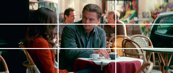
A well-
- Give the right amount of headroom. Headroom is how close the top of the frame is to the actors’ heads. A shot will have a lot or a little headroom and will generally (but not always) stay consistent for all actors in a scene. Headroom can convey a lot about a character. When you give characters the right amount of headroom, they will seem to inhabit the scene comfortably; if you purposely give them little headroom, you’re suggesting that they are uncomfortable in the scene, and you can use this composition technique for dramatic effect. Although a comedy will usually have more headroom than a drama, there are no hard and fast rules.
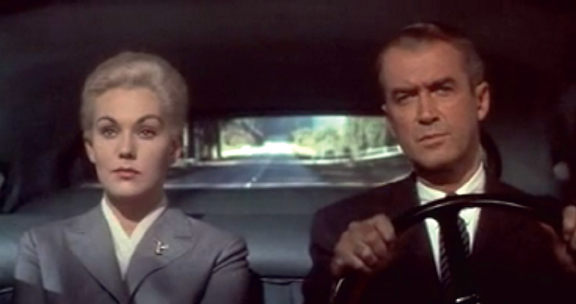
Just the right amount of headroom in Vertigo (1958)
- Provide negative space. Frame ahead of your character so that there is negative space (space that is not filled) where the character’s eyes are looking (this is called giving the character eye room, or look room), or where the character is walking (this is called giving the character lead room). Negative space is important because it allows you to direct the audience’s gaze to what’s most significant in each shot. In the shot from The King’s Speech, the audience is naturally directed to King George VI’s face; the shot is also artistically composed and looks far more interesting than if his face were dead center in the frame.
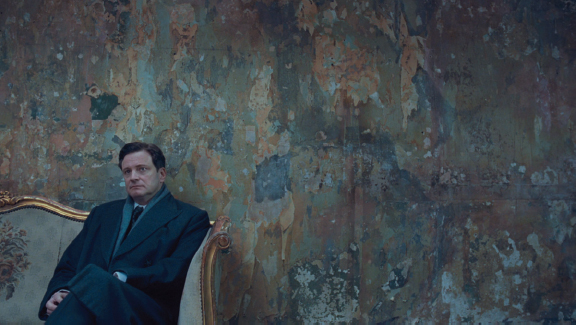
The King’s Speech (2010)
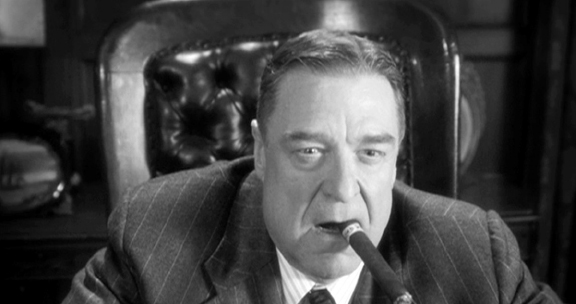
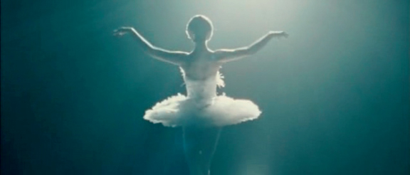
- Use mass and color to your advantage. The audience’s eye will be drawn to a massive object—
one that takes up a disproportionate amount of screen space— and an object that’s strongly colored. This is sometimes called the Hitchcock Rule, after legendary director Alfred Hitchcock, who framed his shots so that the size of a person or an object in the frame was proportional to its importance at that moment in the story. In a classic shot from North by Northwest (1959), the plane is less important than the main character, who is in danger.
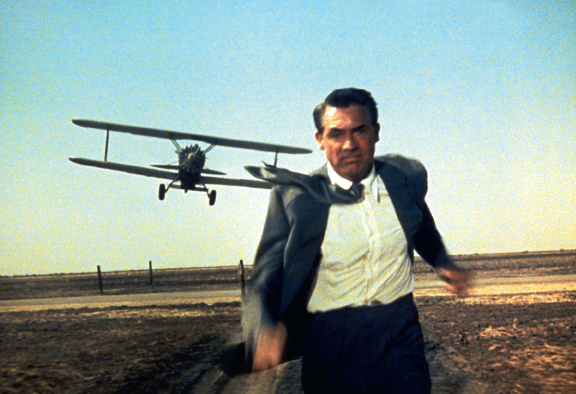
North by Northwest (1959)
The Artist (2011)
In the example from The Artist (2011), the actor in the foreground attracts attention because of his size, and his mass is balanced with negative space in the rest of the frame. In the example from Black Swan (2010), the white dress with pink-
Black Swan (2010)
- Avoid center punching (putting the important subjects directly in the center of the frame), to create a more interesting look. Instead, place the subjects toward the edges of the frame. This is called weighting (or justifying) the frame to the left or right, and it is a matter of storytelling and personal taste; symmetrical frames are generally less exciting than unsymmetrical frames. That said, there are exceptions that would call for center punching the subject—
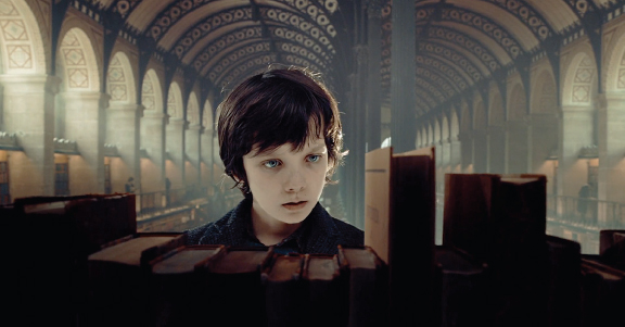
for example, if you want to emphasize ideas of symmetry and balance. - Decide on foreground elements—any objects that are positioned between the camera and the main subject of the shot. Although foreground elements can refer to an actor, as in an over-
the- shoulder shot, they more commonly take the form of some object or piece of set dressing, such as a window frame or a chain- link fence. The foreground object is generally out of focus, but it can be manipulated through the use of a zoom.
Hugo (2011)
- Play the diagonals. Imagine each shot as a series of lines. Diagonal compositions are more dynamic than flat ones, and they help direct the audience’s gaze where you want it to go.
- Angle the camera sparingly and always on purpose. The audience expects the frame of the camera to be level with the ground. If you use a tilted angle, or Dutch angle, tilt the angle approximately 10 to 20 degrees.
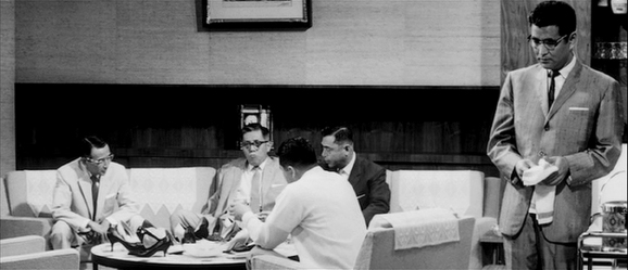
- Keep composition consistent all the way to the end of the scene. If the actors are moving and the camera is moving with them, keep the same amount of lead room. If the actors’ blocking repositions them during the shot, make sure the shot stays well balanced at both the beginning and the end of their movements. Akira Kurosawa’s High and Low (1963) is one of the best-
composed movies ever. When you watch the film, you will see how the blocking is so carefully staged that no matter how the actors or the camera moves, each shot stays perfectly composed.
High and Low (1963)
- Keep distractions out of the frame. The exception to this rule is if you want the audience to notice something a character is not aware of (see Producer Smarts: Composition Outside the Frame, below).
Composition Outside the Frame
You’ve just learned about what you can see inside the frame, but what about what you can’t see? A good producer will know how to guide the director and cinematographer to leave some things out of the picture.
Producers generally keep some actions out of the frame for three reasons:
- It’s cheaper. If you only hear violence rather than see it, you won’t have to make expensive prosthetics and have wardrobe prepare multiple changes of bloody clothes. If you see the train station but only hear the train pulling in, you won’t have to find a train.
- It broadens the audience. On-
screen graphic violence and sexuality can be off- putting to some audiences, or it can push a movie to a more restrictive rating. To keep the possibility of a PG or PG- 13 rating, instead of an R rating, a producer should always make sure to get shots in which graphic action takes place outside the frame. - It’s more effective. The imagination is a powerful tool; it’s often more compelling to imagine something than to witness it. For example, you’re watching a battle scene: if you see the hero thrust her spear at an opponent who’s off-
screen, and you hear the sickening squish of metal entering flesh, you’ll know what happened; your imagination will make it just as violent as you want it to be. Similarly, have you ever noticed that scary movies become scarier when you are seeing the characters in close- up? That’s because you can’t see what’s outside the frame, surrounding them, where the monster may be lurking. What you think might be there is scarier than what you see! Hitchcock, of course, was the master of this methodology. Another classic example, indirectly inspired by Hitchcock, is Jaws (1975). In the first shark attack you never see the shark, just the terror of its victim. In fact you don’t see the entire shark until almost two- thirds of the way into the film. (Of course, director Stephen Spielberg reverted to this approach in part because of technical difficulties he encountered with his mechanical shark, which limited its capabilities, but he has told interviewers over the years that this was a serendipitous problem, because it made the frightful nature of the movie better when he was forced to veer off into a Hitchcockian direction.)
You won’t be required to observe all of these principles in every shot. In fact, almost every movie will use or break each of the rules of good composition at least once. You can also apply these principles to the difference between shooting people and shooting objects (see Action Steps: Shooting People and Objects, below).
ACTION STEPS
Shooting People and Objects
Shooting people is different from shooting things. Most of the time, objects don’t move, and they are not the main characters in a story, whereas people generally move and drive the action forward. Because of this difference, you need to be specific about placement and eyelines.
 Placement. It is usually boring to place an actor in the dead center of the frame. Asymmetrical framing—
balancing the actor’s form with negative space on the other side of the frame— is more appealing. When you do place an actor dead center, it conveys primacy and prominence; this may be combined with a low angle, making the actor appear more powerful and heightening the effect. You can follow the same rule with objects, except that you can place objects at the center of the frame more frequently, especially for cutaways and inserts (see here).  Eyelines. As previously mentioned, you’ll typically shoot actors from eye level or close to eye level—
some directors find that exact eye level is too directly challenging for the audience, and in most cases, you get the best view of the actor’s eyes shooting just below them. On the other hand, objects are customarily shot from the eyeline of the actors in the scene.
Composition in the Moving Frame
 USE CONVERGING LINES
Use converging lines to make your shots more dynamic. The classic converging-lines shot features railroad tracks disappearing into the distance. A wide-angle lens will emphasize converging lines.
More often than not, your camera will be in motion—smaller motions as characters engage with one another, and larger motions to cover actions and more complicated scenes. As the camera moves, the framing of the scene moves with it; a good cinematographer will pay attention to composition all the way through every camera move and usually do a rehearsal of the move first.
In Chapter 6, you learned about the tools that allow cameras to move—dollies, cranes, Steadicams, and anything with wheels on which a camera can be mounted. Now you will learn to use these camera movement tools for storytelling. Camera moves and setups enhance narrative flow and character development and help convey feelings to the audience. Sometimes, when a camera moves fast alongside action, it creates a sense of speed and power. At other times, when the camera gently comes close to a character’s face, the audience might think the character suddenly understands something. In yet another instance, if the camera swoops away or moves higher, expanding the frame wider to give a view of the entire scene, the audience gains a sense of greater perspective.
Because camera movements can occur at any speed, they are inextricably linked to time. A fast move creates a sense of quickening or an exciting pace, whereas a slow move may enhance suspense; alternately, the move may be so slow and subtle that the audience only perceives it through an unconscious emotional response.
Following are the six most important camera movements, and their visual language meaning for character and plot:
 PAN BEFORE ZOOMING
When combining a pan or tilt with a zoom, start the pan or tilt a fraction of a second before you start the zoom for a more professional look.
 Pan. A pan moves the frame on the horizontal axis—from right to left, or left to right. It is useful for following action, for tracking a character that is moving from place to place, and for revealing an important piece of visual information. Mount the camera on a tripod to accomplish a pan.
 Tilt. A tilt moves the frame along the vertical axis—up or down. You can use a tilt to follow the action from the foreground to the background, or vice versa, or to let the audience notice something significant. Mount the camera on a tripod to accomplish a tilt.
 Tracking shot. A tracking shot moves with the characters or the action. Often you’ll position the camera ahead of the characters as they walk or run, moving at the same pace and always staying a consistent distance from the characters. Tracking shots should feel effortless; typically the audience won’t be aware that the camera is moving because they’re focusing on the actors’ movements. You can do a tracking shot with or without actual camera track equipment (see Chapter 6). You can track actors with a handheld camera or a Steadicam. If you use a camera track and mount the camera on a dolly, the shot can also be called a dolly shot.
 Push in or pull out. These shots move along the depth axis, and they can be accomplished with a dolly and track, a handheld camera, or a Steadicam. A push in moves the frame toward the character’s face, giving the sense that the character suddenly understands something or is about to take some kind of action. A push in to an object emphasizes the object’s importance. A pull out creates anticipation that the character is about to do something important, with the frame widening so that the action can take place.
 Zoom. A zoom pushes in or pulls out along the depth axis, and moves the frame without moving the camera. That’s because a zoom is accomplished with a special zoom lens (see here). Due to its special nature, a zoom is able to travel much farther along the z-axis than a camera can move without a zoom lens. Keep in mind there is a crucial storytelling difference between a dolly shot pushing in and a zoom zooming in. A dolly push-in changes the perspective and size relationship between the main actor and the surroundings; a zoom-in does not.
 Crane. A crane shot uses a crane (see Chapter 6) to move the camera from a high angle to a low angle, or from a low angle to a high angle. If you start at a high angle and then move down into the scene, you set the stage for the action. This shot is often used at the beginning of movies or sequences. If you start at eye level and then move up to a high angle, you convey perspective and completion; this shot is often used at the end of sequences, or as the final shot of a film.
 KEEP THE HORIZON LOW
Don’t let the horizon cut though the actors’ heads. Generally, the horizon line should fall at the actors’ shoulders or below.
To make the best use of your camera moves, follow these two important steps:
- Begin with a static frame for a few seconds, perform the camera move, and then end on a static frame, which you should also hold for a few seconds. In editing, you can always cut into or out of the shot while the camera is in motion, but a well-framed, stationary image at the beginning and end of each shot will give you much more flexibility in the editing room (see Creating Images for Continuity).
- Begin each camera move from a less comfortable position, and move toward a more comfortable position. This creates a sense of story progression and emotional drive. For example, you may begin the shot on a car door (uncomfortable because of the camera angle and because it doesn’t reveal much information), then move up to include the driver coming out of the car (comfortable because the actor is well framed and the camera move reveals who has been driving the car). In another example, the shot would begin with an open door (uncomfortable because of the suspenseful angle), and then move into the room to discover a writer sitting at her desk (comfortable because we now know who is in the room).
Composition and Lenses
As you have already discovered from your exploration of lenses in Chapter 6, the choice of lens is fundamental to how each shot is composed. Because different lenses will allow you to show more or less of a scene and will place actors in greater or lesser context with their surroundings, you should stick to the following sequence:
- Set up your preliminary camera position.
- Select the lens that best conveys the story point or emotion of the scene.
- Compose the shot by shifting actors and background objects, or by adjusting the camera position to achieve the visual balance you’re looking for.
- In almost all cases, bring the camera to the actor (or the action), instead of bringing the actor to the camera—
this feels more cinematic and exciting.
Just as focal length affects composition, so do depth of field and focus choices (see Chapter 6). When choosing between deep or shallow depth of field, make sure the image is well balanced; obviously, in deep-
Racking focus can also be used to define your composition and to change the audience’s attention, revealing new insights or showing something the audience had not noticed before. To accomplish a shot like this, you would use a tape measure to make sure you turn the focus dial accurately to each point that needs to be in focus. On a professional production, this is the focus puller’s job. (See Action Steps: Low-Budget Hacks to Make Your Student Film Look High Budget, below.)
 STUDYING COMPOSITION
Choose three still frames from any movie or video (a film, a television episode, or a YouTube video), and analyze them according to the principles of good composition you have just learned. Are they well composed? poorly composed? Explain why. If you would like to study some examples of well-composed films, try these: Citizen Kane (1941), Singin’ in the Rain (1952), Lawrence of Arabia (1962), High and Low (1963), The Godfather (1972), Mother (2009), and Winter’s Bone (2010).
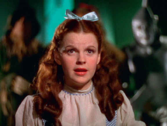
The Wizard of oz (1939)
ACTION STEPS
Low-
No money? No problem. With a little resourcefulness and little or no money, you can use these tricks to make your shots look high end.
 Use a director’s viewfinder—
an inexpensive handheld zoom lens you can look through— to help visualize the composition.  Put a carpenter’s level on top of your camera to make sure it is framed straight.
 Mount small cameras (often called lipstick cameras because they are about as big as a tube of lipstick) on different rigs—
a rig is anything you can attach the camera to, such as a broom handle or a helmet. Actioncams (such as the GoPro) are designed just for this purpose; some even feature Wi- Fi, so you can monitor the shot on your mobile device.