9.1 9.1 Inference for Two-Way Tables
When you complete this section, you will be able to:
• Translate a problem from a comparison of two proportions to an analysis of a 2 × 2 table.
• Find the joint distribution, the marginal distributions, and the conditional distributions for a two-
way table of counts.• Identify the joint distribution, the marginal distributions, and the conditional distributions for a two-
way table from software output. • Choose appropriate conditional distributions to describe relationships in a two-
way table. • Compute expected counts from the counts in a two-
way table. • Compute the chi-
square statistic , and the P-value from the expected counts in a two-way table. Find the degrees of freedom and use the P-value to draw your conclusion. • Identify the chi-
square statistic, the degrees of freedom, and the P-value for a two- way table from software output. Use the P-value to draw your conclusion. • For a 2 × 2 table, explain the relationship between the chi-
square test and the z test for comparing two proportions.
When we studied inference for two proportions in Chapter 8, we started summarizing the raw data by giving the number of observations in each population (n) and how many of these were classified as “successes” (X ).
EXAMPLE 9.1

Who uses Instagram? In Example 8.11 (page 507), we compared the proportions of young women and men who use Instagram. The following table summarizes the data used in this comparison:
| Population | n | X | ˆp = X/n |
| 1 (women) | 537 | 328 | 0.6108 |
| 2 (men) | 532 | 234 | 0.4398 |
| Total | 1069 | 562 | 0.5257 |
These data suggest that the percent of women who use Instagram is 17.1% larger than the percent for men, with a 95% margin of error of 5.9%.
two-
In this chapter, we consider a different summary of the data. Rather than recording just the count of those who use Instagram, we record counts of all the outcomes in a two-
EXAMPLE 9.2
Two-
| Two- |
|||
| Sex | |||
| User | Male | Female | Total |
| No | 298 | 209 | 507 |
| Yes | 234 | 328 | 562 |
| Total | 532 | 537 | 1069 |
We use the term r×c tabler × c table to describe a two-
EXAMPLE 9.3
Vaccinations and political party preference. Should parents be able to decide whether or not to vaccinate their children or should all vaccinations be required for all children? A Pew Internet survey asked this question of U.S. adults aged 18 and over.1 The following table breaks down these results by political party preference:
| Observed numbers of adults | |||
| Party | |||
| Required | Democratic | Republican | Total |
| No | 230 | 258 | 488 |
| Yes | 729 | 479 | 1208 |
| Total | 959 | 737 | 1696 |
The two categorical variables in Example 9.3 are “Required,” with values “No” and “Yes,” and “Party,” with values “Democrat” and “Republican.” We view “Party” as an explanatory variable and “Required” as a categorical response variable.
In Chapter 2, we discussed two-
EXAMPLE 9.4
Software output for vaccinations and political party. Figure 9.1 shows the output from JMP, Minitab, and SPSS for the vaccination data of Example 9.3. For now, we will just concentrate on the different distributions. Later, we will explore other parts of the output.
The three packages use similar displays for the distributions. In the cells of the 2×2 table, we find the counts, the conditional distributions of the column variable for each value of the row variable, the conditional distributions of the row variable for each value of the column variable, and the joint distribution. All of these are expressed as percents rather than proportions.
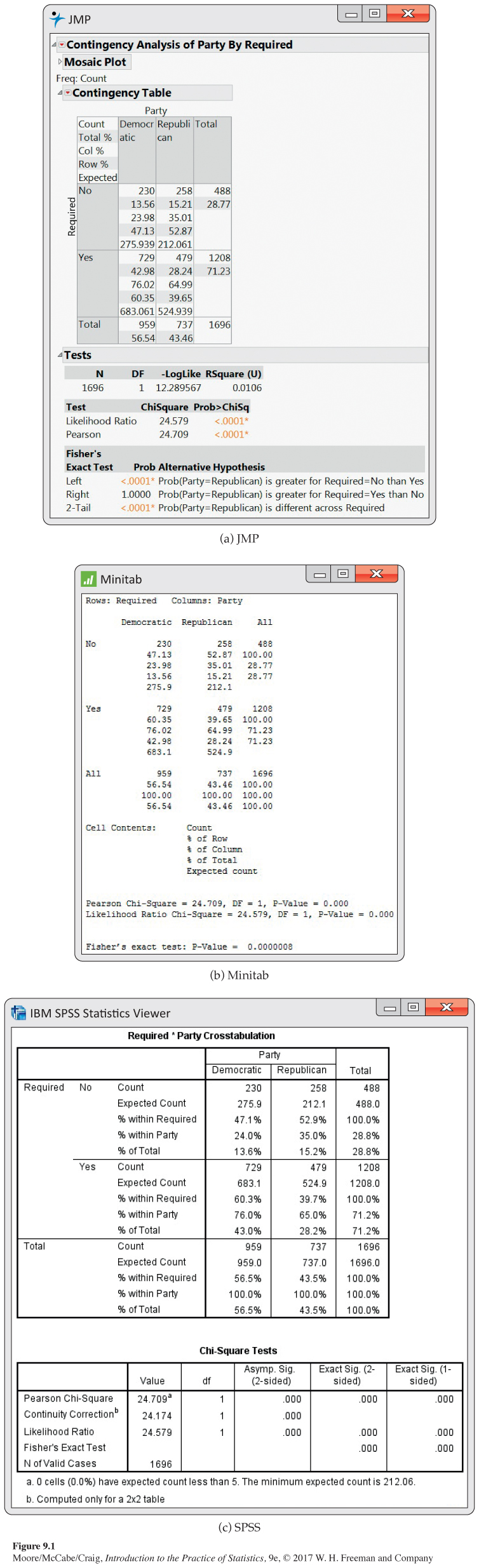
Let’s look at the entries in the upper-
conditional distributions, p. 140
In Chapter 2, we learned that the key to examining the relationship between two categorical variables is to look at conditional distributions. Let’s do that for the vaccination data.
EXAMPLE 9.5
Two-
| Column percents for political party | ||
| Party | ||
| Required | Democratic | Republican |
| No | 24% | 35% |
| Yes | 76% | 65% |
| Total | 100% | 100% |
The “Total” row reminds us that 100% of the Democrats and Republicans have been classified as either thinking that vaccinations should be required or not. (The sums sometimes differ slightly from 100% because of roundoff error.) The bar graphs in Figure 9.2 compare the percents. The difference between the percents of adults who think vaccinations should not be required is reasonably large (24% for Democrats versus 35% percent for Republicans).
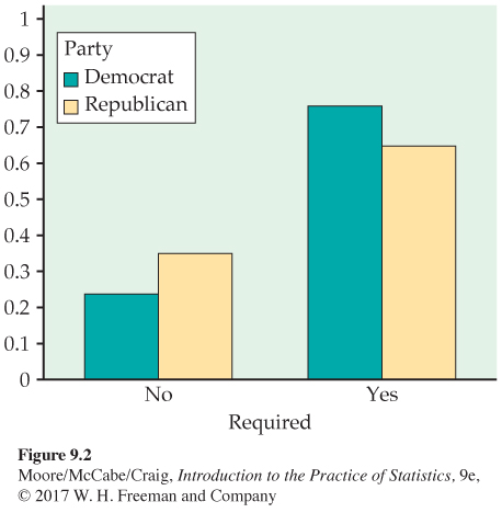
A statistical test will tell us whether or not this difference can be plausibly attributed to chance. Specifically, if there is no association between party preference and opinions about requiring vaccinations, how likely is it that a sample would show a difference as large or larger than that displayed in Figure 9.2? In the last part of this section, we discuss the significance test to examine this question.
Note that Figure 9.2 shows the percents favoring required vaccinations (yes) as well as percents opposed (no). In a description of the results, we would choose one of these for our main story. For tables with more than two columns, we would normally plot the percents for all columns. Here is another way to display the data in a two-
EXAMPLE 9.6
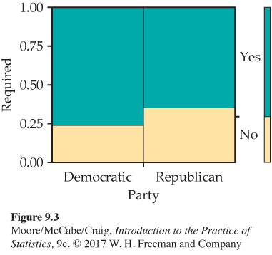
Mosaic plot for vaccination opinions and political party preference. Figure 9.3 displays the joint distribution and the two marginal distributions in a single plot, called a mosaic plot. The sizes of the four rectangles are proportional to the four probabilities of the joint distribution. The bar at the right side gives the marginal distribution of the required variable while the widths of the vertical bars give the marginal distribution of the variable party.
mosaic plot, p. 143
USE YOUR KNOWLEDGE
Question 9.1
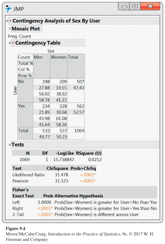
9.1 Find two conditional distributions for the Instagram data. Figure 9.4 shows JMP output for the Instagram data of Example 9.2 (page 526). Use this output to answer the following questions.
(a) Find the conditional distribution of Instagram use for females.
(b) Do the same for males.
(c) Graphically display the two conditional distributions.
(d) Write a short summary interpreting the two conditional distributions.
9.1 (a) 61.08% of women use Instagram; 38.92% do not. (b) 43.98% of men use Instagram; 56.02% do not. (d) A greater percent of women use Instagram.
Question 9.2
9.2 Condition on Instagram user. Refer to the previous exercise. Use the output in Figure 9.4 to answer the following questions.
(a) Find the conditional distribution of sex for Instagram users.
(b) Do the same for those who do not use Instagram.
(c) Graphically display the two conditional distributions.
(d) Write a short summary interpreting the two conditional distributions.
Question 9.3
9.3 Which conditional distributions should you use? Refer to your answers to the two previous exercises. Which of these distributions do you prefer for interpreting these data? Give reasons for your answer.
9.3 Most will probably prefer the distribution broken down by Sex, which emphasizes the difference between men and women and their Instagram usage.
The hypothesis: No association
The null hypothesis H0 of interest in a two-
In our example, the hypothesis H0 that there is no association between political party preference and opinions about requiring vaccinations is equivalent to the statement that the variables “required” and “party” are independent. For other two-
Expected cell counts
To test the null hypothesis in r×c tables, we compare the observed cell counts with expected cell countsexpected cell counts calculated under the assumption that the null hypothesis is true. A numerical summary of the comparison will be our test statistic.
EXAMPLE 9.7
Expected counts from software. The observed and expected counts for the vaccine example appear in the JMP, Minitab, and SPSS computer outputs shown in Figure 9.1 (pages 528–
How is this expected count obtained? Look at the percents in the right margin of the tables in Figure 9.1. We see that 28.77% of all adults thought that vaccinations should not be required. If the null hypothesis of no relation between party and required is true, we expect this overall percent to apply to both Democrats and Republicans. In particular, we expect 28.77% of the Democrats to be opposed to making vaccinations required. Because there are 959 Democrats, the expected count is 28.77% of 959, or 275.9. The other expected counts are calculated in the same way.
The reasoning of Example 9.7 leads to a simple formula for calculating expected cell counts. To compute the expected count of Democrats opposed to requiring vaccinations, we multiplied the proportion of adults opposed to requiring vaccinations (488/1696) by the number of Democrats (959). From Figure 9.1, we see that the numbers 488 and 959 are the row and column totals for the cell of interest and that 1696 is n, the total number of observations for the table. The expected cell count is, therefore, the product of the row and column totals divided by the table total.
EXPECTED CELL COUNTS
expected count=
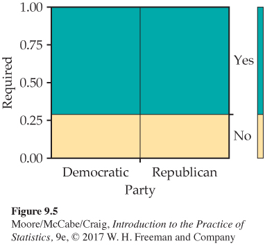
In Figure 9.3 (page 531), we used a mosaic plot to display the data for the vaccination and political party preference data. Looking at the two columns, we can see that the proportion in the lower region, corresponding to being opposed to required vaccinations, is smaller for the Democrats than for the Republicans. This illustrates graphically the difference in the conditional distributions of required for the two parties. What would the mosaic plot look like if there was no difference? If there was no difference in the conditional distributions, then the two variables would be independent, and the observed counts would be equal to the expected counts. If we rerun the analysis with the expected counts in place of the observed counts, we obtain the mosaic plot in Figure 9.5. Notice that the proportions of each party responding yes are now equal.
The chi-
To test the H0 that there is no association between the row and column classifications, we use a statistic that compares the entire set of observed counts with the set of expected counts. To compute this statistic,
• First, take the difference between each observed count and its corresponding expected count, and square these values so that they are all 0 or positive.
• Because a large difference means less if it comes from a cell that is expected to have a large count, divide each squared difference by the expected count. This is a type of standardization.
• Finally, sum over all cells.
standardizing, p. 59
The result is called the chi-
CHI-
The chi-
where “observed” represents an observed cell count, “expected” represents the expected count for the same cell, and the sum is over all cells in the table.

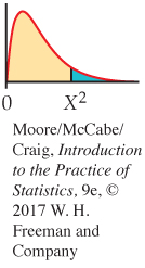
If the expected counts and the observed counts are very different, a large value of will result. Large values of provide evidence against the null hypothesis. To obtain a P-value for the test, we need the sampling distribution of under the assumption that (no association between the row and column variables) is true. The distribution is called the chi-
Like the distributions, the distributions form a family described by a single parameter, the degrees of freedom. We use to indicate a particular member of this family. Figure 9.6 displays the density curves of the and distributions. As you can see in the figure, distributions take only positive values and are skewed to the right. Table F in the back of the book gives upper critical values for the distributions.
degrees of freedom, p. 409
CHI-
The null hypothesis is that there is no association between the row and column variables in a two-
If is true, the chi-
The P-value for the chi-
where is a random variable having the distribution with . For tables larger than , we will use this approximation whenever the average of the expected counts is 5 or more and the smallest expected count is 1 or more. For tables, we require all four cell counts to be 5 or more.2
The chi-
EXAMPLE 9.8
Chi-
The chi-
The outputs in Figure 9.1 also report results for testing the hypothesis of no association using alternatives to the chi-
The test does not provide insight into the nature of the relationship between the variables. It is up to us to see that the data show that Republicans are more likely to believe that vaccinations should not be required. You should always accompany a chi-
Observational studies such as the one in Example 9.3 cannot tell us whether or not an explanatory variable is a cause of a pattern in a response variable. For the party and vaccine scenario, a causal association does not seem plausible. Often, association can be explained by confounding with other variables.
confounding, p. 150
Computations
The calculations required to analyze a two-
COMPUTATIONS FOR TWO-
1. Calculate descriptive statistics that convey the important information in the table. Usually, these will be column or row percents.
2. Find the expected counts and use these to compute the statistic.
3. Use chi-
square critical values from Table F to find the approximate -value. 4. Draw a conclusion about the association between the row and column variables.
The next few examples illustrate these steps.
EXAMPLE 9.9
Health habits of college students. Physical activity generally declines when students leave high school and enroll in college. This suggests that college is an ideal setting to promote physical activity. One study examined the level of physical activity and other health-
| Physical activity | ||||
| Fruit consumption | Low | Moderate | Vigorous | Total |
| Low | 69 | 206 | 294 | 569 |
| Medium | 25 | 126 | 170 | 321 |
| High | 14 | 111 | 169 | 294 |
| Total | 108 | 443 | 633 | 1184 |
![]()
The table in Example 9.9 is a 3 × 3 table, to which we have added the marginal totals obtained by summing across rows and columns. For example, the first-
Computing conditional distributions
First, we summarize the observed relation between physical activity and fruit consumption. We expect a positive association, but there is no clear distinction between an explanatory variable and a response variable in this setting. If we have such a distinction, then the clearest way to describe the relationship is to compare the conditional distributions of the response variable for each value of the explanatory variable. Otherwise, we can compute the conditional distribution each way and then decide which gives a better description of the data.
EXAMPLE 9.10
Health habits of college students: Conditional distributions. Let’s look at the data in the first column of the table in Example 9.9. There were 108 students with low physical activity. Of these, there were 69 with low fruit consumption. Therefore, the column proportion for this cell is

That is, 63.9% of the low physical activity students had low fruit consumption. Similarly, 25 of the low physical activity students has moderate fruit consumption. This percent is 23.1%.
In all, we calculate nine percents. Here are the results:
| Column percents for fruit consumption and physical activity | ||||
| Physical activity | ||||
| Fruit consumption | Low | Moderate | Vigorous | Total |
| Low | 63.9 | 46.5 | 46.4 | 48.1 |
| Medium | 23.1 | 28.4 | 26.9 | 27.1 |
| High | 13.0 | 25.1 | 26.7 | 24.8 |
| Total | 100.0 | 100.0 | 100.0 | 100.0 |
In addition to the conditional distributions of fruit consumption for each level of physical activity, the table also gives the marginal distribution of fruit consumption. These percents appear in the rightmost column, labeled “Total.”
![]()
The sum of the percents in each column should be 100, except for possible small roundoff errors. It is good practice to calculate each percent separately and then sum each column as a check. In this way, we can find arithmetic errors that would not be uncovered if, for example, we calculated the column percent for the “High” row by subtracting the sum of the percents for “Low” and “Medium” from 100.
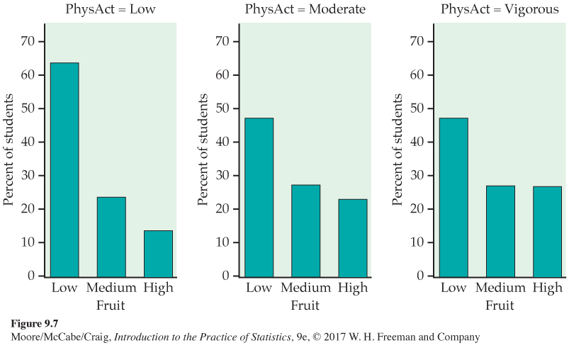
Figure 9.7 compares the distributions of fruit consumption for each of the three physical activity levels. For each activity level, the highest percent is for students who consume low amounts of fruit. For low physical activity, there is a clear decrease in the percent when moving from low to medium to high fruit consumption. The patterns for moderate physical activity and vigorous physical activity are similar. Low fruit consumption is still dominant, but the percents for medium and high fruit consumption are about the same for the moderate and vigorous activity levels. The percent of low fruit consumption is highest for the low physical activity students compared with those who have moderate or vigorous physical activity. These plots suggest that there is an association between these two variables.
USE YOUR KNOWLEDGE
Question 9.4
9.4 Examine the row percents. Refer to the health habits data that we examined in Example 9.9 (page 537). For the row percents, make a table similar to the one in Example 9.10 (page 537).
Question 9.5
9.5 Make some plots. Refer to the previous exercise. Make plots of the row percents similar to those in Figure 9.7.
9.5 Among all three fruit consumption groups, vigorous exercise is most likely. Incidence of low exercise decreases with increasing fruit consumption.
Question 9.6
9.6 Compare the conditional distributions. Compare the plots you made in the previous exercise with those given in Figure 9.7. Which set of plots do you think gives a better graphical summary of the relationship between these two categorical variables? Give reasons for your answer. Note that there is not a clear right or wrong answer for this exercise. You need to make a choice and to explain your reasons for making it.
We observe a clear relationship between physical activity and fruit consumption in this study. The chi-
![]()
The chi-
EXAMPLE 9.11
The chi-
Note that although any observed count of the number of students must be a whole number, an expected count need not be.
Calculations for the other eight cells in the table are performed in the same way. With these nine expected counts, we are now ready to use the formula for the statistic on page 534. The first term in the sum comes from the cell for students with low fruit consumption and low physical activity. The observed count is 69 and the expected count is 51.90. Therefore, the contribution to the statistic for this cell is
When we add the terms for each of the nine cells, the result is
Because there are levels of fruit consumption and levels of physical activity, the degrees of freedom for this statistic are
Under the null hypothesis that fruit consumption and physical activity are independent, the test statistic has a distribution. To obtain the P-value, look at the df = 4 row in Table F.
| df = 4 | ||
| p | 0.01 | 0.005 |
| 13.28 | 14.86 | |
The calculated value lies between the critical points for probabilities 0.01 and 0.005. The P-value is, therefore, between 0.01 and 0.005. (Software gives the value as 0.0068.) There is strong evidence (, , ) that there is a relationship between fruit consumption and physical activity.
We can check our work by adding the expected counts to obtain the row and column totals, as in the table. These totals are the same as those in the table of observed counts except for small roundoff errors.
USE YOUR KNOWLEDGE
Question 9.7
9.7 Find the expected counts. Refer to Example 9.11. Compute the expected counts and display them in a table. Check your work by adding the expected counts to obtain row and column totals. These should be the same as those in the table of observed counts except for small roundoff errors.
9.7 They are shown in the following table.
| Physical Activity | ||||
|---|---|---|---|---|
| Fruit | Low | Medium | Vigorous | Total |
| Low | 51.9 | 212.9 | 304.2 | 569 |
| Medium | 29.3 | 120.1 | 171.6 | 321 |
| High | 26.8 | 110.0 | 157.2 | 294 |
| Total | 108 | 443 | 633 | 1184 |
Question 9.8
9.8 Find the statistic. Refer to the previous exercise. Use the formula on page 534 to compute the contributions to the chi-
Question 9.9
9.9 Find the -value. For each of the following give the degrees of freedom and an appropriate bound on the -value for the statistic.
(a) for a table.
(b) for a table.
(c) for a table.
(d) for a table.
9.9 df = (r − 1)(c − 1). (a) df = 6, 0.025 < P-value < 0.05. (b) df = 6, 0.025 < P-value < 0.05. (c) df = 2, 0.10 < P-value < 0.15. (d) df = 2, 0.01 < P-value < 0.02.
Question 9.10
9.10 Instagram users: The chi-
The chi-
A comparison of the proportions of “successes” in two populations leads to a table. We can compare two population proportions either by the chi-
USE YOUR KNOWLEDGE
Question 9.11
9.11 Comparison of conditional distributions. Consider the following table.
| Observed counts | |||
| Explanatory variable | |||
| Response variable | 1 | 2 | Total |
| Yes | 75 | 95 | 170 |
| No | 135 | 115 | 250 |
| Total | 210 | 210 | 420 |
(a) Compute the conditional distribution of the response variable for each of the two explanatory-
variable categories. (b) Display the distributions graphically.
(c) Write a short paragraph describing the two distributions and how they differ.
9.11 (a) Explanatory 1: 35.7% Yes and 64.3% No. Explanatory 2: 45.2% Yes and 54.8% No. (c) Explanatory variable value 1 had proportionately fewer Yes responses.
Question 9.12
9.12 Expected cell counts and the chi-
(a) Find the expected counts for all cells. Are they large enough to justify use of the chi-
square test for these data? (b) Computer software gives you X2 = 3.95. What are the degrees of freedom for this statistic?
(c) Using Table F, give an appropriate bound on the P-value.
Question 9.13
9.13 Compare the chi-
(a) Set up the problem as a comparison between two proportions. Describe the population proportions, state the null and alternative hypotheses, and give the sample proportions.
(b) Carry out the significance test to compare the two proportions. Report the z statistic, the P-value, and your conclusion.
(c) Compare the P-value for this significance test with the one that you reported in the previous exercise.
(d) Verify that the square of the z statistic is the X2 statistic given in the previous exercise.
9.13 (a) = proportion of “yes” responses in group i. H0: p1 = p2, Ha: p1 ≠ p2; (b) z = − 1.9882, P-value = 0.0469. (c) The P-values agree. (d) z2 = ( − 1.9882)2 = 3.9529.
BEYOND THE BASICS
Meta-
Policymakers wanting to make decisions based on research are sometimes faced with the problem of summarizing the results of many studies. These studies may show effects of different magnitudes, some highly significant and some not significant. What overall conclusion can we draw? Meta-
EXAMPLE 9.12

Do we eat too much salt? Evidence from a variety of sources suggests that diets high in salt are associated with risks to human health. To investigate the relationship between salt intake and stroke, information from 14 studies was combined in a meta-
| Low salt | High salt | |
| CVD | 88 | 112 |
| No CVD | 1081 | 1134 |
| Total | 1169 | 1246 |
relative risk, p. 518
Let’s look at the relative risk for this study. We first find the proportion of subjects who developed CVD in each group. For the subjects with a low salt intake, the proportion who developed CVD is
or 75 per thousand; for the high-
or 90 per thousand. We can now compute the relative risk as the ratio of these two proportions. We choose to put the high-
Relative risk greater than 1 means that the high-
When the data from all 14 studies were combined, the relative risk was reported as 1.17 with a 95% confidence interval of (1.02, 1.32). Because this interval does not include the value 1, corresponding to equal proportions in the two groups, we conclude that the higher CVD rates are not the same for the two diets (). The high-
USE YOUR KNOWLEDGE
Question 9.14
9.14 A different view of the relative risk. In the previous example, we computed the relative risk for the high-