2.1 Scatterplots


We expect that states with larger populations would spend more on education than states with smaller populations.1 What is the nature of this relationship? Can we use this relationship to evaluate whether some states are spending more than we expect or less than we expect? This type of exercise is called benchmarking. The basic idea is to compare processes or procedures of an organization with those of similar organizations.
benchmarking
The data file EDSPEND gives
- the state name
- state spending on education ($ billion)
- local government spending on education ($ billion)
- spending (total of state and local) on education ($ billion)
- gross state product ($ billion)
- growth in gross state product (percent)
- population (million)
for each of the 50 states in the United States.
APPLY YOUR KNOWLEDGE
Question 2.3
2.3 Classify the variables
Use the EDSPEND data set for this exercise. Classify each variable as categorical or quantitative. Is there a label variable in the data set? If there is, identify it.
Question 2.4
2.4 Describe the variables
Refer to the previous exercise.
- Use graphical and numerical summaries to describe the distribution of spending.
- Do the same for population.
- Write a short paragraph summarizing your work in parts (a) and (b).
The most common way to display the relation between two quantitative variables is a scatterplot.
EXAMPLE 2.3 Spending and population
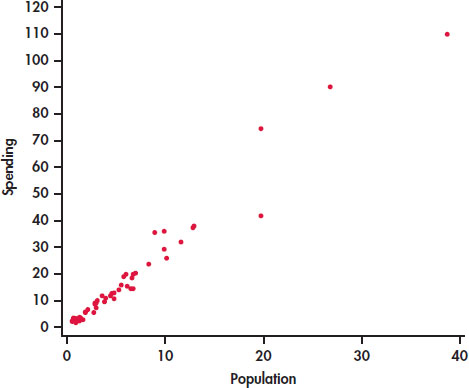
CASE 2.1 A state with a larger number of people needs to spend more money on education. Therefore, we think of population as an explanatory variable and spending on education as a response variable. We begin our study of this relationship with a graphical display of the two variables.
Figure 2.1 is a scatterplot that displays the relationship between the response variable, spending, and the explanatory variable, population. The data appear to cluster around a line with relatively small variation about this pattern. The relationship is positive: states with larger populations generally spend more on education than states with smaller populations. There are three or four states that are somewhat extreme in both population and spending on education, but their values still appear to be consistent with the overall pattern.
Scatterplot
A scatterplot shows the relationship between two quantitative variables measured on the same cases. The values of one variable appear on the horizontal axis, and the values of the other variable appear on the vertical axis. Each case in the data appears as the point in the plot fixed by the values of both variables for that case.
Always plot the explanatory variable, if there is one, on the horizontal axis (the x axis) of a scatterplot. As a reminder, we usually call the explanatory variable x and the response variable y. If there is no explanatory–response distinction, either variable can go on the horizontal axis. The time plots in Section 1.2 (page 19) are special scatterplots where the explanatory variable x is a measure of time.
APPLY YOUR KNOWLEDGE
Question 2.5
2.5 Make a scatterplot
- Make a scatterplot similar to Figure 2.1 for the education spending data.
- Label the four points with high population and high spending with the names of these states.
Question 2.6
2.6 Change the units
- Create a spreadsheet with the education spending data with education spending expressed in millions of dollars and population in thousands. In other words, multiply education spending by 1000 and multiply population by 1000.
- Make a scatterplot for the data coded in this way.
- Describe how this scatterplot differs from Figure 2.1.
Interpreting scatterplots
To interpret a scatterplot, apply the strategies of data analysis learned in Chapter 1.
REMINDER

examining a distribution, p. 18
Examining a Scatterplot
In any graph of data, look for the overall pattern and for striking deviations from that pattern.
You can describe the overall pattern of a scatterplot by the form, direction, and strength of the relationship.
An important kind of deviation is an outlier, an individual value that falls outside the overall pattern of the relationship.
The scatterplot in Figure 2.1 shows a clear form: the data lie in a roughly straight-line, or linear, pattern. To help us see this linear relationship, we can use software to put a straight line through the data. (We will show how this is done in Section 2.3.)
linear relationship
EXAMPLE 2.4 Scatterplot with a Straight Line
CASE 2.1 Figure 2.2 plots the education spending data along with a fitted straight line. This plot confirms our initial impression about these data. The overall pattern is approximately linear and there are a few states with relatively high values for both variables.
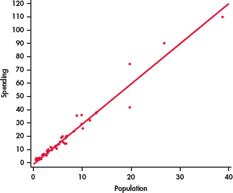
The relationship in Figure 2.2 also has a clear direction: states with higher populations spend more on education than states with smaller populations. This is a positive association between the two variables.
Positive Association, Negative Association
Two variables are positively associated when above-average values of one tend to accompany above-average values of the other, and below-average values also tend to occur together.
Two variables are negatively associated when above-average values of one tend to accompany below-average values of the other, and vice versa.
The strength of a relationship in a scatterplot is determined by how closely the points follow a clear form. The strength of the relationship in Figure 2.1 is fairly strong.
Software is a powerful tool that can help us to see the pattern in a set of data. Many statistical packages have procedures for fitting smooth curves to data measured on a pair of quantitative variables. Here is an example.
EXAMPLE 2.5 Smooth Relationship for Education Spending
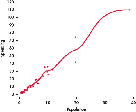
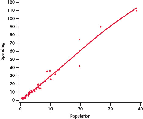
Figure 2.3 is a scatterplot of the population versus education spending for the 50 states in the United States with a smooth curve generated by software. The smooth curve follows the data very closely and is somewhat bumpy. We can adjust the extent to which the relationship is smoothed by changing the smoothing parameter. Figure 2.4 is the result. Here we see that the smooth curve is very close to our plot with the line in Figure 2.2. In this way, we have confirmed our view that we can summarize this relationship with a line.
smoothing parameter
The log transformation
In many business and economic studies, we deal with quantitative variables that take only positive values and are skewed toward high values. In Example 2.4 (page 67), you observed this situation for spending and population size in our education spending data set. One way to make skewed distributions more Normal looking is to transform the data in some way.
The most important transformation that we will use is the log transformation. This transformation can be used only for variables that have positive values. Occasionally, we use it when there are zeros, but, in this case, we first replace the zero values by some small value, often one-half of the smallest positive value in the data set.
log transformation
You have probably encountered logarithms in one of your high school mathematics courses as a way to do certain kinds of arithmetic. Usually, these are base 10 logarithms. Logarithms are a lot more fun when used in statistical analyses. For our statistical applications, we will use natural logarithms. Statistical software and statistical calculators generally provide easy ways to perform this transformation.
APPLY YOUR KNOWLEDGE
Question 2.7
2.7 Transform education spending and population
Refer to Exercise 2.4 (page 65). Transform the education spending and population variables using logs, and describe the distributions of the transformed variables. Compare these distributions with those described in Exercise 2.4.
In this chapter, we are concerned with relationships between pairs of quantitative variables. There is no requirement that either or both of these variables should be Normal. However, let’s examine the effect of the transformations on the relationship between education spending and population.
EXAMPLE 2.6 Education Spending and Population with Logarithms
Figure 2.5 is a scatterplot of the log of education spending versus the log of education for the 50 states in the United States. The line on the plot fits the data well, and we conclude that the relationship is linear in the transformed variables.

Notice how the data are more evenly spread throughout the range of the possible values. The three or four high values no longer appear to be extreme. We now see them as the high end of a distribution.
In Exercise 2.7, the transformations of the two quantitative variables maintained the linearity of the relationship. Sometimes we transform one of the variables to change a nonlinear relationship into a linear one.

The interpretation of scatterplots, including knowing to use transformations, is an art that requires judgment and knowledge about the variables that we are studying. Always ask yourself if the relationship that you see makes sense. If it does not, then additional analyses are needed to understand the data.
Many statistical procedures work very well with data that are Normal and relationships that are linear. However, there is no requirement that we must have Normal data and linear relationships for everything that we do. In fact, with advances in statistical software, we now have many statistical techniques that work well in a wide range of settings. See Chapters 16 and 17 for examples.
Adding categorical variables to scatterplots
In Example 1.28 (page 38), we examined the fuel efficiency, measured as miles per gallon (MPG) for highway driving, for 1067 vehicles for the model year 2014. The data file (CANFUEL) that we used there also gives carbon dioxide (CO2) emissions and several other variables related to the type of vehicle. One of these is the type of fuel used. Four types are given:
- X, regular gasoline
- Z, premium gasoline
- D, diesel
- E, ethanol.
Although much of our focus in this chapter is on linear relationships, many interesting relationships are more complicated. Our fuel efficiency data provide us with an example.
EXAMPLE 2.7 Fuel Efficiency and CO_2 Emissions

Let’s look at the relationship between highway MPG and CO2 emissions, two quantitative variables, while also taking into account the type of fuel, a categorical variable. The JMP statistical software was used to produce the plot in Figure 2.6. We see that there is a negative relationship between the two quantitative variables. Better (higher) MPG is associated with lower CO2 emissions. The relationship is curved, however, not linear.
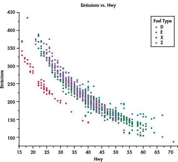
The legend on the right side of the figure identifies the colors used to plot the four types of fuel, our categorical variable. The vehicles that use regular gasoline (green) and premium gasoline (purple) appear to be mixed together. The diesel-burning vehicles (blue) are close to the the gasoline-burning vehicles, but they tend to have higher values for both MPG and emissions. On the other hand, the vehicles that burn ethanol (red) are clearly separated from the other vehicles.
Careful judgment is needed in applying this graphical method. Don’t be discouraged if your first attempt is not very successful. To discover interesting things in your data, you will often produce several plots before you find the one that is most effective in describing the data.2