3.2 Common Types of Graphs
Graphs are powerful because they can display the relation between two or more variables in just one image. We first show you how to create scatterplots and line graphs—
Scatterplots
A scatterplot is a graph that depicts the relation between two scale variables. The values of each variable are marked along the two axes, and a mark is made to indicate the intersection of the two scores for each participant. The mark is above the participant’s score on the x-axis and across from the score on the y-axis.
A scatterplot is a graph that depicts the relation between two scale variables. The values of each variable are marked along the two axes, and a mark is made to indicate the intersection of the two scores for each participant. The mark is above the participant’s score on the x-axis and across from the score on the y-axis. We suggest that you think through your graph by sketching it by hand before creating it on a computer.
EXAMPLE 3.1
Figure 3-5 describes the relation between the number of hours students spent studying and the students’ grades on a statistics exam. In this example, the independent variable (x, on the horizontal axis) is the number of hours spent studying, and the dependent variable (y, on the vertical axis) is the grade on the statistics exam.
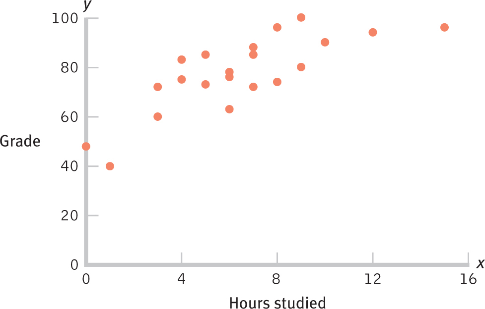
Figure 3-
MASTERING THE CONCEPT
3.2: Scatterplots and line graphs are used to depict relations between two scale variables.
The scatterplot in Figure 3-5 suggests that more hours studying leads to higher grades; it includes each participant’s two scores (one for hours spent studying and the other for grade received) that reveal the overall pattern of scores. In this scatterplot, the values on both axes go down to 0 but they don’t have to. Sometimes the scores are clustered and the pattern in the data might be clearer by adjusting the range on one or both axes. (If it’s not practical for the scores to go down to 0, be sure to indicate this with cut marks.)
52
A range-
Edward R. Tufte’s (1997/2005, 2001/2006b, 2006a) beautiful books demonstrate simple ways to create clearer graphs. One guideline is to increase the “data–
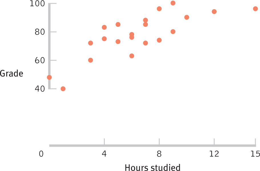
Figure 3-
To create a scatterplot:
- Organize the data by participant; each participant will have two scores, one on each scale variable.
- Label the horizontal x-axis with the name of the independent variable and its possible values, starting with 0 if practical.
- Label the vertical y-axis with the name of the dependent variable and its possible values, starting with 0 if practical.
52
- Make a mark on the graph above each study participant’s score on the x-axis and next to his or her score on the y-axis.
- To convert to a range-
frame, simply erase the axes below the minimum score and above the maximum score.
A scatterplot between two scale variables can tell three possible stories. First, there may be no relation at all; in this case, the scatterplot looks like a jumble of random dots. This is an important scientific story if we previously believed that there was a systematic pattern between the two variables.
A linear relation between variables means that the relation between variables is best described by a straight line.
Second, a linear relation between variables means that the relation between variables is best described by a straight line. When the linear relation is positive, the pattern of data points flows upward and to the right. When the linear relation is negative, the pattern of data points flows downward and to the right. The data story about hours studying and statistics grades in Figures 3-
A nonlinear relation between variables means that the relation between variables is best described by a line that breaks or curves in some way.
A nonlinear relation between variables means that the relation between variables is best described by a line that breaks or curves in some way. Nonlinear simply means “not straight,” so there are many possible nonlinear relations between variables. For example, the Yerkes–
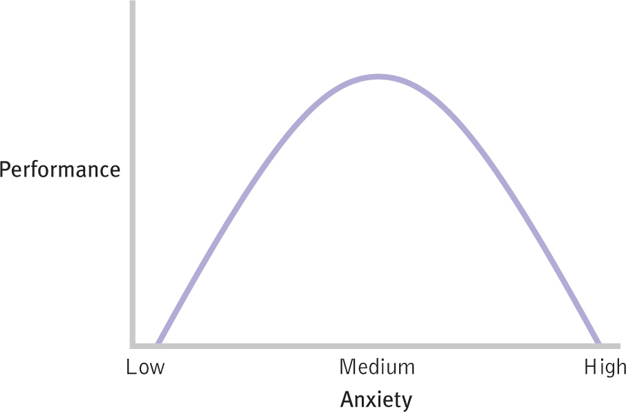
Figure 3-
Line Graphs
A line graph is used to illustrate the relation between two scale variables.
A line graph is used to illustrate the relation between two scale variables. One type of line graph is based on a scatterplot and allows us to construct a line of best fit that represents the predicted y score for each x value. A second type of line graph allows us to visualize changes in the values on the y-axis over time.
EXAMPLE 3.2
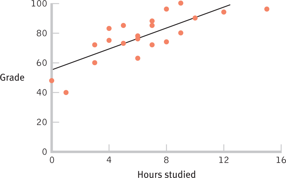
Figure 3-
The first type of line graph, based on a scatterplot, is especially useful because the best-
54
Here is a recap of the steps to create a scatterplot with a line of best fit:
- Label the x-axis with the name of the independent variable and its possible values, starting with 0 if practical.
- Label the y-axis with the name of the dependent variable and its possible values, starting with 0 if practical.
- Make a mark above each study participant’s score on the x-axis and next to his or her score on the y-axis.
- Visually estimate and sketch the line of best fit through the points on the scatterplot.
- Maximize the data–
ink ratio by converting to a range frame: Erase the axes below the minimum score and above the maximum score.
A time plot, or time series plot, is a graph that plots a scale variable on the y-axis as it changes over an increment of time (e.g., second, day, century) labeled on the x-axis.
A second situation in which a line graph is more useful than just a scatterplot involves time-
EXAMPLE 3.3
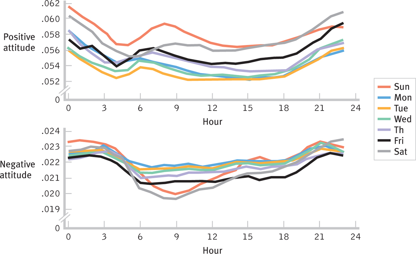
Figure 3-
Figure 3-9, for example, shows positive attitudes and negative attitudes around the world, as expressed on Twitter. The researchers analyzed more than half a billion tweets over the course of 24 hours (Golder & Macy, 2011) and plotted separate lines for each day of the week. These fascinating data tell many stories. For example, people tend to express more positive and fewer negative attitudes in the morning than later in the day; people express more positive attitudes on the weekends than during the week; and the weekend morning peak in positive attitudes is later than during the week, perhaps an indication that people are sleeping in.
Here is a recap of the steps to create a time plot:
- Label the x-axis with the name of the independent variable and its possible values. The independent variable should be an increment of time (e.g., hour, month, year).
- Label the y-axis with the name of the dependent variable and its possible values, starting with 0 if practical.
- Make a mark above each value on the x-axis at the value for that time on the y-axis.
- Connect the dots.
55
- As you did with the scatterplot, maximize the data–
ink ratio by converting to a range- frame: Erase the y-axis below the minimum y value and above the maximum y value.
Bar Graphs
A bar graph is a visual depiction of data in which the independent variable is nominal or ordinal and the dependent variable is scale. The height of each bar typically represents the average value of the dependent variable for each category.
A bar graph is a visual depiction of data in which the independent variable is nominal or ordinal and the dependent variable is scale. The height of each bar typically represents the average value of the dependent variable for each category. The independent variable on the x-axis could be either nominal (such as gender) or ordinal (such as Olympic medal winners who won gold, silver, or bronze medals). We could even combine two independent variables in a single graph by drawing two separate clusters of bars to compare men’s and women’s finishing times of the gold, silver, and bronze medalists.
Here is a recap of the variables used to create a bar graph:
- The x-axis of a bar graph indicates discrete levels of a nominal or an ordinal variable.
- The y-axis of a bar graph may represent counts or percentages. But the y-axis of a bar graph can also indicate many other scale variables, such as average running speeds, scores on a memory task, or reaction times.
MASTERING THE CONCEPT
3.3: Bar graphs depict data for two or more categories. They tell a data story more precisely than do either pictorial graphs or pie charts.
A Pareto chart is a type of bar graph in which the categories along the x-axis are ordered from highest bar on the left to lowest bar on the right.
Bar graphs are flexible tools for presenting data visually. For example, if there are many categories to be displayed along the horizontal x-axis, researchers sometimes create a Pareto chart, a type of bar graph in which the categories along the x-
EXAMPLE 3.4
Figure 3-10 shows two different ways of depicting the percentage of Internet users in a given country who visited Twitter.com in June 2010. One graph is an alphabetized bar graph; the other is a Pareto chart. Where does Canada’s usage fit relative to that of other countries? Which graph makes it is easier to answer that question?
56
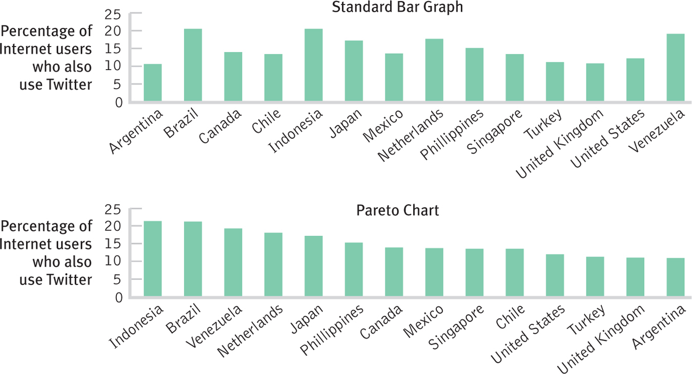
Figure 3-
EXAMPLE 3.5
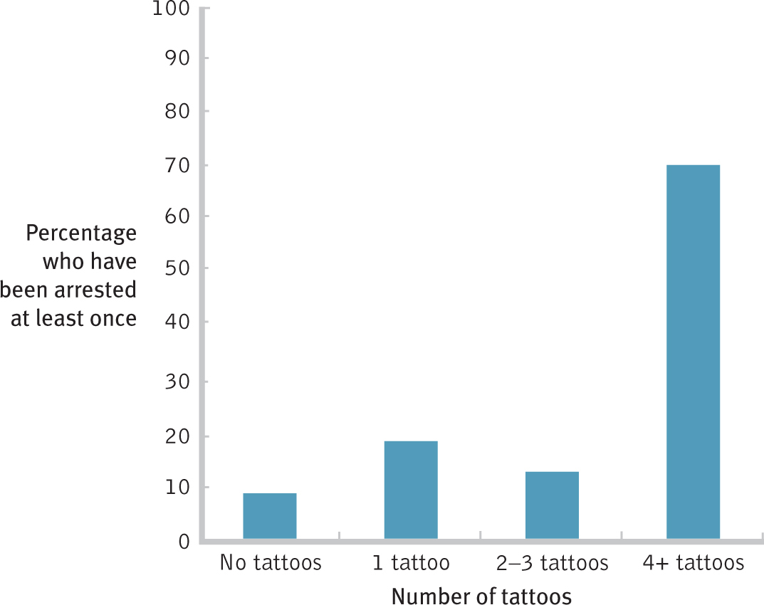
Figure 3-
Bar graphs can help us understand the answers to interesting questions. For example, researchers wondered whether piercings and tattoos, once viewed as indicators of a “deviant” worldview, had become mainstream (Koch, Roberts, Armstrong, & Owen, 2010). They surveyed 1753 American college students with respect to numbers of piercings and tattoos, as well as about a range of destructive behaviors including academic cheating, illegal drug use, and number of arrests (aside from traffic arrests). The bar graph in Figure 3-11 depicts one finding: The likelihood of having been arrested was fairly similar among all groups, except among those with four or more tattoos, 70.6% of whom reported having been arrested at least once. A magazine article about this research advised parents, “So, that butterfly on your sophomore’s ankle is not a sign she is hanging out with the wrong crowd. But if she comes home for spring break covered from head to toe, start worrying” (Jacobs, 2010).
Liars’ Alert! The small differences among the students with no tattoos, one tattoo, and two or three tattoos could be exaggerated if a reporter wanted to scare parents. Compare Figure 3-12 to the first three bars of Figure 3-11. Notice what happens when the fourth bar for four or more tattoos is eliminated: The values on the y-axis do not begin at 0, the intervals change from 10 to 2, and the y-axis ends at 20%. The exact same data leave a very different impression. (Note: If the data are very far from 0, and it does not make sense to have the axis go down to 0, indicate this on the graph by including double slashes—
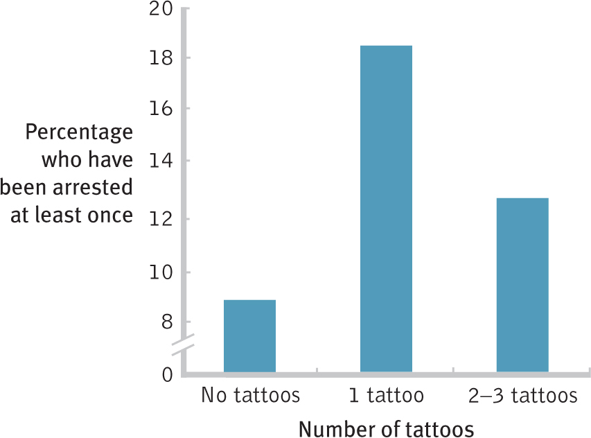
Figure 3-
Here is a recap of the steps to create a bar graph. The critical choice for you, the graph creator, is in step 2.
- Label the x-axis with the name and levels (i.e., categories) of the nominal or ordinal independent variable.
57
- Label the y-axis with the name of the scale dependent variable and its possible values, starting with 0 if practical.
- For every level of the independent variable, draw a bar with the height of that level’s value on the dependent variable.
Tufte (2001) has a plan for better bar graphs. In Figure 3-13, Tufte (a) eliminated the vertical axis; (b) kept the data labels on the y-axis; and (c) replaced the horizontal tick marks with thin white lines through the bars—
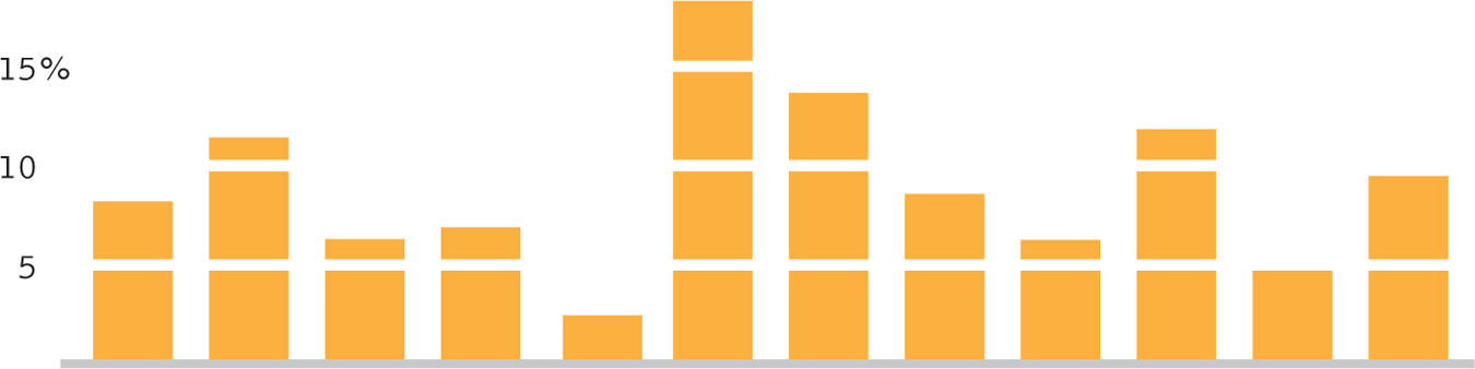
Figure 3-
Pictorial Graphs
A pictorial graph is a visual depiction of data typically used for an independent variable with very few levels (categories) and a scale dependent variable. Each level uses a picture or symbol to represent its value on the scale dependent variable.
Occasionally, a pictorial graph is acceptable, but such a graph should be used sparingly and only if carefully created. A pictorial graph is a visual depiction of data typically used for an independent variable with very few levels (categories) and a scale dependent variable. Each level uses a picture or symbol to represent its value on the scale dependent variable. Eye-
For example, a graphmaker might use stylized drawings of people to indicate population size. Figure 3-14 demonstrates one problem with pictorial graphs. The picture makes the person three times as tall and three times as wide (so that the taller person won’t look so stretched out). But then the total area of the picture is about nine times larger than the shorter one, even though the population is only three times as big—
58
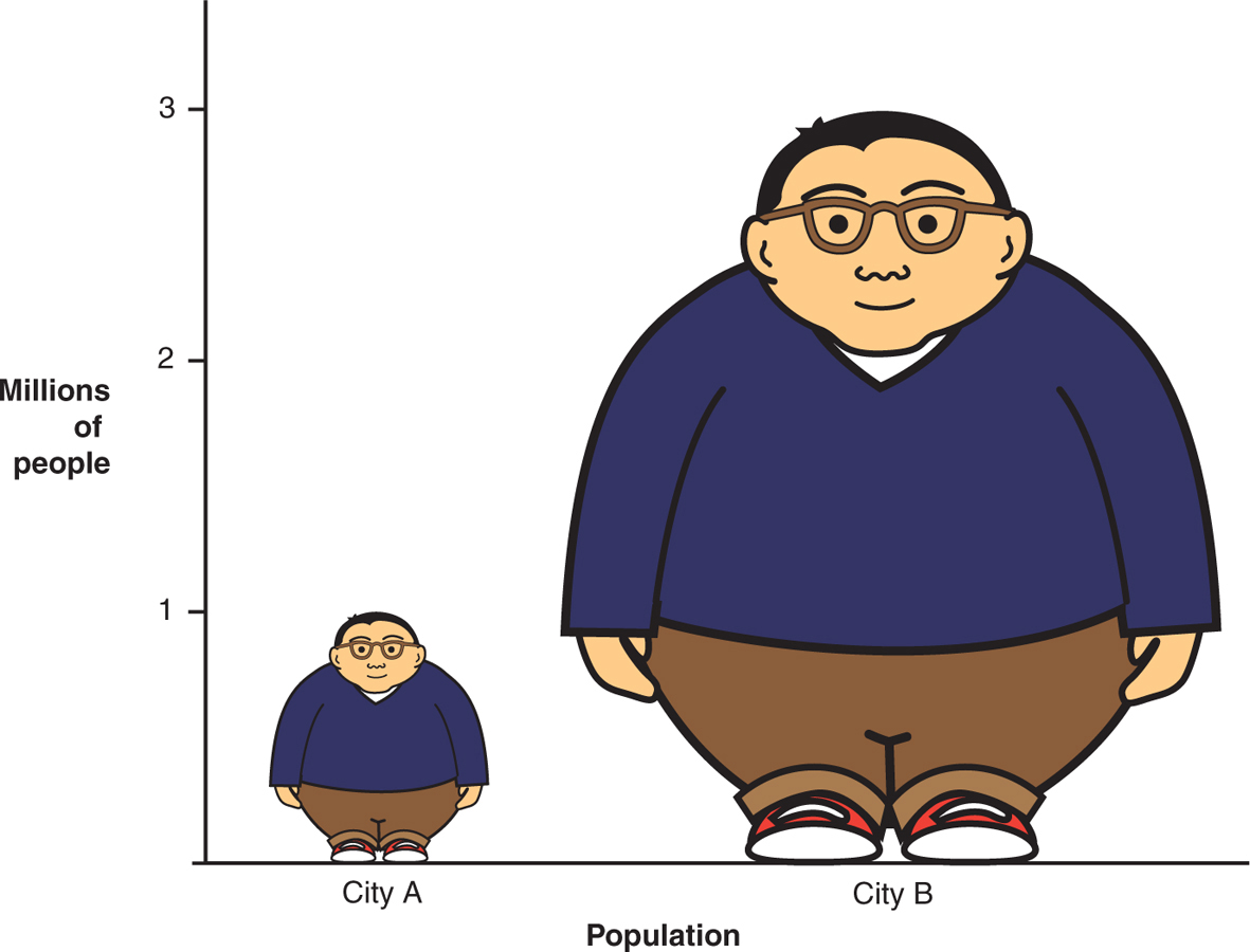
Figure 3-
Pie Charts
A pie chart is a graph in the shape of a circle, with a slice for every level (category) of the independent variable. The size of each slice represents the proportion (or percentage) of each level.
A pie chart is a graph in the shape of a circle, with a slice for every level (category) of the independent variable. The size of each slice represents the proportion (or percentage) of each category. A pie chart’s slices should always add up to 100% (or 1.00, if using proportions). Figure 3-15 demonstrates the difficulty in making comparisons from a pair of pie charts. As suggested by this graph, data can almost always be presented more clearly in a table or bar graph than in a pie chart. Indeed, Tufte (2006b) bluntly advises: “A table is nearly always better than a dumb pie chart” (p. 178). Because of the limitations of pie charts and the ready alternatives, we do not outline the steps for creating a pie chart here.
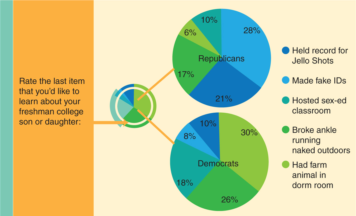
Figure 3-
59
CHECK YOUR LEARNING
Reviewing the Concepts
- Scatterplots and line graphs allow us to see relations between two scale variables.
- When examining the relations between variables, it is important to consider linear and nonlinear relations, as well as the possibility that no relation is present.
- Bar graphs, pictorial graphs, and pie charts depict summary values (such as means or percentages) on a scale variable for various levels of a nominal or ordinal variable.
- Bar graphs are preferred; pictorial graphs and pie charts can be misleading.
Clarifying the Concepts
- 3-
4 How are scatterplots and line graphs similar? - 3-
5 Why should we typically avoid using pictorial graphs and pie charts?
Calculating the Statistics
- 3-
6 What type of visual display of data allows us to calculate or evaluate how a variable changes over time?
Applying the Concepts
- 3-
7 What is the best type of common graph to depict each of the following data sets and research questions? Explain your answers.- Depression severity and amount of stress for 150 university students. Is depression related to stress level?
- Number of inpatient mental health facilities in Canada as measured every 10 years between 1890 and 2000. Has the number of facilities declined in recent years?
- Number of siblings reported by 100 people. What size family is most common?
- Mean years of education for six regions of the United States. Are education levels higher in some regions than in others?
- Calories consumed in a day and hours slept that night for 85 people. Does the amount of food a person eats predict how long he or she sleeps at night?
Solutions to these Check Your Learning questions can be found in Appendix D.