18.1 SOLUTIONS TO ODD-NUMBERED END-OF-CHAPTER PROBLEMS

SOLUTIONS TO ODD-
Chapter 1
1.1 Descriptive statistics organize, summarize, and communicate a group of numerical observations. Inferential statistics use sample data to make general estimates about the larger population.
1.3 The four types of variables are nominal, ordinal, interval, and ratio. A nominal variable is used for observations that have categories, or names, as their values. An ordinal variable is used for observations that have rankings (i.e., 1st, 2nd, 3rd) as their values. An interval variable has numbers as its values; the distance (or interval) between pairs of consecutive numbers is assumed to be equal. A ratio variable meets the criteria for interval variables but also has a meaningful zero point. Interval and ratio variables are both often referred to as scale variables.
1.5 Discrete variables can only be represented by specific numbers, usually whole numbers; continuous variables can take on any values, including those with great decimal precision (e.g., 1.597).
1.7 A confounding variable (also called a confound) is any variable that systematically varies with the independent variable so that we cannot logically determine which variable affects the dependent variable. Researchers attempt to control confounding variables in experiments by randomly assigning participants to conditions. The hope with random assignment is that the confounding variable will be spread equally across the different conditions of the study, thus neutralizing its effects.
1.9 An operational definition specifies the operations or procedures used to measure or manipulate an independent or dependent variable.
1.11 When conducting experiments, the researcher randomly assigns participants to conditions or levels of the independent variable. When random assignment is not possible, such as when studying something like gender or marital status, correlational research is used. Correlational research allows us to examine how variables are related to each other; experimental research allows us to make assertions about how an independent variable causes an effect in a dependent variable.
1.13
“This was an experiment” (not “This was a correlational study.”)
“the independent variable of caffeine” (not “the dependent variable of caffeine”)
“A university assessed the validity” (not “A university assessed the reliability”)
“In a between-
groups experiment” (not “In a within- groups experiment”)
1.15 The sample is the 2500 Canadians who work out every week. The population is all Canadians.
1.17 The sample is the 100 customers who completed the survey. The population is all of the customers at the grocery store.
1.19
73 people
All people who shop in grocery stores similar to the one where data were collected
Inferential statistic
Answer may vary, but here is one way that the amount of fruit and vegetable items purchased could be operationalized as a nominal variable. People could be labeled as having a “healthy diet” or an “unhealthy diet.”
Answers may vary, but there could be groupings such as “no items,” “a minimal number of items,” “some items,” and “many items.”
Answers may vary, but the number of items could be counted or weighed.
1.21
The independent variables are physical distance and emotional distance. The dependent variable is accuracy of memory.
There are two levels of physical distance (within 100 miles and 100 miles or farther) and three levels of emotional distance (knowing no one who was affected, knowing people who were affected but lived, and knowing someone who died).
Answers may vary, but accuracy of memory could be operationalized as the number of facts correctly recalled.
1.23
The average weight for a 10-
year- old girl was 77.4 pounds in 1963 and nearly 88 pounds in 2002. No; the CDC would not be able to weigh every single girl in the United States because it would be too expensive and time consuming.
It is a descriptive statistic because it is a numerical summary of a sample. It is an inferential statistic because the researchers drew conclusions about the population’s average weight based on this information from a sample.
1.25
Ordinal
Scale
Nominal
1.27
Discrete
Continuous
Discrete
Discrete
1.29
The independent variables are temperature and rainfall. Both are continuous scale variables.
The dependent variable is experts’ ratings. This is a discrete scale variable.
The researchers wanted to know if the wine experts are consistent in their ratings—
that is, if they’re reliable. This observation would suggest that Robert Parker’s judgments are valid. His ratings seem to be measuring what they intend to measure—
wine quality.
1.31
Forbes is operationalizing earnings as all of a comedian’s pretax gross income from all sources, provided that he earned the majority of his money from live performances.
Erin Gloria Ryan likely has a problem with this definition because not all comedians perform live as their primary source of income. In her article, she explains: “The Forbes list isn’t a brofest because men 100% dominate the top echelons of comedy. . . [It] employs an outdated definition of what comedy is and who is earning money from it that is always going to skew male. The game is rigged.”
Forbes could operationalize the earnings of comedians as pretax gross income, as they are already doing, but they could include all comedians, whether they earned most of their money from concerts, TV or internet shows, movies, books, MP3 sales, or any other comedy-
related source. This would remove the restriction that most income must come from concert sales. According to Ryan, this broader definition would have put Ellen DeGeneres in first place; she earned $53 million in 2013. Other female comedians who would have leaped onto this list include Sofía Vergara, Tina Fey, Amy Poehler, and Chelsea Handler.
1.33
An experiment requires random assignment to conditions. It would not be ethical to randomly assign some people to smoke and some people not to smoke, so this research had to be correlational.
Other unhealthy behaviors have been associated with smoking, such as poor diet and infrequent exercise. These other unhealthy behaviors might be confounded with smoking.
The tobacco industry could claim it was not the smoking that was harming people, but rather the other activities in which smokers tend to engage or fail to engage.
You could randomly assign people to either a smoking group or a nonsmoking group, and assess their health over time.
1.35
This is experimental because students are randomly assigned to one of the incentive conditions for recycling.
Answers may vary, but one hypothesis could be “Students fined for not recycling will report a lower level of concern about the environment, on average, than those rewarded for recycling.”
1.37
Researchers could have randomly assigned some people who are HIV-
positive to take the oral vaccine and other people who are HIV- positive not to take the oral vaccine. The second group would likely take a placebo. This would have been a between-
groups experiment because the people who are HIV- positive would have been in only one group: either vaccine or no vaccine. This limits the researchers’ ability to draw causal conclusions because the participants who received the vaccine may have been different in some way from those who did not receive the vaccine. There may have been a confounding variable that led to these findings. For example, those who received the vaccine might have had better access to health care and better sanitary conditions to begin with, making them less likely to contract cholera regardless of the vaccine’s effectiveness.
The researchers might not have used random assignment because it would have meant recruiting participants, likely immunizing half, then following up with all of them. The researchers likely did not want to deny the vaccine to people who were HIV-
positive because they might have contracted cholera and died without it.
1.39
A “good charity” is operationally defined as one that spends more of its money for the cause it is supporting and less for fundraising or administration.
The rating is a scale variable, as it has a meaningful zero point, has equal distance between intervals, and is continuous.
The tier is an ordinal variable, as it involves ranking the organizations into categories (1st, 2nd, 3rd, 4th, or 5th tier) and it is discrete.
The type of charity is a nominal variable, as it uses names or categories to classify the values (e.g., health and medical needs) and it is discrete.
Measuring finances is more objective and easier to measure than some of the criteria mentioned by Ord, such as importance of the problem and competency and honesty.
Charity Navigator’s ratings are more likely to be reliable than GiveWell’s ratings because they are based on an objective measure. It is more likely that different assessors would come up with the same rating for Charity Navigator than for GiveWell.
GiveWell’s ratings are likely to be more valid than Charity Navigator’s, provided that they can attain some level of reliability. GiveWell’s more comprehensive rating system incorporates a better-
rounded assessment of a charity. This would be a correlational study because donation funds, the independent variable, would not be randomly assigned based on country but measured as they naturally occur.
This would be an experiment because the levels of donation funds, the independent variable, are randomly assigned to different regions to determine the effect on death rate.
Chapter 2
2.1 Raw scores are the original data, to which nothing has been done.
2.3 A frequency table is a visual depiction of data that shows how often each value occurred; that is, it shows how many scores are at each value. Values are listed in one column, and the numbers of individuals with scores at that value are listed in the second column. A grouped frequency table is a visual depiction of data that reports the frequency within each given interval, rather than the frequency for each specific value.
2.5 Bar graphs typically provide scores for nominal data, whereas histograms typically provide frequencies for scale data. Also, the categories in bar graphs do not need to be arranged in a particular order and the bars should not touch, whereas the intervals in histograms are arranged in a meaningful order (lowest to highest) and the bars should touch each other.
2.7 A histogram looks like a bar graph but is usually used to depict scale data, with the values (or midpoints of intervals) of the variable on the x-axis and the frequencies on the y-axis. A frequency polygon is a line graph, with the x-axis representing values (or midpoints of intervals) and the y-axis representing frequencies; a dot is placed at the frequency for each value (or midpoint), and the points are connected.
2.9 In everyday conversation, you might use the word distribution in a number of different contexts, from the distribution of food to a marketing distribution. A statistician would use distribution only to describe the way that a set of scores, such as a set of grades, is distributed. A statistician is looking at the overall pattern of the data—
2.11 With positively skewed data, the distribution’s tail extends to the right, in a positive direction, and with negatively skewed data, the distribution’s tail extends to the left, in a negative direction.
2.13 A ceiling effect occurs when there are no scores above a certain value; a ceiling effect leads to a negatively skewed distribution because the upper part of the distribution is constrained.
2.15 17.95% and 40.67%
2.17 0.10% and 96.77%
2.19 0.04, 198.22, and 17.89
2.21 The full range of data is 68 minus 2, plus 1, or 67. The range (67) divided by the desired seven intervals gives us an interval size of 9.57, or 10 when rounded. The seven intervals are: 0–
2.23 26 shows
2.25 Serial killers would create positive skew, adding high numbers of murders to the data that are clustered around 1.
2.27
For the college population, the range of ages extends farther to the right (with a larger number of years) than to the left, creating positive skew.
The fact that youthful prodigies have limited access to college creates a sort of floor effect that makes low scores less possible.
2.29
Percentage Frequency Percentage 10 1 5.26 9 0 0.00 8 0 0.00 7 0 0.00 6 0 0.00 5 2 10.53 4 2 10.53 3 4 21.05 2 4 21.05 1 5 26.32 0 1 5.26 In 10.53% of these schools, exactly 4% of the students reported that they wrote between 5 and 10 twenty-
page papers that year. This is not a random sample. It includes schools that chose to participate in this survey and opted to have their results made public.
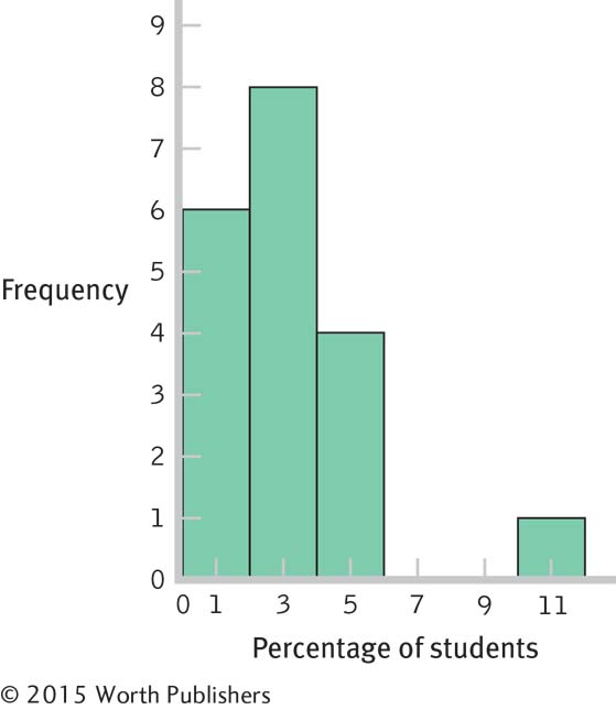
One
The data are clustered around 1% to 4%, with a high outlier, 10%.
2.31
Interval Frequency 60– 69 9 50– 59 8 40– 49 13 30– 39 13 20– 29 8 10– 19 12 0– 9 7 Page C-4There are many possible answers to this question. For example, we might ask whether the prestige of the university or the region of the country is a factor in acceptance rate.
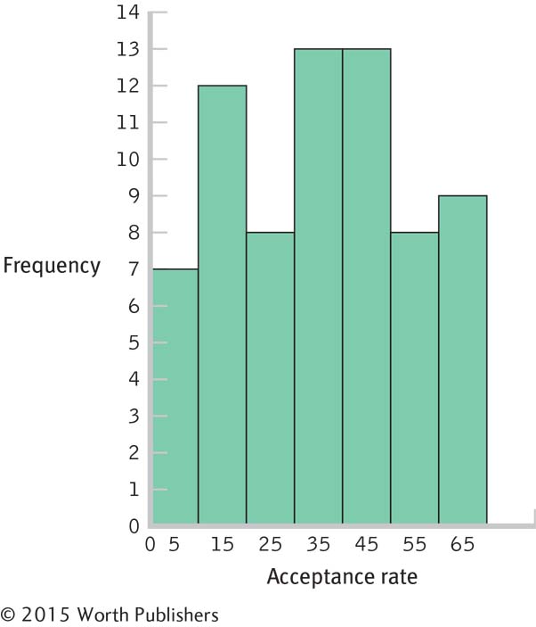
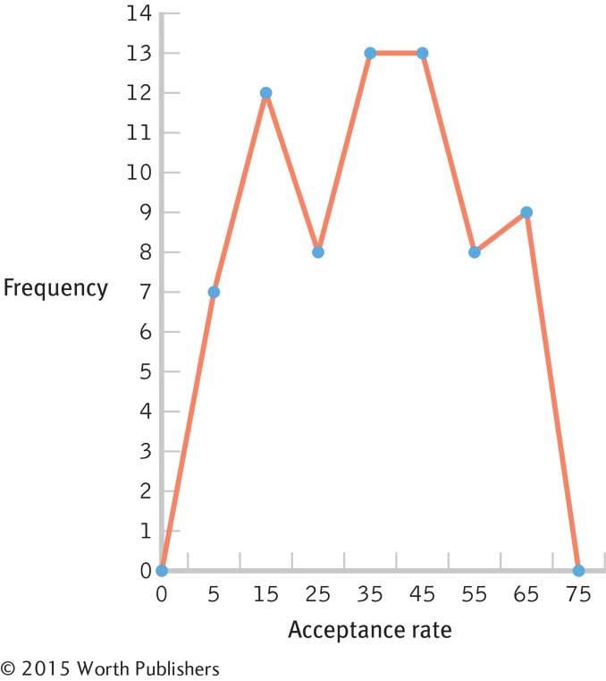
There are no unusual scores, as the distribution is fairly uniform, with frequencies between 6 and 13. The center of the distribution seems to be in the 20–
49 range.
2.33
Extroversion scores are most likely to have a normal distribution. Most people would fall toward the middle, with some people having higher levels and some having lower levels.
The distribution of finishing times for a marathon is likely to be positively skewed. The floor is the fastest possible time, a little over 2 hours; however, some runners take as long as 6 hours or more. Unfortunately for the very, very slow but unbelievably dedicated runners, many marathons shut down the finish line 6 hours after the start of the race.
The distribution of numbers of meals eaten in a dining hall in a semester on a three-
meal- a- day plan is likely to be negatively skewed. The ceiling is three times per day, multiplied by the number of days; most people who choose to pay for the full plan would eat many of these meals. A few would hardly ever eat in the dining hall, pulling the tail in a negative direction.
2.35
2.37
A frequency polygon based on these data is likely to be negatively skewed. The scale is 1–
10 and most films are rated above the midpoint. Very few are as low as Gunday. There is more likely to be a ceiling effect. With most films earning high ratings, it seems that the limiting factor is the top score of 10. No film earned the lowest possible score of 1, and few were as low as Gunday’s 1.4. So, there doesn’t seem to be a floor effect of 1.
IMDb ratings don’t seem to be a good way to operationalize movie quality. Audience ratings may be based on something other than how good the film is. In this case, many of those who rated Gunday based their scores on politics rather than on the qualities of the film itself. Another way to operationalize movie quality is a rating based on critics’ reviews, such as the system used by rottentomatoes.com. This site provides an average rating from critics, based on published reviews, in addition to one by movie audiences. Critics are unlikely to rate a movie simply based on politics.
2.39
Months Frequency Percentage 12 1 5 11 0 0 10 1 5 9 1 5 8 0 0 7 1 5 6 1 5 5 0 0 4 1 5 3 4 20 2 2 10 1 3 15 0 5 25 Page C-5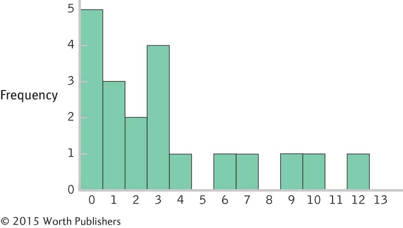
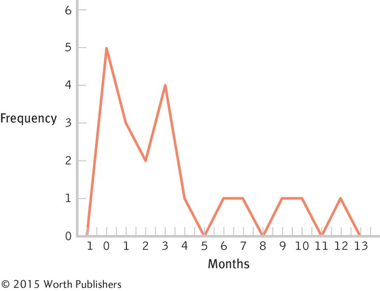
Interval Frequency 10– 14 months 2 5– 9 months 3 0– 4 months 15 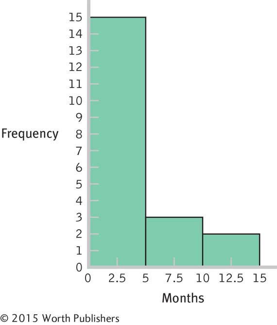
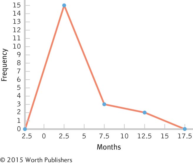
These data are centered around the 3-
month period, with positive skew extending the data out to the 12- month period. The bulk of the data would need to be shifted from the 3-
month period to approximately 12 months, so the women who have breast- fed for 3 months so far might be the focus of attention. Perhaps early contact at the hospital and at follow- up visits after birth would help encourage mothers to breast- feed, and to breast- feed longer. One could also consider studying the women who create the positive skew to learn what unique characteristics or knowledge they have that influenced their behavior.
2.41
Former Students Now in Top Jobs Frequency Percentage 13 1 1.85 12 0 0.00 11 0 0.00 10 0 0.00 9 1 1.85 8 3 5.56 7 4 7.41 6 5 9.26 5 9 16.67 4 8 14.81 3 23 42.59 Page C-6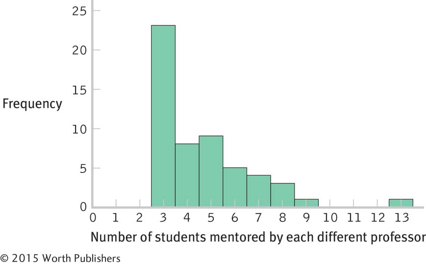
This distribution is positively skewed.
The researchers operationalized the variable of mentoring success as numbers of students placed into top professorial positions. There are many other ways this variable could have been operationalized. For example, the researchers might have counted numbers of student publications while in graduate school or might have asked graduates to rate their satisfaction with their graduate mentoring experiences.
The students might have attained their positions as professors because of the prestige of their advisor, not because of his mentoring.
There are many possible answers to this question. For example, the attainment of a top professorial position might be predicted by the prestige of the institution, the number of publications while in graduate school, or the graduate student’s academic ability.
Chapter 3
3.1 The five techniques for misleading with graphs are the biased scale lie, the sneaky sample lie, the interpolation lie, the extrapolation lie, and the inaccurate values lie.
3.3 To convert a scatterplot to a range-
3.5 With scale data, a scatterplot allows for a helpful visual analysis of the relation between two variables. If the data points appear to fall approximately along a straight line, the variables may have a linear relation. If the data form a line that changes direction along its path, the variables may have a nonlinear relation. If the data points show no particular relation, it is possible that the two variables are not related.
3.7 A bar graph is a visual depiction of data in which the independent variable is nominal or ordinal and the dependent variable is scale. Each bar typically represents the mean value of the dependent variable for each category. A Pareto chart is a specific type of bar graph in which the categories along the x-axis are ordered from highest bar on the left to lowest bar on the right.
3.9 A pictorial graph is a visual depiction of data typically used for a nominal independent variable with very few levels (categories) and a scale dependent variable. Each level uses a picture or symbol to represent its value on the scale dependent variable. A pie chart is a graph in the shape of a circle, with a slice for every level. The size of each slice represents the proportion (or percentage) of each category. In most cases, a bar graph is preferable to a pictorial graph or a pie chart.
3.11 The independent variable typically goes on the horizontal x-axis and the dependent variable goes on the vertical y-axis.
3.13 Moiré vibrations are any visual patterns that create a distracting impression of vibration and movement. A grid is a background pattern, almost like graph paper, on which the data representations, such as bars, are superimposed. Ducks are features of the data that have been dressed up to be something other than merely data.
3.15 Like a traditional scatterplot, the locations of the points on the bubble graph simultaneously represent the values that a single case (or country) has on two scale variables. The graph as a whole depicts the relation between these two variables.
3.17 Total dollars donated per year is scale data. A time plot would nicely show how donations varied across years.
3.19
The independent variable is gender and the dependent variable is video game score.
Nominal
Scale
The best graph for these data would be a bar graph because there is a nominal independent variable and a scale dependent variable.
3.21 Linear, because the data could be fit with a line drawn from the upper-
3.23
Bar graph
Line graph; more specifically, a time plot
The y-axis should go down to 0.
The lines in the background are grids, and the three-
dimensional effect is a type of duck. 3.20%, 3.22%, 2.80%
If the y-axis started at 0, all of the bars would appear to be about the same height. The differences would be minimized.
3.25 The minimum value is 0.04 and the maximum is 0.36, so the axis could be labeled from 0.00 to 0.40. We might choose to mark every 0.05 value:
0.00 0.05 0.10 0.15 0.20 0.25 0.30 0.35 0.40
3.27 The relation between physical health and positive emotions seems to be positive, with the data fitting a line moving from the lower-
3.29
The independent variable is height and the dependent variable is attractiveness. Both are scale variables.
The best graph for these data would be a scatterplot (which also might include a line of best fit if the relation is linear) because there are two scale variables.
It would not be practical to start the axis at 0. With the data clustered from 58 to 71 inches, a 0 start to the axis would mean that a large portion of the graph would be empty. We would use cut marks to indicate that the axis did not include all values from 0 to 58. (However, we would include the full range of data—
0 to 71— if omitting some of these numbers would be misleading.)
3.31
The independent variable is country and the dependent variable is male suicide rate.
Country is a nominal variable and suicide rate is a scale variable.
The best graph for these data would be a bar graph or a Pareto chart. Because there are six categories or countries to list along the x-axis, it may be best to arrange them in order from highest to lowest using a Pareto chart.
A time series plot could show year on the x-axis and suicide rate on the y-axis. Each country would be represented by a different color line.
3.33
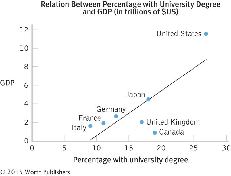
The percentage of residents with a university degree appears to be related to GDP. As the percentage with a university degree increases, so does GDP.
It is possible that an educated populace has the skills to make that country productive and profitable. Conversely, it is possible that a productive and profitable country has the money needed for the populace to be educated.
3.35
The independent variable is the academic institution. It is nominal; the levels are the 10 colleges.
The dependent variable is alumni donation rate. It is a scale variable; the units are percentages, and the range of values is from 50.2 to 62.6.
The defaults will differ, depending on which software is used. Here is one example.
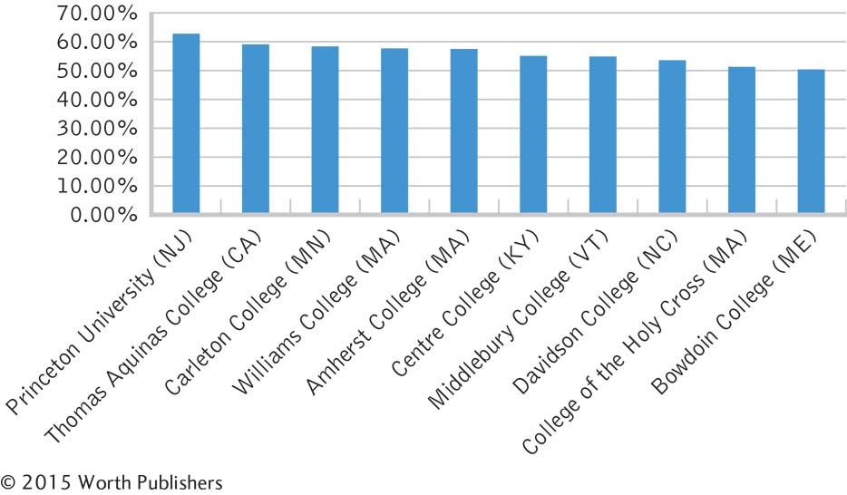
The redesigns will differ, depending on which software is used. In this example, we added a clear title and labeled the y-axis (being sure that it reads from left to right). We also eliminated the unnecessary lines in the background and the decimal places of each number on the y-axis.
There are many possible answers to this question. The researcher might want to identify characteristics of alumni who donate, methods of soliciting donations that result in the best outcomes, or characteristics of universities that have the highest donation rates.
Pictures could be used instead of bars. For example, dollar signs might be used to represent the donation rate for each college.
If the dollar signs become wider as they get taller, as often happens with pictorial graphs, the overall size would be proportionally larger than the increase in donation rate it is meant to represent. A bar graph is not subject to this problem because graphmakers are not likely to make bars wider as they get taller.
3.37
One independent variable is time frame; it has two levels: 1945–
1950 and 1996– 1998. The other independent variable is type of graduate program; it also has two levels: clinical psychology and experimental psychology. The dependent variable is percentage of graduates who had a mentor while in graduate school.
Page C-8
These data suggest that clinical psychology graduate students were more likely to have been mentored if they were in school in the 1996–
1998 time frame than if they were in school during the 1945– 1950 time frame. There does not appear to be such a difference among experimental psychology students. This was not a true experiment. Students were not randomly assigned to time period or type of graduate program.
A time series plot would be inappropriate with so few data points. It would suggest that we could interpolate between these data points. It would suggest a continual increase in the likelihood of being mentored among clinical psychology students, as well as a stable trend, albeit at a high level, among experimental psychology students.
The story based on two time points might be falsely interpreted as a continual increase of mentoring rates for the clinical psychology students and a plateau for the experimental psychology students. The expanded data set suggests that the rates of mentoring have fluctuated over the years. Without the four time points, we might be seduced by interpolation into thinking that the two scores represent the end points of a linear trend. We cannot draw conclusions about time points for which we have no data—
especially when we have only two points, but even when we have more points.
3.39
The details will differ, depending on the software used. Here is one example.
The default options that students choose to override will differ. For the bar graph below, we (1) added a title, (2) labeled the x-axis, (3) labeled the y-axis, (4) rotated the y-axis label so that it reads from left to right, and (5) eliminated the unnecessary key.
3.41
The graph is a scatterplot: individual points are identified for two scale variables—
academic standing and “hotness.” The variables are academic standing and “hotness.”
The graph could be redesigned to get rid of moiré vibrations, such as the colored background; and the grid (the background pattern of graph paper) and duck (the woman in the background image) could be eliminated.
3.43 Each student’s advice will differ. The following are examples of advice.
Business and women: Eliminate all the pictures, including the woman, piggy banks, the dollar signs in the background, and the icons to the right (e.g., house). The two bars near the top could mislead us into thinking they indicated quantity, even though they are the same length for two different median wages. Either eliminate the bars or size them so that they are appropriate to the dollars they represent. Ideally, the two median wages would be presented in a bar graph. Eliminate unnecessary words (e.g., “The Mothers of Business Invention”).
Workforce participation: Eliminate all the pictures. A falling line in the art shown indicates an increase in percentage; notice that 40% is at the top and 80% is at the bottom. Make the y-axis go from highest to lowest, starting from 0. Make the lines easier to compare by eliminating the three-
dimensional effect. Make it clear where the data point for each year falls by including a tick mark for each number on the x-axis.
3.45
The graph proposes that Type I regrets of action are initially intense but decline over the years, while Type II regrets of inaction are initially mild but become more intense over the years.
There are two independent variables: type of regret (a nominal variable) and age (a scale variable).There is one dependent variable: intensity of regrets (also a scale variable).
Page C-9This is a graph of a theory. No data have been collected, so there are no statistics of any kind.
The story that this theoretical relation suggests is that regrets over things a person has done are intense shortly after the actual behavior but decline over the years. In contrast, regrets over things a person has not done but wishes they had are initially low in intensity but become more intense as the years go by.
3.47
These data tell us that most domestic Canadian students—
59%—strongly agreed or somewhat agreed that international students have improved their universities’ reputations. Far fewer— 15%—strongly disagreed or somewhat disagreed with this statement, and 27% reserved judgment for some reason. To understand this pie chart, we have to look back and forth between the label and each “pie slice” that it describes. We then need to mentally compare the various percentages in the graph. A bar graph would allow for easier comparisons among the possible responses.
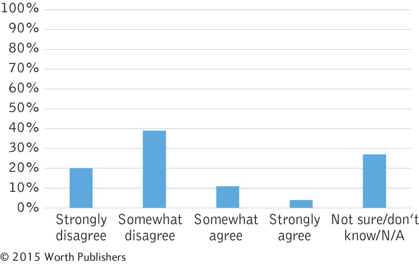
In this case, it makes sense to keep the possible responses in order from most negative to most positive (with the catch-
all “other” category at the end). If we arranged the bars in order of height— somewhat disagree, not sure/don’t know/N/A, strongly disagree, somewhat agree, and strongly agree— the story is not as easy to understand. This graph allows us to “see” that Canadian students tend to hold positive opinions toward the effect of international students on their universities’ reputations.
3.49
Data can almost always be presented more clearly in a bar graph or table than in a pie chart.
Answers to this question should include revising the data to add up to 100%, removing chartjunk (e.g., colors, shading, background images), and more clearly labeling categories with candidate names only. The graph also should not have 3-
D features.
3.51
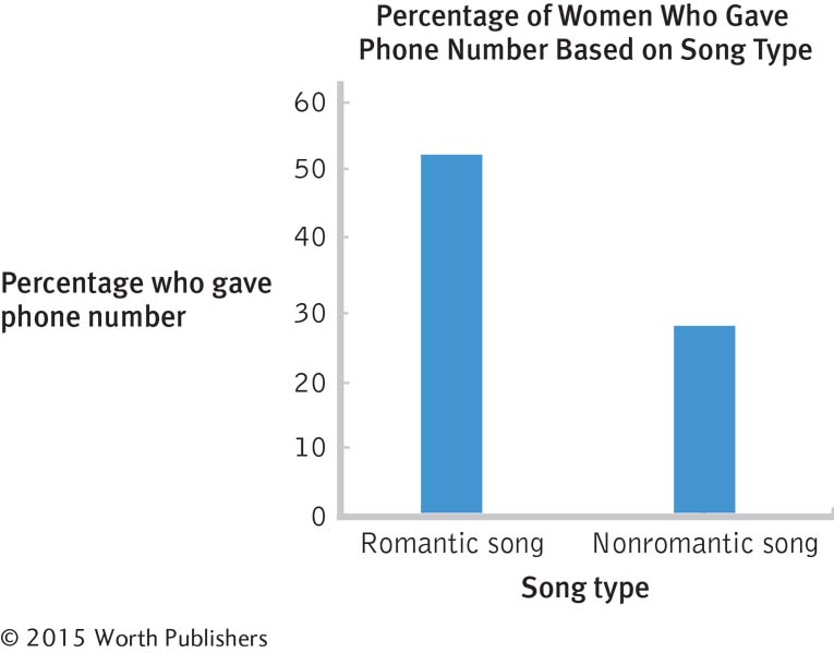
The independent variable is song type, with two levels: romantic song and nonromantic song.
The dependent variable is dating behavior.
This is a between-
groups study because each participant is exposed to only one level or condition of the independent variable. Dating behavior was operationalized by giving one’s phone number to an attractive person of the opposite sex. This may not be a valid measure of dating behavior, as we do not know if the participant actually intended to go on a date with the researcher. Giving one’s phone number might not necessarily indicate an intention to date.
We would use a bar graph because there is one nominal independent variable and one scale dependent variable.
The default graph will differ, depending on which software is used. Here is one example:
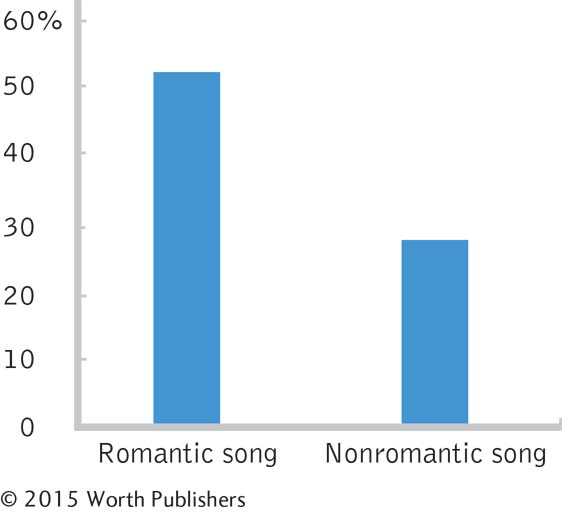
The default options that students choose to override will differ. Here is one example.
Chapter 4
4.1 The mean is the arithmetic average of a group of scores; it is calculated by summing all the scores and dividing by the total number of scores. The median is the middle score of all the scores when a group of scores is arranged in ascending order. If there is no single middle score, the median is the mean of the two middle scores. The mode is the most common score of all the scores in a group of scores.
4.3 The mean takes into account the actual numeric value of each score. The mean is the mathematic center of the data. It is the center balance point in the data, such that the sum of the deviations (rather than the number of deviations) below the mean equals the sum of deviations above the mean.
4.5 The mean might not be useful in a bimodal or multimodal distribution because in a bimodal or multimodal distribution the mathematical center of the distribution is not the number that describes what is typical or most representative of that distribution.
4.7 The mean is affected by outliers because the numeric value of the outlier is used in the computation of the mean. The median typically is not affected by outliers because its computation is based on the data in the middle of the distribution, and outliers lie at the extremes of the distribution.
4.9 The standard deviation is the typical amount each score in a distribution varies from the mean of the distribution.
4.11 The standard deviation is a measure of variability in terms of the values of the measure used to assess the variable, whereas the variance is squared values. Squared values simply don’t make intuitive sense to us, so we take the square root of the variance and report this value, the standard deviation.
4.13
The mean is calculated:
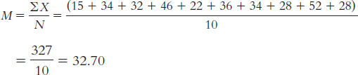
The median is found by arranging the scores in numeric order—
15, 22, 28, 28, 32, 34, 34, 36, 46, 52— then dividing the number of scores, 10, by 2 and adding 1/2 to get 5.5. The mean of the 5th and 6th score in the ordered list of scores is the median— (32 + 34)/2 = 33— so 33 is the median. The mode is the most common score. In these data, two scores appear twice, so we have two modes, 28 and 34.
Adding the value of 112 to the data changes the calculation of the mean in the following way:
(15 + 34 + 32 + 46 + 22 + 36 + 34 + 28 + 52 + 28 + 112)/11 = 439/11 = 39.91
The mean gets larger with this outlier.
There are now 11 data points, so the median is the 6th value in the ordered list, which is 34.
The modes are unchanged at 28 and 34.
This outlier increases the mean by approximately 7 values; it increases the median by 1; and it does not affect the mode at all.
The range is: Xhighest − Xlowest = 52 − 15 = 37
The variance is:
We start by calculating the mean, which is 32.70. We then calculate the deviation of each score from the mean and the square of that deviation.
X X − M (X − M )2 15 − 17.70 313.29 34 1.30 1.69 32 − 0.70 0.49 46 13.30 176.89 22 − 10.70 114.49 36 3.30 10.89 34 1.30 1.69 28 − 4.70 22.09 52 19.30 372.49 28 − 4.70 22.09 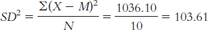
The standard deviation is:
 or
or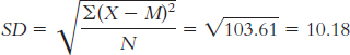
4.15
The mean is calculated as:
The median is found by arranging the temperatures in numeric order:
− 3.7, − 1.7, 1.7, 5.9, 13.6, 16.4, 24, 29.5, 34.6, 38.5, 42.1, 43.3
There are 12 data points, so the mean of the 6th and 7th data points gives us the median: (16.4 + 24)/2 = 20.20°F.
The mean is calculated as:
The median is found by arranging the temperatures in numeric order:
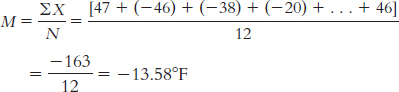
− 47, − 46, − 46, − 38, − 20, − 20, − 5, − 2, 8, 9, 20, 24
There are 12 data points, so the mean of the 6th and 7th data points gives us the median: [ − 20 + − 5]/2 = − 25/2 = − 12.50°F.
There are two modes: both − 46 and − 20 were recorded twice.
The mean is calculated as:
 Page C-11
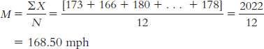
The median is found by arranging the wind gusts in numeric order:
136, 142, 154, 161, 163, 164, 166, 173, 174, 178, 180, 231
There are 12 data points, so the mean of the 6th and 7th data points gives us the median: (164 + 166)/2 = 165 mph.
There is no mode among these wind gusts.
For the wind gust data, we could create 10 mph intervals and calculate the mode as the interval that occurs most often. There are four recorded gusts in the 160–
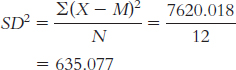
169 mph interval, three in the 170– 179 interval, and only one in the other intervals. So, the 160– 169 mph interval could be presented as the mode. The range is: Xhighest − Xlowest = 43.3 − ( − 3.7) = 47°F
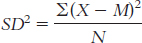
The variance is:
We start by calculating the mean, which is 20.35°F. We then calculate the deviation of each score from the mean and the square of that deviation.
X X − M (X − M )2 − 3.7 − 24.05 578.403 − 1.7 − 22.05 486.203 5.9 − 14.45 208.803 16.4 − 3.95 15.603 29.5 9.15 83.723 38.5 18.15 329.423 43.3 22.95 526.703 42.1 21.75 473.063 34.6 14.25 203.063 24 3.65 13.323 13.6 − 6.75 45.563 1.7 − 18.65 347.823 The variance is:
The standard deviation is:
or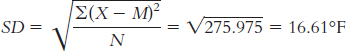
The range is Xhighest − Xlowest = 24 − ( − 47) = 71°F
The variance is:
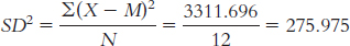
We already calculated the mean, − 13.583°F. We now calculate the deviation of each score from the mean and the square of that deviation.
X X − M (X − M )2 − 47 − 33.417 1116.696 − 46 − 32.417 1050.862 − 38 − 24.417 596.190 − 20 − 6.417 41.178 − 2 11.583 134.166 8 21.583 465.826 24 37.583 1412.482 20 33.583 1127.818 9 22.583 509.992 − 5 8.583 73.668 − 20 − 6.417 41.178 − 46 − 32.417 1050.862 The variance is:
The standard deviation is:
or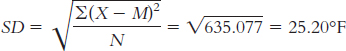
For the peak wind gust data, the range is Xhighest − Xlowest = 231 − 136 = 95 mph
The variance is:
We start by calculating the mean, which is 168.50 mph. We then calculate the deviation of each score from the mean and the square of that deviation.
X X − M (X − M )2 173 4.50 20.25 166 − 2.50 6.25 180 11.50 132.25 231 62.50 3906.25 164 − 4.50 20.25 136 − 32.50 1056.25 154 − 14.50 210.25 142 − 26.50 702.25 174 5.50 30.25 161 − 7.50 56.25 163 − 5.50 30.25 178 9.50 90.25 Page C-12The variance is:
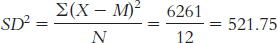
The standard deviation is:
or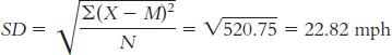
4.17 The mean for salary is often greater than the median for salary because the high salaries of top management inflate the mean but not the median. If we are trying to attract people to our company, we may want to present the typical salary as whichever value is higher—
4.19 There are few participants in this study (only seven) so a single extreme score would influence the mean more than it would influence the median. The median is a more trustworthy indicator than the mean when there is only a handful of scores.
4.21 In April 1934, a wind gust of 231 mph was recorded. This data point is rather far from the next closest record of 180 mph. If this extreme score were excluded from analyses of central tendency, the mean would be lower, the median would change only slightly, and the mode would be unaffected.
4.23 There are many possible answers to this question. All answers will include a distribution that is skewed, perhaps one that has outliers. A skewed distribution would affect the mean but not the median. One example would be the variable of number of foreign countries visited; the few jet-
4.25
These ads are likely presenting outlier data.
To capture the experience of the typical individual who uses the product, the ad could include the mean result and the standard deviation. If the distribution of outcomes is skewed, it would be best to present the median result.
4.27
The formula for variance is
We start by creating three columns: one for the scores, one for the deviations of the scores from the mean, and one for the squares of the deviations.
We can now calculate variance:
X X − M (X − M )2 0 − 2.789 7.779 5 2.211 4.889 3 0.211 0.045 3 0.211 0.045 1 − 1.789 3.201 10 7.211 51.999 2 − 0.789 0.623 2 − 0.789 0.623 3 0.211 0.045 1 − 1.789 3.201 2 − 0.789 0.623 4 1.211 1.467 2 − 0.789 0.623 1 − 0.789 3.201 1 − 0.789 3.201 1 − 0.789 3.201 4 1.211 1.467 3 0.211 0.045 5 2.211 4.889 We calculate standard deviation the same way we calculate variance, but we then take the square root:
The typical score is around 2.79, and the typical deviation from 2.79 is around 2.19.
4.29 There are many possible answers to these questions. The following are only examples.
70, 70. There is no skew; the mean is not pulled away from the median.
80, 70. There is positive skew; the mean is pulled up, but the median is unaffected.
60, 70. There is negative skew; the mean is pulled down, but the median is unaffected.
4.31
Because the policy for which violations were issued changed during this time frame, we cannot make accurate comparisons before and after Hurricane Sandy. The conditions for issuing violations were not constant; thus, the policy change would be a likely explanation for a change in the data.
Page C-13The removal of violations in Zone A, which appears to have been most affected by infestations after the hurricane, would result in eliminating an otherwise extreme number, or outlier, of issued violations. This would lead to inaccurate data as it does not accurately portray the number of rat violations, only the number of rat violations issued under the current policy.
4.33 It would probably be appropriate to use the mean because the data are scale; we would assume we have a large number of data points available to us; and the mean is the most commonly used measure of central tendency. Because of the large amount of data available, the effect of outliers is minimized. All of these factors would support the use of the mean for presenting information about the heights or weights of large numbers of people.
4.35 We cannot directly compare the mean ages reported by Canada with the median ages reported by the United States because it is likely that there were some older outliers in both Canada and the United States, and these outliers would affect the means reported by Canada much more than they would affect the medians reported by the United States.
4.37
The researchers reported an increase in early literacy among students in the intervention group (those whose parents received the text messages) as compared with the students who were not in the intervention group (those whose parents did not receive texts). The intervention seemed to work. That is, those in the intervention group as a whole ended up higher in literacy skills as compared with the mean for the nonintervention group. The increase was between 0.21 and 0.34 deviations. We know that the standard deviation indicates the difference of a typical student from the mean. So, the shift for the group as a whole is not as big as the amount that the typical student differs from the mean. It’s just part of a standard deviation.
The researchers used a between-
groups design because each student could only be in one group— either the group in which parents received the text messages or the group in which the parents did not receive the text messages.
4.39
Interval Frequency 60– 69 1 50– 59 5 40– 49 9 30– 39 5 20– 29 8 10– 19 2 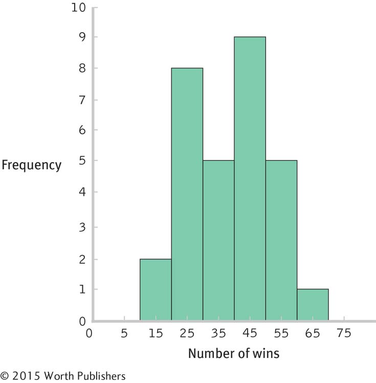
With 30 scores, the median would be between the 15th and 16th scores: (30/2) + 0.5 + 15.5. The 15th and 16th scores are 39 and 40, respectively, so the median is 39.50. The mode is 29; there are three scores of 29.
Software reports that the range is 42 and the standard deviation is 11.59.
The summary will differ for each student but should include the following information: The data appear to be roughly symmetric and unimodal, maybe a bit negatively skewed. There are no glaring outliers.
Answers will vary. One example is whether number of wins is related to the average age of a team’s players.
Chapter 5
5.1 It is rare to have access to an entire population. That is why we study samples and use inferential statistics to estimate what is happening in the population.
5.3 Generalizability refers to the ability of researchers to apply findings from one sample or in one context to other samples or contexts.
5.5 Random sampling means that every member of a population has an equal chance of being selected to participate in a study. Random assignment means that each selected participant has an equal chance of being in any of the experimental conditions.
5.7 Random assignment is a process in which every participant (regardless of how he or she was selected) has an equal chance of being in any of the experimental conditions. This avoids bias across experimental conditions.
5.9 An illusory correlation is a belief that two events are associated when in fact they are not.
5.11 Students’ answers will vary. Personal probability is a person’s belief about the probability of an event occurring; for example, someone’s belief about the likelihood that she or he will complete a particular task.
5.13 In reference to probability, the term trial refers to each occasion that a given procedure is carried out. For example, each time we flip a coin, it is a trial. Outcome refers to the result of a trial. For coin-
5.15 The independent variable is the variable the researcher manipulates. Independent trials or events are those that do not affect each other; the flip of a coin is independent of another flip of a coin because the two events do not affect each other.
5.17 A null hypothesis is a statement that postulates that there is no mean difference between populations or that the mean difference is in a direction opposite of that anticipated by the researcher. A research hypothesis, also called an alternative hypothesis, is a statement that postulates that there is a mean difference between populations or sometimes, more specifically, that there is a mean difference in a certain direction, positive or negative.
5.19 We commit a Type I error when we reject the null hypothesis but the null hypothesis is true. We commit a Type II error when we fail to reject the null hypothesis but the null hypothesis is false.
5.21 In each of the six groups of 10 passengers that go through the checkpoint, we would check the 9th, 9th, 10th, 1st, 10th, and 8th passengers, respectively.
5.23 Only recording the numbers 1 to 5, the sequence appears as 5, 3, 5, 5, 2, 2, and 2. So, the first person is assigned to the fifth condition, the second person to the third condition, and so on.
5.25 Illusory correlation is particularly dangerous because people might perceive there to be an association between two variables that does not in fact exist. Because we often make decisions based on associations, it is important that those associations be real and be based on objective evidence. For example, a parent might perceive an illusory correlation between body piercings and trustworthiness, believing that a person with a large number of body piercings is untrustworthy. This illusory correlation might lead the parent to unfairly eliminate anyone with a body piercing from consideration when choosing babysitters.
5.27 The probability of winning is estimated as the number of people who have already won out of the total number of contestants, or 8/266 = 0.03.
5.29
0.627
0.003
0.042
5.31
Expected relative-
frequency probability Personal probability
Personal probability
Expected relative-
frequency probability
5.33 Most of us believe we can think randomly. However, it is extremely difficult for us to come up with a string of four numbers in which we determined each of the numbers completely independently. We may choose numbers with some meaning for us, perhaps without even realizing we are doing so. We also tend to consider the previous numbers when we come up with each new one. As the BBC article reported, people are lazy when it comes to choosing PINs and passwords. “They use birthdays, wedding days, the names of siblings or children or pets. They use their house number, street name or pick on a favourite pop star” (Ward, 2013). So, the best advice would be to let a random numbers table choose your PIN.
5.35
The independent variable is type of news information, with two levels: information about an improving job market and information about a declining job market.
The dependent variable is psychologists’ attitudes toward their careers.
The null hypothesis would be that, on average, the psychologists who received the positive article about the job market have the same attitude toward their career as those who read a negative article about the job market. The research hypothesis would be that a difference, on average, exists between the two groups.
5.37 Although we all believe we can think randomly if we want to, we do not, in fact, generate numbers independently of the ones that came before. We tend to glance at the preceding numbers in order to make the next ones “random.” Yet once we do this, the numbers are not independent and therefore are not random. Moreover, even if we can keep ourselves from looking at the previous numbers, the numbers we generate are not likely to be random. For example, if we were born on the 6th of the month, then we may be more likely to choose 6’s than other digits. Humans just don’t think randomly.
5.39
The typical study volunteer is likely someone who cares deeply about U.S. college football. Moreover, it is particularly the fans of the top ACC teams, who themselves are likely extremely biased, who are most likely to vote.
External validity refers to the ability to generalize beyond the current sample. In this case, it is likely that fans of the top ACC teams are voting and that the poll results do not reflect the opinions of U.S. college football fans at large.
There are several possible answers to this question. As one example, only eight options were provided. Even though one of these options was “other,” this limited the range of possible answers that respondents would be likely to provide. The sample is also biased in favor of those who know about and would spend time at the USA Today Web site in the first place.
5.41
These numbers are likely not representative. This is a volunteer sample.
Those most likely to volunteer are those who have stumbled across, or searched for, this Web site: a site that advocates for self-
government. Those who respond are more likely to tend toward supporting self- government than are those who do not respond (or even find this Web site). Page C-15This description of libertarians suggests they would advocate for self-
government— as that is part of the name of the group that hosts this quiz— a likely explanation for the predominance of libertarians who responded to this survey. The repeated use of the word “Libertarian” (in the heading and in the icon) likely helps preselect who would come to this Web site in the first place. It doesn’t matter how large a sample is if it’s not representative. With respect to external validity, it would be far preferable to have a smaller but representative sample than a very large but unrepresentative sample.
5.43 Your friend’s bias is an illusory correlation—
5.45 If a depressed person has negative thoughts about himself or herself and about the world, confirmation bias may make it difficult to change those thoughts because confirmation bias would lead this person to pay more attention to and better remember negative events than positive events. For example, he or she might remember the one friend who slighted him or her at a party but not the many friends who were excited to see him or her.
5.47
Probability refers to the proportion of Waldos that we expect to see in these two 1.5-
inch bands in the long run. In the long run, given 53% of Waldos falling in these bands, we would expect the proportion of Waldos to be 0.53. Proportion refers to the observed fraction of Waldos in these bands—
the number of successes (Waldo in one of these bands) divided by the number of trials (total Waldo illustrations used). In this case, the proportion of Waldos in one of these bands is 0.53. Percentage refers to the proportion multiplied by 100: 0.53(100) = 53%, as reported by Blatt in this case. The media often report percentage versions of probabilities.
Although 0.53 is far from 0.3%, Blatt did not analyze every Where’s Waldo? illustration that exists. It does seem that this is more than coincidence, but we might expect a fluctuation in the short run. We can’t know for certain that the Where’s Waldo? game has a bias.
5.49 These polls could be considered independent trials if they were conducted for each state individually, and if the state currently being polled did not have any information about the polling results from other states. However, these are not truly independent trials, as state-
5.51
The null hypothesis is that the average tendency to develop false memories is either unchanged or is lowered by the repetition of false information. The research hypothesis is that false memories are higher, on average, when false information is repeated than when it is not.
The null hypothesis is that the average outcome is the same or worse whether or not structured assessments are used. The research hypothesis is that the average outcome is better when structured assessments are used than when they are not used.
The null hypothesis is that average employee morale is the same whether employees work in enclosed offices or in cubicles. The research hypothesis is that average employee morale is different when employees work in enclosed offices versus in cubicles.
The null hypothesis is that ability to speak one’s native language is the same, on average, whether or not a second language is taught from birth. The research hypothesis is that the ability to speak one’s native language is different, on average, when a second language is taught from birth than when no second language is taught.
5.53
If this conclusion is incorrect, the researcher has made a Type I error. The researcher rejected the null hypothesis when the null hypothesis is really true. (Of course, he or she never knows whether there has been an error! She or he just has to acknowledge the possibility.)
If this conclusion is incorrect, the researcher has made a Type I error. She has rejected the null hypothesis when the null hypothesis is really true.
If this conclusion is incorrect, the researcher has made a Type II error. He has failed to reject the null hypothesis when the null hypothesis is not true.
If this conclusion is incorrect, the researcher has made a Type II error. She has failed to reject the null hypothesis when the null hypothesis is not true.
5.55
Confirmation bias has guided his logic in that he looked for specific events that occurred during the day to fit the horoscope but ignored the events that did not fit the prediction.
If this conclusion is incorrect, they have made a Type I error. Dean and Kelly would have failed to reject the null hypothesis when the null hypothesis is not true.
If an event occurs regularly or a research finding is replicated many times and by other researchers and in a range of contexts, then it is likely the event or finding is not occurring in error or by chance alone.
5.57
The population in which you would be interested is all people who already had read Harry Potter and the Half-
Blood Prince .The sample would be just bel 78. It is dangerous to rely on just one review, bel 78’s testimonial. She clearly felt strongly about the book if she spent the time to post her review. She is not likely to be representative of the typical reader of this book.
This is a large sample, but it is not likely representative of those who had read this book. Not only does this sample consist solely of Amazon users, but it consists of readers who chose to post a review. It is likely that those who took the time to write and post a review were those who felt more strongly about the book than did the typical reader.
In this case, the population of interest would be all Amazon users who had read this book. We would need Amazon to generate a list of everyone who bought the book (something that they would not do because of ethical considerations), and we would have to randomly select a sample from this population. We would then have to identify the people who actually read the book (who may not be the buyers) and elicit the ratings from the randomly selected sample.
Page C-16We could explain that testimonials are typically written by those who feel most strongly about a book. The sample of reviewers, therefore, is unlikely to be representative of the population of readers.
5.59
The population of interest is male students with alcohol problems. The sample is the 64 students who were ordered to meet with a school counselor.
Random selection was not used. The sample was comprised of 64 male students who had been ordered to meet with a school counselor; they were not chosen out of all male students with alcohol problems.
Random assignment was used. Each participant had an equal chance of being assigned to either of the two conditions.
The independent variable is type of counseling. It has two levels: BMI and AE. The dependent variable is number of alcohol-
related problems at follow- up. The null hypothesis is that the mean number of alcohol-
related problems at follow- up is the same, regardless of type of counseling (BMI or AE).The research hypothesis is that students who undergo a BMI have different mean numbers of alcohol- related problems at follow- up than do students who participate in AE. The researchers rejected the null hypothesis.
If the researchers were incorrect in their decision, then they made a Type I error, rejecting the null hypothesis when the null hypothesis is true. The consequences of this type of error are that a new treatment that is no better, on average, than the standard treatment would be implemented. This might lead to unnecessary costs to train counselors to implement the new treatment.
Chapter 6
6.1 In everyday conversation, the word normal is used to refer to events or objects that are common or that typically occur. Statisticians use the word to refer to distributions that conform to a specific bell-
6.3 The distribution of sample scores approaches normal as the sample size increases, assuming the population is normally distributed.
6.5 A z score is a way to standardize data; it expresses how far a data point is from the mean of its distribution in terms of standard deviations.
6.7 The mean is 0 and the standard deviation is 1.0.
6.9 The symbol μM stands for the mean of the distribution of means. The μ indicates that it is the mean of a population, and the subscript M indicates that the population is composed of sample means—the means of all possible samples of a given size from a particular population of individual scores.
6.11 Standard deviation is the measure of spread for a distribution of scores in a single sample or in a population of scores. Standard error is the standard deviation (or measure of spread) in a distribution of means of all possible samples of a given size from a particular population of individual scores.
6.13 The z statistic tells us how many standard errors a sample mean is from the population mean.
6.15
As the sample size increases, the distribution approaches the shape of the normal curve.
Page C-17
6.17
6.19
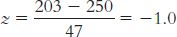
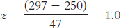
Each of these scores is 47 points away from the mean, which is the value of the standard deviation. The z scores of –1.0 and 1.0 express that the first score, 203, is 1 standard deviation below the mean, whereas the other score, 297, is 1 standard deviation above the mean.
6.21
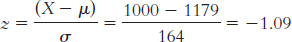
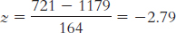
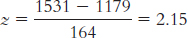
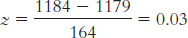
X = z(σ) + μ = − 0.23(164) + 1179 = 1141.28
X = 1.41(164) + 1179 = 1410.24
X = 2.06(164) + 1179 = 1516.84
X = 0.03(164) + 1179 = 1183.92
6.23
X = z(σ) + μ = 1.5(100) + 500 = 650
X = z(σ) + μ = − 0.5(100) + 500 = 450
X = z(σ) + μ = − 2.0(100) + 500 = 300
6.25
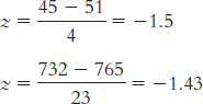
Both of these scores fall below the means of their distributions, resulting in negative z scores. One score (45) is a little farther below its mean than the other (732).
6.27
50%
82% (34 + 34 + 14)
4% (2 + 2)
48% (34 + 14)
100% or nearly 100%
6.29

6.31
The first sample had a mean that was 2.50 standard deviations above the population mean, whereas the second sample had a mean that was 4 standard deviations above the mean. Compared to the population mean (as measured by this scale), both samples are extreme scores; however, a z score of 4.0 is even more extreme than a z score of 2.5.
6.33
Histogram for the 10 scores:
Histogram for the 40 scores:
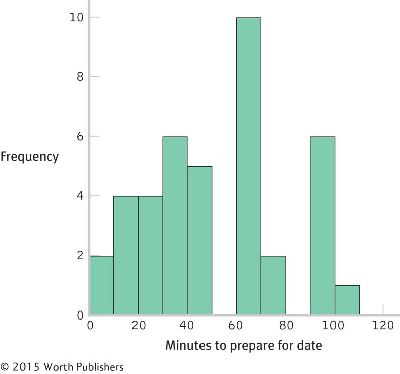
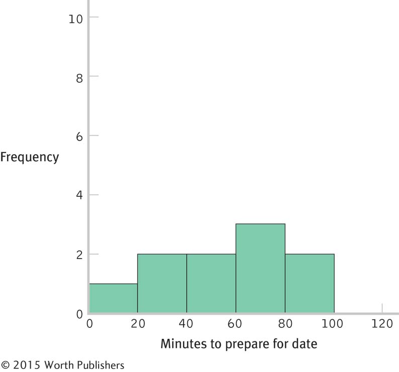
The shape of the distribution became more normal as the number of scores increased. If we added more scores, the distribution would become more and more normal. This happens because many physical, psychological, and behavioral variables are normally distributed. With smaller samples, this might not be clear. But as the sample size approaches the size of the population, the shape of the sample distribution approaches that of the population.
Page C-18These are distributions of scores, as each individual score is represented in the histograms on its own, not as part of a mean.
There are several possible answers to this question. For example, instead of using retrospective self-
reports, we could have had students call a number or send an e- mail as they began to get ready; they would then have called the same number or sent another e- mail when they were ready. This would have led to scores that would be closer to the actual time it took the students to get ready. There are several possible answers to this question. For example, we could examine whether there was a mean gender difference in time spent getting ready for a date.
6.35
The mean of the z distribution is always 0.
The standard deviation of the z distribution is always 1.
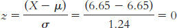
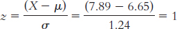
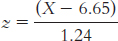
A student 1 standard deviation above the mean would have a score of 6.65 + 1.24 = 7.89. This person’s z score would be:
The answer will differ for each student but will involve substituting one’s own score for X in this equation:
6.37
It would not make sense to compare the mean of this sample to the distribution of individual scores because, in a sample of means, the occasional extreme individual score is balanced by less extreme scores that are also part of the sample. Thus, there is less variability.
The null hypothesis would state that the population from which the sample was drawn has a mean of 3.20. The research hypothesis would state that the mean for the population from which our sample was drawn is not 3.20.
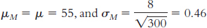
μM = μ = 3.20
6.39
Yes, the distribution of the number of movies college students watch in a year would likely approximate a normal curve. You can imagine that a small number of students watch an enormous number of movies and that a small number watch very few but that most watch a moderate number of movies between these two extremes.
Yes, the number of full-
page advertisements in magazines is likely to approximate a normal curve. We could find magazines that have no or just one or two full- page advertisements and some that are chock full of them, but most magazines have some intermediate number of full- page advertisements. Yes, human birth weights in Canada could be expected to approximate a normal curve. Few infants would weigh in at the extremes of very light or very heavy, and the weight of most infants would cluster around some intermediate value.
6.41 Household income is positively skewed. Most households cluster around a relatively low central tendency, but the 1-
6.43
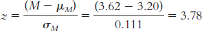
According to these data, the Falcons had a better regular season (they had a higher z score) than did the Braves.
The Braves would have had to have won 101 regular season games to have a slightly higher z score than the Falcons:
There are several possible answers to this question. For example, we could have summed the teams’ scores for every game (as compared to other teams’ scores within their leagues).
6.45
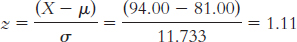
X = z(σ) + μ = −1.705(11.733) + 81.00 = 61 games (rounded to a whole number)
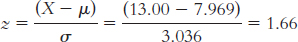
X = z(σ) + μ = −0.319(3.036) + 7.969 = 7 games (rounded to a whole number)
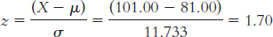
Fifty percent of scores fall below the mean, so 34% (84 − 50 = 34) fall between the mean and the Colts’ score. We know that 34% of scores fall between the mean and a z score of 1.0, so the Colts have a z score of 1.0. X = z(σ) + μ = 1(3.036) + 7.969 = 11 games (rounded to a whole number).
We can examine our answers to be sure that negative z scores match up with answers that are below the mean and positive z scores match up with answers that are above the mean.
6.47
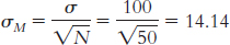
μ = 50; σ = 10
When we calculate the mean of the scores for 95 individuals, the most extreme MMPI-
2 depression scores will likely be balanced by scores toward the middle. It would be rare to have an extreme mean of the scores for 95 individuals. Thus, the spread is smaller than is the spread for all of the individual MMPI- 2 depression scores.
6.49
These are the data for a distribution of scores rather than means because they have been obtained by entering each individual score into the analysis.
Comparing the sizes of the mean and the standard deviation suggests that there is positive skew. A person can’t have fewer than zero friends, so the distribution would have to extend in a positive direction to have a standard deviation larger than the mean.
Page C-19Because the mean is larger than either the median or the mode, it suggests that the distribution is positively skewed. There are extreme scores in the positive end of the distribution that are causing the mean to be more extreme than the median or mode.
You would compare this person to the distribution of scores. When making a comparison of an individual score, we must use the distribution of scores.
You would compare this sample to a distribution of means. When making a comparison involving a sample mean, we must use a distribution of means because it has a different pattern of variability from a distribution of scores (it has less variability).
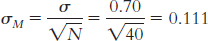
μM = μ = 7.44. The number of individuals in the sample is 80. Substituting 80 in the standard error equation yields
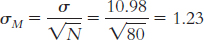
The distribution of means is likely to be a normal curve. Because the sample of 80 is well above the 30 recommended to see the central limit theorem at work, we expect that the distribution of the sample means will approximate a normal distribution.
6.51
You would compare this sample mean to a distribution of means. When we are making a comparison involving a sample mean, we need to use the distribution of means because it is this distribution that indicates the variability we are likely to see in sample means.
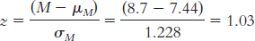
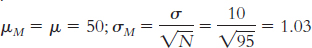
This z statistic of 1.03 is approximately 1 standard deviation above the mean. Because 50% of the sample are below the mean and 34% are between the mean and 1 standard deviation above it, this sample would be at approximately the 84th percentile.
It does make sense to calculate a percentile for this sample. Given the central limit theorem and the size of the sample used to calculate the mean (80), we would expect the distribution of the sample means to be approximately normal.
6.53
The population is all patients treated for blocked coronary arteries in the United States. The sample is Medicare patients in Elyria, Ohio, who received angioplasty.
Medicare and the commercial insurer compared the angioplasty rate in Elyria to that in other towns. Given that the rate was so far above that of other towns, they decided that such a high angioplasty rate was unlikely to happen just by chance. Thus, they used probability to make a decision to investigate.
Medicare and the commercial insurer could look at the z distribution of angioplasty rates in cities from all over the country. Locating the rate of Elyria within that distribution would indicate exactly how extreme or unlikely its angioplasty rates are.
The error made would be a Type I error, as they would be rejecting the null hypothesis that there is no difference among the various towns in rates of angioplasty, and concluding that there is a difference, when there really is no difference.
Elyria’s extremely high rates do not necessarily mean the doctors are committing fraud. One could imagine that an area with a population composed mostly of retirees (that is, more elderly people) would have a higher rate of angioplasty. Conversely, perhaps Elyria has a talented set of surgeons who are renowned for their angioplasty skills and people from all over the country come there to have angioplasty.
6.55
The researchers are operationally defining cheating as the change in standardized test score for a given classroom. This variable is a scale variable.
Researchers could establish a cut-
off z statistic at which those who had a mean change larger than that z statistic would be considered “suspicious.” For example, a classroom with a z statistic of 2 or more may have cheated on this year’s test. A histogram or frequency polygon would provide an easy visual to see where a given classroom falls on the distribution. A researcher could even draw lines indicating the cutoffs and see which classrooms fall beyond them.
They would be committing a Type I error, because they would be rejecting the null hypothesis that there is no difference in a classroom’s test scores from one year to the next when there really is no difference and they should have failed to reject the null hypothesis.
Chapter 7
7.1 A percentile is the percentage of scores that fall below a certain point on a distribution.
7.3 We add the percentage between the mean and the positive z score to 50%, which is the percentage of scores below the mean (50% of scores are on each side of the mean).
7.5 In statistics, assumptions are the characteristics we ideally require the population from which we are sampling to have so that we can make accurate inferences.
7.7 Parametric tests are statistical analyses based on a set of assumptions about the population. By contrast, nonparametric tests are statistical analyses that are not based on assumptions about the population.
7.9 Critical values, often simply called cutoffs, are the test statistic values beyond which we reject the null hypothesis. The critical region refers to the area in the tails of the distribution in which the null hypothesis will be rejected if the test statistic falls there.
7.11 A statistically significant finding is one in which we have rejected the null hypothesis because the pattern in the data differed from what we would expect by chance. The word significant has a particular meaning in statistics. “Statistical significance” does not mean that the finding is necessarily important or meaningful. Statistical significance only means that we are justified in believing that the pattern in the data is likely to reoccur; that is, the pattern is likely genuine.
7.13 Critical region may have been chosen because values of a test statistic describe the area beneath the normal curve that represents a statistically significant result.
7.15 For a one-
7.17 The following are the two options for one-
Null hypothesis: H0: μ1 ≥ μ2
Research hypothesis: H1: μ1 ≺ μ2
Null hypothesis: H0: μ1 ≤ μ1
Research hypothesis: H1: μ1 ≻ μ2
7.19
If 22.96% are beyond this z score (in the tail), then 77.04% are below it (100% − 22.96%).
If 22.96% are beyond this z score, then 27.04% are between it and the mean (50% − 22.96%).
Because the curve is symmetric, the area beyond a z score of 20.74 is the same as that beyond 0.74. Expressed as a proportion, 22.96% appears as 0.2296.
7.21
The percentage above is the percentage in the tail, 4.36%.
The percentage below is calculated by adding the area below the mean, 50%, and the area between the mean and this z score, 45.64%, to get 95.64%.
The percentage at least as extreme is computed by doubling the amount beyond the z score, 4.36%, to get 8.72%.
7.23
19%
4%
92%
7.25
2.5% in each tail
5% in each tail
0.5% in each tail
7.27 μM = μ = 500
7.29
Fail to reject the null hypothesis because 1.06 does not exceed the cutoff of 1.96.
Reject the null hypothesis because − 2.06 is more extreme than − 1.96.
Fail to reject the null hypothesis because a z statistic with 7% of the data in the tail occurs between ±1.48 and ±1.47, which are not more extreme than ±1.96.
7.31
Fail to reject the null hypothesis because 0.95 does not exceed 1.65.
Reject the null hypothesis because − 1.77 is more extreme than − 1.65.
Reject the null hypothesis because the critical value resulting in 2% in the tail falls within the 5% cutoff region in each tail.
7.33
The percentage below is 19.49%.
The percentage below is 50% + 29.10% = 79.10%.
The percentage below is 50% + 34.85% = 84.85%.
The percentage below is 39.36%.
7.35
44.18% of scores are between this z score and the mean. We need to add this to the area below the mean, 50%, to get the percentile score of 94.18%.
94.18% of boys are shorter than Kona at this age.
If 94.18% of boys are shorter than Kona, that leaves 5.82% in the tail. To compute how many scores are at least as extreme, we double this to get 11.64%.
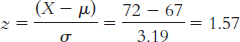
We look at the z table to find a critical value that puts 30% of scores in the tail, or as close as we can get to 30%. A z score of − 0.52 puts 30.15% in the tail. We can use that z score to compute the raw score for height:
X = − 0.52(3.19) + 67 = 65.34 inches
At 72 inches tall, Kona is 6.66 inches taller than Ian.
7.37
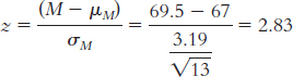
The z statistic indicates that this sample mean is 2.83 standard deviations above the expected mean for samples of size 13. In other words, this sample of boys is, on average, exceptionally tall.
The percentile rank is 99.77%, meaning that 99.77% of sample means would be of lesser value than the one obtained for this sample.
7.39
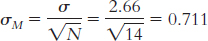
μM = μ = 63.8
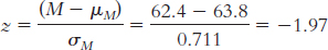
2.44% of sample means would be shorter than this mean.
We double 2.44% to account for both tails, so we get 4.88% of the time.
The average height of this group of 15-
year- old females is rare, or statistically significant.
7.41
This is a nondirectional hypothesis because the researcher is predicting that it will alter skin moisture, not just decrease it or increase it.
This is a directional hypothesis because better grades are expected.
This hypothesis is nondirectional because any change is of interest, not just a decrease or an increase in closeness of relationships.
7.43
X (X − μ) (X − μ)2 January 4.41 0.257 0.066 February 8.24 4.087 16.704 March 4.69 0.537 0.288 April 3.31 − 0.843 0.711 May 4.07 − 0.083 0.007 June 2.52 − 1.633 2.667 July 10.65 6.497 42.211 August 3.77 − 0.383 0.147 September 4.07 − 0.083 0.007 October 0.04 − 4.113 16.917 November 0.75 − 3.403 11.580 December 3.32 − 0.833 0.694 μ = 4.153; SS = osX − μd2 = 91.999;
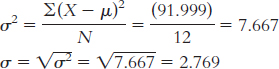
August: X = 3.77
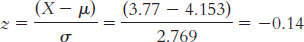
The table tells us that 44.43% of scores fall in the tail beyond a z score of −0.14. So, the percentile for August is 44.43%. This is surprising because it is below the mean, and it was the month in which a devastating hurricane hit New Orleans. (Note: It is helpful to draw a picture of the curve when calculating this answer.)
Paragraphs will be different for each student but will include the fact that a monthly total based on missing data is inaccurate. The mean and the standard deviation based on this population, therefore, are inaccurate. Moreover, even if we had these data points, they would likely be large and would increase the total precipitation for August; August would likely be an outlier, skewing the overall mean. The median would be a more accurate measure of central tendency than the mean under these circumstances.
We would look up the z score that has 10% in the tail. The closest z score is 1.28, so the cutoffs are 21.28 and 1.28. (Note: It is helpful to draw a picture of the curve that includes these z scores.) We can then convert these z scores to raw scores. X = z(σ) + μ = − 1.28(2.769) + 4.153 = 0.61; X = z(σ) + μ = 1.28(2.769) + 4.153 = 7.70. Only October (0.04) is below 0.61. Only February (8.24) and July (10.65) are above 7.70. These data are likely inaccurate, however, because the mean and the standard deviation of the population are based on an inaccurate mean from August. Moreover, it is quite likely that August would have been in the most extreme upper 10% if there were complete data for this month.
7.45
The independent variable is the division. Teams were drawn from either the Football Bowl Subdivision (FBS) or the Football Championship Division (FCS). The dependent variable is the spread.
Random selection was not used. Random selection would entail having some process for randomly selecting FCS games for inclusion in the sample. We did not describe such a process and, in fact, took all the FCS teams from one league within that division.
The populations of interest are football games between teams in the upper divisions of the NCAA (FBS and FCS).
The comparison distribution would be the distribution of sample means.
The first assumption—
that the dependent variable is a scale variable— is met in this example. The dependent variable is point spread, which is a scale measure. The second assumption— that participants are randomly selected— is not met. As described in part (b), the teams for inclusion in the sample were not randomly selected. The third assumption— that the distribution of scores in the population of interest must be normal— is not likely to have been met. The standard deviation is almost as large as the mean, an indication that one or more outliers are creating positive skew. Moreover, we only have a sample size of 4, not the 30 we would need to have a normal distribution of means.
7.47 Because we have a population mean and a population standard deviation, we can use a z test. To conduct this study, we would need a sample of red-
7.49
The independent variable is whether a patient received the video with information about orthodontics. One group received the video; the other group did not. The dependent variable is the number of hours per day patients wore their appliances.
The researcher did not use random selection when choosing his sample. He selected the next 15 patients to come into his clinic.
Step 1: Population 1 is patients who did not receive the video. Population 2 is patients who received the video. The comparison distribution will be a distribution of means. The hypothesis test will be a z test because we have only one sample and we know the population mean and the standard deviation. This study meets the assumption that the dependent variable is a scale measure. We might expect the distribution of number of hours per day people wear their appliances to be normally distributed, but from the information provided it is not possible to tell for sure. Additionally, the sample includes fewer than 30 participants, so the central limit theorem may not apply here. The distribution of sample means may not approach normality. Finally, the participants were not randomly selected. Therefore, we may not want to generalize the results beyond this sample.
Page C-22Step 2: Null hypothesis: Patients who received the video do not wear their appliances a different mean number of hours per day than patients who did not receive the video: H0: μ1 = μ2.
Research hypothesis: Patients who received the video wear their appliances a different mean number of hours per day than patients who did not receive the video: H1: μ1 ≠ μ2.
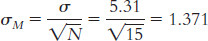
Step 3: μM = μ = 14.78;
Step 4: The cutoff z statistics, based on a p level of 0.05 and a two-
tailed test, are − 1.96 and 1.96. (Note: It is helpful to draw a picture of the normal curve and include these z statistics on it.) Step 5:
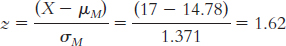
(Note: It is helpful to add this z statistic to your drawing of the normal curve that includes the cutoff z statistics.)
Step 6: Fail to reject the null hypothesis. We cannot conclude that receiving the video improves average patient compliance.
The researcher would have made a Type II error. He would have failed to reject the null hypothesis when a mean difference actually existed between the two populations.
Chapter 8
8.1 There may be a statistically significant difference between group means, but the difference might not be meaningful or have a real-
8.3 Confidence intervals add details to the hypothesis test. Specifically, they tell us a range within which the population mean would fall 95% of the time if we were to conduct repeated hypothesis tests using samples of the same size from the same population.
8.5 In everyday language, we use the word effect to refer to the outcome of some event. Statisticians use the word in a similar way when they look at effect sizes. They want to assess a given outcome. For statisticians, the outcome is any change in a dependent variable, and the event creating the outcome is an independent variable. When statisticians calculate an effect size, they are calculating the size of an outcome.
8.7 If two distributions overlap a lot, then we would probably find a small effect size and not be willing to conclude that the distributions are necessarily different. If the distributions do not overlap much, this would be evidence for a larger effect or a meaningful difference between them.
8.9 According to Cohen’s guidelines for interpreting the d statistic, a small effect is around 0.2, a medium effect is around 0.5, and a large effect is around 0.8.
8.11 In everyday language, we use the word power to mean either an ability to get something done or an ability to make others do things. Statisticians use the word power to refer to the ability to detect an effect, given that one exists.
8.13 80%
8.15 A researcher could increase statistical power by (1) increasing the alpha level; (2) performing a one-
8.17 The goal of a meta-
8.19 (i) σM is incorrect. (ii) The correct symbol is σ (iii) Because we are calculating Cohen’s d, a measure of effect size, we divide by the standard deviation, σ, not the standard error of the mean. We use standard deviation rather than standard error because effect size is independent of sample size.
8.21 18.5% to 25.5% of respondents were suspicious of steroid use among swimmers.
8.23
20%
15%
1%
8.25
A z of 0.84 leaves 19.77% in the tail.
A z of 1.04 leaves 14.92% in the tail.
A z of 2.33 leaves 0.99% in the tail.
8.27 We know that the cutoffs for the 95% confidence interval are z = ±1.96. The standard error is calculated as:

Now we can calculate the lower and upper bounds of the confidence interval.
Mlower = − z(σM) + Msample = − 1.96(0.147) + 4.1 = 3.812 hours
Mupper = z(σM) + Msample = 1.96(0.147) + 4.1 = 4.388 hours
The 95% confidence interval can be expressed as [3.81, 4.39].
8.29 z values of ±2.58 put 0.49% in each tail, without going over, so we will use those as the critical values for the 99% confidence interval. The standard error is calculated as:
Now we can calculate the lower and upper bounds of the confidence interval.
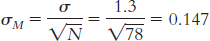
Mlower = − z(σM) + Msample = − 2.58(0.147) + 4.1 = 3.721 hours
Mupper = z(σM) + Msample = 2.58(0.147) + 4.1 = 4.479 hours
The 99% confidence interval can be expressed as [3.72, 4.48].
8.31
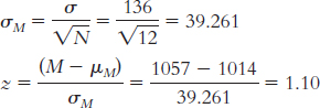
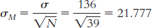 Page C-23
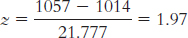
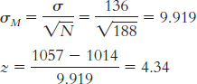
8.33
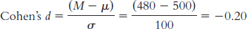
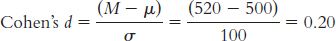
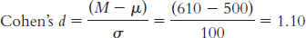
8.35
Large
Medium
Small
No effect (very close to zero)
8.37
The percentage beyond the z statistic of 2.23 is 1.29%. Doubled to take into account both tails, this is 2.58%. Converted to a proportion by dividing by 100, we get a p value of 0.0258, or 0.03.
For − 1.82, the percentage in the tail is 3.44%. Doubled, it is 6.88%. As a proportion, it is 0.0688, or 0.07.
For 0.33, the percentage in the tail is 37.07%. Doubled, it is 74.14%. As a proportion, it is 0.7414, or 0.74.
8.39 We would fail to reject the null hypothesis because the confidence interval around the mean effect size includes 0.
8.41
The mean effect size is d = 0.91.
This is a large effect size.
8.43 Your friend is not considering the fact that the two distributions, that of IQ scores of Burakumin and that of IQ scores of other Japanese, will have a great deal of overlap. The fact that one mean is higher than another does not imply that all members of one group have higher IQ scores than all members of another group. Any individual member of either group, such as your friend’s former student, might fall well above the mean for his or her group (and the other group) or well below the mean for his or her group (and the other group). Research reports that do not give an indication of the overlap between two distributions risk misleading their audience.
8.45
Step 3:
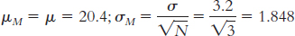
Step 4: The cutoff z statistics are − 1.96 and 1.96.
Step 5:
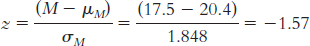
Step 6: Fail to reject the null hypothesis; we can conclude only that there is not sufficient evidence that Canadian adults have different average GNT scores from English adults. The conclusion has changed, but the actual difference between groups has not. The smaller sample size led to a larger standard error and a smaller test statistic. This makes sense because an extreme mean based on just a few participants is more likely to have occurred by chance than is an extreme mean based on many participants.
Step 3:
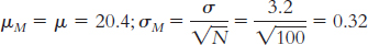
Step 5:
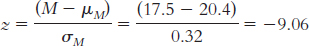
Step 6: Reject the null hypothesis. It appears that Canadian adults have lower average GNT scores than English adults. The test statistic has increased along with the increase in sample size.
Step 3:
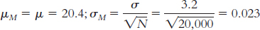
Step 5:
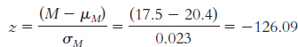
The test statistic is now even larger, as the sample size has grown even larger. Step 6 is the same as in part (b).
As sample size increases, the test statistic increases. A mean difference based on a very small sample could have occurred just by chance. Based on a very large sample, that same mean difference is less likely to have occurred just by chance.
The underlying difference between groups has not changed. This might pose a problem for hypothesis testing because the same mean difference is statistically significant under some circumstances but not others. A very large test statistic might not indicate a very large difference between means; therefore, a statistically significant difference might not be an important difference.
8.47
No, we cannot tell which student will do better on the LSAT. It is likely that the distributions of LSAT scores for the two groups (humanities majors and social science majors) have a great deal of overlap. Just because one group, on average, does better than another group does not mean that every student in one group does better than every student in another group.
Answers to this will vary, but the two distributions should overlap and the mean of the distribution for the social sciences majors should be farther to the right (i.e., higher) than the mean of the distribution for the humanities majors.
8.49
Given μ = 16.189 and σ = 12.128,
we calculate
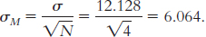 To calculate the 95% confidence interval, we find the z values that mark off the most extreme 0.025 in each tail, which are − 1.96 and 1.96. We calculate the lower end of the interval as Mlower = − z(σM) + Msample = − 1.96(6.064) + 8.75 = − 3.14 and the upper end of the interval as Mupper = z(σM) + Msample = 1.96(6.064) + 8.75 = 20.64. The confidence interval around the mean of 8.75 is [ − 3.14, 20.64].
Because 16.189, the null-
hypothesized value of the population mean, falls within this confidence interval, it is plausible that the point spreads of FCS schools are the same, on average, as the point spreads of FBS schools. It is plausible that they come from the same population of point spreads. Page C-24Because the confidence interval includes 16.189, we know that we would fail to reject the null hypothesis if we conducted a hypothesis test. It is plausible that the sample came from a population with μ = 16.189. We do not have sufficient evidence to conclude that the point spreads of FCS schools are from a different population than the point spreads of FBS schools.
In addition to letting us know that it is plausible that the FCS point spreads are from the same population as those for the FBS schools, the confidence interval tells us a range of plausible values for the mean point spread.
8.51
The appropriate measure of effect size for a z statistic is Cohen’s d, which is calculated as:
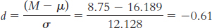
Based on Cohen’s conventions, this is a medium-
to- large effect size. The hypothesis test tells us only whether a sample mean is likely to have been obtained by chance, whereas the effect size gives us the additional information of how much overlap there is between the distributions. Cohen’s d, in particular, tells us how far apart two means are in terms of standard deviation. Because it’s based on standard deviation, not standard error, Cohen’s d is independent of sample size and therefore has the added benefit of allowing us to compare across studies. In summary, effect size tells us the magnitude of the effect, giving us a sense of how important or practical this finding is, and allows us to standardize the results of the study. Here, we know that there’s a medium-
to- large effect.
8.53
We know that the cutoffs for the 95% confidence interval are z = ±1.96. Standard error is calculated as:
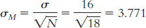
Now we can calculate the lower and upper bounds of the confidence interval.
Mlower = − z(σM) + Msample = − 1.96(3.771) + 38
= $30.61
Mupper = z(σM) + Msample = 1.96(3.771) + 38 = $45.39
The 95% confidence interval can be expressed as [$30.61, $45.39].
Standard error is now calculated as:
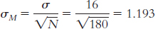
Now we can calculate the lower and upper bounds of the confidence interval.
Mlower = − z(σM) + Msample = − 1.96(1.193) + 38 = $35.66
Mupper = z(σM) + Msample = 1.96(1.193) + 38 = $40.34
The 95% confidence interval can be expressed as [$35.66, $40.34].
The null-
hypothesized mean of $45 falls in the 95% confidence interval when N is 18. Because of this, we cannot claim that things were lower in 2009 than what we would normally expect. When N is increased to 180, the confidence interval becomes narrower because standard error is reduced. As a result, the mean of $45 no longer falls within the interval, and we can now conclude that Valentine’s Day spending was different in 2009 from what was expected based on previous population data. Cohen’s
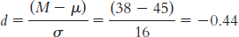 , just around a medium effect size.
8.55
Standard error is calculated as:
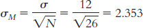
Now we can calculate the lower and upper bounds of the confidence interval.
Mlower = − z(σM) + Msample = − 1.96(2.353) + 123 = 118.39 mph
Mupper = z(σM) + Msample = 1.96(2.353) + 123 = 127.61 mph
The 95% confidence interval can be expressed as [118.39, 127.61].
Because the population mean of 118 mph does not fall within the confidence interval around the new mean, we can conclude that the program had an impact. In fact, we can conclude that the program seemed to increase the average speed of women’s serves.
Cohen’s
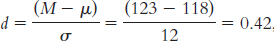 , a medium effect.
Because standard error, which utilizes sample size in its calculation, is part of the calculations for confidence interval, the interval becomes narrower as the sample size increases; however, because sample size is eliminated from the calculation of effect size, the effect size does not change.
8.57
Step 1: We know the following about population 2: μ = 118 mph and σ = 12 mph. We know the following about population 1: N = 26 and M = 123 mph. Standard error is calculated as:

Step 2: Because we are testing whether the sample hits a tennis ball faster, we will conduct a one-
tailed test focused on the high end of the distribution. We need to find the cutoff that marks where 5% of the data fall in the tail of population 2. We know that the critical z value for a one-
tailed test is +1.64. Using that z, we can calculate a raw score. M = z(σM) + μM = +1.64(2.353) + 118 = 121.859 mph
This mean of 121.859 mph marks the point beyond which 5% of all means based on samples of 26 observations will fall, assuming that population 2 is true.
Step 3: For the second distribution, centered around 123 mph, we need to calculate how often means of 121.859 (the cutoff) and more occur. We do this by calculating the z statistic for the raw mean of 121.859 with respect to the sample mean of 123.
Page C-25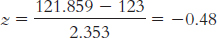
We now look up this z statistic on the table and find that 18.44% falls between this negative z and the mean. We add this to the 50% that falls between the mean and the high tail to get our power of 68.44%.
At an alpha of 10%, the critical value moves to +1.28. This changes the following calculations:
M = z(σM) + μM = +1.28(2.353) + 118 = 121.012 mph
This new mean of 121.012 mph marks the point beyond which 10% of all means based on samples of 26 observations will fall, assuming that population 2 is true.
For the second distribution, centered around 123 mph, we need to calculate how often means of 121.012 (the cutoff) or larger occur. We do this by calculating the z statistic for the raw mean of 121.012 with respect to the sample mean of 123.
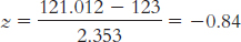
We look up this z statistic on the table and find that 29.95% falls between this negative z and the mean. We add this to the 50% that falls between the mean and the high tail to get power of 79.95%.
Power has moved from 68.44% at alpha of 0.05 to 79.95% at alpha of 0.10. As alpha increased, so did power.
8.59
The topic is the effectiveness of culturally adapted therapies.
The researchers used Cohen’s d as a measure of effect size for each study in the analysis.
The mean effect size they found was 0.45. According to Cohen’s conventions, this is a medium effect.
The researchers could use the group means and standard deviations to calculate a measure of effect size.
8.61
A statistically significant difference just indicates that the difference between the means is unlikely to be due to chance. It does not tell us that there is no overlap in the distributions of the two populations we are considering. It is likely that there is overlap between the distributions and that some players with three children actually perform better than some players with two or fewer children. The drawings of distributions will vary; the two curves will overlap, but the mean of the distribution representing two or fewer children should be farther to the right than the mean of the distribution representing three or more children.
A difference can be statistically significant even if it is very small. In fact, if there are enough observations in a sample, even a tiny difference will approach statistical significance. Statistical significance does not indicate the importance or size of an effect—
we need measures of effect size, which are not influenced by sample size, to understand the importance of an effect. These measures of effect size allow us to compare different predictors of performance. For example, in this case, it is likely that other aspects of a player’s stats are more strongly associated with his performance and therefore would have a larger effect size. We could make the decision about whom to include in the fantasy team on the basis of the largest predictors of performance. Even if the association is true, we cannot conclude that having a third child causes a decline in baseball performance. There are a number of possible causal explanations for this relation. It could be the reverse; perhaps those players who are not performing as well in their careers end up devoting more time to family, so not playing well could lead to having more children. Alternatively, a third variable could explain both (a) having three children, and (b) poorer baseball performance. For example, perhaps less competitive or more laid-
back players have more children and also perform more poorly. The sample size for this analysis is likely small, so the statistical power to detect an effect is likely small as well.
8.63
The sample is the group of low-
income students utilized for the study by Hoxby and Turner (2013). The population is low- income students applying to college. The independent variable is intervention, with two levels—
no intervention and intervention. The dependent variable is number of applications submitted.
Just because a finding is statistically significant, it does not mean that it is practically significant. Justification for the impact of using the intervention based on cost-
benefit may be needed. The effect size for number of applications submitted was 0.247. This is a small effect size, according to Cohen’s conventions.
Effect sizes demonstrate the difference between two means in terms of standard deviations. Thus, for the number of applications submitted, the means for the two groups were 0.247 standard deviations apart.
The intervention increased the average number of applications submitted by 19%.
Chapter 9
9.1 We should use a t distribution when we do not know the population standard deviation and are comparing two groups.
9.3 For both tests, standard error is calculated as the standard deviation divided by the square root of N. For the z test, the population standard deviation is calculated with N in the denominator. For the t test, the standard deviation for the population is estimated by dividing the sum of squared deviations by N − 1.
9.5 t stands for the t statistic, M is the sample mean, μM is the mean of the distribution of means, and sM is the standard error as estimated from a sample.
9.7 Free to vary refers to the number of scores that can take on different values if a given parameter is known.
9.9 As the sample size increases, we can feel more confident in the estimate of the variability in the population. Remember, this estimate of variability (s) is calculated with N − 1 in the denominator in order to inflate the estimate somewhat. As the sample increases from 10 to 100, for example, and then up to 1000, subtracting 1 from N has less of an impact on the overall calculation. As this happens, the t distributions approach the z distribution, where we in fact knew the population standard deviation and did not need to estimate it.
9.11 We can understand the meaning of a distribution of mean differences by reviewing how the distribution is created in the first place. A distribution of mean differences is constructed by measuring the difference scores for a sample of individuals and then averaging those differences. This process is performed repeatedly, using the same population and samples of the same size. Once a collection of mean differences is gathered, they can be displayed on a graph (in most cases, they form a bell-
9.13 The term paired samples is used to describe a test that compares an individual’s scores in both conditions; it is also called a paired-samples t test. Independent samples refer to groups that do not overlap in any way, including membership; the observations made in one group in no way relate to or depend on the observations made in another group.
9.15 Unlike a single-
9.17 If the confidence interval around the mean difference score includes the value of 0, then 0 is a plausible mean difference. If we conduct a hypothesis test for these data, we would fail to reject the null hypothesis.
9.19 As with other hypothesis tests, the conclusions from both the single-
9.21 A Cohen’s d of 0.5 always indicates a medium effect, whether it accompanies a paired-
9.23
First we need to calculate the mean:

We then calculate the deviation of each score from the mean and the square of that deviation..
X X − M (X − M )2 93 − 1.714 2.938 97 2.286 5.226 91 − 3.714 13.794 88 − 6.714 45.078 103 8.286 68.658 94 − 0.714 0.510 97 2.286 5.226 The standard deviation is:
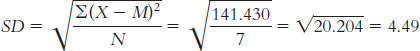
When estimating the population variability, we calculate s:
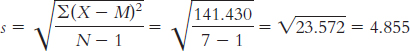
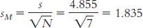
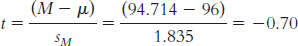
9.25
Because 73 df is not on the table, we go to 60 df (we do not go to the closest value, which would be 80, because we want to be conservative and go to the next-
lowest value for df ) to find the critical value of 1.296 in the upper tail. If we are looking in the lower tail, the critical value is − 1.296. ±1.984
Either − 2.438 or 2.438
9.27
This is a two-
tailed test with df = 25, so the critical t values are ±2.060. df = 17, so the critical t value is +2.567, assuming you’re anticipating an increase in marital satisfaction.
df = 33, so the critical t values are ±2.043.
9.29
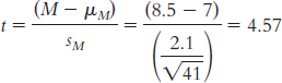
Mlower = − t(sM) + Msample = − 2.705X0.328C + 8.5 = 7.61
Mupper = t(sM) + Msample = 2.705X0.328C + 8.5 = 9.39
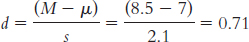
9.31
df = 17, so the critical t value is +2.567, assuming you’re anticipating an increase in marital satisfaction.
df = 63, so the critical t values are ±2.001.
9.33
DIFFERENCE (D) D − M (D − M )2 − 8 − 9.25 85.563 8 6.75 45.563 2 0.75 0.563 5 3.75 14.063 − 5 − 6.25 39.063 4 2.75 7.563 − 2 − 3.25 10.563 6 4.75 22.563 Mdifference = 1.25
SS = Σ(D − M)2 = 225.504
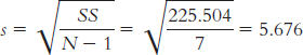 Page C-27
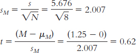
With df = 7, the critical t values are ±2.365. The calculated t statistic of 0.62 does not exceed the critical value. Therefore, we fail to reject the null hypothesis.
When increasing N to 1000, we need to recalculate sM and the t test.
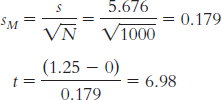
The critical values with df = 7 are t = ±1.98. Because the calculated t exceeds one of the t critical values, we reject the null hypothesis.
Increasing the sample size increased the value of the t statistic and decreased the critical t values, making it easier for us to reject the null hypothesis.
9.35
DIFFERENCE (D) D − M (D − M )2 17 5.429 29.474 22 10.429 108.764 18 6.429 41.332 3 − 8.571 73.462 11 − 0.571 0.326 5 − 6.571 43.178 5 − 6.571 43.178 Mdifference = 11.571
SS = Σ(D − M )2 = 339.714
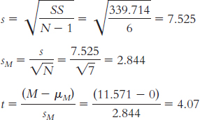
With N = 7, df = 6, t = ±2.447:
Mlower = − t(sM) + Msample = − 2.447(2.844) + 11.571 = 4.61
Mupper = t(sM) + Msample = 2.447(2.844) + 11.571 = 18.53
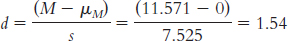
9.37
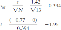
Mlower = − t (sM) + Msample = − 2.179(0.394) + (− 0.77) = − 1.63
Mupper = t(sM) + Msample = 2.179(0.394) + ( − 0.77) = 0.09
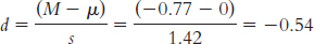
9.39
±1.96
Either − 2.33 or +2.33, depending on the tail of interest
±1.96
The critical z values are lower than the critical t values, making it easier to reject the null hypothesis when conducting a z test. Decisions using the t distributions are more conservative because of the chance that the population standard deviation may have been poorly estimated.
9.41
Step 1: Population 1 is male U.S. Marines following a month-
long training exercise. Population 2 is college men. The comparison distribution will be a distribution of means. The hypothesis test will be a single- sample t test because we have only one sample and we know the population mean but not the standard deviation. This study meets one of the three assumptions and may meet another. The dependent variable, anger, appears to be scale. The data were not likely randomly selected, so we must be cautious with respect to generalizing to all Marines who complete this training. We do not know whether the population is normally distributed, and there are not at least 30 participants. However, the data from the sample do not suggest a skewed distribution. Step 2: Null hypothesis: Male U.S. Marines after a month-
long training exercise have the same average anger levels as college men: H0: μ1 = μ2. Research hypothesis: Male U.S. Marines after a month-
long training exercise have different average anger levels than college men: H1: μ1 ≠ μ2. Step 3: μM = μ = 8.90; sM = 0.494
X X − M (X − M )2 14 0.667 0.445 12 − 1.333 1.777 13 − 0.333 0.111 12 − 1.333 1.777 14 0.667 0.445 15 1.667 2.779 M = 13.333
SS = Σ(X − M)2 = Σ(0.445 + 1.777 + 0.111 + 1.777 + 0.445 + 2.779) = 7.334
Step 4: df = N − 1 = 6 − 1 = 5; the critical values, based on 5 degrees of freedom, a p level of 0.05, and a two-
tailed test, are − 2.571 and 2.571. (Note: It is helpful to draw a curve that includes these cutoffs.) Page C-28Step 5:
(Note: It is helpful to add this t statistic to the curve that you drew in step 4.)
Step 6: Reject the null hypothesis. It appears that male U.S. Marines just after a month-
long training exercise have higher average anger levels than college men have; t(5) = 8.97, p < 0.05.  ; reject the null hypothesis; it appears that male U.S. Marines just after a month-
long training exercise have higher average anger levels than adult men; t(5) = 8.37, p < 0.05.  . Fail to reject the null hypothesis; we conclude that there is no evidence from this study to support the research hypothesis; t(5) = 20.34, p > 0.05.
We can conclude that Marines’ anger scores just after high-
altitude, cold- weather training are, on average, higher than those of college men and adult men. We cannot conclude, however, that they are different, on average, from those of male psychiatric outpatients. With respect to the latter difference, we can only conclude that there is no evidence to support that there is a difference between Marines’ mean anger scores and those of male psychiatric outpatients.
9.43 A study using a paired-
The comparison distribution is a distribution of mean differences. The participants receiving mental exercises training are the same in both samples. So, we would calculate a difference score for each participant and a mean difference score for the study. The mean difference score would be compared to a distribution of all possible mean difference scores for a sample of this size and based on the null hypothesis. In this case, the mean difference score would be compared to 0. Because we have two samples and all participants are in both samples, we would use a paired-
9.45
Step 1: Population 1 is the Devils players in the 2007–
2008 season. Population 2 is the Devils players in the 2008– 2009 season. The comparison distribution is a distribution of mean differences. We meet one assumption: The dependent variable, goals, is scale. We do not, however, meet the assumption that the participants are randomly selected from the population. We may also not meet the assumption that the population distribution of scores is normally distributed (the scores do not appear normally distributed and we do not have an N of at least 30). Step 2: Null hypothesis: The team performed no differently, on average, between the 2007–
2008 and 2008– 2009 seasons: H0: μ1 = μ2. Research hypothesis: The team performed differently, on average, between the 2007–
2008 and 2008– 2009 seasons: H1: μ1 ≠ μ2. Step 3: μ = 0 and sM = 3.682
DIFFERENCE (D) D − M (D − M )2 11 4.833 23.358 6 − 0.167 0.028 − 7 − 13.167 173.370 16 9.833 96.688 − 2 − 8.167 66.670 13 6.833 46.690 Mdifference = 6.167
SS = Σ(D − M )2 = 406.834
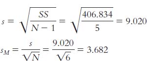
Step 4: The critical t values with a two-
tailed test, a p level of 0.05, and 5 degrees of freedom, are ±2.571. Step 5:
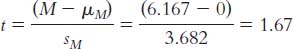
Step 6: Fail to reject the null hypothesis because the calculated t statistic of 1.67 does not exceed the critical t value.
t(5) = 1.67, p > 0.05 (Note: If we had used software, we would provide the actual p value.)
Mlower = − t(sM) + Msample = − 2.571(3.682) − 6.167 = − 3.30
Mupper = t(sM) + Msample = 2.571(3.682) + 6.167 = 15.63
Because the confidence interval includes 0, we fail to reject the null hypothesis. This is consistent with the results of the hypothesis test conducted in part (a).
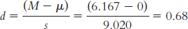
9.47
The professor would use a paired-
samples t-test. No. A change or a difference in mean score might not be statistically significant, particularly with a small sample.
It would be easier to reject the null hypothesis for a given mean difference with the class with 700 students than with the class with 7 students because the t value would be higher with the larger sample.
9.49
The independent variable is type of classroom. It has two levels—
decorated and undecorated (or sparse). The dependent variable is percentage correct on a science test.
The researchers used a paired-
samples t test because they had two scores for each student— one in the sparse classroom and one in the decorated classroom. All students participated in both conditions. Twenty-
three students participated. We know this because the degrees of freedom is 22, and degrees of freedom is calculated as the number of participants minus 1. Page C-29We know the result is statistically significant because the p value of .007 is less than .05.
Students who learned science in an undecorated classroom got an average of 55% of questions correct on a test. The same students learning science in a decorated classroom got only an average of 42% correct. This difference is statistically significant, which means it was unlikely to have occurred just by chance.
The researchers reported the effect size so that readers would have a sense of how large, or important, this finding is.
9.51
The appropriate mean: μM = μ = 11.72
The calculations for the appropriate standard deviation (in this case, standard error, sM) are:

X X − M (X − M )2 25.62 13.57 184.145 13.09 1.04 1.082 8.74 − 3.31 10.956 17.63 5.58 31.136 2.80 − 9.25 85.563 4.42 − 7.63 58.217 Numerator: Σ(X − M)2 = Σ(184.145 + 1.082 + 10.956 + 31.136 + 85.563 + 58.217) = 371.099
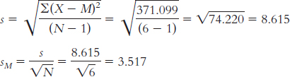
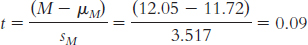
There are several possible answers to this question. Among the hypotheses that could be examined are whether the length of stay on death row depends on gender, race, or age. Specifically, given prior evidence of a racial bias in the implementation of the death penalty, we might hypothesize that black and Hispanic prisoners have shorter times to execution than do prisoners overall.
We would need to know the population standard deviation. If we were really interested in this, we could calculate the standard deviation from the entire online execution list.
The null hypothesis states that the average time spent on death row in recent years is equal to what it has been historically (no change): H0: μ1 = μ2. The research hypothesis is that there has been a change in the average time spent on death row: H1: μ1 ≠ μ2.
The t statistic we calculated was 0.09. The critical t values for a two-
tailed test, alpha or p of 0.05 and df of 5, are ±2.571. We fail to reject the null hypothesis and conclude that we do not have sufficient evidence to indicate a change in time spent on death row. Mlower = − t(sM) + Msample = − 2.571(3.517) + 12.05 = 3.01 years
Mupper = t(sM) + Msample = 2.571(3.517) + 12.05 = 21.09 years
Because the population mean of 11.72 years is within the very large range of the confidence interval, we fail to reject the null hypothesis. This confidence interval is so large that it is not useful. The large size of the confidence interval is due to the large variability in the sample (sM) and the small sample size (resulting in a large critical t value).
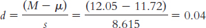
This is a small effect.
9.53
The independent variable is presence of posthypnotic suggestion, with two levels: suggestion or no suggestion. The dependent variable is Stroop reaction time in seconds.
Step 1: Population 1 is highly hypnotizable individuals who receive a posthypnotic suggestion. Population 2 is highly hypnotizable individuals who do not receive a posthypnotic suggestion. The comparison distribution will be a distribution of mean differences. The hypothesis test will be a paired-
samples t test because we have two samples and all participants are in both samples. This study meets one of the three assumptions and may meet another. The dependent variable, reaction time in seconds, is scale. The data were not likely randomly selected, so we should be cautious when generalizing beyond the sample. We do not know whether the population is normally distributed and there are not at least 30 participants, but the sample data do not suggest skew. Step 2: Null hypothesis: Highly hypnotizable individuals who receive a posthypnotic suggestion will have the same average Stroop reaction times as highly hypnotizable individuals who receive no posthypnotic suggestion: H0: μ1 = μ2.
Research hypothesis: Highly hypnotizable individuals who receive a posthypnotic suggestion will have different average Stroop reaction times than will highly hypnotizable individuals who receive no posthypnotic suggestion: H1: μ1 ≠ μ2.
Step 3: mM = l = 0; sM = 0.420
(Note: Remember to cross out the original scores once you have created the difference scores so you won’t be tempted to use them in your calculations.)
DIFFERENCE (D ) D − M (D − M )2 − 4.1 − 1.05 1.103 − 4.2 − 1.15 1.323 − 1.6 1.45 2.103 − 3.0 0.05 0.003 − 3.2 − 0.15 0.023 − 2.2 0.85 0.723 Page C-30Mdifference = − 3.05
SS = Σ(D − M)2 = Σ (1.103 + 1.323 + 2.103 + 0.003 + 0.023 + 0.723) = 5.278
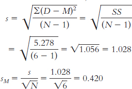
Step 4: df = N − 1 = 6 − 1 = 5; the critical values, based on 5 degrees of freedom, a p level of 0.05, and a two-
tailed test, are − 2.571 and 2.571. Step 5:
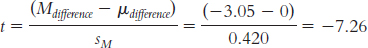
Step 6: Reject the null hypothesis; it appears that highly hypnotizable people have faster Stroop reaction times when they receive a posthypnotic suggestion than when they do not.
t(5) = − 7.26, p <, 0.05
Step 2: Null hypothesis: The average Stroop reaction time of highly hypnotizable individuals who receive a posthypnotic suggestion is greater than or equal to that of highly hypnotizable individuals who receive no posthypnotic suggestion: H0: μ1 ≥ μ2.
Research hypothesis: Highly hypnotizable individuals who receive a posthypnotic suggestion will have faster (i.e., lower number) average Stroop reaction times than highly hypnotizable individuals who receive no posthypnotic suggestion: H1: μ1 < μ2.
Step 4: df = N − 1 = 6 − 1 = 5; the critical value, based on 5 degrees of freedom, a p level of 0.05, and a one-
tailed test, is − 2.015. (Note: It is helpful to draw a curve that includes this cutoff.) Step 6: Reject the null hypothesis; it appears that highly hypnotizable people have faster Stroop reaction times when they receive a posthypnotic suggestion than when they do not.
It is easier to reject the null hypothesis with a one-
tailed test. Although we rejected the null hypothesis under both conditions, the critical t value is less extreme with a one- tailed test because the entire 0.05 (5%) critical region is in one tail instead of divided between two. The difference between the means of the samples is identical, as is the test statistic. The only aspect that is affected is the critical value.
Step 4: df = N − 1 = 6 − 1 = 5; the critical values, based on 5 degrees of freedom, a p level of 0.01, and a two-
tailed test, are − 4.032 and 4.032. (Note: It is helpful to draw a curve that includes these cutoffs.) Step 6: Reject the null hypothesis; it appears that highly hypnotizable people have faster mean Stroop reaction times when they receive a posthypnotic suggestion than when they do not.
A p level of 0.01 leads to more extreme critical values than a p level of 0.05. When the tails are limited to 1% versus 5%, the tails beyond the cutoffs are smaller and the cutoffs are more extreme. So it is easier to reject the null hypothesis with a p level of .05 than the null hypothesis with a p level of .01.
The difference between the means of the samples is identical, as is the test statistic. The only aspect that is affected is the critical value.
Step 3: μM = μ = 0; sM = 0.850
(Note: Remember to cross out the original scores once you have created the difference scores so you won’t be tempted to use them in your calculations.)
| DIFFERENCE (D ) | D − M | (D − M )2 |
| − 4.1 | − 0.8 | 0.64 |
| − 4.2 | − 0.9 | 0.81 |
| − 1.6 | 1.7 | 2.89 |
Mdifference = − 3.3
SS = Σ(D − M )2 = Σ (0.64 + 0.81 + 2.89) = 4.34
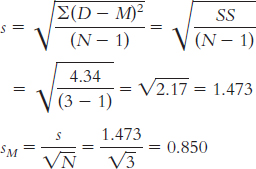
Step 4: df = N − 1 = 3 − 1 − 2; the critical values, based on 2 degrees of freedom, a p level of 0.05, and a two-
Step 5: 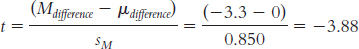
(Note: It is helpful to add this t statistic to the curve that you drew in step 4.)
This test statistic is no longer beyond the critical value. Reducing the sample size makes it more difficult to reject the null hypothesis because it results in a larger standard error and therefore a smaller test statistic. It also results in more extreme critical values.
Chapter 10
10.1 An independent-
10.3 Independent events are things that do not affect each other. For example, the lunch you buy today does not impact the hours of sleep the authors of this book will get tonight.
10.5 The comparison distribution for the paired-
10.7 Both of these represent corrected variance within a group (s2), but one is for the X variable and the other is for the Y variable. Because these are corrected measures of variance, N − 1 is in the denominator of the equations.
10.9 We assume that larger samples do a better job of estimating the population than smaller samples do, so we would want the variability measure based on the larger sample to count more.
10.11 We can take the confidence interval’s upper bound and lower bound, compare those to the point estimate in the numerator, and get the margin of error. So, if we predict a score of 7 with a confidence interval of [4.3, 9.7], we can also express this as a margin of error of 2.7 points (7 ± 2.7). Confidence interval and margin of error are simply two ways to say the same thing.
10.13 Larger ranges mean less precision in making predictions, just as widening the goal posts in rugby or in American football mean that you can be less precise when trying to kick the ball between the posts. Smaller ranges indicate we are doing a better job of predicting the phenomenon within the population. For example, a 95% confidence interval that spans a range from 2 to 12 is larger than a 95% confidence interval from 5 to 6. Although the percentage range has stayed the same, the width of the distribution has changed.
10.15 We would take several steps back from the final calculation of standard error to the step in which we calculated pooled variance. Pooled variance is the variance version, or squared version, of standard deviation. To convert pooled variance to the pooled standard deviation, we take its square root.
10.17 Guidelines for interpreting the size of an effect based on Cohen’s d were presented in Table 10-2. Those guidelines state that 0.2 is a small effect, 0.5 is a medium effect, and 0.8 is a large effect.
10.19
Group 1 is treated as the X variable; MX = 95.8.
X X − M (X − M)2 97 1.2 1.44 83 − 12.8 163.84 105 9.2 84.64 102 6.2 38.44 92 − 3.8 14.44 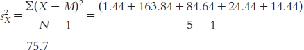
Group 2 is treated as the Y variable; MY = 104.
Y Y − M (Y − M)2 111 7 49 103 − 1 1 96 − 8 64 106 2 4 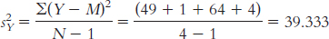
Treating group 1 as X and group 2 as Y, dfX = N − 1 = 5 − 1 = 4, dfY = 4 − 1 = 3, and dftotal = dfX + dfY = 4 + 3 = 7.
− 2.365, 2.365
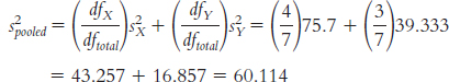
For group 1:
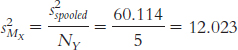
For group 2:
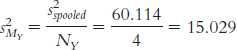
s2difference = s2MY = 12.023 + 15.029 = 27.052
The standard deviation of the distribution of differences between means is:

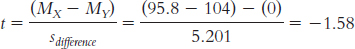
The critical t values for the 95% confidence interval for a df of 7 are − 2.365 and 2.365.
(MX − MY)lower = − t(sdifference) + (MX − MY)sample
= − 2.365(5.201) + ( − 8.2) = − 20.50
(MX − MY)upper = t(sdifference) + (MX − MY)sample
= 2.365(5.201) + ( − 8.2) = 4.10
The confidence interval is [ − 20.50, 4.10].
To calculate Cohen’s d, we need to calculate the pooled standard deviation for the data:

Cohen’s d =
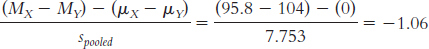
10.21
dftotal is 35, and the cutoffs are − 2.030 and 2.030.
dftotal is 26, and the cutoffs are − 2.779 and 2.779.
− 1.740 and 1.740
10.23
Step 1: Population 1 is highly hypnotizable people who receive a posthypnotic suggestion. Population 2 is highly hypnotizable people who do not receive a posthypnotic suggestion. The comparison distribution will be a distribution of differences between means. The hypothesis test will be an independent-
samples t test because we have two samples and every participant is in only one sample. This study meets one of the three assumptions and may meet another. The dependent variable, reaction time in seconds, is scale. The data were not likely randomly selected, so we should be cautious when generalizing beyond the sample. We do not know whether the population is normally distributed, and there are fewer than 30 participants, but the sample data do not suggest skew. Page C-32Step 2: Null hypothesis: Highly hypnotizable individuals who receive a posthypnotic suggestion have the same average Stroop reaction times as highly hypnotizable individuals who receive no posthypnotic suggestion—
H0: μ1 = μ2. Research hypothesis: Highly hypnotizable individuals who receive a posthypnotic suggestion have different average Stroop reaction times than highly hypnotizable individuals who receive no posthypnotic suggestion—
H1: μ1 ≠ μ2. Step 3: (μ1 − μ2) = 0; sdifference = 0.463
Calculations:
MX = 12.55
X X − M (X − M )2 12.6 0.05 0.003 13.8 1.25 1.563 11.6 − 0.95 0.903 12.2 − 0.35 0.123 12.1 − 0.45 0.203 13.0 0.45 0.203 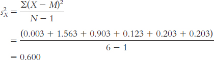
MY = 9.50
Y Y − M (Y − M )2 8.5 − 1.0 1.000 9.6 0.1 0.010 10.0 0.5 0.250 9.2 − 0.3 0.090 8.9 − 0.6 0.360 10.8 1.3 1.690 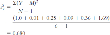
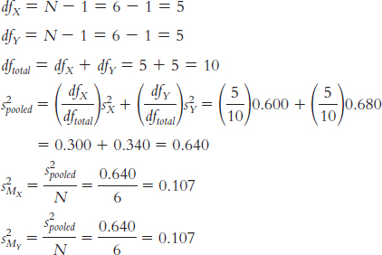
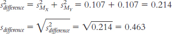
Step 4: The critical values, based on a two-
tailed test, a p level of 0.05, and dftotal of 10, are − 2.228 and 2.228. (Note: It is helpful to draw a curve that includes these cutoffs.) Step 5:
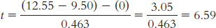
(Note: It is helpful to add this t statistic to the curve that you drew in step 4.)
Step 6: Reject the null hypothesis; it appears that highly hypnotizable people have faster Stroop reaction times when they receive a posthypnotic suggestion than when they do not.
t(10) = 6.59, p < 0.05. (Note: If we used software to conduct the t test, we would report the actual p value associated with this test statistic.)
When there are two separate samples, the t statistic becomes smaller. Thus, it becomes more difficult to reject the null hypothesis with a between-
groups design than with a within- groups design. In the within-
groups design and the calculation of the paired- samples t test, we create a set of difference scores and conduct a t test on that set of difference scores. This means that any overall differences that participants have on the dependent variable are subtracted out and do not go into the measure of overall variability that is in the denominator of the t statistic. To calculate the 95% confidence interval, first calculate:
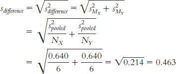
The critical t statistics for a distribution with df = 10 that correspond to a p level of 0.05—
that is, the values that mark off the most extreme 0.025 in each tail— are − 2.228 and 2.228. Then calculate:
(MX − MY)lower = − t(sdifference) + (MX − MY)sample = − 2.228 (0.463) + (12.55 − 9.5) = − 1.032 + 3.05 = 2.02
(MX − MY)upper = t (sdifference) + (MX − MY)sample = 2.228(0.463) + (12.55 − 9.5) = 1.032 + 3.05 = 4.08
The 95% confidence interval around the difference between means of 3.05 is [2.02, 4.08].
Were we to draw repeated samples (of the same sizes) from these two populations, 95% of the time the confidence interval would contain the true population parameter.
Because the confidence interval does not include 0, it is not plausible that there is no difference between means. Were we to conduct a hypothesis test, we would be able to reject the null hypothesis and could conclude that the means of the two samples are different.
In addition to determining statistical significance, the confidence interval allows us to determine a range of plausible differences between means. An interval estimate gives us a better sense than does a point estimate of how precisely we can estimate from this study.
Page C-33The appropriate measure of effect size for a t statistic is Cohen’s d, which is calculated as:
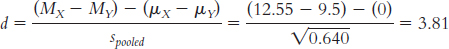
Based on Cohen’s conventions, this is a large effect size.
It is useful to have effect-
size information because the hypothesis test tells us only whether we were likely to have obtained our sample mean by chance. The effect size tells us the magnitude of the effect, giving us a sense of how important or practical this finding is, and allows us to standardize the results of the study so that we can compare across studies. Here, we know that there’s a large effect.
10.25
Step 1: Population 1 consists of men. Population 2 consists of women. The comparison distribution is a distribution of differences between means. We will use an independent-
samples t test because men and women cannot be in both conditions, and we have two groups. Of the three assumptions, we meet one because the dependent variable, number of words uttered, is a scale variable. We do not know whether the data were randomly selected or whether the population is normally distributed, and there is a small N, so we should be cautious in drawing conclusions. Step 2: Null hypothesis: There is no mean difference in the number of words uttered by men and women—
H0: μ1 = μ2. Research hypothesis: Men and women utter a different number of words, on average—
H1: μ1 ≠ μ2. Step 3: (μ1 − μ2) = 0; sdifference = 612.565
Calculations (treating women as X and men as Y):
MX = 16,091.600
X X − M (X − M )2 17,345 1253.400 1,571,011.560 15,593 − 498.600 248,601.960 16,624 532.400 283,499.760 16,696 604.400 365,299.360 14,200 − 1891.600 3,578,150.560 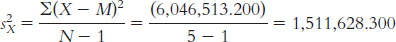
MY = 16,160.600
Y Y − M (Y − M )2 16,345 184.400 34,003.360 17,222 1061.400 1,126,569.960 15,646 − 514.600 264,813.160 14,889 − 1271.600 1,616,966.560 16,701 540.400 292,032.160 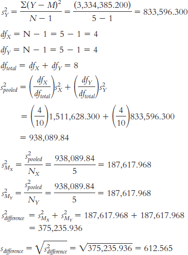
Step 4: The critical values, based on a two-
tailed test, a p level of 0.05, and a dftotal of 8, are − 2.306 and 2.306. Step 5:
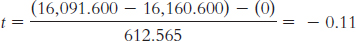
Step 6: We fail to reject the null hypothesis. The calculated t statistic of − 0.11 is not more extreme than the critical t values.
t(8) = − 0.11, p > 0.05. (Note: If we used software to conduct the t test, we would report the actual p value associated with this test statistic.)
(MX − MY)lower = − t(sdifference) + (MX − MY)sample
= − 2.306(612.565) + ( − 69.000)
= − 1481.575
(MX − MY)upper = t(sdifference) + (MX − MY)sample
= 2.306(612.565) + ( − 69.000)
= 1343.575
The 95% confidence interval around the observed mean difference of − 69.00 is [ − 1481.58, 1343.58].
This confidence interval indicates that if we were to repeatedly sample differences between the means, 95% of the time our mean would fall between − 1481.58 and 1343.58.
First, we need the appropriate measure of variability. In this case, we calculate pooled standard deviation by taking the square root of the pooled variance:

Now we can calculate Cohen’s d:
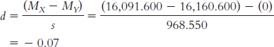
This is a small effect.
Page C-34Effect size tells us how big the difference we observed between means was, uninfluenced by sample size. Often, this measure will help us understand whether we want to continue along our current research lines; that is, if a strong effect is indicated but we fail to reject the null hypothesis, we might want to replicate the study with more statistical power. In this case, however, the failure to reject the null hypothesis is accompanied by a small effect.
10.27
Step 1: Population 1 consists of mothers, and population 2 is nonmothers. The comparison distribution will be a distribution of differences between means. We will use an independent-
samples t test because someone is either identified as being a mother or not being a mother; both conditions, in this case, cannot be true. Of the three assumptions, we meet one because the dependent variable, decibel level, is a scale variable. We do not know whether the data were randomly selected and whether the population is normally distributed, and we have a small N, so we will be cautious in drawing conclusions. Step 2: Null hypothesis: There is no mean difference in sound sensitivity, as reflected in the minimum level of detection, between mothers and nonmothers—
H0: μ1 = μ2. Research hypothesis: There is a mean difference in sensitivity between the two groups—
H1: μ1 ≠ μ2. Step 3: (μ1 − μ2) = 0; sdifference = 9.581
Calculations:
MX = 47
X X − M (X − M )2 33 − 14 196 55 8 64 39 − 8 64 41 − 6 36 67 20 400 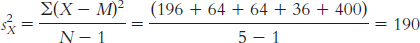
MY = 58.333
Y Y − M (Y − M )2 56 − 2.333 5.443 48 − 10.333 106.771 71 12.667 160.453 
dfX = N − 1 = 5 − 1 = 4
dfY = N − 1 = 3 − 1 = 2
dftotal = dfX + dfY = 4 + 2 = 6
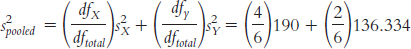
= 126.667 + 45.445 = 172.112
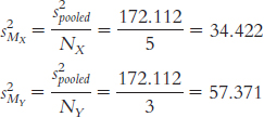
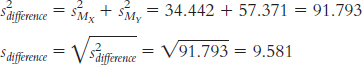
Step 4: The critical values, based on a two-
tailed test, a p level of 0.05, and a dftotal of 6, are −2.447 and 2.447. Step 5:
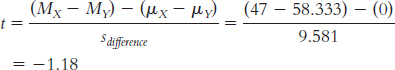
Step 6: Fail to reject the null hypothesis. We do not have enough evidence, based on these data, to conclude that mothers have more sensitive hearing, on average, when compared to nonmothers.
t(6) = − 1.18, p > 0.05. (Note: If we used software to conduct the t test, we would report the actual p value associated with this test statistic.)
(MX − MY)lower = − t(sdifference) + (MX − MY)sample = − 2.447(9.581) + (47 − 58.333) = −34.778
(MX − MY)upper = t(sdifference) + (MX − MY)sample = 2.447(9.581) + (47 − 58.333) = 12.112
The 95% confidence interval around the difference between means of 211.333 is [234.78, 12.11].
What we learn from this confidence interval is that there is great variability in the plausible difference between means for these data, reflected in the wide range. We also notice that 0 is within the confidence interval, so we cannot assume a difference between these groups.
Whereas point estimates result in one value ( − 11.333, in this case) in which we have no estimate of confidence, the interval estimate gives us a range of scores about which we have known confidence.

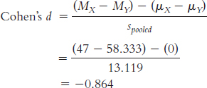
This is a large effect.
Effect size tells us how big the difference we observed between means was, without the influence of sample size. Often, this measure helps us decide whether we want to continue along our current research lines. In this case, the large effect would encourage us to replicate the study with more statistical power.
10.29
We would use a single-
sample t test because we have one sample of figure skaters and are comparing that sample to a population (women with eating disorders) for which we know the mean. Page C-35We would use an independent-
samples t test because we have two samples, and no participant can be in both samples. One cannot have both a high level and a low level of knowledge about a topic. We would use a paired-
samples t test because we have two samples, but every student is assigned to both samples— one night of sleep loss and one night of no sleep loss.
10.31
We would use an independent-
samples t test because there are two samples, and no participant can be in both samples. One cannot be a pedestrian en route to work and a tourist pedestrian at the same time. Null hypothesis: People en route to work tend to walk at the same pace, on average, as people who are tourists—
H0: μ1 = μ2. Research hypothesis: People en route to work tend to walk at a different pace, on average, than do those who are tourists—
H1: μ1 ≠ μ2.
10.33
The independent variable is the tray availability with levels of not available and available.
The dependent variables are food waste and dish use. Food waste was likely operationalized by weight or volume of food disposed, whereas dish use was likely operationalized by number of dishes used or dirtied.
This study is an experiment because the environment was manipulated or controlled by the researchers. It assumes that the individuals were randomly sampled from the population and randomly assigned to one of the two levels of the independent variable.
We would use an independent-
samples t test because there is a scale- dependent variable, there are two samples, and no participant can be in both samples. One cannot have trays available and not available at the same time.
10.35
The researchers used an independent-
samples t test. We know this because there were two separate groups, so this was a between- groups design. The researchers were comparing the difference between means. We know that the finding is statistically significant because we are told that the p value is less than 0.001. Researchers often report very small p values this way rather than saying, for example, p = 0.0000054.
There were 65 participants. There were 63 total degrees of freedom. This would have been calculated by summing the degrees of freedom for each group. The degrees of freedom for each group was the sample size minus 1.
There was a mean of 14.6% verbatim overlap with the lecture for students taking notes on laptops, and a mean of 8.8% verbatim overlap with the lecture for students taking notes longhand.
The effect size is 0.94. This is a large effect, according to Cohen’s conventions.
10.37
Waters is predicting lower levels of obesity among children who are in the Edible Schoolyard program than among children who are not in the program. Waters and others who believe in her program are likely to notice successes and overlook failures. Solid research is necessary before instituting such a program nationally, even though it sounds extremely promising.
Students could be randomly assigned to participate in the Edible Schoolyard program or to continue with their usual lunch plan. The independent variable is the program, with two levels (Edible Schoolyard, control), and the dependent variable could be weight. Weight is easily operationalized by weighing children, perhaps after one year in the program.
We would use an independent-
samples t test because there are two samples and no student is in both samples. Step 1: Population 1 is all students who participated in the Edible Schoolyard program. Population 2 is all students who did not participate in the Edible Schoolyard program. The comparison distribution will be a distribution of differences between means. The hypothesis test will be an independent-
samples t test. This study meets all three assumptions. The dependent variable, weight, is scale. The data would be collected using a form of random selection. In addition, there would be more than 30 participants in the sample, indicating that the comparison distribution would likely be normal. Step 2: Null hypothesis: Students who participate in the Edible Schoolyard program weigh the same, on average, as students who do not participate—
H0: μ1 = μ2. Research hypothesis: Students who participate in the Edible Schoolyard program have different weights, on average, than students who do not participate—
H1: μ1 ≠μ2. The dependent variable could be nutrition knowledge, as assessed by a test, or body mass index (BMI).
There are many possible confounds when we do not conduct a controlled experiment. For example, the Berkeley school might be different to begin with. After all, the school allowed Waters to begin the program, and perhaps it had already emphasized nutrition. Random selection allows us to have faith in the ability to generalize beyond our sample. Random assignment allows us to eliminate confounds, other variables that may explain any differences between groups.
Chapter 11
11.1 An ANOVA is a hypothesis test with at least one nominal independent variable (with at least three total groups) and a scale-
11.3 Between-
11.5 The three assumptions are that the participants were randomly selected, the underlying populations are normally distributed, and the underlying variances of the different conditions are similar, or homoscedastic.
11.7 The F statistic is calculated as the ratio of two variances. Variability, and the variance measure of it, is always positive—
11.9 With sums of squares, we add up all the squared values. Deviations from the mean always sum to 0. By squaring these deviations, we can sum them and they will not sum to 0. Sums of squares are measures of variability of scores from the mean.
11.11 The grand mean is the mean of every score in a study, regardless of which sample the score came from.
11.13 Cohen’s d; R2
11.15 Post hoc means “after this.” These tests are needed when an ANOVA is significant and we want to discover where the significant differences exist between the groups.
11.17
Standard error is wrong. The professor is reporting the spread for a distribution of scores, the standard deviation.
t statistic is wrong. We do not use the population standard deviation to calculate a t statistic. The sentence should say z statistic instead.
Parameters is wrong. Parameters are numbers that describe populations, not samples. The researcher calculated the statistics.
z statistic is wrong. Evelyn is comparing two means; thus, she would have calculated a t statistic.
11.19 The four assumptions are that (1) the data are randomly selected; (2) the underlying population distributions are normal; (3) the variability is similar across groups, or homoscedasticity; and (4) there are no order effects.
11.21 The “subjects” variability is noise in the data caused by each participant’s personal variability compared with the other participants. It is calculated by comparing each person’s mean response across all levels of the independent variable with the grand mean, which is the overall mean response across all levels of the independent variable.
11.23 Counterbalancing involves exposing participants to the different levels of the independent variable in different orders.
11.25 To calculate the sum of squares for subjects, we first calculate an average of each participant’s scores across the levels of the independent variable. Then we subtract the grand mean from each participant’s mean. We repeat this subtraction for each score the participant has—
11.27 If we have a between-
11.29 The calculations for R2 for a one-
11.31
dfbetween = Ngroups − 1 = 3 − 1 = 2
dfwithin = df1 + df2 + . . . + dflast = (4 − 1) + (3 − 1) + (5 − 1) = 3 + 2 + 4 = 9
dftotal = dfbetween + dfwithin = 2 + 9 = 11
The critical value for a between-
groups degrees of freedom of 2 and a within- groups degrees of freedom of 9 at a p level of 0.05 is 4.26. 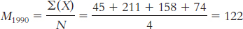
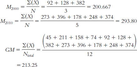
(Note: The total sum of squares may not exactly equal the sum of the between-
groups and within- groups sums of squares because of rounding decisions.) The total sum of squares is calculated here as SStotal = Σ(X − GM)2:
Sample X (X − GM ) (X − GM )2 1990 45 − 168.25 28,308.063 M1990 = 122 211 − 2.25 5.063 158 − 55.25 3052.563 74 − 139.25 19,390.563 2000 92 − 121.25 14,701.563 M2000 = 200.667 128 − 85.25 7267.563 382 168.75 28,476.563 2010 273 59.75 3570.063 M2010 = 293.8 396 182.75 33,397.563 178 − 35.25 1242.563 248 34.75 1207.563 374 160.75 25,840.563 GM = 213.25 SStotal = 166,460.256
Page C-37The within-
groups sum of squares is calculated here as SSwithin = Σ(X − M)2: Sample X (X − M ) (X − M )2 1990 45 − 77 5929.00 M1990 = 122 211 89 7921.00 158 36 1296.00 74 − 48 2304.00 2000 92 − 108.667 11,808.517 M2000 = 200.667 128 − 72.667 5280.493 382 181.333 32,881.657 2010 273 − 20.8 432.64 M2010 = 293.8 396 102.2 10,444.84 178 − 115.8 13,409.64 248 − 45.8 2097.64 374 80.2 6432.04 GM = 213.25 SSwithin = 100,237.467
The between-
groups sum of squares is calculated here as SSbetween = Σ(M − GM)2: Sample X (M − GM ) (M − GM )2 1990 45 − 91.25 8326.563 M1990 = 122 211 − 91.25 8326.563 158 − 91.25 8326.563 74 − 91.25 8326.563 2000 92 − 12.583 158.332 M2000 = 200.667 128 − 12.583 158.332 382 − 12.583 158.332 2010 273 80.55 6488.303 M2010 = 293.8 396 80.55 6488.303 178 80.55 6488.303 248 80.55 6488.303 374 80.55 6488.303 GM = 213.25 SSbetween = 66,222.763
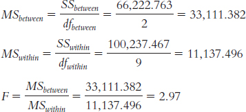
Source SS df MS F Between 66,222.763 2 33,111.382 2.97 Within 100,237.467 9 11,137.496 Total 166,460.256 11 Effect size is calculated as
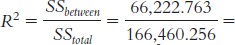 0.40. According to Cohen’s conventions for R2, this is a very large effect.
11.33
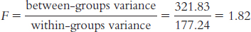
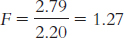
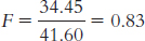
11.35
| Source | SS | df | MS | F |
| Between | 43 | 2 | 21.500 | 2.66 |
| Within | 89 | 11 | 8.091 | |
| Total | 132 | 13 |
11.37 With four groups, there would be a total of six different comparisons.
11.39
dfbetween = Ngroups − 1 = 3 − 1 = 2
dfsubjects = n − 1 = 4 − 1 = 3
dfwithin = (dfbetween)(dfsubjects) = (2)(3) = 6
dftotal = dfbetween + dfsubjects + dfwithin = 2 + 3 + 6 = 11, or we can calculate it as dftotal = Ntotal − 1 = 12 − 1 = 11
SStotal = Σ(X − GM )2 = 754
Level (X ) X − GM (X − GM )2 1 7 − 10 100 1 16 − 1 1 1 3 − 14 196 1 9 − 8 64 2 15 − 2 4 2 18 1 1 2 18 1 1 2 13 − 4 16 3 22 5 25 3 28 11 121 3 26 9 81 3 29 12 144 GM = 17 Σ(X − GM )2 = 754
Page C-38SSbetween = Σ(M − GM )2 = 618.504
Level Rating (X ) Group Mean (M ) M − GM (M − GM )2 1 7 8.75 − 8.25 68.063 1 16 8.75 − 8.25 68.063 1 3 8.75 − 8.25 68.063 1 9 8.75 − 8.25 68.063 2 15 16 − 1 1.000 2 18 16 − 1 1.000 2 18 16 − 1 1.000 2 13 16 − 1 1.000 3 22 26.25 9.25 85.563 3 28 26.25 9.25 85.563 3 26 26.25 9.25 85.563 3 29 26.25 9.25 85.563 GM = 17 Σ(M − GM )2 = 618.504
SSsubjects = Σ(Mparticipant − GM)2 = 62.001
Participant Level Rating (X ) Participant Mean (MPARTICIPANT) MPARTICIPANT − GM (MPARTICIPANT − GM )2 1 1 7 14.667 − 2.333 5.443 2 1 16 20.667 3.667 13.447 3 1 3 15.667 − 1.333 1.777 4 1 9 17 0 0 1 2 15 14.667 − 2.333 5.443 2 2 18 20.667 3.667 13.447 3 2 18 15.667 − 1.333 1.777 4 2 13 17 0 0 1 3 22 14.667 − 2.333 5.443 2 3 28 20.667 3.667 13.447 3 3 26 15.667 − 1.333 1.777 4 3 29 17 0 0 GM = 17 Σ(Mparticipant − GM )2 = 62.001
SSwithin = SStotal − SSbetween − SSsubjects = 754 − 618.504 − 62.001 = 73.495
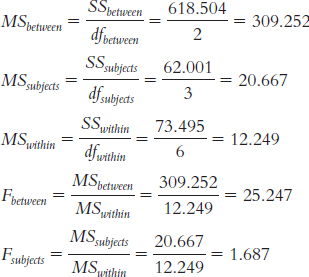
Source SS df MS F Between- groups 618.504 2 309.252 25.25 Subjects 62.001 3 20.667 1.69 Within- groups 73.495 6 12.249 Total 754 11 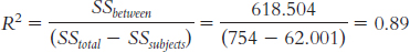
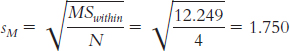
The Tukey HSD statistic comparing level 1 and level 3 would be:
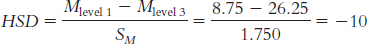
11.41
SOURCE SS df MS F Between 941.102 2 470.551 10.16 Subjects 3807.322 10 380.732 8.22 Within 926.078 20 46.304 Total 5674.502 32 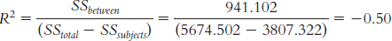
11.43
The independent variable is type of program. The levels are The Daily Show and network news. The dependent variable is the amount of substantive video and audio reporting per second.
The hypothesis test that Fox would use is an independent-
samples t test. The independent variable is still type of program, but now the levels are The Daily Show, network news, and cable news. The hypothesis test would be a one-
way between- groups ANOVA.
11.45
A t distribution; we are comparing the mean IQ of a sample of 10 to the population mean of 100; this student knows only the population mean—
she doesn’t know the population standard deviation. An F distribution; we are comparing the mean ratings of four samples—
families with no books visible, with only children’s books visible, with only adult books visible, and with both types of books visible. A t distribution; we are comparing the average vocabulary of two groups.
11.47
The independent variable in this case is the type of program in which students are enrolled; the levels are arts and sciences, education, law, and business. Because every student is enrolled in only one program, Ruby would use a one-
way between- groups ANOVA. Now the independent variable is year, with levels of first, second, or third. Because the same participants are repeatedly measured, Ruby would use a one-
way within- groups ANOVA. The independent variable in this case is type of degree, and its levels are master’s, doctoral, and professional. Because every student is in only one type of degree program, Ruby would use a one-
way between- groups ANOVA. The independent variable in this case is stage of training, and its levels are master’s, doctoral, and postdoctoral. Because the same students are repeatedly measured, Ruby would use a one-
way within- groups ANOVA.
11.49
The independent variable is political viewpoint, with the levels Republican, Democrat, and neither.
The dependent variable is religiosity.
The populations are all Republicans, all Democrats, and all who categorize themselves as neither. The samples are the Republicans, Democrats, and people who say they are neither among the 180 students.
Because every student identified only one type of political viewpoint, the researcher would use a one-
way between- groups ANOVA. No participant could be in more than one level of the independent variable. First, you would calculate the between-
groups variance. This involves calculating a measure of variability among the three sample means— the religiosity scores of the Republicans, Democrats, and others. Then you would calculate the within- groups variance; this is essentially an average of the variability within each of the three samples. Finally, you would divide the between- groups variance by the within- groups variance. If the variability among the means is much larger than the variability within each sample, it would be evidence that the means are different from one another.
11.51
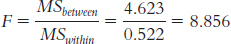

The “Sig.” for t is the same as that for the ANOVA, 0.005, because the F distribution reduces to the t distribution when we are dealing with two groups.
11.53
The independent variable is instructor self-
disclosure, which is a nominal variable with three levels— high, medium, and low self- disclosure. The first dependent variable mentioned is levels of motivation, which is a scale variable.
This is a between-
groups design because students are only exposed to one of the three types of instructor self- disclosure via the Facebook pages. A one-
way between- subjects ANOVA would be used to analyze the data. This is a true experiment as participants were randomly assigned to levels of a manipulated independent variable. This means that the researchers can draw a causal conclusion. That is, they can conclude that high self-
disclosure causes “higher levels of motivation and affective learning and a more positive classroom climate,” as compared with low and medium levels of self- disclosure.
11.55
The independent variable is languages spoken, which is a nominal variable with four levels—
monolingual (English), bilingual (Spanish- English), bilingual (French- English), and bilingual (Chinese- English). The dependent variable is vocabulary skills as assessed by the PPVT, a scale variable. We know that the finding is statistically significant because the p value of 0.0001 is less than the typical cutoff p level of 0.05.
The findings from the one-
way ANOVA only tell us that there is at least one difference among the groups but not which specific groups are statistically significantly different from each other. Statistically significant mean differences between mean vocabulary scores exist between the monolingual children and the bilingual (Chinese-
English) children and between the monolingual children and the bilingual (French- English) children. They also exist between the bilingual (Spanish- English) children and the bilingual (Chinese- English) children and between the bilingual (Spanish- English) children and the bilingual (French- English) children. However, the monolingual children and bilingual (Spanish- English) children did not statistically significantly differ from each other, on average, nor did the bilingual (Chinese- English) and bilingual (French- English) children statistically significantly differ from each other, on average.
11.57
Null hypothesis: People experience the same mean amount of fear across all three levels of dog size—
H0: μ1 = μ2 = μ3. Research hypothesis: People do not experience the same mean amount of fear across all three levels of dog size.
We do not know how the participants were selected, so the first assumption of random selection might not be met. We do not know how the dogs were presented to the participants, so we cannot assess whether order effects are present.
The effect size was 0.89, which is a large effect. This indicates that the effect might be important, meaning the size of a dog might have a large impact on the amount of fear people experience.
The Tukey HSD test statistic was − 10. According to the q statistic table, the critical value for the Tukey HSD when there are 6 within-
groups degrees of freedom and three treatment levels is 4.34. We can conclude that the mean difference in fear when a small versus large dog is presented is statistically significant, with the large dog evoking greater fear.
11.59
Step 5: We must first calculate df and SS to fill in the source table.
dfbetween = Ngroups − 1 = 2
dfsubjects = n − 1 = 4
dfwithin = (dfbetween)(dfsubjects) = 8
dftotal = Ntotal − 1 = 14
For the total sum of squares: SStotal = Σ(X − GM)2 = 73.6
Time X X − GM (X − GM )2 Past 18 − 1.6 2.56 Past 17.5 − 2.1 4.41 Past 19 − 0.6 0.36 Past 16 − 3.6 12.96 Past 20 0.4 0.16 Present 18.5 − 1.1 1.21 Present 19.5 − 0.1 0.01 Present 20 0.4 0.16 Present 17 − 2.6 6.76 Present 18 − 1.6 2.56 Future 22 2.4 5.76 Future 24 4.4 19.36 Future 20 0.4 0.16 Future 23.5 3.9 15.21 Future 21 1.4 1.96 GM = 19.6 SStotal = 73.6
For sum of squares between: SSbetween = Σ(M − GM )2 = 47.5
Time X Group Mean (M ) M − GM (M − GM )2 Past 18 18.1 − 1.5 2.25 Past 17.5 18.1 − 1.5 2.25 Past 19 18.1 − 1.5 2.25 Past 16 18.1 − 1.5 2.25 Past 20 18.1 − 1.5 2.25 Present 18.5 18.6 − 1 1 Present 19.5 18.6 − 1 1 Present 20 18.6 − 1 1 Present 17 18.6 − 1 1 Present 18 18.6 − 1 1 Future 22 22.1 2.5 6.25 Future 24 22.1 2.5 6.25 Future 20 22.1 2.5 6.25 Future 23.5 22.1 2.5 6.25 Future 21 22.1 2.5 6.25 GM = 19.6 SSbetween = 47.5
Page C-41For sum of squares subjects: SSsubjects = Σ(Mparticipant − GM)2 = 3.429
Participant Time X Participant mean (MPARTICIPANT) MPARTICIPANT − GM (MPARTICIPANT − GM )2 1 Past 18 19.500 − 0.100 0.010 2 Past 17.5 20.333 0.733 0.537 3 Past 19 19.667 0.067 0.004 4 Past 16 18.833 − 0.767 0.588 5 Past 20 19.667 0.067 0.004 1 Present 18.5 19.500 − 0.100 0.010 2 Present 19.5 20.333 0.733 0.537 3 Present 20 19.667 0.067 0.004 4 Present 17 18.833 − 0.767 0.588 5 Present 18 19.667 0.067 0.004 1 Future 22 19.500 − 0.100 0.010 2 Future 24 20.333 0.733 0.537 3 Future 20 19.667 0.067 0.004 4 Future 23.5 18.833 − 0.767 0.588 5 Future 21 19.667 0.067 0.004 GM = 19.6 SSsubjects = 3.429
SSwithin = SStotal − SSbetween − SSsubjects = 22.671
Source SS df MS F Between 47.5 2 23.750 8.38 Subjects 3.429 4 0.857 0.30 Within 22.671 8 2.834 Total 73.6 14 Step 6: The F statistic, 8.38, is beyond 4.46, the critical F value at a p level of 0.05. We would reject the null hypothesis. There is a difference, on average, among the past, present, and future self-
reported life satisfaction of pessimists. First, we calculate
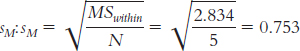
Next, we calculate HSD for each pair of means.
For past versus present:
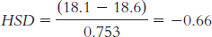
For past versus future:
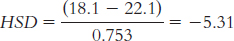
For present versus future:
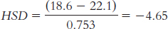
The critical value of q at a p level of 0.05 is 4.04. Thus, we reject the null hypothesis for the past versus future comparison and for the present versus future comparison, but not for the past versus present comparison. These results indicate that the mean self-
reported life satisfaction of pessimists is not significantly different for their past and present, but they expect to have greater life satisfaction in the future, on average. 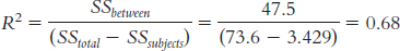
11.61 dfbetween = Ngroups − 1 = 2
dfsubjects = n − 1 = 4
dfwithin = (dfbetween)(dfsubjects) = 8
dftotal = Ntotal − 1 = 14
For the total sum of squares: SStotal = Σ(X − GM)2 = 4207.335
| Stimulus | X | X − GM | (X − GM )2 |
| Owner | 69 | 20.667 | 427.125 |
| Owner | 72 | 23.667 | 560.127 |
| Owner | 65 | 16.667 | 277.789 |
| Owner | 75 | 26.667 | 711.129 |
| Owner | 70 | 21.667 | 469.459 |
| Cat | 28 | − 20.333 | 413.431 |
| Cat | 32 | − 16.333 | 266.767 |
| Cat | 30 | − 18.333 | 336.099 |
| Cat | 29 | − 19.333 | 373.765 |
| Cat | 31 | − 17.333 | 300.433 |
| Dog | 45 | − 3.333 | 11.109 |
| Dog | 43 | − 5.333 | 28.441 |
| Dog | 47 | − 1.333 | 1.777 |
| Dog | 45 | − 3.333 | 11.109 |
| Dog | 44 | − 4.333 | 18.775 |
GM = 48.333 SStotal = 4207.335
For sum of squares between: SSbetween − Σ(M − GM)2 = 4133.735
| Stimulus | X | Group Mean (M) | M − GM | (M − GM )2 |
| Owner | 69 | 70.2 | 21.867 | 478.166 |
| Owner | 72 | 70.2 | 21.867 | 478.166 |
| Owner | 65 | 70.2 | 21.867 | 478.166 |
| Owner | 75 | 70.2 | 21.867 | 478.166 |
| Owner | 70 | 70.2 | 21.867 | 478.166 |
| Cat | 28 | 30 | − 18.333 | 336.099 |
| Cat | 32 | 30 | − 18.333 | 336.099 |
| Cat | 30 | 30 | − 18.333 | 336.099 |
| Cat | 29 | 30 | − 18.333 | 336.099 |
| Cat | 31 | 30 | − 18.333 | 336.099 |
| Dog | 45 | 44.8 | − 3.533 | 12.482 |
| Dog | 43 | 44.8 | − 3.533 | 12.482 |
| Dog | 47 | 44.8 | − 3.533 | 12.482 |
| Dog | 45 | 44.8 | − 3.533 | 12.482 |
| Dog | 44 | 44.8 | − 3.533 | 12.482 |
GM = 48.333 SSbetween = 4133.735
For sum of squares subjects: SSsubjects = Σ(Mparticipant − GM)2 = 12.675
| Stimulus | X | Participant Mean | MPARTICIPANT− GM | (MPARTICIPANT −GM )2 |
| Owner | 69 | 47.333 | −1.000 | 1.000 |
| Owner | 72 | 49.000 | 0.667 | 0.445 |
| Owner | 65 | 47.333 | −1.000 | 1.000 |
| Owner | 75 | 49.667 | 1.334 | 1.780 |
| Owner | 70 | 48.333 | 0.000 | 0.000 |
| Cat | 28 | 47.333 | −1.000 | 1.000 |
| Cat | 32 | 49.000 | 0.667 | 0.445 |
| Cat | 30 | 47.333 | −1.000 | 1.000 |
| Cat | 29 | 49.667 | 1.334 | 1.780 |
| Cat | 31 | 48.333 | 0.000 | 0.000 |
| Dog | 45 | 47.333 | −1.000 | 1.000 |
| Dog | 43 | 49.000 | 0.667 | 0.445 |
| Dog | 47 | 47.333 | −1.000 | 1.000 |
| Dog | 45 | 49.667 | 1.334 | 1.780 |
| Dog | 44 | 48.333 | 0.000 | 0.000 |
GM = 48.333 SSsubjects = 12.675
SSwithin = SStotal − SSbetween − SSsubjects = 60.925
| Source | SS | df | MS | F |
| Between | 4133.735 | 2 | 2066.868 | 271.38 |
| Subjects | 12.675 | 4 | 3.169 | 0.42 |
| Within | 60.925 | 8 | 7.616 | |
| Total | 4207.335 | 14 |
11.63 At a p level of 0.05, the critical F value is 4.46. Because the calculated F statistic does not exceed the critical F value, we would fail to reject the null hypothesis. Because we failed to reject the null hypothesis, it would not be appropriate to perform post hoc comparisons.
11.65
Level of trust in the leader is the independent variable. It has three levels: low, moderate, and high.
The dependent variable is level of agreement with a policy supported by the leader or supervisor.
Step 1: Population 1 is employees with low trust in their leader. Population 2 is employees with moderate trust in their leader. Population 3 is employees with high trust in their leader. The comparison distribution will be an F distribution. The hypothesis test will be a one-
way between- groups ANOVA. We do not know if employees were randomly selected. We also do not know if the underlying distributions are normal, and the sample sizes are small so we must proceed with caution. To check the final assumption, that we have homoscedastic variances, we will calculate variance for each group. Page C-43Sample Low Trust Moderate Trust High Trust Squared deviations 16 100 3.063 1 121 18.063 4 1 60.063 25 27.563 Sum of squares 46 222 108.752 N − 1 3 2 3 Variance 15.33 111 36.25 Because the largest variance, 111, is much more than twice as large as the smallest variance, we can conclude we have heteroscedastic variances. Violation of this third assumption of homoscedastic samples means we should proceed with caution. Because these data are intended to give you practice calculating statistics, proceed with your analyses. When conducting real research, we would want to have much larger sample sizes and to more carefully consider meeting the assumptions.
Step 2: Null hypothesis: There are no mean differences between these three groups: The mean level of agreement with a policy does not vary across the three trust levels—
H0: μ1 = μ2 = μ3. Research hypothesis: There are mean differences between some or all of these groups: The mean level of agreement depends on trust.
Step 3: dfbetween = Ngroups − 1 = 3 – 1 = 2
dfwithin = df1 + df2 + . . . + dflast = (4 − 1) + (3 − 1) + (4 − 1) = 3 + 2 + 3 = 8
dftotal = dfbetween + dfwithin = 2 + 8 = 10
The comparison distribution will be an F distribution with 2 and 8 degrees of freedom.
Step 4: The critical value for the F statistic based on a p level of 0.05 is 4.46.
Step 5: GM = 21.727
Total sum of squares is calculated here as SStotal = Σ(X − GM)2:
Sample X (X − GM ) (X − GM )2 Low trust 9 − 12.727 161.977 Mlow = 13 14 − 7.727 59.707 11 − 10.727 115.069 18 − 3.727 13.891 Moderate trust 14 − 7.727 59.707 Mmod = 24 35 13.273 176.173 23 1.273 1.621 High trust 27 5.273 27.805 Mhigh = 28.75 33 11.273 127.081 21 − 0.727 0.529 34 12.273 150.627 GM = 21.727 SStotal = 894.187
Within-
groups sum of squares is calculated here as SSwithin = Σ(X − M)2: Sample X (X − M) (X − M)2 Low trust 9 − 4 16.00 Mlow = 13 14 1 1.00 11 − 2 4.00 18 5 25.00 Moderate trust 14 − 10 100.00 Mmod = 24 35 11 121.00 23 − 1 1.00 High trust 27 − 1.75 3.063 Mhigh = 28.75 33 4.25 18.063 21 − 7.75 60.063 34 5.25 27.563 GM = 21.727 SSwithin = 376.752
Page C-44Between-
groups sum of squares is calculated here as SSbetween = Σ(M − GM)2: Sample X (M − GM ) (M − GM )2 Low trust 9 − 8.727 76.161 Mlow = 13 14 − 8.727 76.161 11 − 8.727 76.161 18 − 8.727 76.161 Moderate trust 14 2.273 5.167 Mmod = 24 35 2.273 5.167 23 2.273 5.167 High trust 27 7.023 49.323 Mhigh = 28.75 33 7.023 49.323 21 7.023 49.323 34 7.023 49.323 GM = 21.727 SSbetween = 517.437
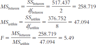
Source SS df MS F Between 517.437 2 258.719 5.49 Within 376.752 8 47.094 Total 894.187 10 Step 6: The F statistic, 5.49, is beyond the cutoff of 4.46, so we can reject the null hypothesis. The mean level of agreement with a policy supported by a supervisor varies across level of trust in that supervisor. Remember, the research design and data did not meet the three assumptions of this statistical test, so we should be careful in interpreting this finding.
F (2,8) = 5.49, p < 0.05. (Note: We would include the actual p value if we used software to conduct this analysis).
Because there are unequal sample sizes, we must calculate a weighted sample size.
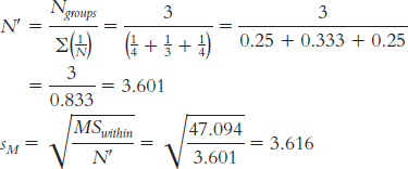
Now we can compare the three groups.
Low trust (M = 13) versus moderate trust (M = 24):
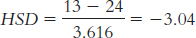
Low trust (M = 13) versus high trust (M = 28.75):
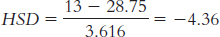
Moderate trust (M = 24) versus high trust (M = 28.75):
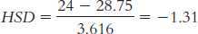
According to the q table, the critical value is 4.04 for a p level of 0.05 when we are comparing three groups and have within-
groups degrees of freedom of 8. We obtained one q value (24.36) that exceeds this cutoff. Based on the calculations, there is a statistically significant difference between the mean level of agreement by employees with low trust in their supervisors compared to those with high trust. Because the sample sizes here were so small and we did not meet the three assumptions of ANOVA, we should be careful in making strong statements about this finding. In fact, these preliminary findings would encourage additional research. It is not possible to conduct a t test in this situation because there are more than two groups or levels of the independent variable.
It is not possible to conduct this study with a within-
groups design because participants cannot be in more than one of the groups or levels of the independent variable. In other words, an employee has only one level of trust in his or her supervisor.
11.67
The independent variable is the type of substance placed beneath the eyes, and its levels are black grease, black antiglare stickers, and petroleum jelly.
The dependent variable is eye glare.
This is a one-
way within- groups ANOVA. The first assumption of ANOVA is that the samples are randomly selected from their populations. It is unlikely that the researchers met this assumption. The study description indicates that the researchers were from Yale University and does not mention any techniques the researchers might have used to obtain participants from across the nation. So it is likely that the Yale researchers used a sample of participants from their local area.
The second assumption is that the population distribution is normal. Although we do not know the exact distribution of the population of scores, there are more than 30 participants in the study. When there are at least 30 participants in a sample, the distribution of sample means will be approximately normal even if the underlying distribution of scores is not. So it is likely that the distribution of sample means is normal and that this assumption was met.
The third assumption is homoscedasticity—
that the samples come from populations with equal variances. Based on the description of the study, it is not possible to tell whether this assumption was met. The researchers could assess whether this assumption was met by comparing the variance of each of the three treatment groups to ensure that the largest variance is no larger than two times the smallest variance. The fourth assumption that is specific to the within-
groups ANOVA is that there are no order effects. To protect against order effects, the researcher would want to have counterbalanced the order in which the participants experienced the treatment conditions. Step 5: We must first calculate df and SS to fill in the source table.
Page C-45dfbetween = Ngroups − 1 = 2
dfsubjects = n − 1 = 3
dfwithin = (dfbetween)(dfsubjects) = 6
dftotal = Ntotal − 1 = 11
For the total sum of squares: SStotal = Σ(X − GM)2 = 16.527
Condition X X − GM (X − GM )2 Black grease 19.8 2.175 4.731 Black grease 18.2 0.575 0.331 Black grease 19.2 1.575 2.481 Black grease 18.7 1.075 1.156 Antiglare stickers 17.1 − 0.525 0.276 Antiglare stickers 17.2 − 0.425 0.181 Antiglare stickers 18 0.375 0.141 Antiglare stickers 17.9 0.275 0.076 Petroleum jelly 15.9 − 1.725 2.976 Petroleum jelly 16.3 − 1.325 1.756 Petroleum jelly 16.2 − 1.425 2.031 Petroleum jelly 17 − 0.625 0.391 GM = 17.625 SStotal = 16.527
For the sum of squares between: SSbetween = Σ(M − GM)2 = 13.820
Condition X Group Mean (M) M − GM (M − GM )2 Black grease 19.8 18.975 1.35 1.823 Black grease 18.2 18.975 1.35 1.823 Black grease 19.2 18.975 1.35 1.823 Black grease 18.7 18.975 1.35 1.823 Antiglare stickers 17.1 17.55 − 0.075 0.006 Antiglare stickers 17.2 17.55 − 0.075 0.006 Antiglare stickers 18 17.55 − 0.075 0.006 Antiglare stickers 17.9 17.55 − 0.075 0.006 Petroleum jelly 15.9 16.35 − 1.275 1.626 Petroleum jelly 16.3 16.35 − 1.275 1.626 Petroleum jelly 16.2 16.35 − 1.275 1.626 Petroleum jelly 17 16.35 − 1.275 1.626 GM = 17.625 SSbetween = 13.820
For the sum of squares subjects: SSsubjects = Σ(Mparticipant − GM)2 = 0.735
Participant Condition X Participant Mean (MPARTICIPANT) MPARTICIPANT − GM (MPARTICIPANT − GM )2 1 Black grease 19.8 17.600 − 0.025 0.001 2 Black grease 18.2 17.233 − 0.392 0.154 3 Black grease 19.2 17.800 0.175 0.031 4 Black grease 18.7 17.867 0.242 0.059 1 Antiglare stickers 17.1 17.600 − 0.025 0.001 2 Antiglare stickers 17.2 17.233 − 0.392 0.154 3 Antiglare stickers 18 17.800 0.175 0.031 4 Antiglare stickers 17.9 17.867 0.242 0.059 1 Petroleum jelly 15.9 17.600 − 0.025 0.001 2 Petroleum jelly 16.3 17.233 − 0.392 0.154 3 Petroleum jelly 16.2 17.800 0.175 0.031 4 Petroleum jelly 17 17.867 0.242 0.059 GM = 17.625 SSsubjects = 0.735
Page C-46SSwithin = SStotal − SSbetween − SSsubjects = 1.972
Source SS df MS F Between 13.820 2 6.91 21.00 Subjects 0.735 3 0.245 0.74 Within 1.972 6 0.329 Total 16.527 11 Step 6: The F statistic, 21.00, is beyond 5.14, the critical F value at a p level of 0.05. We would reject the null hypothesis. There is a difference, on average, in the visual acuity of participants while wearing different substances beneath their eyes.
First, we calculate
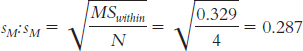
Next, we calculate HSD for each pair of means.
For grease versus stickers:
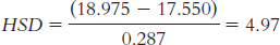
For grease versus jelly:
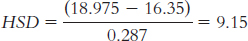
For stickers versus jelly:
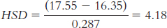
The critical value of q at a p level of 0.05 is 4.34. Thus, we reject the null hypothesis for the grease versus stickers comparison and for the grease versus jelly comparison, but not for the stickers versus jelly comparison. These results indicate that black grease beneath the eyes leads to better visual acuity, on average, than either antiglare stickers or petroleum jelly.
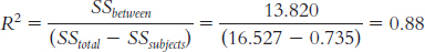
This study could be conducted using a between-
groups design if football players were assigned to only one of the three conditions; thus, they would be exposed to the black grease, the antiglare stickers, or the petroleum jelly, rather than all three.
Chapter 12
12.1 A two-
12.3 In everyday conversation, the word cell conjures up images of a prison or a small room in which someone is forced to stay, or of one of the building blocks of a plant or animal. In statistics, the word cell refers to a single condition in a factorial ANOVA that is characterized by its values on each of the independent variables.
12.5 A two-
12.7 A marginal mean is the mean of a row or a column in a table that shows the cells of a study with a two-
12.9 Bar graphs allow us to visually depict the relative changes across the different levels of each independent variable. By adding lines that connect the bars within each series, we can assess whether the lines appear parallel, significantly different from parallel, or intersecting. Intersecting and significantly nonparallel lines are indications of interactions.
12.11 First, we may be able to reject the null hypothesis for the interaction. (If the interaction is statistically significant, then it might not matter whether the main effects are significant; if they are also significant, then those findings are usually qualified by the interaction and they are not described separately. The overall pattern of cell means can tell the whole story.) Second, if we are not able to reject the null hypothesis for the interaction, then we focus on any significant main effects, drawing a specific directional conclusion for each. Third, if we do not reject the null hypothesis for either main effect or the interaction, then we can only conclude that there is insufficient evidence from this study to support the research hypotheses.
12.13 This is the formula for the between-
12.15 We can use R2 to calculate effect size similarly to how we did for a one-
12.17
There are two independent variables or factors: gender and sporting event. Gender has two levels, male and female, and sporting event has two levels, Sport 1 and Sport 2.
Type of campus is one factor that has two levels: dry and wet. The second factor is type of college, which has three levels: state, private, and religious.
Age group is the first factor, with three levels: 12–
13, 14– 15, and 16– 17. Gender is a second factor, with two levels: female and male. Family composition is the last factor, with three levels: two parents, single parent, no identified authority figure.
12.19
Ice Hockey Figure Skating Men M = (19 + 17 + 18 + 17)/4 = 17.75 M = (6 + 4 + 8 + 3)/4 = 5.25 (17.75 + 5.25)/2 = 11.50 Women M = (13 + 14 + 18 + 8)/4 = 13.25 M = (11 + 7 + 4 + 14)/4 = 9 (13.25 + 9)/2 + 11.125 (17.75 + 13.25)/2 = 15.5 (5.25 + 9)/2 = 7.125 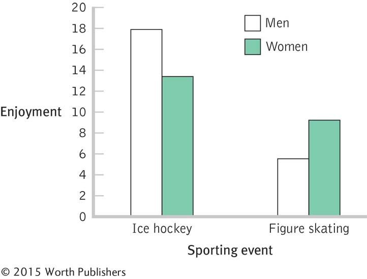
dfrows(gender) = Nrows − 1 = 2 − 1 = 1
dfcolumns(sport) = Ncolumns − 1 = 2 − 1 = 1
dfinteraction = (dfrows)(dfcolumns) = (1)(1) = 1
dfwithin = dfM,H + dfM,S + dfW,H + dfW,S = 3 + 3 + 3 + 3 = 12
dftotal = Ntotal − 1 = 16 − 1 = 15
We can also check that this answer is correct by adding all of the other degrees of freedom together:
1 + 1 + 1 + 12 = 15
The critical value for an F distribution with 1 and 12 degrees of freedom, at a p level of 0.01, is 9.33.
GM = 11.313
SStotal = Σ(X − GM)2 for each score = 475.438
X X − GM (X − GM )2 Men, hockey 19 7.687 59.090 17 5.687 32.342 18 6.687 44.716 17 5.687 32.342 Men, skating 6 − 5.313 28.228 4 − 7.313 53.480 8 − 3.313 10.976 3 − 8.313 69.106 Women, hockey 13 1.687 2.846 14 2.687 7.220 18 6.687 44.716 8 − 3.313 10.976 Women, skating 11 − 0.313 0.098 7 − 4.313 18.602 4 − 7.313 53.480 14 2.687 7.220 Σ = 475.438
Page C-48Sum of squares for gender: SSbetween(rows) =Σ(Mrow − GM)2 for each score = 0.560
X (MROW − GM ) (MROW − GM )2 Men, hockey 19 0.187 0.035 17 0.187 0.035 18 0.187 0.035 17 0.187 0.035 Men, skating 6 0.187 0.035 4 0.187 0.035 8 0.187 0.035 3 0.187 0.035 Women, hockey 13 − 0.188 0.035 14 − 0.188 0.035 18 − 0.188 0.035 8 − 0.188 0.035 Women, skating 11 − 0.188 0.035 7 − 0.188 0.035 4 − 0.188 0.035 14 − 0.188 0.035 Σ = 0.560
Sum of squares for sporting event: SSbetween(columns) = Σ(Mcolumn − GM)2 for each score = 280.560
X (MCOLUMN − GM ) (MCOLUMN − GM )2 Men, hockey 19 4.187 17.531 17 4.187 17.531 18 4.187 17.531 17 4.187 17.531 Men, skating 6 − 4.188 17.539 4 − 4.188 17.539 8 − 4.188 17.539 3 − 4.188 17.539 Women, hockey 13 4.187 17.531 14 4.187 17.531 18 4.187 17.531 8 4.187 17.531 Women, skating 11 − 4.188 17.539 7 − 4.188 17.539 4 − 4.188 17.539 14 − 4.188 17.539 Σ = 280.560
SSwithin = Σ(X − Mcell)2 for each score = 126.256
X (X − Mcell ) (X − Mcell )2 Men, hockey 19 1.25 1.563 17 − 0.75 0.563 18 0.25 0.063 17 − 0.75 0.563 Men, skating 6 0.75 0.563 4 − 1.25 1.563 8 2.75 7.563 3 − 2.25 5.063 Women, hockey 13 − 0.25 0.063 14 0.75 0.563 18 4.75 22.563 8 − 5.25 27.563 Women, skating 11 2 4.000 7 − 2 4.000 4 − 5 25.000 14 5 25.000 Σ = 126.256
We use subtraction to find the sum of squares for the interaction. We subtract all other sources from the total sum of squares, and the remaining amount is the sum of squares for the interaction.
SSgender×sport = SStotal − (SSgender + SSsport + SSwithin)
SSgender×sport = 475.438 − (0.560 + 280.560 + 126.256) = 68.062
SOURCE SS df MS F Gender 0.560 1 0.560 0.05 Sporting event 280.560 1 280.560 26.67 Gender × sport 68.062 1 68.062 6.47 Within 126.256 12 10.521 Total 475.438 15
12.21
| SOURCE | SS | df | MS | F |
| Gender | 248.25 | 1 | 248.25 | 8.07 |
| Parenting style | 84.34 | 3 | 28.113 | 0.91 |
| Gender × style | 33.60 | 3 | 11.20 | 0.36 |
| Within | 1107.2 | 36 | 30.756 | |
| Total | 1473.39 | 43 |
12.23 For the main effect A:
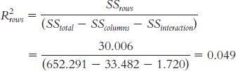
According to Cohen’s conventions, this is approaching a medium effect size.
For the main effect B:
According to Cohen’s conventions, this is approaching a medium effect size.
For the interaction:
According to Cohen’s conventions, this is smaller than a small effect size.
12.25
This study would be analyzed with a between-
groups ANOVA because different groups of participants were assigned to the different treatment conditions. This study could be redesigned to use a within-
groups ANOVA by testing the same group of participants on some myths repeated once and some repeated three times both when the participants are young and then again when they are old.
12.27
There are two independent variables. The first is gender, and its levels are male and female. The second is the gender of the person being sought, and its levels are same-
sex and opposite- sex. The dependent variable is the preferred maximum age difference.
He would use a two-
way between- groups ANOVA. He would use a 2 × 2 between-
groups ANOVA. The ANOVA would have four cells. This number is obtained by multiplying the number of levels of each independent variable (2 × 2).
Male Female Same- sex Same- sex; male Same- sex; female Opposite- sex Opposite- sex; male Opposite- sex; female
12.29
The first independent variable is the gender said to be most affected by the illness, and its levels are men and women. The second independent variable is the gender of the participant, and its levels are male and female. The dependent variable is level of comfort, on a scale of 1–
7. The researchers conducted a two-
way between- groups ANOVA. The reported statistics do indicate that there is a significant interaction because the probability associated with the F statistic for the interaction is less than 0.05.
Female Participants Male Participants Illness affects woman 4.88 3.29 Illness affects men 3.56 4.67 Bar graph for the interaction:
This is a qualitative interaction. Female participants indicated greater average comfort about attending a meeting regarding an illness that affects women than about attending a meeting regarding an illness that affects men. Male participants had the opposite pattern of results; male participants indicated greater average comfort about attending a meeting regarding an illness that affects men as opposed to one that affects women.
Female Participants Male Participants Illness affects women 4.88 4.80 Illness affects men 3.56 4.67 Note: There are several cell means that would work.
Page C-50Bar graph for the new means:
Female Participants Male Participants Illness affects women 4.88 5.99 Illness affects men 3.56 4.67
12.31
The first independent variable is the race of the face, and its levels are white and black. The second independent variable is the type of instruction given to the participants, and its levels are no instruction and instruction to attend to distinguishing features. The dependent variable is the measure of recognition accuracy.
The researchers conducted a two-
way between- groups ANOVA. The reported statistics indicate that there is a significant main effect of race. On average, the white participants who saw white faces had higher recognition scores than did white participants who saw black faces.
The main effect is misleading because those who received instructions to attend to distinguishing features actually had lower mean recognition scores for the white faces than did those who received no instruction, whereas those who received instructions to attend to distinguishing features had higher mean recognition scores for the black faces than did those who received no instruction.
The reported statistics do indicate that there is a significant interaction because the probability associated with the F statistic for the interaction is less than 0.05.
Black Face White Face No instruction 1.04 1.46 Distinguishing features instruction 1.23 1.38 Bar graph of findings:
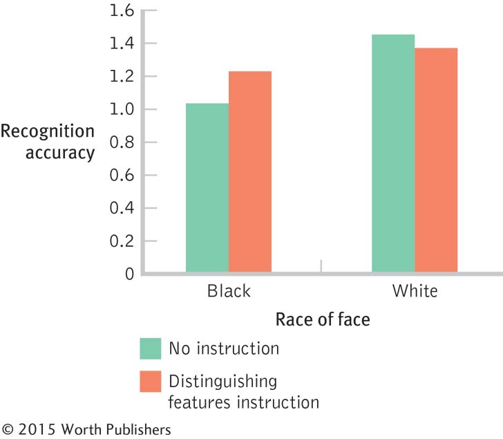
When given instructions to pay attention to distinguishing features of the faces, participants’ average recognition of the black faces was higher than when given no instructions, whereas their average recognition of the white faces was worse than when given no instruction. This is a qualitative interaction because the direction of the effect changes between black and white.
12.33
The first independent variable is gender of the seeker, and its levels are men and women. The second independent variable is gender of the person being sought, and its levels are men and women. The dependent variable is the oldest acceptable age of the person being sought.
Women Seekers Men Seekers Men sought 34.80 35.40 Women sought 36.00 27.20 Step 1: Population 1 (women, men) is women seeking men. Population 2 (men, women) is men seeking women. Population 3 (women, women) is women seeking women. Population 4 (men, men) is men seeking men. The comparison distributions will be F distributions. The hypothesis test will be a two-
way between- groups ANOVA. Assumptions: The data are not from random samples, so we must generalize with caution. The assumption of homogeneity of variance is violated because the largest variance (29.998) is much larger than the smallest variance (1.188). For the purposes of this exercise, however, we will conduct this ANOVA.
Step 2: Main effect of first independent variable—
gender of seeker: Null hypothesis: On average, men and women report the same oldest acceptable ages for a partner—
μM = μW. Page C-51Research hypothesis: On average, men and women report different oldest acceptable ages for a partner—
μM ≠ μW. Main effect of second independent variable—
gender of person sought: Null hypothesis: On average, those seeking men and those seeking women report the same oldest acceptable ages for a partner—
μM = μW. Research hypothesis: On average, those seeking men and those seeking women report different oldest acceptable ages for a partner—
μM ≠ μW. Interaction: Seeker × sought:
Null hypothesis: The effect of the gender of the seeker does not depend on the gender of the person sought.
Research hypothesis: The effect of the gender of the seeker does depend on the gender of the person sought.
Step 3: dfcolumns(seeker) = 2 − 1 = 1
dfrows(sought) = 2 − 1 = 1
dfinteraction = (1)(1) = 1
dfwithin = dfW,M + dfM,W + dfW,W + dfM,M
= 4 + 4 + 4 + 4 = 16
Main effect of gender of seeker: F distribution with 1 and 16 degrees of freedom
Main effect of gender of sought: F distribution with 1 and 16 degrees of freedom
Interaction of seeker and sought: F distribution with 1 and 16 degrees of freedom
Step 4: Cutoff F for main effect of seeker: 4.49
Cutoff F for main effect of sought: 4.49
Cutoff F for interaction of seeker and sought: 4.49
Step 5: SStotal = Σ(X − GM)2 = 454.559
SScolumn(seeker) = Σ(Mcolumn(seeker) − GM)2 = 84.050
SSrow(sought) = Σ(Mrow(sought) − GM)2 = 61.260
SSwithin = Σ(X − Mcell)2 = 198.800
SSinteraction = SStotal − (SSrow + SScolumn + SSwithin) = 110.449
SOURCE SS df MS F Seeker gender 84.050 1 84.050 6.76 Sought gender 61.260 1 61.260 4.93 Seeker × sought 110.449 1 110.449 8.89 Within 198.800 16 12.425 Total 454.559 19 Step 6: There is a significant main effect of gender of the seeker; it appears that women are willing to accept older dating partners, on average, than are men. There is also a significant main effect of gender of the person being sought; it appears that those seeking men are willing to accept older dating partners, on average, than are those seeking women. Additionally, there is a significant interaction between the gender of the seeker and the gender of the person being sought. Because there is a significant interaction, we ignore the main effects and report only the interaction.
There is a significant quantitative interaction because there is a difference for male seekers, but not for female seekers. We are not seeing a reversal of direction necessary for a qualitative interaction.
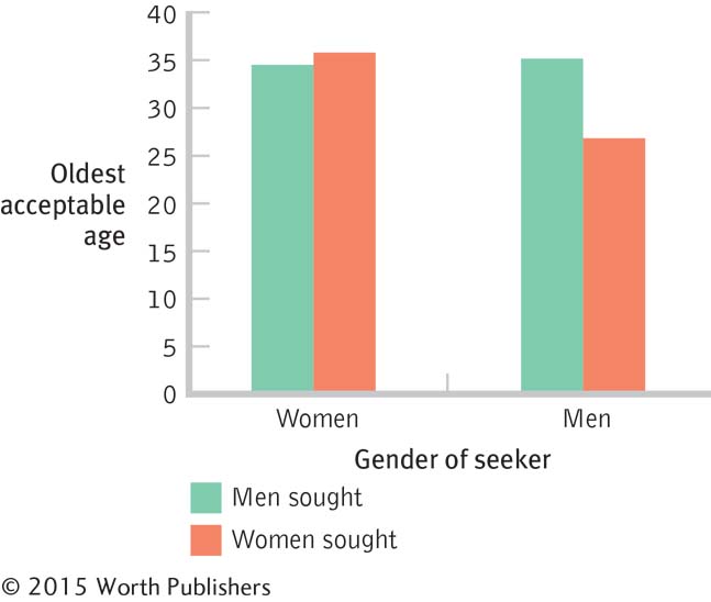
For the main effect of seeker gender:
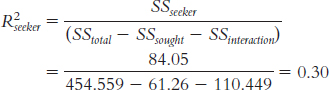
According to Cohen’s conventions, this is a large effect size.
For the main effect of sought gender:
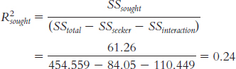
According to Cohen’s conventions, this is a large effect size.
For the interaction:
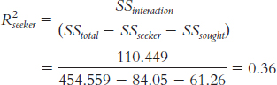
According to Cohen’s conventions, this is a large effect size.
12.35
The independent variables are type of payment, still with two levels, and level of payment, now with three levels (low, moderate, and high).The dependent variable is still willingness to help, as assessed with the 11-
point scale. Page C-52Low Amount Moderate Amount High Amount Cash payment 4.75 7.50 8.00 6.75 Candy payment 6.25 6.00 6.50 6.25 5.50 6.75 7.25 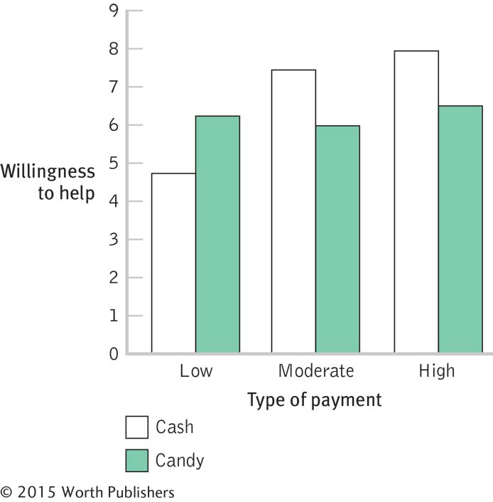
There does still seem to be the same qualitative interaction, such that the effect of the level of payment depends on the type of payment. When candy payments are used, the level seems to have no mean impact. However, when cash payments are used, a low level leads to a lower willingness to help, on average, than when candy is used, and a moderate or high level leads to a higher willingness to help, on average, than when candy is used.
Post hoc tests would be needed. Specifically, we would need to compare the three levels of payment to see where specific significant differences exist. Based on the graph we created, it appears as if willingness to help in the low payment condition is significantly lower, on average, than in the moderate and high conditions for payments.
12.37
The researchers conducted a two-
way between- groups ANOVA. By averaging the percentages for each pair of bars, we can estimate that the mean for sender is around 52 or 53, and the mean for receiver is around 47 or 48. So, there does appear to be a main effect of role in the negotiations. Senders—
the people who kick off the negotiations— end up doing better, on average, than do receivers. It does not seem that there is a main effect of type of information provided. The mean of the two bars for each is around 50.
There seems to be a qualitative interaction. It seems to be better to be the sender (the one initiating the negotiation if the sender is not providing information about areas in which she or he is willing to acquiesce, whereas it seems better to be the receiver if the sender is providing information about what she or he will settle for.
The y-axis should begin at 0. Otherwise, the graph would exaggerate the differences between groups.
12.39
The independent variables are type of feedback (levels: positive, negative), level of expertise (levels: novice, expert), and domain (level: feedback on language acquisition, pursuit of environmental causes, use of consumer products).
The dependent variable appears to be interest in instructor, seeking behavior, and response behavior.
This interaction is statistically significant, as the p value is less than 0.05.
The statistic missing from this report is a measure of effect size, such as R2. The effect size helps us figure out whether something that is statistically significant is also practically important.
The bar graph illustrates what appears to be a qualitative interaction. Experts sought and responded more to negative feedback than to positive feedback; novices sought and responded more to positive feedback than to negative feedback.
Suggestions may vary. The graph needs a clear, specific title; the y-axis should go down to 0; and the label on the y-axis should be rotated so that it reads left to right.
Chapter 13
13.1 A correlation coefficient is a statistic that quantifies the relation between two variables.
13.3 A perfect relation occurs when the data points fall exactly on the line we fit through the data. A perfect relation results in a correlation coefficient of − 1.0 or 1.0.
13.5 According to Cohen (1988), a correlation coefficient of 0.50 is a large correlation, and 0.30 is a medium one. However, it is unusual in social science research to have a correlation as high as 0.50. The decision of whether a correlation is worth talking about is sometimes based on whether it is statistically significant, as well as what practical effect a correlation of a certain size indicates.
13.7 When used to capture the relation between two variables, the correlation coefficient is a descriptive statistic. When used to draw conclusions about the greater population, such as with hypothesis testing, the coefficient serves as an inferential statistic.
13.9 Positive products of deviations, indicating a positive correlation, occur when both members of a pair of scores tend to result in a positive deviation or when both members tend to result in a negative deviation. Negative products of deviations, indicating a negative correlation, occur when members of a pair of scores tend to result in opposite-
13.11 (1) We calculate the deviation of each score from its mean, multiply the two deviations for each participant, and sum the products of the deviations. (2) We calculate a sum of squares for each variable, multiply the two sums of squares, and take the square root of the product of the sums of squares. (3) We divide the sum from step 1 by the square root in step 2.
13.13 Test–
13.15
These data appear to be negatively correlated.
These data appear to be positively correlated.
Neither; these data appear to have a very small correlation, if any.
13.17
− 0.28 is a medium correlation.
0.79 is a large correlation.
1.0 is a perfect correlation.
− 0.015 is almost no correlation.
13.19
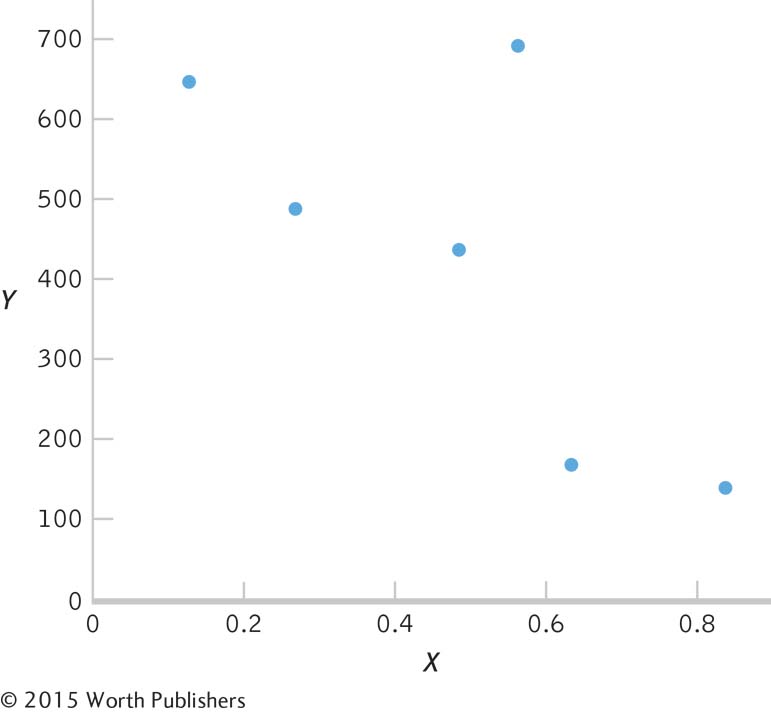
X (X − MX) Y (Y − MY ) (X − MX ) (Y − MY ) 0.13 − 0.36 645 218.50 − 78.660 0.27 − 0.22 486 59.50 − 13.090 0.49 0.00 435 8.50 0.000 0.57 0.08 689 262.50 21.000 0.84 0.35 137 − 289.50 − 101.325 0.64 0.13 167 − 259.50 − 38.925 MX = 0.49 MY = 426.5 Σ[(X − MX )(Y − MY)] = − 211.0
X (X − MX) (X − MX )2 Y (Y − MY ) (Y − MY )2 0.13 − 0.36 0.130 645 218.50 47,742.25 0.27 − 0.22 0.048 486 59.50 3540.25 0.49 0.00 0.000 435 8.50 72.25 0.57 0.08 0.006 689 262.50 68,906.25 0.84 0.35 0.123 137 − 289.50 83,810.25 0.64 0.13 0.023 167 − 259.50 67,340.25 Σ(X − MX)2 = 0.330 Σ(Y − MY )2 = 271,411.50

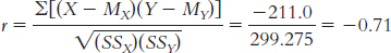
dfr = N − 2 = 6 − 2 = 4
− 0.811 and 0.811
13.21
X (X − MX ) Y (Y − MY ) (X − MX ) (Y − MY ) 40 −2.143 60 22.857 −48.983 45 2.857 55 17.857 51.017 20 −22.143 30 −7.143 158.167 75 32.857 25 −12.143 −398.983 15 −27.143 20 −17.143 465.312 35 −7.143 40 2.857 −20.408 65 22.857 30 −7.143 163.268 MX = 42.143 MY = 37.143 Σ[(X − MX)(Y − MY)] = 42.854
Page C-54X (X − MX) (X − MX)2 Y (Y − MY) (Y − MY )2 40 −2.143 4.592 60 22.857 522.442 45 2.857 8.162 55 17.857 318.872 20 −22.143 490.312 30 −7.143 51.022 75 32.857 1079.582 25 −12.143 147.452 15 −27.143 736.742 20 −17.143 293.882 35 −7.143 51.022 40 2.857 8.162 65 22.857 522.442 30 −7.143 51.022 Σ(X − MX )2 = 2892.854 Σ(Y − MY )2 = 1392.854
dfr = N − 2 = 7 − 2 = 5
− 0.754 and 0.754
13.23
dfr = N − 2 = 3113 − 2 = 3111. The highest degrees of freedom listed on the table is 100, with cutoffs of − 0.195 and 0.195.
dfr = N − 2 = 72 − 2 = 70; − 0.232 and 0.232
13.25 When using a measure to diagnose individuals, having a reliability of at least 0.90 is important—
13.27
Newman’s data do not suggest a correlation between Mercury’s phases and breakdowns. There was no consistency in the report of breakdowns during one of the phases.
Massey may observe a correlation because she already believes that there is a relation between astrological events and human events. As you learned in Chapter 5, the confirmation bias refers to the tendency to pay attention to those events that confirm our prior beliefs. The confirmation bias may lead Massey to observe an illusory correlation (i.e., she perceives a correlation that does not actually exist) because she attends only to those events that confirm her prior belief that the phase of Mercury is related to breakdowns.
Given that there are two phases of Mercury (and assuming they’re equal in length), half of the breakdowns that occur would be expected to occur during the retrograde phase and the other half during the nonretrograde phase, just by chance. Expected relative-
frequency probability refers to the expected frequency of events. So in this example we would expect 50% of breakdowns to occur during the retrograde phase and 50% during the nonretrograde phase. If we base our conclusions on only a small number of observations of breakdowns, the observed relative- frequency probability is more likely to differ from the expected relative- frequency probability because we are less likely to have a representative sample of breakdowns. This correlation would not be useful in predicting events in your own life because no relation would be observed in this limited time span.
Available data do not support the idea that a correlation exists between Mercury’s phases and breakdowns.
13.29
The accompanying scatterplot depicts the relation between hours of exercise and number of friends. Note that you could have chosen to put hours of exercise along the y-axis and number of friends along the x-axis.
The scatterplot suggests that as the number of hours of exercise each week increases from 0 to 5, there is an increase in the number of friends, but as the hours of exercise continue to increase past 5, there is a decrease in the number of friends.
It would not be appropriate to calculate a Pearson correlation coefficient with this set of data. The scatterplot suggests a nonlinear relation between exercise and number of friends, and the Pearson correlation coefficient measures only the extent of linear relation between two variables.
13.31 Step 1: Population 1: Adolescents like those we studied. Population 2: Adolescents for whom there is no relation between externalizing behavior and anxiety. The comparison distribution is made up of correlation coefficients based on many, many samples of our size, 10 people, randomly selected from the population.
We do not know if the data were randomly selected (first assumption), so we must be cautious when generalizing the findings. We also do not know if the underlying population distribution for externalizing behaviors and anxiety in adolescents is normally distributed (second assumption).The sample size is too small to make any conclusions about this assumption, so we should proceed with caution. The third assumption, unique to correlation, is that the variability of one variable is equal across the levels of the other variable. Because we have such a small data set, it is difficult to evaluate this. However, we can see from the scatterplot that the data are somewhat consistently variable.
Step 2: Null hypothesis: There is no correlation between externalizing behavior and anxiety among adolescents—
Research hypothesis: There is a correlation between externalizing behavior and anxiety among adolescents—
Step 3: The comparison distribution is a distribution of Pearson correlations, r, with the following degrees of freedom: dfr = N − 2 = 10 − 2 = 8.
Step 4: The critical values for an r distribution with 8 degrees of freedom for a two-
Step 5: The Pearson correlation coefficient is calculated in three steps. First, we calculate the numerator:
| X | (X − MX ) | Y | (Y − MY ) | (X − MX) (Y − MY ) |
| 9 | 2.40 | 37 | 7.60 | 18.24 |
| 7 | 0.40 | 23 | −6.40 | −2.56 |
| 7 | 0.40 | 26 | −3.40 | −1.36 |
| 3 | −3.60 | 21 | −8.40 | 30.24 |
| 11 | 4.40 | 42 | 12.60 | 55.44 |
| 6 | −0.60 | 33 | 3.60 | −2.16 |
| 2 | −4.60 | 26 | −3.40 | 15.64 |
| 6 | −0.60 | 35 | 5.60 | −3.36 |
| 6 | −0.60 | 23 | −6.40 | 3.84 |
| 9 | 2.40 | 28 | −1.40 | −3.36 |
MX = 6.60 MY = 29.40 Σ[(X − MX )(Y − MY )] = 110.60
Second, we calculate the denominator:
| X | (X − MX ) | (X − MX )2 | Y | (Y − MY ) | (Y − MY )2 |
| 9 | 2.40 | 5.76 | 37 | 7.60 | 57.76 |
| 7 | 0.40 | 0.16 | 23 | −6.40 | 40.96 |
| 7 | 0.40 | 0.16 | 26 | −3.40 | 11.56 |
| 3 | −3.60 | 12.96 | 21 | −8.40 | 70.56 |
| 11 | 4.40 | 19.36 | 42 | 12.60 | 158.76 |
| 6 | −0.60 | 0.36 | 33 | 3.60 | 12.96 |
| 2 | −4.60 | 21.16 | 26 | −3.40 | 11.56 |
| 6 | −0.60 | 0.36 | 35 | 5.60 | 31.36 |
| 6 | −0.60 | 0.36 | 23 | −6.40 | 40.96 |
| 9 | 2.40 | 5.76 | 28 | −1.40 | 1.96 |
Σ(X − MX )2 = 66.40 Σ(Y − MY )2 = 438.40

Finally, we compute r:
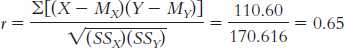
The test statistic, r = 0.65, is larger in magnitude than the critical value of 0.632. We can reject the null hypothesis and conclude that there is a strong positive correlation between the number of externalizing behaviors performed by adolescents and their level of anxiety.
13.33
You might expect a person who owns a lot of cats to tend to have many mental health problems. Because the two variables are positively correlated, as cat ownership increases, the number of mental health problems tends to increase.
You might expect a person who owns no cats or just one cat to tend to have few mental health problems. Because the variables are positively correlated, people who have a low score on one variable are also likely to have a low score on the other variable.
You might expect a person who owns a lot of cats to tend to have few mental health problems. Because the two variables are negatively related, as one variable increases, the other variable tends to decrease. This means a person who owns a lot of cats would likely have a low score on the mental health variable.
You might expect a person who owns no cats or just one cat to tend to have many mental health problems. Because the two variables are negatively related, as one variable decreases, the other variable tends to increase, which means that a person with fewer cats would likely have more mental health problems.
13.35
The accompanying scatterplot depicts a negative linear relation between perceived femininity and perceived trauma. Because the relation appears linear, it is appropriate to calculate the Pearson correlation coefficient for these data. (Note: The number (2) indicates that two participants share that pair of scores.)
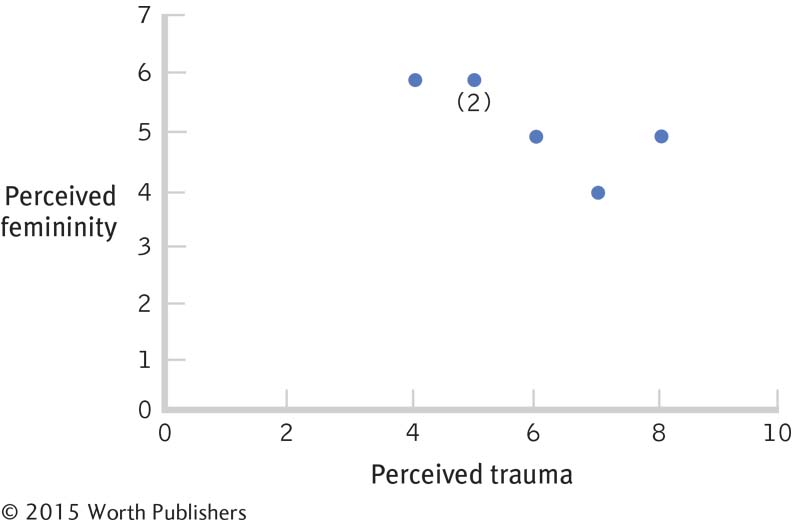 Page C-56
The Pearson correlation coefficient is calculated in three steps. Step 1 is calculating the numerator:
X (X − MX ) Y (Y − MY ) (X − MX )(Y − MY ) 5 −0.833 6 0.667 −0.556 6 0.167 5 −0.333 −0.056 4 −1.833 6 0.667 −1.223 5 −0.833 6 0.667 −0.556 7 1.167 4 −1.333 −1.556 8 2.167 5 −0.333 −0.722 MX = 5.833 MY = 5.333 Σ[(X − MX )(Y − MY )] = − 4.669
Step 2 is calculating the denominator:
X (X − MX) (X − MX)2 Y (Y − MY) (Y − MY)2 5 −0.833 0.694 6 0.667 0.445 6 0.167 0.028 5 −0.333 0.111 4 −1.833 3.360 6 0.667 0.445 5 −0.833 0.694 6 0.667 0.445 7 1.167 1.362 4 −1.333 1.777 8 2.167 4.696 5 −0.333 0.111 Σ[(X − MX )2 = 10.834 Σ(Y − MY )2 = 3.334

Step 3 is computing r:
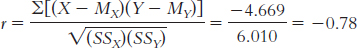
The correlation coefficient reveals a strong negative relation between perceived femininity and perceived trauma; as trauma increases, perceived femininity tends to decrease.
Those participants who had positive deviation scores on trauma tended to have negative deviation scores on femininity (and vice versa), meaning that when a person’s score on one variable was above the mean for that variable (positive deviation), his or her score on the second variable was typically below the mean for that variable (negative deviation). So, having a high score on one variable was associated with having a low score on the other, which is a negative correlation.
13.37
The scatterplot below depicts a positive linear relation between perceived trauma and perceived masculinity. The data appear to be linearly related; therefore, it is appropriate to calculate a Pearson correlation coefficient.
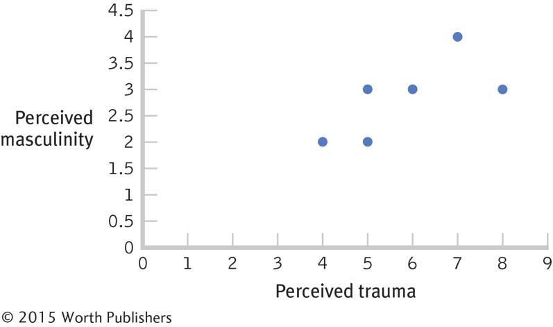
The Pearson correlation coefficient is calculated in three steps. Step 1 is calculating the numerator:
X (X − MX ) Y (Y − MY ) (X − MX )(Y − MY ) 5 −0.833 3 0.167 −0.139 6 0.167 3 0.167 0.028 4 −1.833 2 −0.833 1.527 5 −0.833 2 −0.833 0.694 7 1.167 4 1.167 1.362 8 2.167 3 0.167 0.362 MX = 5.833 MY = 2.833 Σ[(X − MX )(Y − MY)] = 3.834
Step 2 is calculating the denominator:
X (X − MX ) (X − MX )2 Y (Y − MY ) (Y − MY )2 5 −0.833 0.694 3 0.167 0.028 6 0.167 0.028 3 0.167 0.028 4 −1.833 3.360 2 −0.833 0.694 5 −0.833 0.694 2 −0.833 0.694 7 1.167 1.362 4 1.167 1.362 8 2.167 4.696 3 0.167 0.028 Σ[(X − MX )2 = 10.834 Σ(Y − MY )2 = 2.834

Step 3 is computing r:
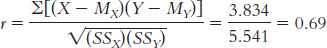
The correlation coefficient is large and positive. This means that as ratings of trauma increased, ratings of masculinity tended to increase as well.
For most of the participants, the sign of the deviation for the traumatic variable is the same as that for the masculinity variable, which indicates that those participants scoring above the mean on one variable also tended to score above the mean on the second variable (and likewise for the lowest scores). Because the scores for each participant tend to fall on the same side of the mean, this is a positive relation.
Page C-57When the soldier was a woman, the perception of the situation as traumatic was strongly negatively correlated with the perception of the woman as feminine. This relation is opposite that observed when the soldier was a man. When the soldier was a man, the perception of the situation as traumatic was strongly positively correlated with the perception of the man as feminine. Regardless of whether the soldier was a man or a woman, there was a positive correlation between the perception of the situation as traumatic and the perception of masculinity, but the observed correlation was stronger for the perceptions of women than for the perceptions of men.
13.39
Because your friend is running late, she is likely more concerned about traffic than she otherwise would be. Thus, she may take note of traffic only when she is running late, leading her to believe that the amount of traffic correlates with how late she is. Furthermore, having this belief, in the future she may think only of cases that confirm her belief that a relation exists between how late she is and traffic conditions, reflecting a confirmation bias. Alternatively, traffic conditions might be worse when your friend is running late, but that could be a coincidence. A more systematic study of the relation between your friend’s behavior and traffic conditions would be required before she could conclude that a relation exists.
There are a number of possible answers to this question. For example, we could operationalize the degree to which she is late as the number of minutes past her intended departure time that she gets in the car. We could operationalize the amount of traffic as the number of minutes the car is being driven at less than the speed limit (given that your friend would normally drive right at the speed limit).
13.41
The reporter suggests that convertibles are not generally less safe than other cars.
Convertibles may be driven less often than other cars, as they may be considered primarily a recreational vehicle. If they are driven less, owners have fewer chances to get into accidents while driving them.
A more appropriate comparison may be to determine the number of fatalities that occur per every 100 hours driven in various kinds of cars.
13.43
The researchers are suggesting that participation in arts education programs causes students to tend to perform better and stay in school longer.
It could be that those students who perform better and stay in school longer are more likely to be interested in, and therefore participate in, arts education programs.
There are many possible answers. For example, the socioeconomic status of the students’ families may be associated with performance in school, years of schooling, and participation in arts education programs, with higher socioeconomic status tending to lead to improved performance, staying in school longer, and higher participation in arts education programs.
13.45
It appears that the data are somewhat positively correlated.
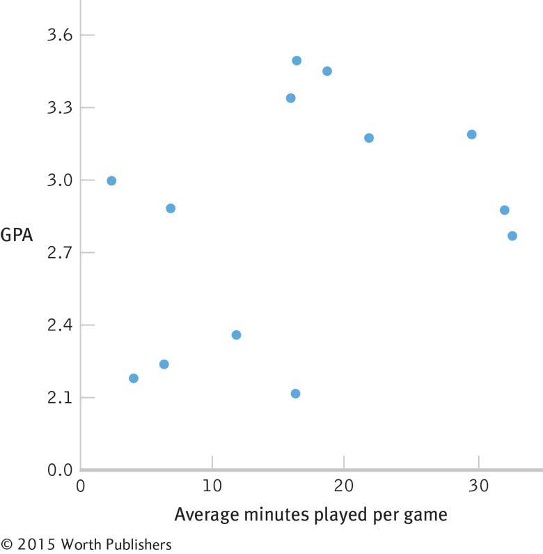
The Pearson correlation coefficient is calculated in three steps. Step 1 is calculating the numerator:
X (X − MX) Y (Y − MY) (X − MX) (Y − MY) 29.70 13.159 3.20 0.343 4.514 32.14 15.599 2.88 0.023 0.359 32.72 16.179 2.78 −0.077 −1.246 21.76 5.219 3.18 0.323 1.686 18.56 2.019 3.46 0.603 1.217 16.23 −0.311 2.12 −0.737 0.229 11.80 −4.741 2.36 −0.497 2.356 6.88 −9.661 2.89 0.033 −0.319 6.38 −10.161 2.24 −0.617 6.269 15.83 −0.711 3.35 0.493 −0.351 2.50 −14.041 3.00 0.143 −2.008 4.17 −12.371 2.18 −0.677 8.375 16.36 −0.181 3.50 0.643 −0.116 MX = 16.541 MY = 2.857 Σ[(X − MX)(Y − MY )] = 20.965
Page C-58Step 2 is calculating the denominator:
X (X − MX) (X − MX)2 Y (Y − MY) (Y − MY)2 29.70 13.159 173.159 3.20 0.343 0.118 32.14 15.599 243.329 2.88 0.023 0.001 32.72 16.179 261.760 2.78 −0.077 0.006 21.76 5.219 27.238 3.18 0.323 0.104 18.56 2.019 4.076 3.46 0.603 0.364 16.23 −0.311 0.097 2.12 −0.737 0.543 11.80 −4.741 22.477 2.36 −0.497 0.247 6.88 −9.661 93.335 2.89 0.033 0.001 6.38 −10.161 103.246 2.24 −0.617 0.381 15.83 −0.711 0.506 3.35 0.493 0.243 2.50 −14.041 197.150 3.00 0.143 0.020 4.17 −12.371 153.042 2.18 −0.677 0.458 16.36 −0.181 0.033 3.50 0.643 0.413. Σ(X − MX )2 = 1279.448 Σ(Y − MY )2 = 2.899

Step 3 is computing r:
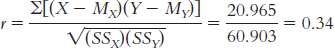
We computed the correlation coefficient for these data to explore whether there was a relation between GPA and playing time for the members of this team. If we were interested in making a statement about athletes in general, an inferential analysis, we would want to collect more data from a random or representative sample and conduct a hypothesis test.
Step 1: Population 1: Athletes like those we studied. Population 2: Athletes for whom there is no relation between minutes played and GPA. The comparison distribution is made up of many, many correlation coefficients based on samples of our size, 13 people, randomly selected from the population.
We know that these data were not randomly selected (first assumption), so we must be cautious when generalizing the findings. We also do not know if the underlying population distributions are normally distributed (second assumption).The sample size is too small to make any conclusions about this assumption, so we should proceed with caution. The third assumption, unique to correlation, is that the variability of one variable is equal across the levels of the other variable. Because we have such a small data set, it is difficult to evaluate this.
Step 2: Null hypothesis: There is no correlation between participation in athletics, as measured by minutes played on average, and GPA—
H0: ρ = 0. Research hypothesis: There is a correlation between participation in athletics and GPA—
H1: ρ ≠ 0. Step 3: The comparison distribution is a distribution of Pearson correlation coefficients, r, with the following degrees of freedom: dfr = N − 2 = 13 − 2 = 11.
Step 4: The critical values for an r distribution with 11 degrees of freedom for a two-
tailed test with a p level of 0.05 are −0.553 and 0.553. Step 5: r = 0.34, as calculated in part (b).
Step 6: The test statistic, r = 0.34, is not larger in magnitude than the critical value of 0.553, so we fail to reject the null hypothesis. We cannot conclude that a relation exists between these two variables. Because the sample size is rather small and we calculated a medium correlation with this small sample, we would be encouraged to collect more data to increase statistical power so that we may more fully explore this relation.
Because the results are not statistically significant, we cannot draw any conclusion, except that we do not have enough information.
We could have collected these data randomly, rather than looking at just one team. We also could have collected a larger sample size. In order to say something about causation, we could manipulate average minutes played to see whether that manipulation results in a change in GPA. Because very few coaches would be willing to let us do that, we would have a difficult time conducting such an experiment.
13.47
If students were marked down for talking about the rooster rather than the cow, the reading test would not meet the established criteria. The question asked on the test is ambiguous because the information regarding what caused the cow’s behavior to change is not explicitly stated in the story. Furthermore, the correct answer to the question provided on the Web site is not actually an answer to the question itself. The question states, “What caused Brownie’s behavior to change?” The answer that the cow started out kind and ended up mean is a description of how her behavior changed, not what caused her behavior to change. This question does not appear to be a valid question because it does not appear to provide an accurate assessment of students’ writing ability.
One possible third variable that could lead to better performance in some schools over others is the average socioeconomic status of the families whose children attend the school. Schools in wealthier areas or counties would have students of higher socioeconomic status, who might be expected to perform better on a test of writing skill. A second possible third variable that could lead to better performance in some schools over others is the type of reading and writing curriculum implemented in the school. Different ways of teaching the material may be more effective than others, regardless of the effectiveness of the teachers who are actually presenting the material.
13.49
The participants in the study are the various countries on which rates were obtained.
The two variables are health care spending and health, as assessed by life expectancy. Health care spending was operationalized as the amount spent per capita on health care, whereas life expectancy is the average age at death. Another way to operationalize health could be rates of various diseases, such as heart disease, or obesity via body mass index (BMI).
Page C-59The study finding was that there is a negative correlation between health care spending and life expectancy, in which countries, such as the United States, that have higher rates of spending on health care per capita have lower life expectancies. One would suspect the opposite to be true, that the more a country spends on health care, the healthier the population would be, thus resulting in higher life expectancy.
Other possible third variables could be the typical body weight in a country, the typical exercise levels in a country, accident rates, access to health care, access or knowledge of preventative health measures, stereotypes, or a country’s typical diet.
This study is a correlational study, not a true experiment, because countries were not assigned to certain levels of health care spending, and then assessed for life expectancy. The data were obtained from naturally occurring events.
It would not be possible to conduct a true experiment on this topic as this would require a manipulation in the health care spending for various countries for the entire population for a long period of time, which would not be realistic, practical, or ethical to implement.
13.51
High school athletic participation might be operationalized as a nominal variable by indicating whether a student participates in athletics (levels: yes or no), or by categorizing each student according to the type of athletics (levels: none, football, baseball, etc.) in which they participate.
High school athletic participation might be operationalized as a scale variable by counting the number of sports in which a student participates (e.g., 0, 1, 2), or by counting the number of days on which a student participates in sports annually.
Correlation is a useful tool to quantify the relation between two scale variables, especially when manipulation of either variable does not or cannot occur, and measuring either variable on a nominal or ordinal level would result in information being lost.
The researchers reported the following positive correlations: high school athletic participation and high school GPA; high school athletic participation and college completion; high school athletic participation and earnings as an adult; and high school athletic participation and various positive health behaviors. There are several other positive correlations among only male students; they include the following: high school athletic performance and alcohol consumption; high school athletic performance and sexist attitudes; high school athletic performance and homophobic attitudes; and high school athletic performance and violence. These are all positive correlations because as high school athletic participation increases, so does each of these variables.
There are no negative correlations reported; in all cases, an increase in one variable tended to accompany an increase in the other variable.
One possible causal explanation is that high school athletic participation (A) tends to cause positive health behaviors (B). A second possible causal explanation is that positive health behaviors (B) tend to cause high school athletic participation (A). A third possible causal explanation is that some other variable, such as socioeconomic status (C), could tend to affect both high school athletic participation and positive health behaviors.
Chapter 14
14.1 Regression allows us to make predictions based on the relation established in the correlation. Regression also allows us to consider the contributions of several variables.
14.3 There is no difference between these two terms. They are two ways to express the same thing.
14.5 a is the intercept, the predicted value for Y when X is equal to 0, which is the point at which the line crosses, or intercepts, the y-axis. b is the slope, the amount that Y is predicted to increase for an increase of 1 in X.
14.7 The intercept is not meaningful or useful when it is impossible to observe a value of 0 for X. If height is being used to predict weight, it would not make sense to talk about the weight of someone with no height.
14.9 The line of best fit in regression means that we couldn’t make the line a little steeper, or raise or lower it, in any way that would allow it to represent those dots any better than it already does. This is why we can look at the scatterplot around this line and observe that the line goes precisely through the middle of the dots. Statistically, this is the line that leads to the least amount of error in prediction.
14.11 Data points clustered closely around the line of best fit are described by a small standard error of the estimate; this allows us to have a high level of confidence in the predictive ability of the independent variable. Data points clustered far away from the line of best fit are described by a large standard error of the estimate, and result in our having a low level of confidence in the predictive ability of the independent variable.
14.13 If regression to the mean did not occur, every distribution would look bimodal, like a valley. Instead, the end result of the phenomenon of regression to the mean is that things look unimodal, like a hill or what we call the normal, bell-
14.15 The sum of squares total, SStotal, represents the worst-
14.17 The basic steps to calculate the proportionate reduction in error are: (1) Determine the error associated with using the mean as the predictor. (2) Determine the error associated with using the regression equation as the predictor. (3) Subtract the error associated with the regression equation from the error associated with the mean. (4) Divide the difference (calculated in step 3) by the error associated with using the mean.
14.19 An orthogonal variable is an independent variable that makes a separate and distinct contribution in the prediction of a dependent variable, as compared with the contributions of another independent variable.
14.21 Multiple regression is often more useful than simple linear regression because it allows us to take into account the contribution of multiple independent variables, or predictors, and increase the accuracy of prediction of the dependent variable, thus reducing the prediction error. Because behaviors are complex and tend to be influenced by many factors, multiple regression allows us to better predict a given outcome.
14.23
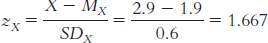
zŶ = (rXY)(zX) = (0.31)(1.667) = 0.517
Ŷ = zŶ(SDY) + MY = (0.517)(3.2) + 10 = 11.65
14.25
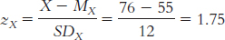
zŶ = (rXY)(zX) = (0.19)(1.75) = −0.333
Ŷ = zŶ(SDY) + MY = (−0.333)(95) + 1000 = 968.37
The y intercept occurs when X is equal to 0. We start by finding a z score:
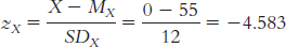
This is the z score for an X of 0. Now we need to figure out the predicted z score on Y for this X value:
zŶ = (rXY)(zX) = (−0.19)(−4.583) = −0.871
The final step is to convert the predicted z score on this predicted Y to a raw score:
Ŷ = zŶ(SDY) + MY = (0.871)(95) + 1000 = 1082.745
This is the y intercept.
The slope can be found by comparing the predicted Y value for an X value of 0 (the intercept) and an X value of 1. Using the same steps as in part (a), we can compute the predicted Y score for an X value of 1.
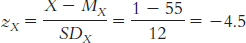
This is the z score for an X of 1. Now we need to figure out the predicted z score on Y for this X value:
zŶ = (rXY)(zX) = (−0.19)(−4.5) = 0.855
The final step is to convert the predicted z score on this predicted Y to a raw score:
Ŷ = zŶ(SDY) + MY = (0.855)(95) + 1000 = 1081.255
We compute the slope by measuring the change in Y with this 1-
unit increase in X: 1081.225 − 1082.745 = − 1.52
This is the slope.
Ŷ = 1082.745 − 1.52(X)
In order to draw the line, we have one more Ŷ value to compute. This time we can use the regression equation to make the prediction:
Ŷ = 1082.745 − 1.52(48) = 1009.785
Now we can draw the regression line.
14.27
Ŷ = 49 + (− 0.18)(X) = 49 + ( − 0.18)(− 31) = 54.58
Ŷ = 49 + (− 0.18)(65) = 37.3
Ŷ = 49 + (− 0.18)(14) = 46.48
14.29
The sum of squared error for the mean, SStotal:
X Y MY Error Squared Error 4 6 6.75 −0.75 0.563 6 3 6.75 −3.75 14.063 7 7 6.75 0.25 0.063 8 5 6.75 −1.75 3.063 9 4 6.75 −2.75 7.563 10 12 6.75 5.25 27.563 12 9 6.75 2.25 5.063 14 8 6.75 1.25 1.563 SStotal = Σ(Y − MY)2 = 59.504
The sum of squared error for the regression equation, SSerror:
X Y Regression Equation Y Error (Y − Ŷ) Squared Error 4 6 Ŷ = 2.643 + 0.469(4) = 4.519 1.481 2.193 6 3 Ŷ = 2.643 + 0.469(6) = 5.457 −2.457 6.037 7 7 Ŷ = 2.643 + 0.469(7) = 5.926 1.074 1.153 8 5 Ŷ = 2.643 + 0.469(8) = 6.395 −1.395 1.946 9 4 Ŷ = 2.643 + 0.469(9) = 6.864 −2.864 8.202 10 12 Ŷ = 2.643 + 0.469(10) = 7.333 4.667 21.781 12 9 Ŷ = 2.643 + 0.469(12) = 8.271 0.729 0.531 14 8 Ŷ = 2.643 + 0.469(14) = 9.209 −1.209 1.462 SSerror = Σ(Y − Ŷ)2 = 43.305
Page C-61The proportionate reduction in error for these data:
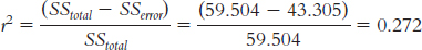
This calculation of r2, 0.272, equals the square of the correlation coefficient, r2 = (0.52)(0.52) = 0.270. These numbers are slightly different due to rounding decisions.
The standardized regression coefficient is equal to the correlation coefficient for simple linear regression, 0.52. We can also check that this is correct by computing β:
X (X − MX ) (X − MX )2 Y (Y − MY ) (Y − MY )2 4 −4.75 22.563 6 −0.75 0.563 6 −2.75 7.563 3 −3.75 14.063 7 −1.75 3.063 7 0.25 0.063 8 −0.75 0.563 5 −1.75 3.063 9 0.25 0.063 4 −2.75 7.563 10 1.25 1.563 12 5.25 27.563 12 3.25 10.563 9 2.25 5.063 14 5.25 27.563 8 1.25 1.563 Σ(X − MX)2 = 73.504 Σ(Y − MY)2 = 59.504
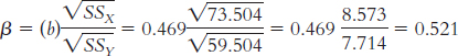
14.31
Ŷ = 1.675 + (0.001)(XSAT) + ( − 0.008) (Xrank); or
Ŷ = 1.675 + 0.001 (XSAT) − 0.008(Xrank)
Ŷ = 1.675 + (0.001)(1030) − 0.008(41)
= 1.675 + 1.03 − 0.328 = 2.377
Ŷ = 1.675 + (0.001)(860) − 0.008(22)
= 1.675 + 0.86 − 0.176 = 2.359
Ŷ = 1.675 + (0.001)(1060) − 0.008(8)
= 1.675 + 1.06 − 0.064 = 2.671
14.33
Outdoor temperature is the independent variable.
Number of hot chocolates sold is the dependent variable.
As the outdoor temperature increases, we would expect the sale of hot chocolate to decrease.
There are several possible answers to this question. For example, the number of fans in attendance may positively predict the number of hot chocolates sold. The number of children in attendance may also positively predict the number of hot chocolates sold. The number of alternative hot beverage choices may negatively predict the number of hot chocolates sold.
14.35
X = z(σ) + μ = − 1.2(0.61) + 3.51 = 2.778. This answer makes sense because the raw score of 2.778 is a bit more than 1 standard deviation below the mean of 3.51.
X = z(σ) + μ = 0.66(0.61) + 3.51 = 3.913. This answer makes sense because the raw score of 3.913 is slightly more than 0.5 standard deviation above the mean of 3.51.
14.37
3.12
3.16
3.18
The accompanying graph depicts the regression line for GPA and hours studied.
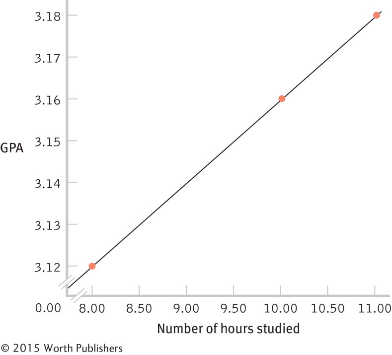
We can calculate the number of hours one would need to study in order to earn a 4.0 by substituting 4.0 for in the regression equation and solving for X: 4.0 = 2.96 + 0.02(X). To isolate the X, we subtract 2.96 from the left side of the equation and divide by 0.02: X = (4.0 − 2.96)/0.02 = 52. This regression equation predicts that we would have to study 52 hours per week in order to earn a 4.0. It is misleading to make predictions about what will happen when a person studies this many hours because the regression equation for prediction is based on a sample that studied far fewer hours. Even though the relation between hours studied and GPA was linear within the range of studied scores, outside of that range it may have a different slope or no longer be linear, or the relation may not even exist.
14.39
We cannot conclude that cola consumption causes a decrease in bone mineral density because there are a number of different kinds of causal relations that could lead to the predictive relation observed by Tucker and colleagues. There may be some characteristic about these older women that both causes them to drink cola and leads to a decrease in bone mineral density. For example, perhaps overall poorer health habits lead to an increased consumption of cola and a decrease in bone mineral density.
Multiple regression allows us to assess the contributions of more than one independent variable to the outcome, the dependent variable. Performing this multiple regression allowed the researchers to explore the unique contributions of a third variable, such as physical activity, in addition to bone density.
Physical activity might produce an increase in bone mineral density, as exercise is known to increase bone density. Conversely, it is possible that physical activity might produce a decrease in cola consumption because people who exercise more might drink beverages that are more likely to keep them hydrated (such as water or sports drinks).
Calcium intake should produce an increase in bone mineral density, thereby producing a positive relation between calcium intake and bone density. It is possible that consumption of cola means less consumption of beverages with calcium in them, such as milk, producing a negative relation between cola consumption and bone density.
14.41
Ŷ = 24.698 + 0.161(X), or predicted year 3 anxiety = 24.698 + 0.161 (year 1 depression)
As depression at year 1 increases by 1 point, predicted anxiety at year 3 increases, on average, by the slope of the regression equation, which is 0.161.
We would predict that her year 3 anxiety score would be 26.31.
We would predict that his year 3 anxiety score would be 25.02.
14.43
The independent variable in this study was marital status, and the dependent variable was chance of breaking up.
It appears that the researchers initially conducted a simple linear regression and then conducted a multiple regression analysis to account for the other variables (e.g., age, financial status) that may have been confounded with marital status in predicting the dependent variable.
Answers will differ, but the focus should be on the statistically significant contribution these other variables had in predicting the dependent variable, which appear to be more important than, and perhaps explain, the relation between marital status and the break-
up of the relationship. Another “third variable” in this study could have been length of relationship before child was born. Married couples may have been together longer than cohabitating couples, and it may be that those who were together longer before the birth of the child, regardless of their marital status, are more likely to stay together than those who had only been together for a short period of time prior to the birth.
14.45
Multiple regression may have been used to predict countries’ diabetes rates based on consumption of sugar while controlling for rates of obesity and other variables.
Accounting for other factors allowed Bittman to exclude the impact of potentially confounding variables. This is important as there are other variables, such as rates of obesity, that could have contributed to the relation between sugar consumption and rates of diabetes across countries. Factoring out other variables allows us to eliminate these potential confounds as explanations for a relation.
Numerous other factors may have been included. For example, the researchers may have controlled for countries’ gross domestic product, median educational attainment, health care spending, unemployment rates, and so on.
Let’s consider the A-
B- C model of understanding possible causal explanations within correlation to understand why it is most likely that A (sugar consumption) causes B (rates of diabetes). First, it doesn’t make sense that B (rates of diabetes) causes A (increased sugar consumption). Second, although it’s still possible that one or more additional variables (C) account for the relation between A (sugar consumption) and B (diabetes rates), this explanation is not likely because the researchers controlled for most of the obvious possible confounding variables.
14.47
To predict the number of hours João studies per week, we use the formula zŶ = (rXY)(zX) to find the predicted z score for the number of hours he studies; then we can transform the predicted z score into his raw score. First, translate his predicted raw score for age into a z score for age:
 . Then calculate his predicted z score for number of hours studied: zŶ = (rXY)(zX) = (0.49)(1.677) = 0.82. Finally, translate the z score for hours studied into the raw score for hours studied: Ŷ = 0.82(5.582) + 14.2 = 18.777.
First, translate Kimberly’s age raw score into an age z score:
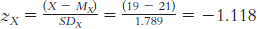 . Then calculate the predicted z score for hours studied: zŶ = (rXY)(zX) = (0.49)(−1.118) = −0.548. Finally, translate the z score for hours studied into the raw score for hours studied: Ŷ = − 0.548(5.582) + 14.2 = 11.141.
Seung’s age is well above the mean age of the students sampled. The relation that exists for traditional-
aged students may not exist for students who are much older. Extrapolating beyond the range of the observed data may lead to erroneous conclusions. From a mathematical perspective, the word regression refers to a tendency for extreme scores to drift toward the mean. In the calculation of regression, the predicted score is closer to its mean (i.e., less extreme) than the score used for prediction. For example, in part (a) the z score used for predicting was 1.677 and the predicted z score was 0.82, a less extreme score. Similarly, in part (b) the z score used for predicting was −1.118 and the predicted z score was − 0.548, which is again a less extreme score.
First, we calculate what we would predict for Y when X equals 0; that number, − 17.908, is the intercept.
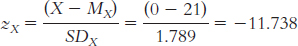
zŶ = (rXY)(zX) = (0.49)(−11.738) = −5.752
Ŷ = zŶ(SDY) + MY = −5.752(5.582) + 14.2 = −17.908
Note that the reason this prediction is negative (it doesn’t make sense to have a negative number of hours) is that the number for age, 0, is not a number that would actually be used in this situation—
it’s another example of the dangers of extrapolation, but it still is necessary to determine the regression equation. Then we calculate what we would predict for Y when X equals 1: the amount that that number, −16.378, differs from the prediction when X equals 0 is the slope.
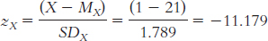
zŶ = (rXY)(zX) = (0.49)(−11.179) = −5.478
Ŷ = zŶ(SDY) + MY = −5.478(5.582) + 14.2 = −16.378
When X equals 0, − 17.908 is the prediction for Y. When X equals 1, − 16.378 is the prediction for Y. The latter number is 1.530 higher [ − 16.378 − ( − 17.908) = 1.530]—that is, more positive—
than the former. Remember when you’re calculating the difference to consider whether the prediction for Y was more positive or more negative when X increased from 0 to 1. Page C-63Thus, the regression equation is: Ŷ = −17.91 + 1.53(X).
Substituting 17 for X in the regression equation for part (e) yields 8.1. Substituting 22 for X in the regression equation yields 15.75. We would predict that a 17-
year- old would study 8.1 hours and a 22- year- old would study 15.75 hours. The accompanying graph depicts the regression line for predicting hours studied per week from a person’s age.
It is misleading to include young ages such as 0 and 5 on the graph because people of that age would never be college students.
The accompanying graph shows the scatterplot and regression line relating age and number of hours studied. Vertical lines from each observed data point are drawn to the regression line to represent the error prediction from the regression equation.
The accompanying scatterplot relating age and number of hours studied includes a horizontal line at the mean number of hours studied. Vertical lines between the observed data points and the mean represent the amount of error in predicting from the mean.
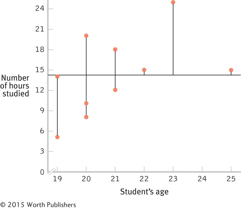
There appears to be less error in part (i), where the regression line is used to predict hours studied. This occurs because the regression line is the line that minimizes the distance between the observed scores and the line drawn through them. That is, the regression line is the one line that can be drawn through the data that produces the minimum error.
To calculate the proportionate reduction in error the long way, we first calculate the predicted Y scores (3rd column) for each of the observed X scores in the data set and determine how much those predicted Y scores differ from the observed Y scores (4th column), and then we square them (5th column).
AGE Observed Hours Studied Predicted Hours Studied Observed– Predicted Square of Observed– Predicted Observed– Mean Square of Observed– Mean 19 5 11.16 −6.16 37.946 −9.2 84.64 20 20 12.69 7.31 53.436 5.8 33.64 20 8 12.69 −4.69 21.996 −6.2 38.44 21 12 14.22 −2.22 4.928 −2.2 4.84 21 18 14.22 3.78 14.288 3.8 14.44 23 25 17.28 7.72 59.598 10.8 116.64 22 15 15.75 −0.75 0.563 0.8 0.64 20 10 12.69 −2.69 7.236 −4.2 17.64 19 14 11.16 2.84 8.066 −0.2 0.04 25 15 20.34 −5.34 28.516 0.8 0.64 Page C-64We then calculate SSerror, which is the sum of the squared error when using the regression equation as the basis of prediction. This sum, calculated by adding the numbers in column 5, is 236.573. We then subtract the mean from each score (column 6), and square these differences (column 7). Next, we calculate SStotal, which is the sum of the squared error when using the mean as the basis of prediction. This sum is 311.6. Finally, we calculate the proportionate reduction in error as
The r2 calculated in part (l) indicates that 24% of the variability in hours studied is accounted for by a student’s age. By using the regression equation, we have reduced the error of the prediction by 24% as compared with using the mean.
To calculate the proportionate reduction in error the short way, we would square the correlation coefficient. The correlation between age and hours studied is 0.49. Squaring 0.49 yields 0.24. It makes sense that the correlation coefficient could be used to determine how useful the regression equation will be because the correlation coefficient is a measure of the strength of association between two variables. If two variables are strongly related, we are better able to use one of the variables to predict the values of the other.
Here are the computations needed to compute β:
X (X − MX) (X − MX)2 Y (Y − MY) (Y − MY)2 19 −2 4 5 −9.2 84.64 20 −1 1 20 5.8 33.64 20 −1 1 8 −6.2 38.44 21 0 0 12 −2.2 4.84 21 0 0 18 3.8 14.44 23 2 4 25 10.8 116.64 22 1 1 15 0.8 0.64 20 −1 1 10 −4.2 17.64 19 −2 4 14 −0.2 0.04 25 4 16 15 0.8 0.64 Σ(X − MX)2 = 32 Σ(Y − MY)2 = 311.6
The standardized regression coefficient is equal to the correlation coefficient, 0.49, for simple linear regression.
The hypothesis test for regression is the same as that for correlation. The critical values for r with 8 degrees of freedom at a p level of 0.05 are − 0.632 and 0.632. With a correlation of 0.49, we fail to exceed the cutoff and therefore fail to reject the null hypothesis. The same is true then for the regression equation. We do not have a statistically significant regression and should be careful not to claim that the slope is different from 0.
Chapter 15
15.1 Nominal data are those that are categorical in nature; they cannot be ordered in any meaningful way, and they are often thought of as simply named. Ordinal data can be ordered, but we cannot assume even distances between points of equal separation. For example, the difference between the second and third scores may not be the same as the difference between the seventh and the eighth. Scale data are measured on either the interval or ratio level; we can assume equal intervals between points along these measures.
15.3 The chi-
15.5 Throughout the book, we have referred to independent variables, those variables that we hypothesize to have an effect on the dependent variable. We also described how statisticians refer to observations that are independent of one another, such as a between-
15.7 In most previous hypothesis tests, the degrees of freedom have been based on sample size. For the chi- . Here, k is the symbol for the number of categories.
15.9 The contingency table presents the observed frequencies for each cell in the study.
15.11 This is the formula to calculate the chi-
15.13 Relative likelihood indicates the relative chance of an outcome (i.e., how many times more likely the outcome is, given the group membership of an observation). For example, we might determine the relative likelihood that a person would be a victim of bullying, given that the person is a boy versus a girl.
15.15 Relative likelihood and relative risk are exactly the same measure, but relative likelihood is typically called relative risk when it comes to health and medical situations because it describes a person’s risk for a disease or health outcome.
15.17 The most useful graph for displaying the results of a chi-
15.19 When we are concerned about meeting the assumptions of a parametric test, we can convert scale data to ordinal data and use a nonparametric test.
15.21 When transforming scale data to ordinal data, the scale data are rank ordered. This means that even a very extreme scale score will have a rank that makes it continuous with the rest of the data when rank ordered.
15.23 In all correlations, we assess the relative position of a score on one variable with its position on the other variable. In the case of the Spearman rank-
15.25 Values for the Spearman rank-
15.27 The Wilcoxon signed-
15.29 The assumptions of the Mann–
15.31 If the data meet the assumptions of the parametric test, then using the parametric test gives us more power to detect a significant effect than does the nonparametric equivalent. Transforming the scale data required for the parametric test into the ordinal data required for the nonparametric test results in a loss of precision of information (i.e., we know that one observation is greater than another, but we don’t know how much greater it is).
15.33
The independent variable is gender, which is nominal (men or women).The dependent variable is number of loads of laundry, which is scale.
The independent variable is need for approval, which is ordinal (rank). The dependent variable is miles on a car, which is scale.
The independent variable is place of residence, which is nominal (on or off campus).The dependent variable is whether the student is an active member of a club, which is also nominal (active or not active).
15.35
Category Observed (O ) Expected (E ) O − E (O − E )2 
1 750 625 750 − 625 = 125 15,625 25 2 650 625 650 − 625 = 25 625 1 3 600 625 600 − 625 = −25 625 1 4 500 625 500 − 625 = −125 15,625 25 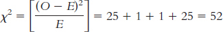
15.37 The conditional probability of being a smoker, given that a person is female is  , and the conditionalprobability of being a smoker, given that a person is male is
  . The relative likelihood of being a smoker given that one is female rather than male is
 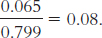 . These Turkish women with lung cancer were less than one-
15.39
Count Variable X RankX Variable Y Rank Y 1 134.5 3 64.00 7 2 186 10 60.00 1 3 157 9 61.50 2 4 129 1 66.25 10 5 147 7 65.50 8.5 6 133 2 62.00 3.5 7 141 5 62.50 5 8 147 7 62.00 3.5 9 136 4 63.00 6 10 147 7 65.50 8.5 Count Rank X Rank Y Difference Squared Difference 1 3 7 −4 16 2 10 1 9 81 3 9 2 7 49 4 1 10 −9 81 5 7 8.5 −1.5 2.25 6 2 3.5 −1.5 2.25 7 5 5 0 0 8 7 3.5 3.5 12.25 9 4 6 −2 4 10 7 8.5 −1.5 2.25 Page C-66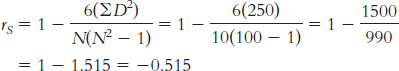
15.41
When calculating the Spearman correlation coefficient, we must first transform the variable “hours trained” into a rank-
ordered variable. We then take the difference between the two ranks and square those differences: Race Rank Hours Trained Hours Rank Difference Squared Difference 1 25 1.5 −0.5 0.25 2 25 1.5 0.5 0.25 3 22 3 0 0 4 18 5.5 −1.5 2.25 5 19 4 1 1 6 18 5.5 0.5 0.25 7 12 10 −3 9 8 17 7 1 1 9 15 9 0 0 10 16 8 2 4 We calculate the Spearman correlation coefficient as:
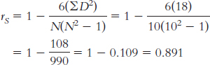
The critical rS with an N of 10, a p level of 0.05, and a two-
tailed test is 0.648. The calculated rS is 0.89, which exceeds the critical value. So we reject the null hypothesis. Finishing place was positively associated with the number of hours spent training.
15.43 ΣRgroup1 = 1 + 2.5 + 8 + 4 + 6 + 10 = 31.5
Σ Rgroup2 = 11 + 9 + 2.5 + 5 + 7 + 12 = 46.5
The formula for the first group is:
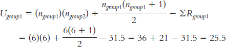
The formula for the second group is:
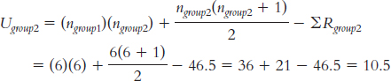
15.45
To conduct the Mann–
Whitney U test, we first obtain the rank of every person in the data set. We then separately sum the ranks of the two groups, men and women: Student Gender Class Standing Rank Male Rank Female Rank 1 Male 98 11 11 2 Female 72 9 9 3 Male 15 3 3 4 Female 3 1 1 5 Female 102 12 12 6 Female 8 2 2 7 Male 43 7 7 8 Male 33 6 6 9 Female 17 4 4 10 Female 82 10 10 11 Male 63 8 8 12 Male 25 5 5 We sum the ranks for the men: ΣRm = 11 + 3 + 7 + 6 + 8 + 5 = 40
We sum the ranks for the women: ΣRw = 9 + 1 + 12 + 2 + 4 + 10 = 38
We calculate U for the men:
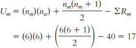
We calculate U for the women:
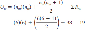
The critical value for the Mann–
Whitney U test with two samples of size 6, a p level of 0.05, and a two- tailed test is 5. We compare the smaller of the two U values to the critical value and reject the null hypothesis if it is smaller than the critical value. Because the smaller U of 17 is not less than 5, we fail to reject the null hypothesis. There is no evidence for a difference in the class standing of men and women.
15.47
The first variable is gender, which is nominal (male or female). The second variable is salary negotiation, which also is nominal (wage not explicitly negotiable or wage explicitly negotiable).
A chi-
square test for independence would be appropriate because both variables are nominal. The researchers found that both genders seemed to be more likely to negotiate when the ad stated that the wage was negotiable than when that was not stated; however, when the job posting stated that the wage was negotiable, women seemed to be somewhat more likely than men to negotiate, whereas, when wage was not explicitly mentioned as negotiable in the job posting, men seemed to be more likely than women to negotiate.
15.49
A nonparametric test would be appropriate because both of the variables are nominal: gender and major.
Page C-67A nonparametric test is more appropriate because the sample size is small and the data are unlikely to be normal; the “top boss” is likely to have a much higher income than the other employees. This outlier would lead to a nonnormal distribution.
A parametric test would be appropriate because the independent variable (type of student: athlete versus nonathlete) is nominal and the dependent variable (grade point average) is scale.
A nonparametric test would be appropriate because the independent variable (athlete versus nonathlete) is nominal and the dependent variable (class rank) is ordinal.
A nonparametric test would be appropriate because the research question is about the relation between two nominal variables: seat-
belt wearing and degree of injuries. A parametric test would be appropriate because the independent variable (seat-
belt use: no seat belt versus seat belt) is nominal and the dependent variable (speed) is scale.
15.51
(i) Year. (ii) Grades received. (iii) This is a category III research design because the independent variable, year, is nominal and the dependent variable, grade (A or not), could also be considered nominal.
(i) Type of school. (ii) Average GPA of graduating students. (iii) This is a category II research design because the independent variable, type of school, is nominal and the dependent variable, GPA, is scale.
(i) SAT scores of incoming students. (ii) College GPA. (iii) This is a category I research design because both the independent variable and the dependent variable are scale.
15.53
Mexican White Black Married Single Married Head of Household Immigrant Neighborhood Nonimmigrant Neighborhood Committed crime No crime Unmarried Head Of Household Immigrant Neighborhood Nonimmigrant Neighborhood Committed crime No crime First Generation Second Generation Third Generation Committed crime No crime
15.55
There is one variable, the gender of the op-
ed writers. Its levels are men and women. A chi-
square test for goodness of fit would be used because we have data on a single nominal variable from one sample. Step 1: Population 1 is op-
ed contributors, in proportions of males and females that are like those in our sample. Population 2 is op- ed contributors, in proportions of males and females that are like those in the general population. The comparison distribution is a chi- square distribution. The hypothesis test will be a chi- square test for goodness of fit because we have only one nominal variable. This study meets three of the four assumptions. (1) The variable under study is nominal. (2) Each observation is independent of all the others. (3) There are more than five times as many participants as there are cells (there are 124 op- ed articles and only two cells). (4) This is not, however, a randomly selected sample of op- eds, so we must generalize with caution; specifically, we should not generalize beyond the New York Times. Step 2: Null hypothesis: The proportions of male and female op-
ed contributors are the same as those in the population as a whole. Research hypothesis: The proportions of male and female op-
ed contributors are different from those in the population as a whole. Step 3: The comparison distribution is a chi-
square distribution with 1 degree of freedom:  .
.Step 4: The critical χ2, based on a p level of 0.05 and 1 degree of freedom, is 3.841.
Step 5:
Observed (Proportions of Men and Women) Men Women 103 21 Expected (Based on the General Population) Men Women 62 62 Category Observed (O ) Expected (E ) O − E (O − E)2
Men 103 62 41 1681 27.113 Women 21 62 −41 1681 27.113 
Step 6: Reject the null hypothesis. The calculated chi-
square statistic exceeds the critical value. It appears that the proportion of op- eds written by women versus men is not the same as the proportion of men and women in the population. Specifically, there are fewer women than in the general population. χ2(1, N = 124) = 54.23, p < 0.05
15.57
The accompanying table shows the conditional proportions.
Exciting Routine Dull Same city 0.424 0.521 0.055 1.00 Same state/different city 0.468 0.485 0.047 1.00 Different state 0.502 0.451 0.047 1.00 The accompanying graph shows these conditional proportions.
The relative likelihood of finding life exciting if one lives in a different state as opposed to the same city is
 .
.
15.59
There are two nominal variables—
premarital doubts (yes or no) and divorced by 4 years (yes or no). Chi-
square tests for independence were used because there were two nominal variables. These tests were conducted for husbands and wives separately. n should be reported as N. The specific p values for each hypothesis test should be provided. An effect size—
Cramér’s V in these cases— should be reported for each hypothesis test. The researchers could not conclude that the likelihood of husbands being divorced by 4 years was dependent on premarital doubts. However, premarital doubts did seem to be related to being divorced by 4 years for wives.
15.61
The Mann–
Whitney U test would be most appropriate because it is a nonparametric equivalent to the independent- samples t test. It is used when there is a nominal independent variable with two levels (north and south of the equator), a between- groups research design, and an ordinal dependent variable (the ranking of the city). The Wilcoxon signed-
rank test would be most appropriate because there is a nominal independent variable with two levels (the time of the previous study versus 2012), a within- groups research design, and an ordinal dependent variable (ranking). The Wilcoxon signed- rank test is the nonparametric equivalent to the paired- samples t test. The Spearman rank-
order correlation would be most appropriate because this is a question about the relation between two ordinal variables. The Spearman rank- order correlation is the nonparametric equivalent to the Pearson correlation. The Kruskal–
Wallis H test would be most appropriate because it is a nonparametric equivalent to the one- way between- groups ANOVA. It is used when there is a nominal independent variable with three or more levels (the various continents, in this case), a between- groups research design, and an ordinal dependent variable (the ranking of the city).
15.63
The first variable of interest is test grade, which is a scale variable. The second variable of interest is the order in which students completed the test, which is an ordinal variable.
The accompanying table shows test grade converted to ranks, difference scores, and squared differences.
Grade Percentage Grade Speed Rank D D2 98 1 1 0 0 93 6 2 4 16 92 4 3 1 1 88 5 4 1 1 87 3 5 −2 4 74 2 6 −4 16 67 8 7 1 1 62 7 8 −1 1 We calculate the Spearman correlation coefficient as:
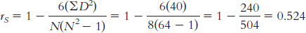
The coefficient tells us that there is a rather large positive relation between the two variables. Students who completed the test more quickly also tended to score higher.
We could not have calculated a Pearson correlation coefficient because one of the variables, order in which students turned in the test, is ordinal.
This correlation does not indicate that students should attempt to take their tests as quickly as possible. Correlation does not provide evidence for a particular causal relation. A number of underlying causal relations could produce this observed correlation.
A third variable that might cause both speedy test taking and a good test grade is knowledge of the material. Students with better knowledge of, and more practice with, the material would be able to get through the test more quickly and get a better grade.
1.00 is the strongest correlation and −0.001 is the weakest correlation.
15.65
The independent variable is the type of institution and its levels are public and private. The dependent variable is U.S. News & World Report ranking.
This is a between-
groups design because the institutions are either public or private but cannot be both. Page C-69We have to use a nonparametric test for these data because the dependent measure is ordinal.
Step 1: The data are ordinal. The schools on the list have not been randomly selected but were systematically selected (they are the top 19 programs in the United States). Finally, a number of schools have tied ranks. The results of the Mann–
Whitney U test may not be valid. Step 2: Null hypothesis: There will tend to be no difference between the rankings of public and private schools.
Research hypothesis: There will tend to be a difference between the rankings of public and private schools.
Step 3: There are 9 public universities and 10 private universities listed.
Step 4: The critical value for a Mann–
Whitney U test with one group of 9 and one group of 10, a p level of 0.05, and a two- tailed test is 20. The calculated statistic will need to be less than or equal to this critical value to be considered statistically significant. Step 5:
University Rank Type of School Public Rank Private Rank Princeton University 2 Private 2 University of California, Berkeley 2 Public 2 University of Wisconsin, Madison 2 Public 2 Stanford University 4.5 Private 4.5 University of Michigan, Ann Arbor 4.5 Public 4.5 Harvard University 7 Private 7 University of Chicago 7 Private 7 University of North Carolina, Chapel Hill 7 Public 7 University of California, Los Angeles 9 Public 9 Northwestern University 10.5 Private 10.5 University of Pennsylvania 10.5 Private 10.5 Columbia University 12.5 Private 12.5 Indiana University, Bloomington 12.5 Public 12.5 Duke University 14.5 Private 14.5 University of Texas, Austin 14.5 Public 14.5 New York University 16 Private 16 Cornell University 18 Private 18 Ohio State University 18 Public 18 Pennsylvania State University, University Park 18 Public 18 ΣRpublic = 2 + 2 + 4.5 + 7 + 9 + 12.5 + 14.5 + 18 + 18 = 87.5
ΣRprivate = 2 + 4.5 + 7 + 7 + 10.5 + 10.5 + 12.5 + 14.5 + 16 + 18 = 102.5

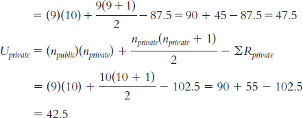
Step 6: The smaller U statistic, 42.5, is not smaller than the critical value of 20, so we fail to reject the null hypothesis.
U = 42.5, p > 0.05
15.67
Hours studied per week appears to be roughly normal, with observations across the range of values—
from 0 through 20. Monthly cell phone bill appears to be positively skewed, with one observation much higher than all the others. The histogram confirms the impression that the monthly cell phone bill is positively skewed. It appears that there is an outlier in the distribution.
Parametric tests assume that the underlying population data are normally distributed or that there is a large enough sample size that the sampling distribution will be normal anyway. These data seem to indicate that the underlying distribution is not normally distributed; moreover, there is a fairly small sample size (N = 29). We would not want to use a parametric test.
15.69
There are two variables in this study. The independent variable is the referred child’s gender (boy, girl) and the dependent variable is the diagnosis (problem, no problem but below norms, no problem and normal height).
A chi-
square test for independence would be used because we have data on two nominal variables. Step 1: Population 1 is referred children like those in this sample. Population 2 is referred children from a population in which growth problems do not depend on the child’s gender. The comparison distribution is a chi-
square distribution. The hypothesis test will be a chi- square test for independence because we have two nominal variables. This study meets three of the four assumptions. (1) The two variables are nominal. (2) Every participant is in only one cell. (3) There are more than five times as many participants as there are cells (there are 278 participants and six cells). (4) The sample, however, was not randomly selected, so we must use caution when generalizing. Step 2: Null hypothesis: The proportion of boys in each diagnostic category is the same as the proportion of girls in each category.
Research hypothesis: The proportion of boys in each diagnostic category is different from the proportion of girls in each category.
Step 3: The comparison distribution is a chi-
square distribution that has 2 degrees of freedom:  .
.Step 4: The critical χ2, based on a p level of 0.05 and 2 degrees of freedom, is 5.99.
Page C-70Step 5:
Medical Problem Observed No Problem/ Below Norm No Problem/ Normal Height Boys 27 86 69 182 Girls 39 38 19 96 66 124 88 278 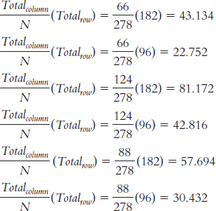
Medical Problem Expected No Problem/ Below Norm No Problem/ Normal Height Boys 43.134 81.172 57.694 182 Girls 22.752 42.816 30.432 96 65.886 123.988 88.126 278 Category Observed (O) Expected (E) O − E (O − E)2
Boy; med prob 27 43.134 −16.134 260.306 6.035 Boy; no prob/below 86 81.172 4.828 23.31 0.287 Boy; no prob/norm 69 57.694 11.306 127.826 2.216 Girl; med prob 39 22.752 16.248 263.998 11.603 Girl; no prob/below 38 42.816 −4.816 23.194 0.542 Girl; no prob/norm 19 30.432 −11.432 130.691 4.295 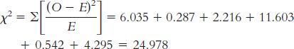
Step 6: Reject the null hypothesis. The calculated chi-
square value exceeds the critical value. It appears that the proportion of boys in each diagnostic category is not the same as the proportion of girls in each category. Cramér’s
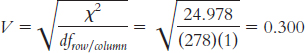 According to Cohen’s conventions, this is a small-
to- medium effect size. χ2(1, N = 278) = 24.98, p < 0.05, Cramér’s V = 0.30
The accompanying table shows the conditional proportions.
Medical Problem Observed No Problem/ Below Norm No Problem/ Normal Height Boys 0.148 0.473 0.379 1.00 Girls 0.406 0.396 0.198 1.00 The accompanying graph shows all six conditions.
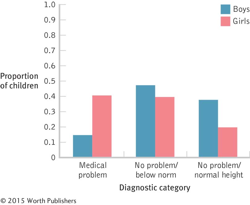
Of the 113 boys below normal height, 27 were diagnosed with a medical problem. Of the 77 girls below normal height, 39 were diagnosed with a medical problem. The conditional proportion for boys is 0.239 and for girls is 0.506. This makes the relative risk for having a medical condition, given that one is a boy as opposed to a girl
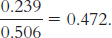
Boys below normal height are about half as likely to have a medical condition as are girls below normal height.
The relative risk for having a medical condition, given that one is a girl, is
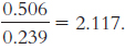
Girls below normal height are about twice as likely to have a medical condition as are boys below normal height.
The two relative risks give us complementary information. Saying that boys are half as likely to have a medical condition implies that girls are twice as likely to have a medical condition.